Обзор лучших ресурсов по разработке бренда, разработке упаковки
contact us | ok@ohmycode.ru
contact us | ok@ohmycode.ru
Estonia is a country in the Baltic region of Northern Europe bordered to the north by the Gulf of Finland, to the west by the Baltic Sea, to the south by Latvia and to the east by Lake Peipus and Russia. Across the Baltic Sea lie Sweden and Finland. After spending the twentieth century marred by Russian and German occupation and having already gained independence once in 1918, Estonia has blossomed after its second independence in 1991 and is more akin to its Nordic neighbors than its Soviet past. Free healthcare, a high-income economy, digital know-how, a 100 to 84 women to men ratio, great education, and only 1.3 million people whose kids are reportedly the 3rd fittest in the world. After reading this page the “That’s it, I’m moving to Canada” pales in comparison to the thought of moving to Estonia. It sounds great. It also looks great, with half of the country covered by forests and being one of the largest deposits of glacial erratic boulders! Anyway, we are here to talk about the effort by Enterprise Estonia, an institution that contributes to the achievement of the strategic goals of the Estonian economy, supports the development of companies with export capacity, promotes Estonia’s tourism, attracts foreign investments, and offers e-residency. Earlier this month Enterprise Estonia introduced a new country brand designed by Estonian Design Team.
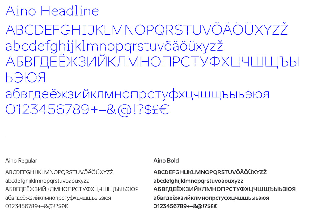
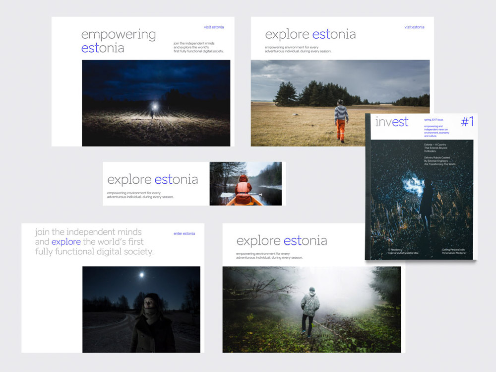
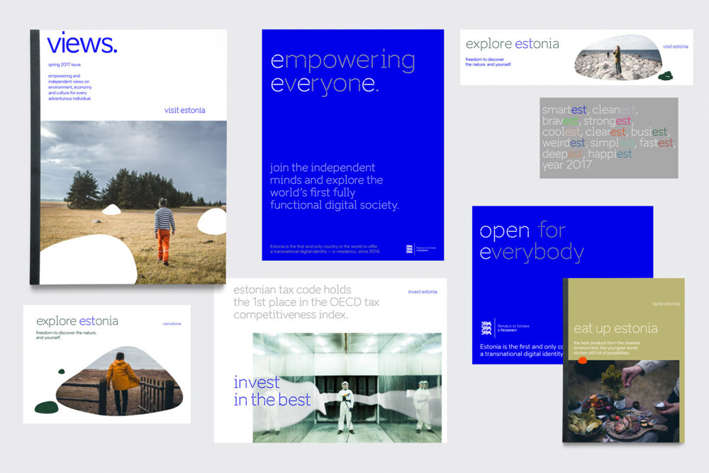
Since we are not using a logo, consistency in verbal and visual communication is essential. Aino, a typeface by Anton Koovit, is the official typeface of Estonia for both headlines and body copy.
The old logo looked more like a random window decal than a proper country logo and suffered from far too many strokes (even though, I see them too, there is only two — it feels like a hundred). The one thing it did well was cement EST, its ISO-certified country abbreviation, as a recognizable visual and verbal element. The new logo — which is not an actual official logo according to Enterprise Estonia, but, c’mon, there is no way that will not become the logo by default once the identity has to be put to use — places emphasis on the tech advancements and lifestyle of Estonia with a markedly “techie”-looking custom typeface that’s half stencil, half monospace coding font. It immediately conveys new/digital/future, which is cool but maybe a tad cold. The not-a-logo on its own is a little delicate but distinctive enough to be discernible from other logos. I understand the not-wanting-a-logo philosophy but it might be beneficial to create a stand-alone version that’s a slightly thicker with more pronounced stencil breaks to maybe not use as a logo down the line. So, if there is no logo, despite me spending a long paragraph on it, what makes brand Estonia, Estonia?
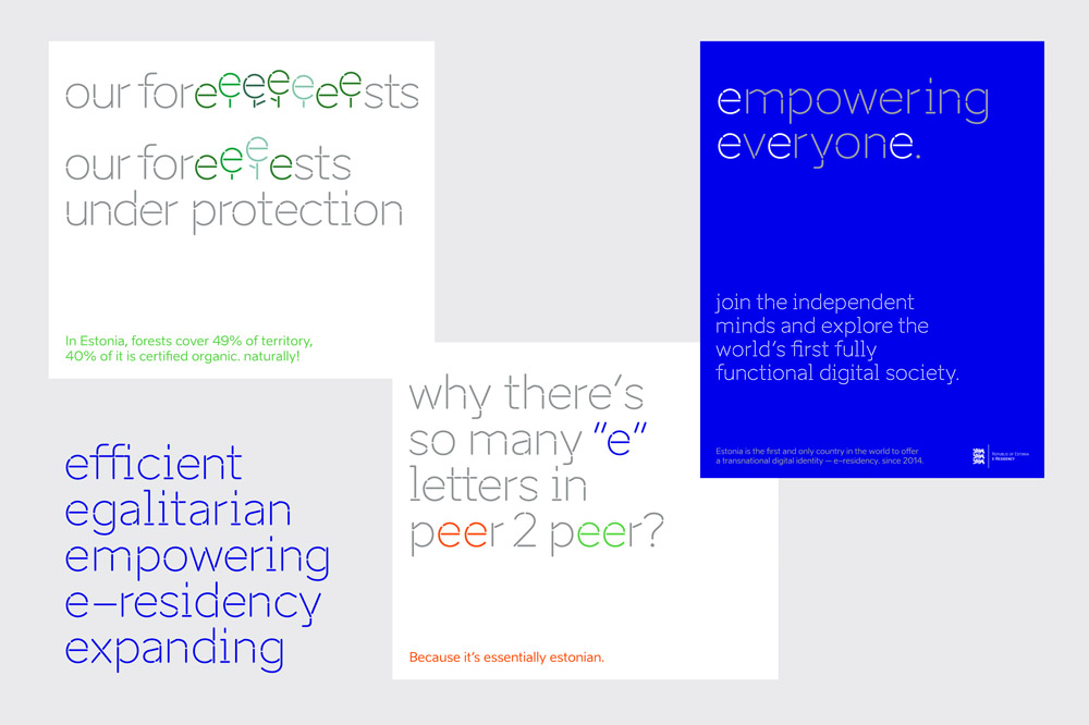
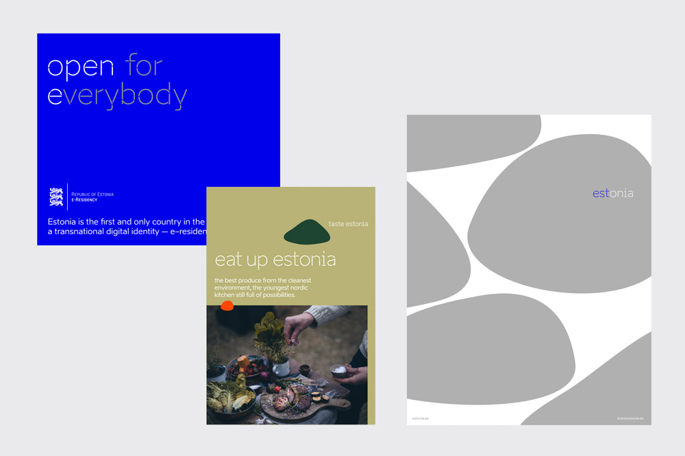
“e”
As in Estonia, eco, efficient, egalitarian, empowering, e-residency, e-society, expanding etc. As our .ee web domain and e-Estonia.
We use positive e-words in headlines, slogans and pullouts. We play with the rhythm of e-words and use letter ‘e’ as a design element.
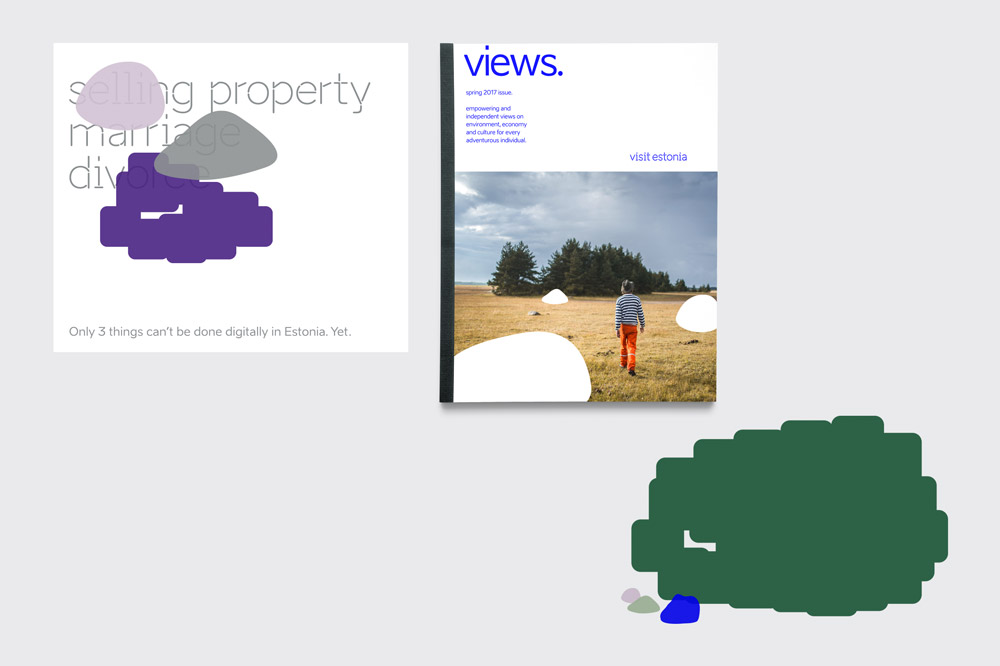
“est”
EST is one of our ISO-certified country abbreviations (the other being EE). It can be found as a syllable in various languages, e.g. the english superlative form.
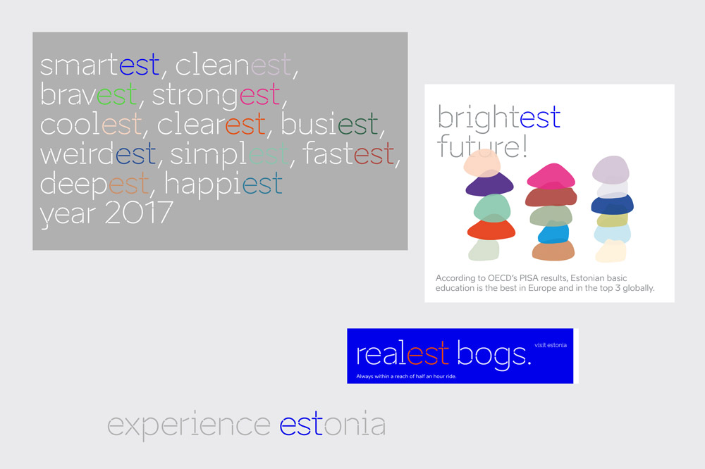
Mainly, the custom type family, with the Headline style being the most distinctive. It’s almost a really great typeface; the lowercase in particular is its most interesting aspect but it feels rushed somehow, lacking one or two rounds of finesse. One thing that drives me crazy is the “b” that has a flat side, where none of the other circular characters have one. But, in general, it gets the point across that this is not, say, Peru. It has a fitting aesthetic. Through type, the other branded element is placing emphasis on “est” in words, which works very well in English (and I have no idea if it has the same effect in Estonian) and establishes a clever, recurring grammatical element that’s fun and memorable. There is also the option to emphasize only “e”s and that works as well, perhaps in a less obvious way.
Boulders
Boulders are our brand’s disruptive and playful elements as they are strong carriers of identity on our land. In nature, the giant erratic boulders appear unexpectedly in the forest or on the beach. In our designs we also use them to disrupt or as practical design elements.
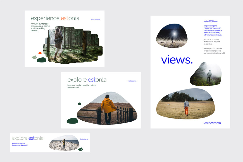
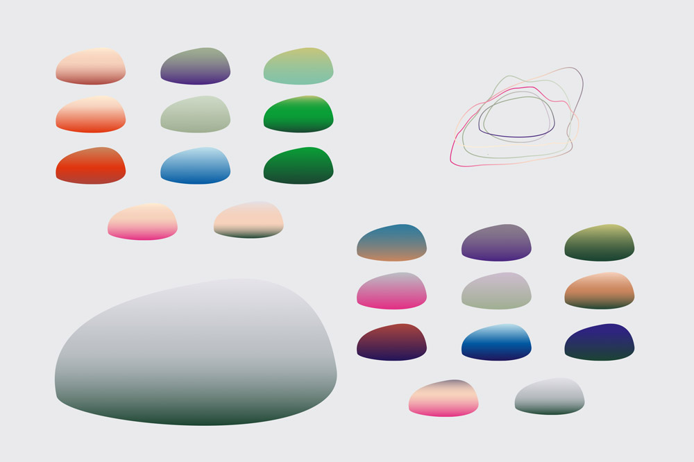
The other element of the identity are boulders! Yes, boulders. Or, as mentioned in the intro, glacial erratic boulders. It’s a completely unusual element that even before I learned that Estonia has so many of these boulders, I immediately thought “Heck, there must be boulders in Estonia”. Although some applications are a little funky — especially those with too many colors — I kind of love the boulders. It’s an organic shape that breaks the coldness of the font and hints at the nature aspect of Estonia.
Overall, this is a great effort to give a consistent voice to a relatively lesser known-about or understood country — I’ll admit my own ignorance in that I didn’t realize it was so progressive — and put it front and center as a significant hub for the future.
Thanks to Anatolijs Vjalihs for the tip.

 Новости Союза дизайнеров
Все о дизайне в Санкт-Петербурге.
Новости Союза дизайнеров
Все о дизайне в Санкт-Петербурге.