Обзор лучших ресурсов по разработке бренда, разработке упаковки
contact us | ok@ohmycode.ru
contact us | ok@ohmycode.ru
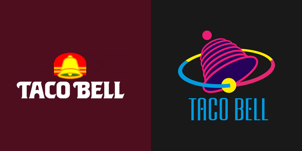
Established in 1962 by Glen Bell, Taco Bell is a Tex-Mex chain of fast-food restaurants offering tacos, burritos, and monstrosities like Doritos® Locos Taco, the Quesarito (a burrito wrapped in a quesadilla), and the Enchirito (a burrito coated like an enchilada). I ate at Taco Bell once. It was truly distasteful and I’m not that big a food snob. But, clearly, I’m alone: Taco Bell has 6,000 restaurants across the U.S. serving more than 40 million customers every week, plus locations around the world, from Iceland to Japan to Saudi Arabia. Yesterday, along with the opening of a flagship Taco Bell Cantina in Las Vegas, Taco Bell introduced a new logo designed by Lippincott and Taco Bell’s internal design group, TBD.
In what the brand terms an “evolution, not revolution,” the new logo mirrors the new restaurant strategy: one size doesn’t fit all. In this modern take, color makes a splash and allows customization through patterns and textures, giving usage flexibility while maintaining its iconic framework.
Digital rollout of the logo refresh takes place today, while physical assets like restaurant design, packaging and impacted retail partners will roll out more gradually, depending on development and refresh timelines.
The old logo was fine… mostly from twenty years of inertia as a mainstay of the fast-food American landscape. It was bold and vibrant and easily recognizable. I can’t say there is anything I personally like about it — perhaps the conviction to use blue and magenta together — but it’s a logo perfectly suited for the product that also manages to make a bell look fun. Amid all the bright colors, swooshes, and exaggerated typography what the old logo did well was hide the fact that there was nothing of much interest in the logo, which the new logo painfully reveals. In its simplicity, what’s left is a lackluster bell and a wordmark that looks like it defaulted to a system font.
This is where the minimalist trend that has yielded successful results for things like Microsoft, Mastercard, or even AT&T, demonstrates that it’s not a bullet-proof solution. The new icon is simpler and easier to reproduce, I’ll grant that without question, but it’s as plain as the flavor of their product. It also makes me think of it as being a logo for the Professional Bell Association, looking like the logos for the NBA and MLB, with the bell striking an action pose. The wordmark, I can’t even… I don’t know what else would have been better but this is literally the least appetizing option possible.
The simplicity of the bell might be justified in this brief teaser that shows how the logo can take on any skin it wants, like MTV and, um, Pandora, before it. Despite my lack of admiration for the logo, this could actually work as Taco Bell’s tone of voice can be quirky and humorous — 1990s’ “Yo Quiero Taco Bell” notwithstanding — so they can pull off the logo looking like a bunch of different things that, like the old logo, will hide the fact that logo is a plain bell.
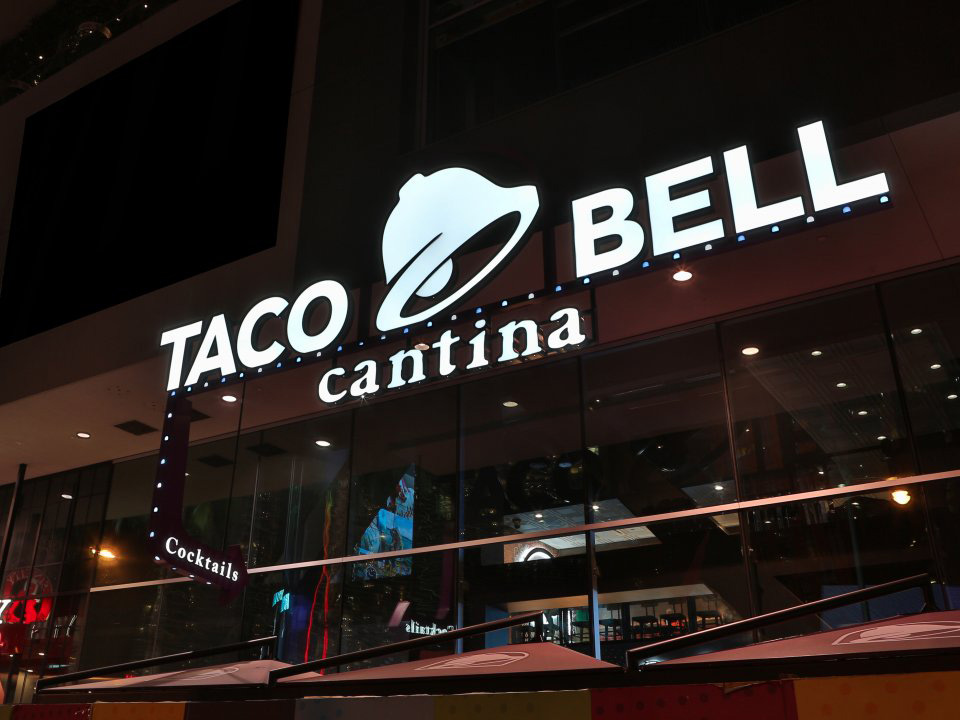
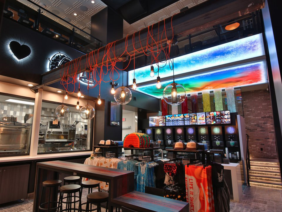
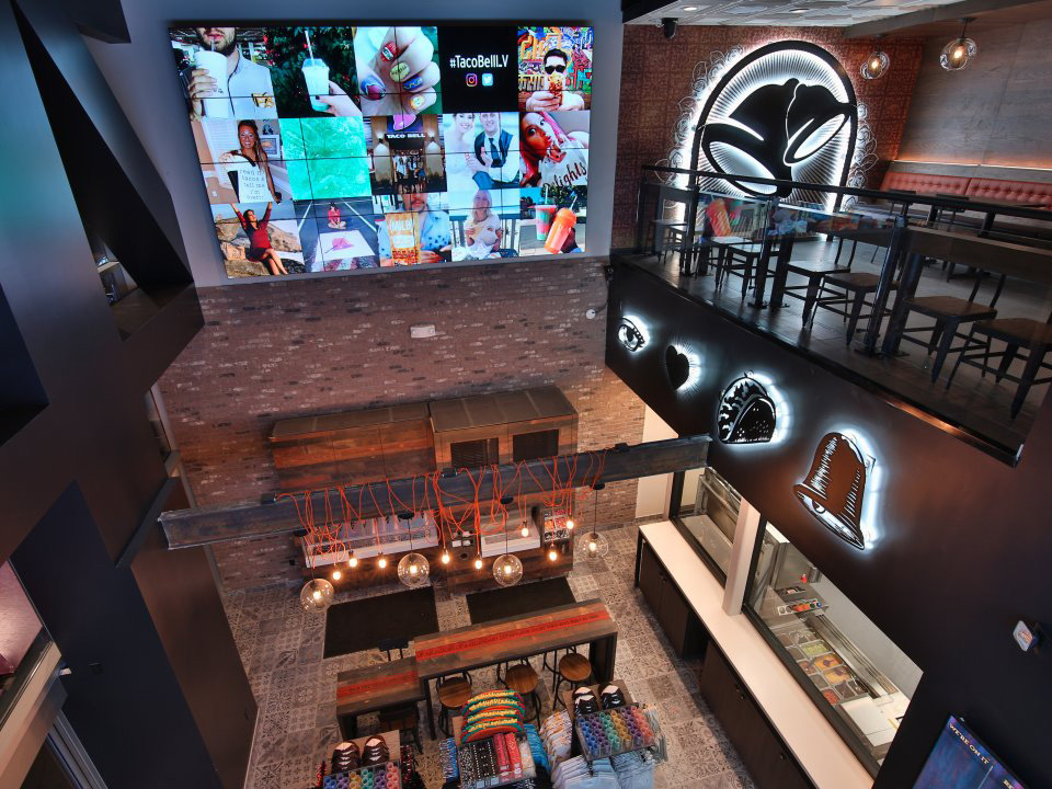
The Taco Bell Cantina concept is kind of scary in its mixing of Quesaritos, branded bikinis, and alcohol-infused slushies. I’m not the target audience, I get that, but the more upscale look is hard to believe or take too seriously. When I think of Taco Bell I always think of Demolition Man (1993), which I consider to be one of the tentpoles in my education of American culture as a young Mexican and now it starts to feel truer than usual:
I don’t think the vintage logo is the solution — even when that’s a powerful trend in identity design — and the 2032 fictional version was clearly made in the 1990s in the spirit of Saved by the Bell graphics but the two logos above have more personality and feel more appropriate for the industry than the new logo. I have the feeling I may be proven wrong down the line as Taco Bell has the budgetary wherewithal to give this logo the visual and tonal environment to succeed and keep building on its growing popularity. Still, as a logo by itself, it could use an enchilada wrapped around it.
Thanks to OCPDesigns for the tip.

 Новости Союза дизайнеров
Все о дизайне в Санкт-Петербурге.
Новости Союза дизайнеров
Все о дизайне в Санкт-Петербурге.