Обзор лучших ресурсов по разработке бренда, разработке упаковки
contact us | ok@ohmycode.ru
contact us | ok@ohmycode.ru
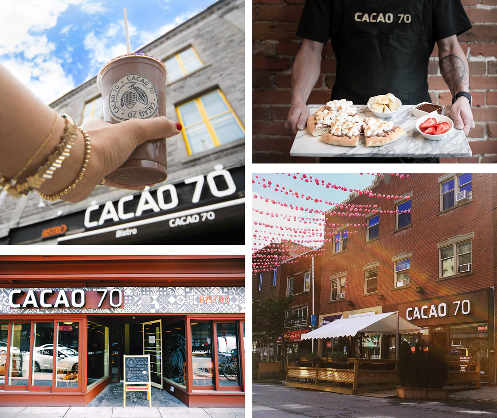
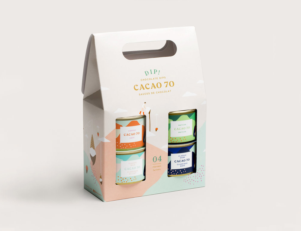
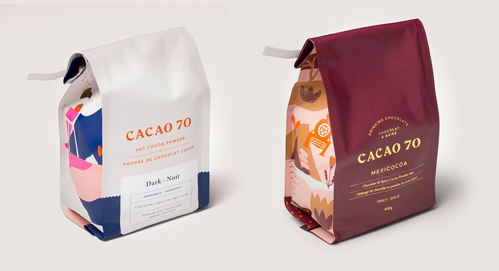
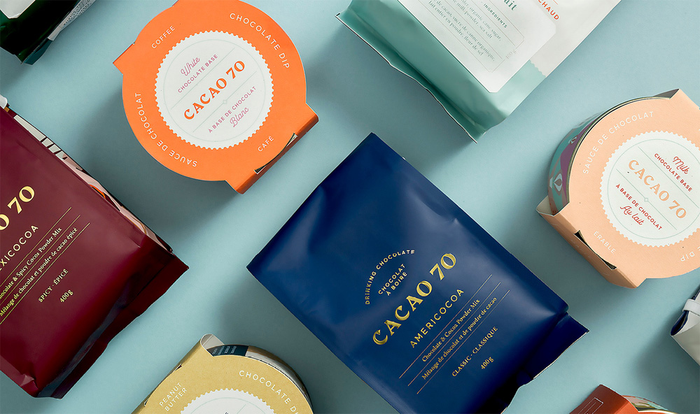
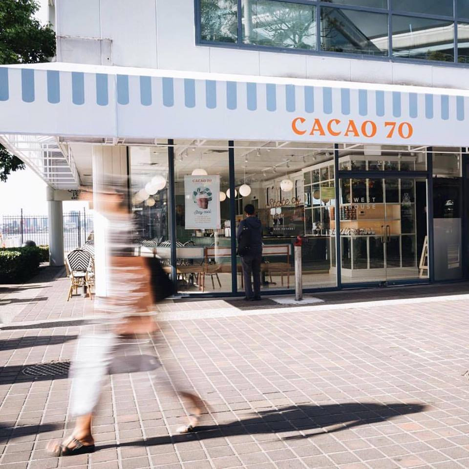
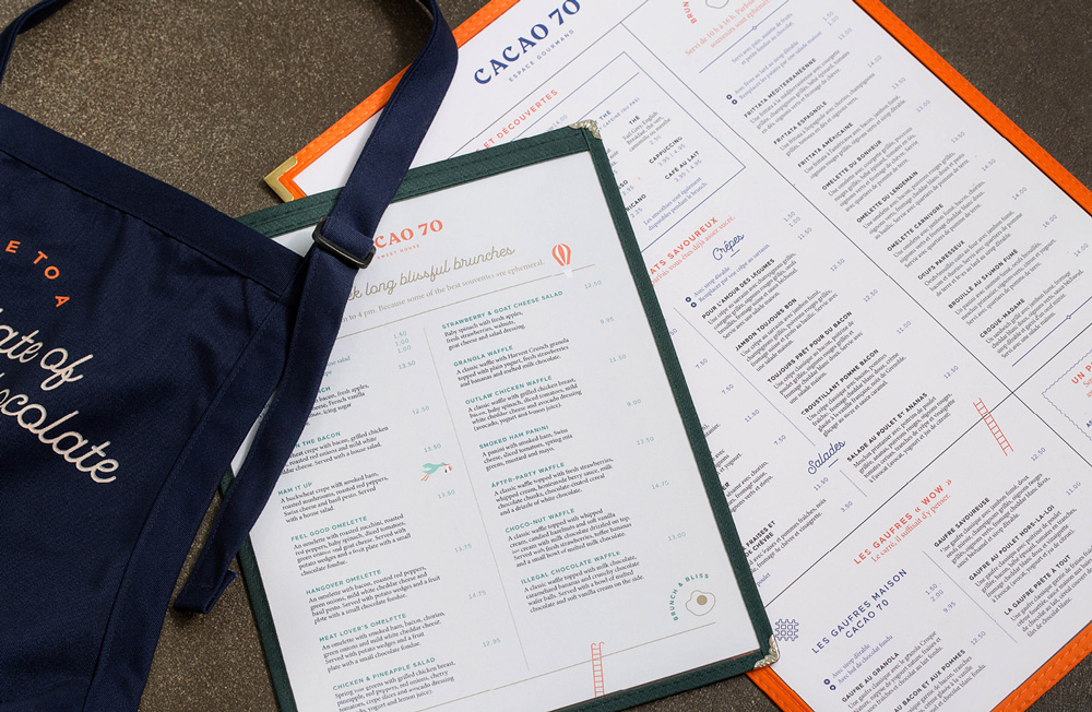
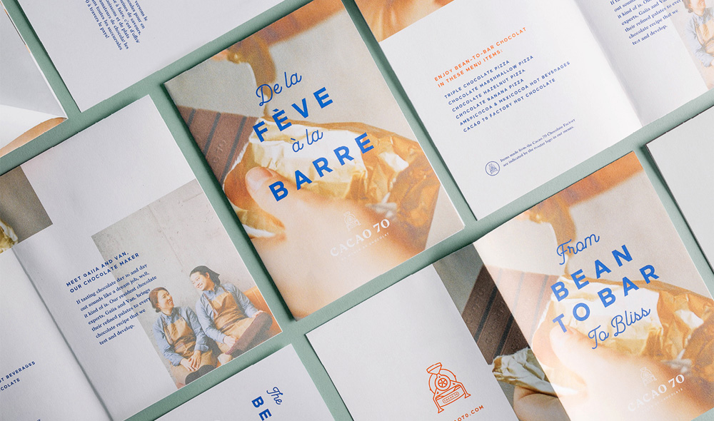
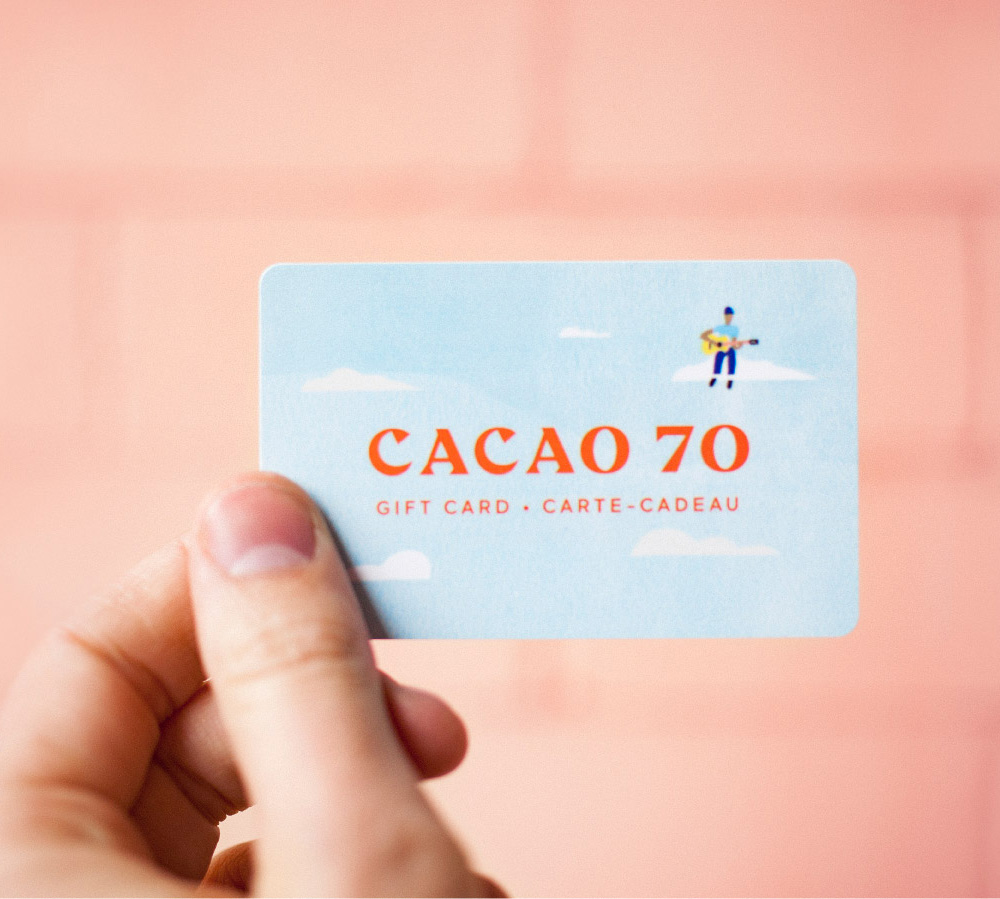
Established in 2011, Cacao 70 launched originally as a single chocolate drinking bar in Montréal, Québec, and has grown to be a significant Canadian chocolatier through bean sourcing, product development, and new store concepts. There are now 14 locations across Canada — including Montréal, Toronto, and Vancouver — where they have one of their three establishments: Eatery, for brunch, lunch, and sweets; Sweet House, with all kinds of sweet treats; and Dip Shop, serving ice cream dipped in chocolate. They also sell their own products, including bars, dips/fondues, and hot cocoa powders. Last year, Cacao 70 introduced a new identity and packaging designed by Montréal- and Tokyo-based In Good Company.
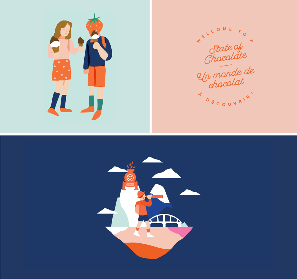
For Cacao 70, we created a whole new brand strategy, going to market strategy, and visual identity to fit their ambitions. A whimsical world, to make us dream and be transported to new flavours.
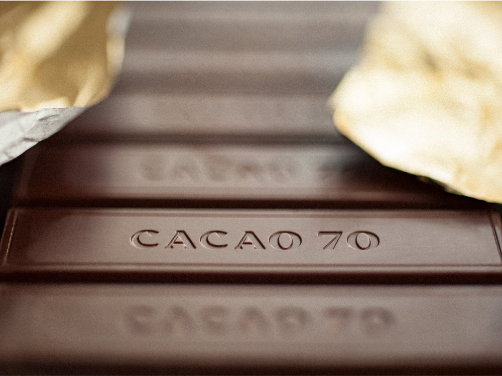
The old logo was a bad interpretation of the old Coffee Bean & Tea Leaf logo with some misplaced corporate type — that “CACAO 70” wordmark was like something you would see on the cover of a telco brochure. Clearly, their logo (or old look) didn’t stop them from growing and delivering great chocolate but with the new logo (and look) the identity matches a lot better what seems to be a delicious product. The wordmark is done in an elegant, beautiful, and striking chiseled serif where each character has a great personality of its own — those “C”s! — and it also happens to be a great combination of repeating characters, two “C”s, two “A”s, and basically two “O”s, with the “7” adding a similar angle to the “A”. Anyway, too much rhapsodizing about that wordmark. In addition, there is a chocolate-churner icon that is kind of awkward, lacking the elegance and crispness of the wordmark, which is a little unfortunate as it appears everywhere. I mean, it’s not horrible, but it stands out in the wrong way.
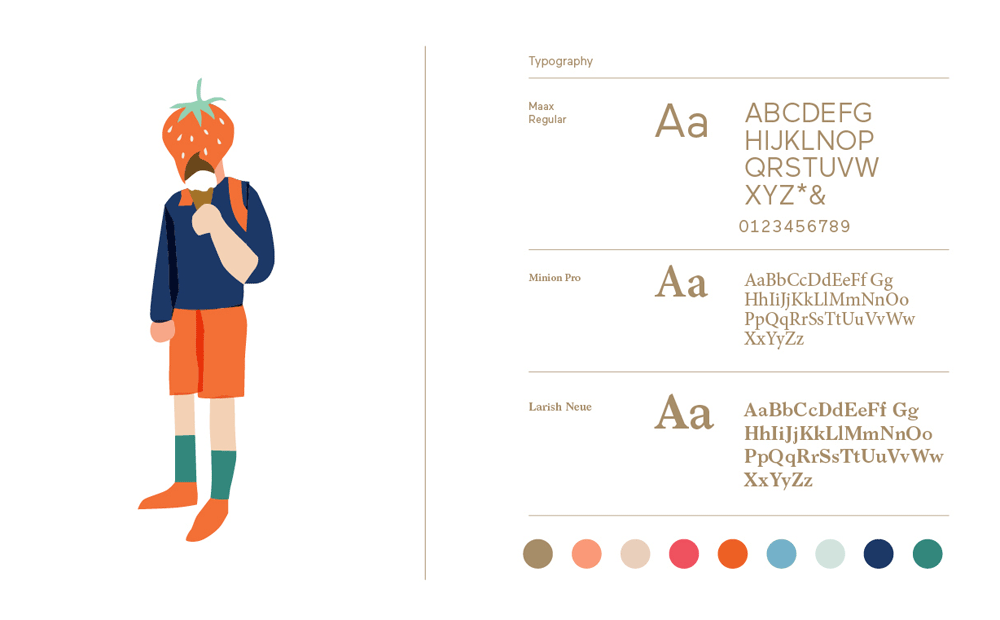
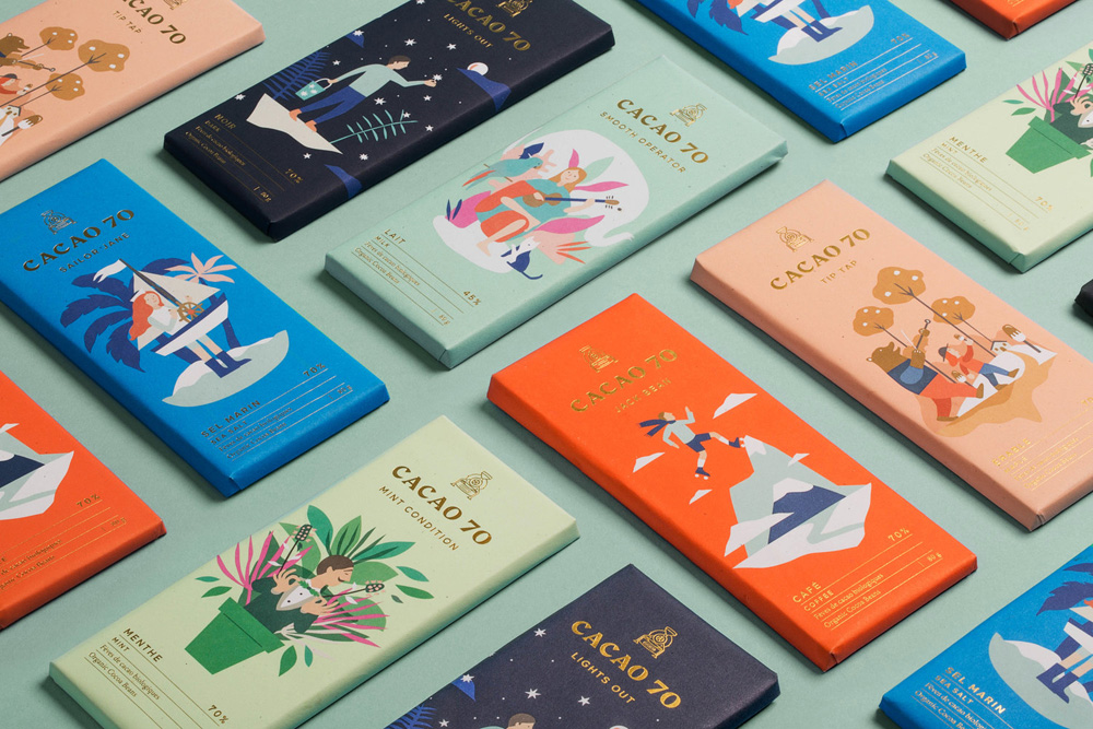
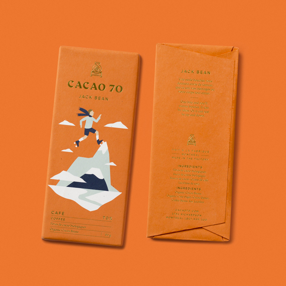
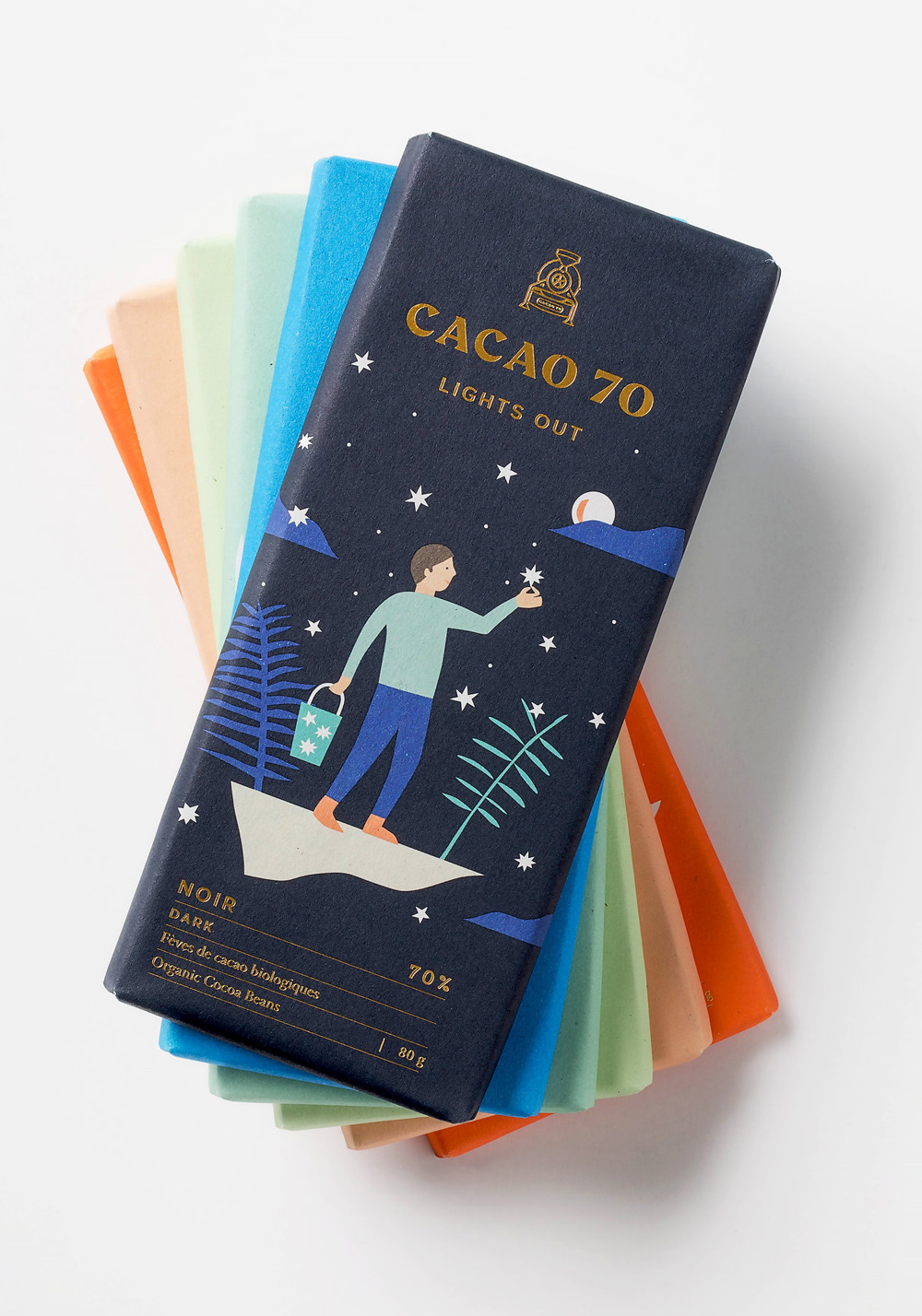
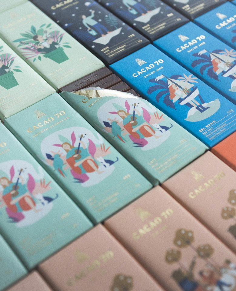
The chocolate bars are like a mid-week Friday Likes treat. These are just lovely and amazing with great illustrations and a beautiful color palette accentuated by my fave, gold foil. Aside from it being eye candy, the typography and hierarchy throughout the product range is very well managed.
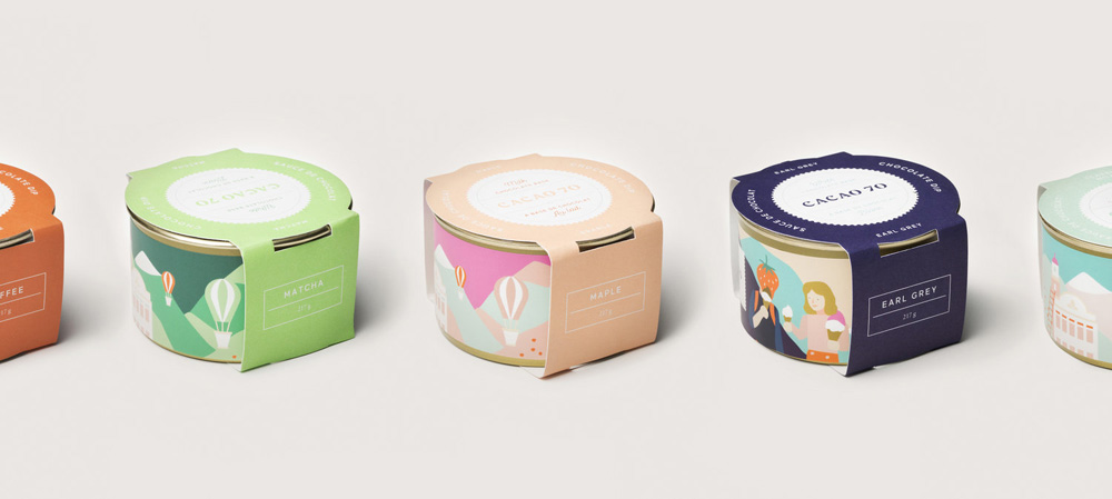
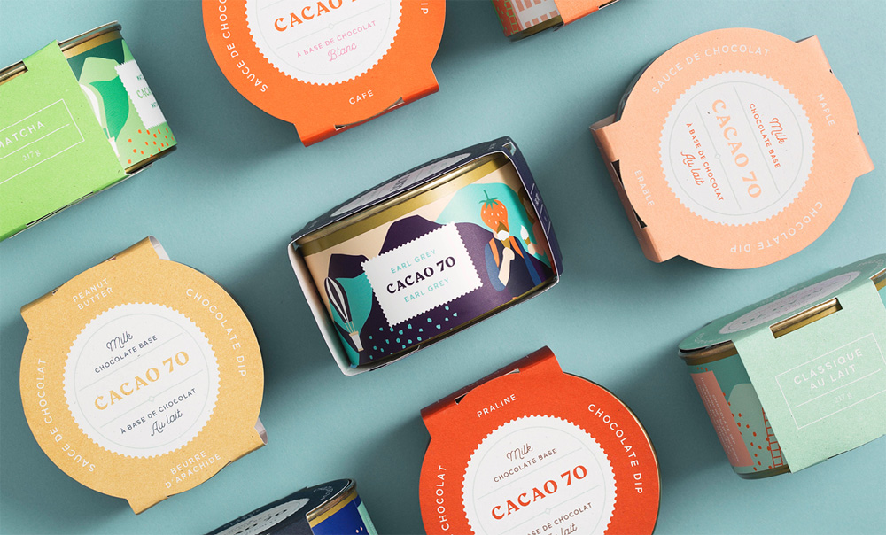
Not much else to add, really. It’s hard to not be satisfied by this and it’s undoubtedly a major improvement from the old identity.

 Новости Союза дизайнеров
Все о дизайне в Санкт-Петербурге.
Новости Союза дизайнеров
Все о дизайне в Санкт-Петербурге.