contact us | ok@ohmycode.ru
contact us | ok@ohmycode.ru
(Est. 1979) “Alzheimer’s Society is a United Kingdom care and research charity for people with dementia and their carers. It operates in England, Wales and Northern Ireland, while its sister charities Alzheimer Scotland and Alzheimer’s Society of Ireland cover Scotland and the Republic of Ireland respectively. It is a membership organisation, which works to improve the quality of life of people affected by dementia in England, Wales and Northern Ireland. Many of the 25,000 members have personal experience of dementia, as carers, health professionals or people with dementia themselves.” (Wikipedia)
Heavenly (London / New York / Cardiff)
Alzheimer's Society press release
Alzheimer's Society blog post
DesignWeek story (a few more application images here)
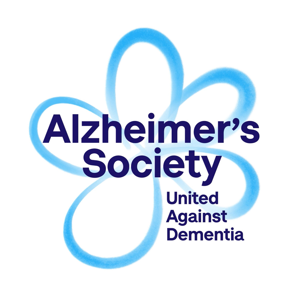
One thing that came across loud and clear, in both our conversations with people affected by dementia and our research among supporters and members of the public, was the need for a tangible and meaningful icon that could be used to demonstrate their support for our cause and their solidarity with people affected by it. The forget-me-not flower – long-associated with dementia – was the natural and popular choice.
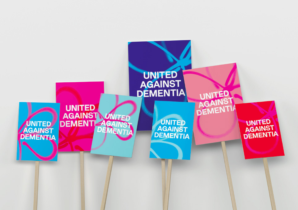
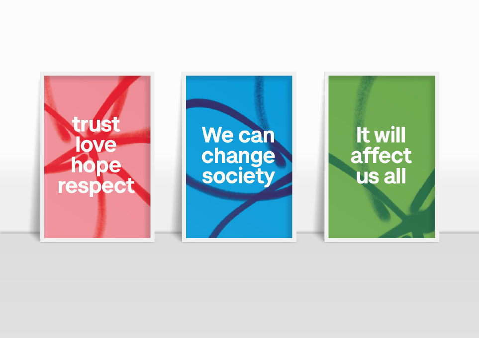
Our stylised forget-me-not and other elements of our visual identity, like the vibrant colour palette, reference graffiti, ‘Pop Art’ and grass-roots change, expressing the need to be bolder and disrupt the status quo.
Our new strapline – united against dementia – communicates that we all have a role to play in beating dementia once and for all.
The old logo was more or less okay. It had the right idea of using its tagline to form a flag but the typography was far too clinical and cold, making it feel more like a hospital than a human-driven charity. The new logo uses a graffiti depiction of a forget-me-not flower, which (not to my previous knowledge) has been used as a symbol for dementia, so if you know about the relationship (and I'm guessing those bound to be involved with the organization are) it should be a quick read that this is a forget-me-not and not just some random blue flower. Even if someone does see just some random blue flower it's not the worst thing that can happen… there is a fragility to the idea of a flower that touches on the effect dementia has on people but then its graffiti rendering is kind of empowering… it does have a stand-up-and-fight attitude but not downright revolutionary. The main wordmark is fine but I'm not crazy about the stacked tagline and where it's placed — the overall lock-up is kind of weird and maybe obscures the icon more than it should. The applications have a good energy to them and the color palette of red, pinks, and blues is bold and vibrant. Overall, a great improvement over the old while also giving the organization a visual rallying cry.


Thanks to David Latcham for the tip.

 Новости Союза дизайнеров
Все о дизайне в Санкт-Петербурге.