Обзор лучших ресурсов по разработке бренда, разработке упаковки
contact us | ok@ohmycode.ru
contact us | ok@ohmycode.ru
Established in 1937, Volkswagen needs little introduction as its one of the most well-known car brands in the world — for both good and not so good reasons. The former includes the design and production of the Beetle, the VW Van, and the Golf, while the latter includes its origin as the “People’s Car” under the Nazi regime and the recent diesel emission fraud. Still, it is one of the world’s most successful volume carmakers, with facilities in 14 countries and over 195,000 employees producing vehicles for customers in more than 150 nations. As Volkswagen looks both to the future and to create some distance between the diesel scandal, the company is putting its focus on pure electric cars, starting with the ID.3, officially launched yesterday at the International Motor Show (IAA) in Frankfurt, where they also introduced a new logo and identity designed in-house.
Jochen Sengpiehl, Chief Marketing Officer of Volkswagen, explains: “We have created a new holistic global brand experience on all channels and across all touch points. As a general principle, the aim in future will not be to show a perfect advertising world. In our presentation, we want to become more human and more lively, to adopt the customer’s perspective to a greater extent and to tell authentic stories.”
The strategic foundations for the new brand design were not laid by external agencies but by a joint team of Volkswagen Design and Marketing. The design was implemented with the full integration of all departments of the company in the record time of nine months using a powerhouse concept developed by Volkswagen especially for this purpose.A total of 19 internal teams and 17 external agencies were involved in the project.
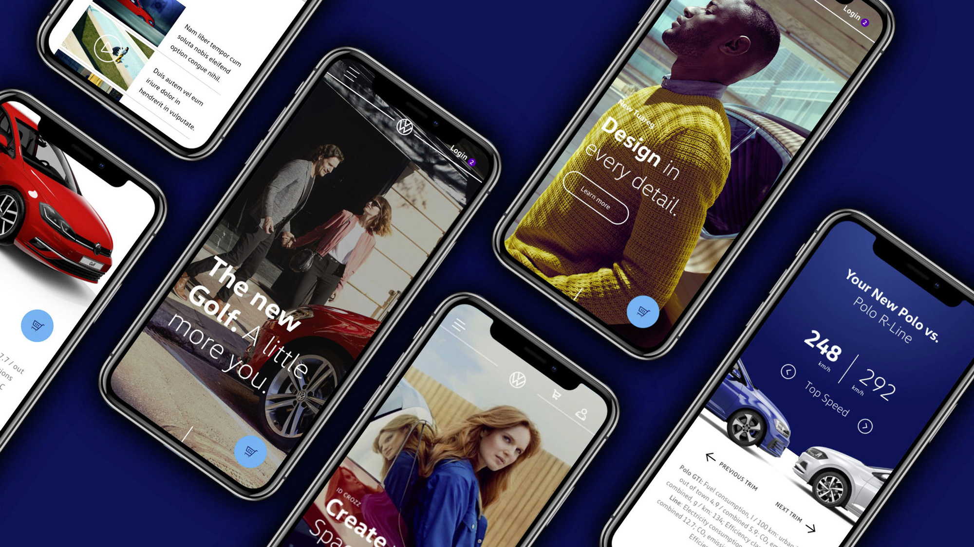
The symbol and trademark will be the new logo. This will be more modern, clearer and simpler. The logo will be reduced to its essential elements and presented with a new design that is flat and two-dimensional. It will allow more flexible use and will be outstandingly recognizable in digital media. To date, the logo has been blue and white. A new blue tone is now being added, allowing additional color variants. As the digital application with simple, user-friendly interfaces has become extremely important, the logo will be positioned flexibly with the new “moving frame” in the future.
The VW logo is a classic, there is no doubt about that, but under growing layers of chrome over the past 20 years it had become increasingly more difficult to see what made the logo good other than its legacy or even remember that the chrome effects didn’t come into play until the late 1990s, obscuring the same flat design, that was previously already “reduced to its essential elements”, being touted today. This is a semi-long way of saying that the move away from the faux dimensionality and chrome effects that have permeated cars for so long is most welcome for VW.
Even though it retains the stacked “VW” structure — which would have been brand suicide if they had introduced something completely different — the new logo comes across as shockingly different. I mean, it’s clearly the “same” but the move to thin lines really transforms the look of the logo. Unfortunately, it isn’t quite the best possible manifestation. I can’t help but compare this to the Lufthansa icon redesign, which came across as being so precisely and crisply executed that it was hard to disagree with it but, here, there is a very distracting small disparity of line thicknesses between the circle (thin), the letters (less thin but not evidently thicker), and the gap between the letters (almost as thin as the circle stroke but not quite), that it’s hard to fully get on board with the evolution, which is sad because I really wanted this to be great.
The new logo is not bad, really. It actually has a little bit of an awkward, imperfect design undercurrent that’s somewhat interesting and I’ll take it over any of the old chrome versions but I feel like it could have been such a big runaway success if the execution had been more refined.
The moving frame brings an end to the rigid positioning of the logo in the bottom right-hand corner, with the frame moving nimbly across digital user interfaces. This allows the flexible positioning of the logo at the most effective point. As a result, interfaces can be kept simple and user-friendly and the logo can also be prominent on small devices.
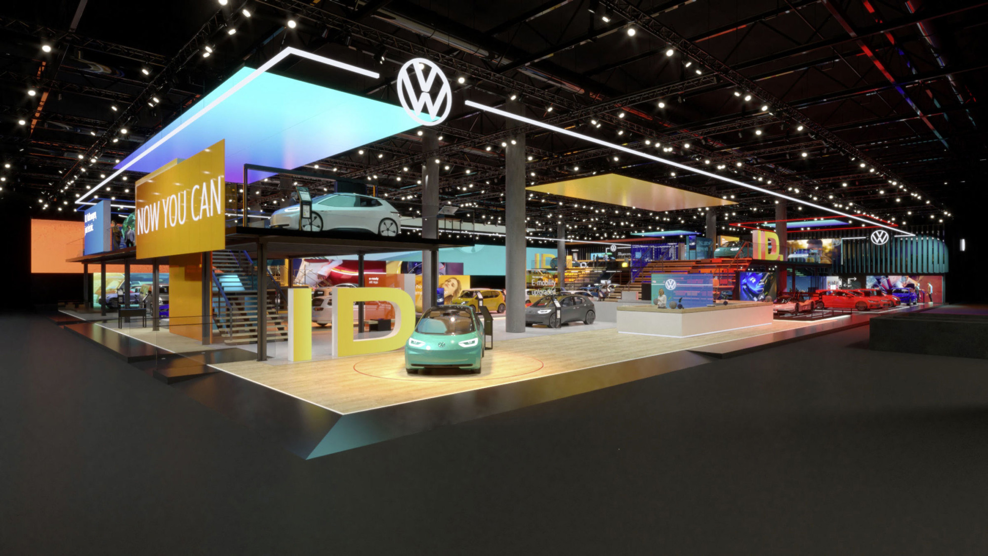
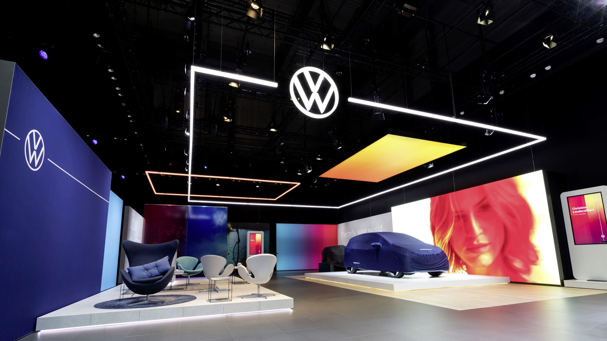
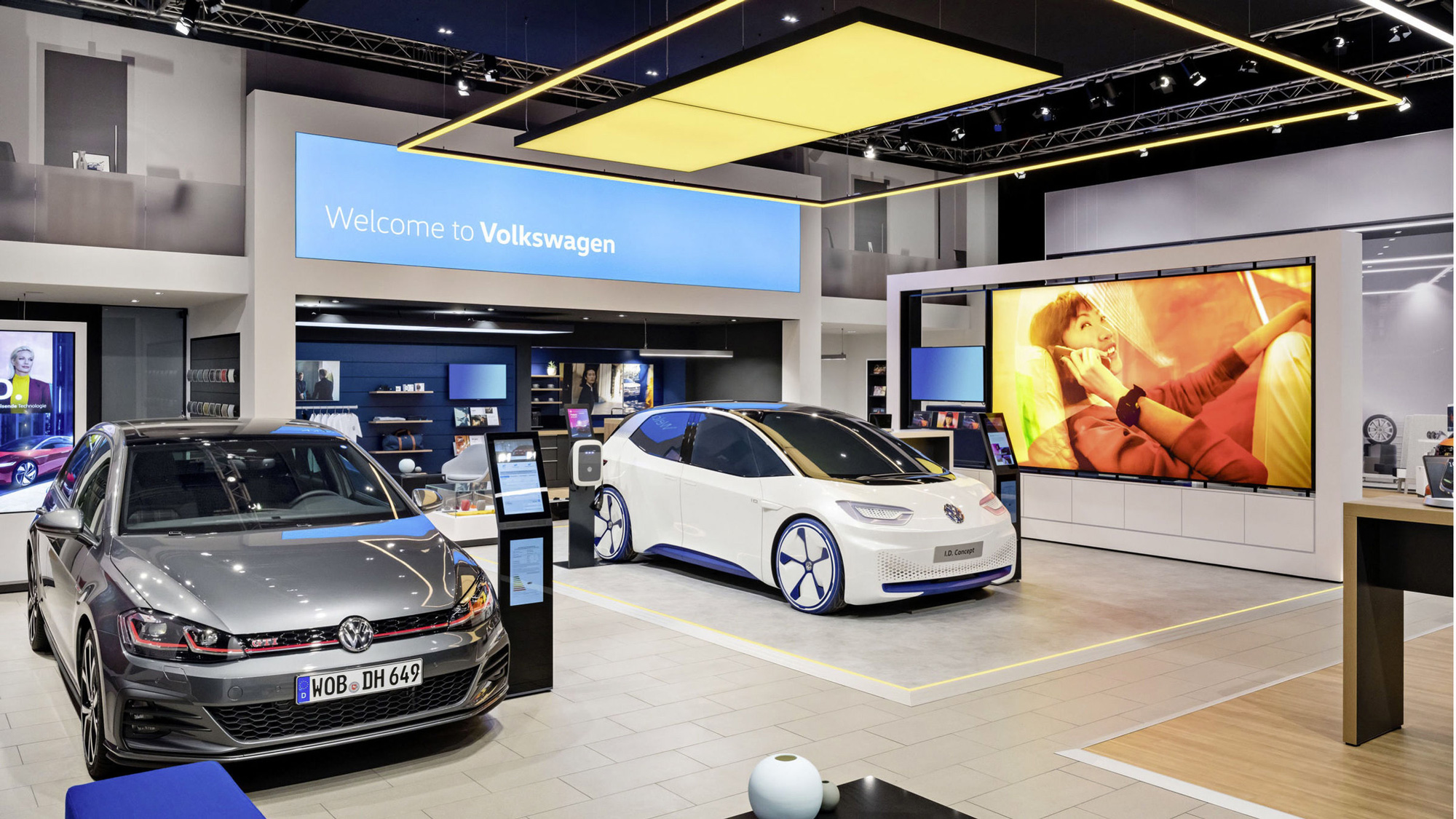
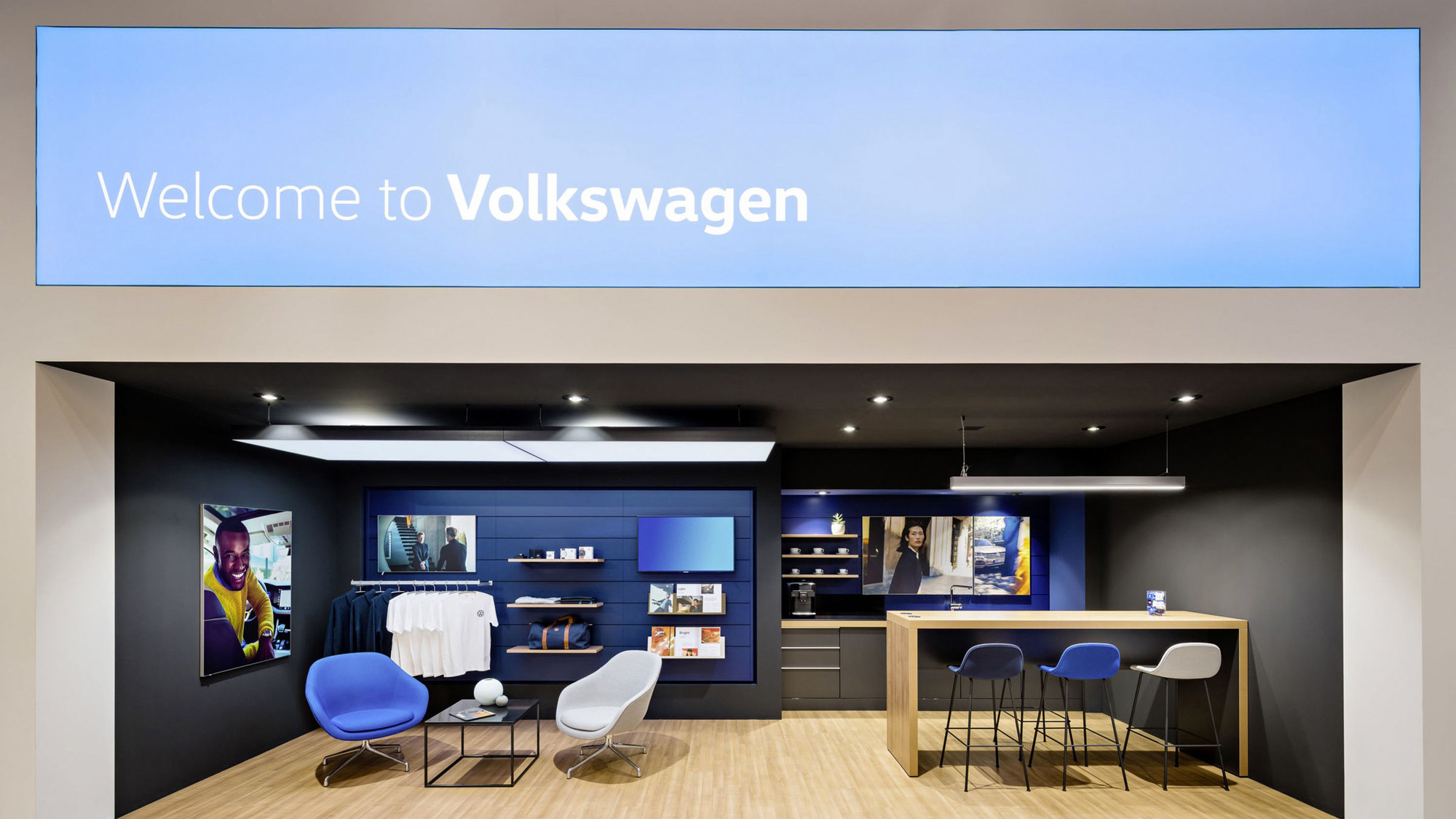
The new visual language of the brand will be very different from that presented by Volkswagen to date - it will be bolder and more colorful. The focus will be on people. Volkswagen will no longer concentrate on perfectionism in vehicle photography. In future, the main objective will be to present realistic situations that customers can identify with.
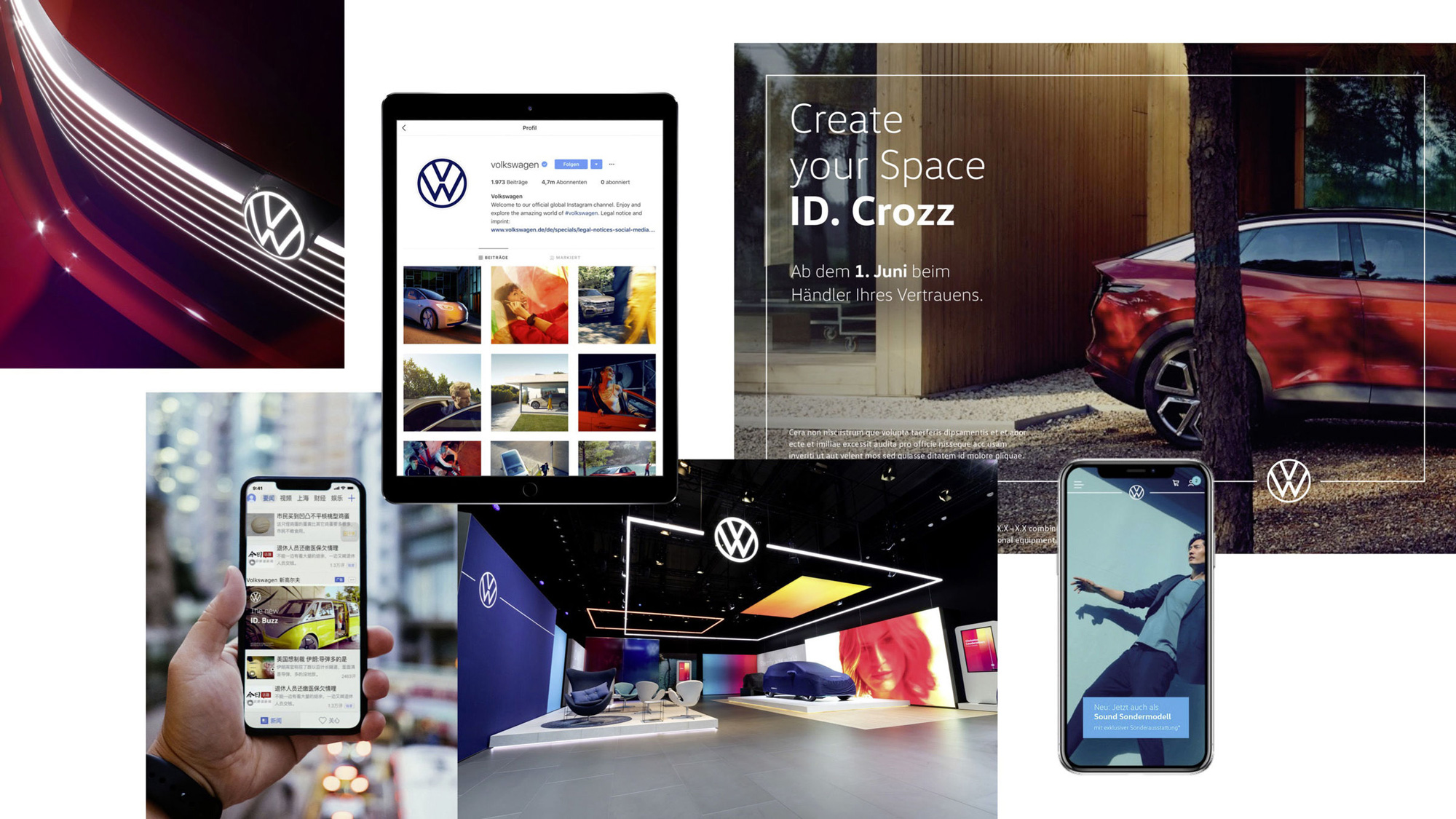
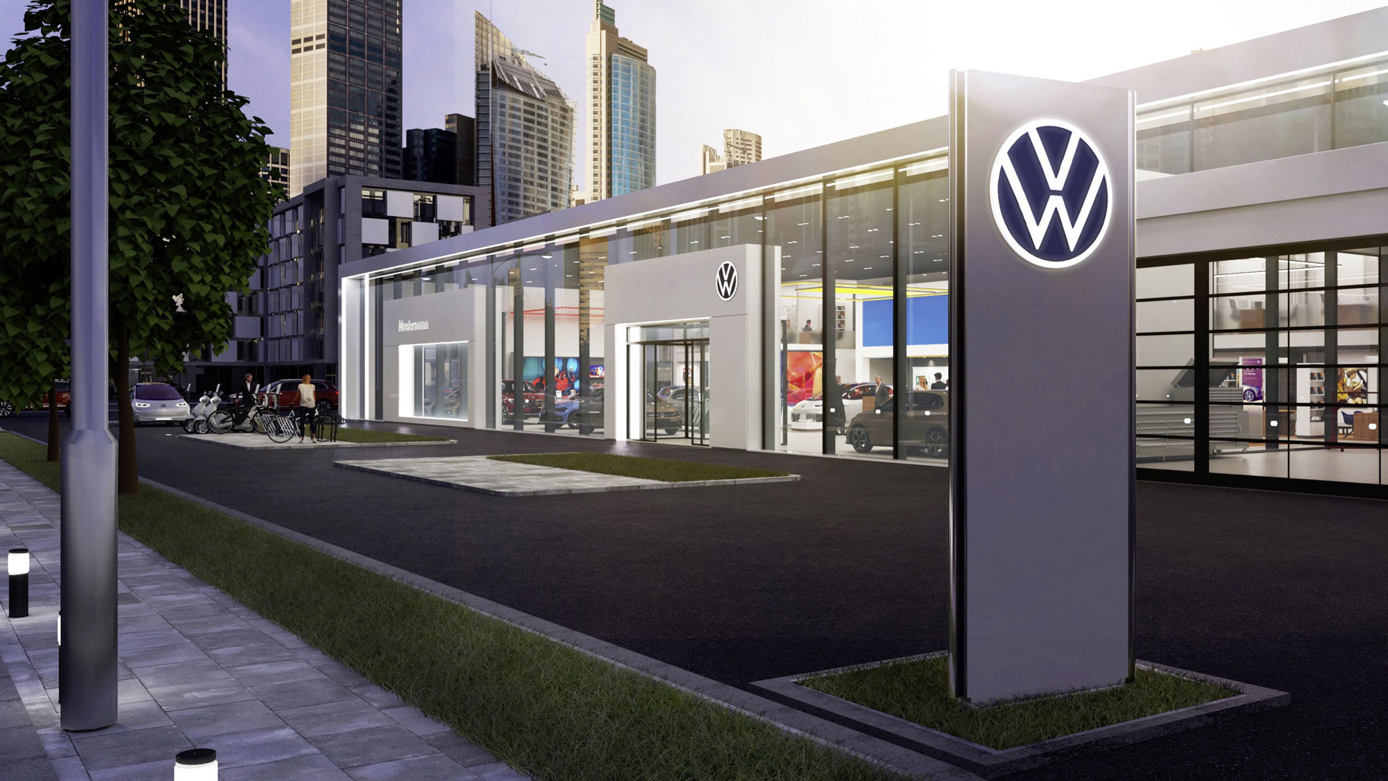
The “moving frame” device is actually pretty good and begins to support the thinness of the new logo — although, a little infuriatingly, it introduces a third level of thinness in all the lines at play. It’s a good visual device that might become as important, if not more, than the logo itself to signal that you are looking at a VW ad (or brand impression of any other sort). The video of the moving frame does a really good job in presenting it as a unifying theme across applications and the one thing I do love about this new evolution is the use of the frame as a line or border of actual light in physical spaces — I think that’s a great jump from a white line in print and digital to a physical manifestation in dealerships and showrooms.
Instead of a brand claim, Volkswagen will have a sound logo for the first time. This will make also make the Volkswagen brand distinctive in acoustic terms, both in the vehicle and in communications.
For several decades, Volkswagen has used a male voice to present its vehicles and for advertising purposes. The brand is now to become female. On almost all markets, a woman with a warm, pleasant and confident voice will speak for Volkswagen.
I’m not a sound expert or even a sound novice and perhaps it’s the newness of it but I do not see/hear a clear connection between the mnemonic and the logo or the car brand. It sounds more like a telco mnemonic.
As in the case of the vehicle, light will also play a key role in communications. Light is the new chromium. In future, the logo will be illuminated, on the vehicle, at the brand locations and at the dealerships.
The global changeover is to be implemented using a cost-optimized, resource-conserving approach. Initially, the brand’s locations and dealers in Europe will be changed over, followed by China in October. The changeover will then be implemented step-by-step in North and South America as well as the rest of the world from the beginning of 2020. The roll-out is to be completed by the middle of next year. Volkswagen’s rebranding is one of the largest projects of this type in the industry worldwide. All in all, 171 markets in 154 countries are concerned. At the 10,000 facilities of dealers and service partners throughout the world, about 70,000 logos will be replaced.
Going back again to the Lufthansa design, I feel like they nailed down perfectly what their brand world is through typography, color, and materials that all made sense whether they were applied on paper, digitally, or in the plane cabin. Looking at the images above, there is a hint of cohesiveness in the use of blues, but it isn’t a convincing “This is the new Volkswagen” brand. Maybe it’s unfair to want it to feel that way at launch but even the typeface used throughout in bold and light pairings doesn’t quite feel like a solid brand element — like, the type could change at any point and it wouldn’t make a big difference.
In the end, the true impact of the logo evolution will be determined by the evolution of the company and the adoption of their new electric cars by consumers… if that goes well, no one will complain about the new logo — but, if these new cars are a bust, this poor new logo is going to suffer the fall as part of the turning point. But let’s be optimistic. As it stands, the new logo is a clear signal of a new era for Volkswagen, regardless of its execution merits. It reads as a lighter, nimbler manifestation of the brand that aims to move past its recent negative associations and build positive new ones.
 each year since publication began in 2006

 Новости Союза дизайнеров
Все о дизайне в Санкт-Петербурге.
Новости Союза дизайнеров
Все о дизайне в Санкт-Петербурге.