Обзор лучших ресурсов по разработке бренда, разработке упаковки
contact us | ok@ohmycode.ru
contact us | ok@ohmycode.ru
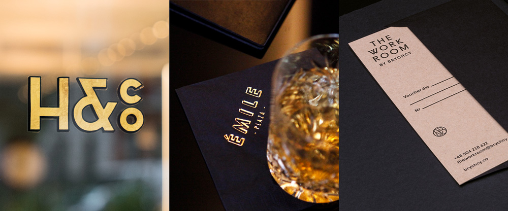
To the delight of some but perhaps not others, a collection of Art Deco-inspired work with projects from New York, Vienna, and Krakow.
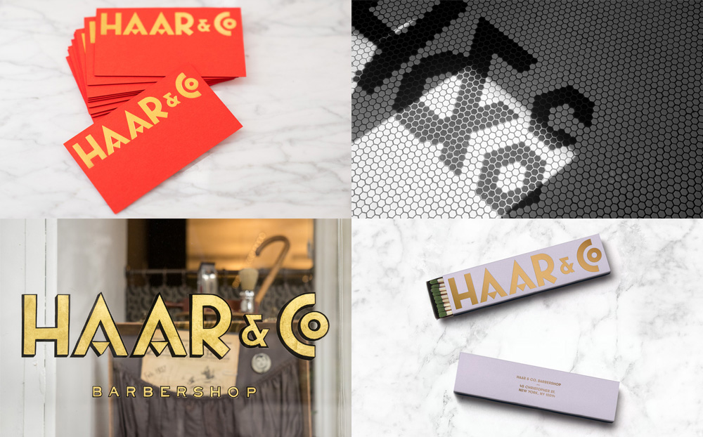
Haar & Co. is a barbershop in the Greenwich Village neighborhood of New York, NY, run by master barber Michael Haar. Designed by the New York office of Redscout, the identity oozes Art Deco inspiration and the logo’s letterforms manage to recall that era but also convey a sense of freshness — the ampersand feels like it came out of a Barnbrook project — and I’m really digging that “Co”. Not a lot of applications but the few shown are nicely executed; I would have liked to see a better integration of the green and orange colors somehow instead of existing on their own. Bonus points for that tile work. See full project
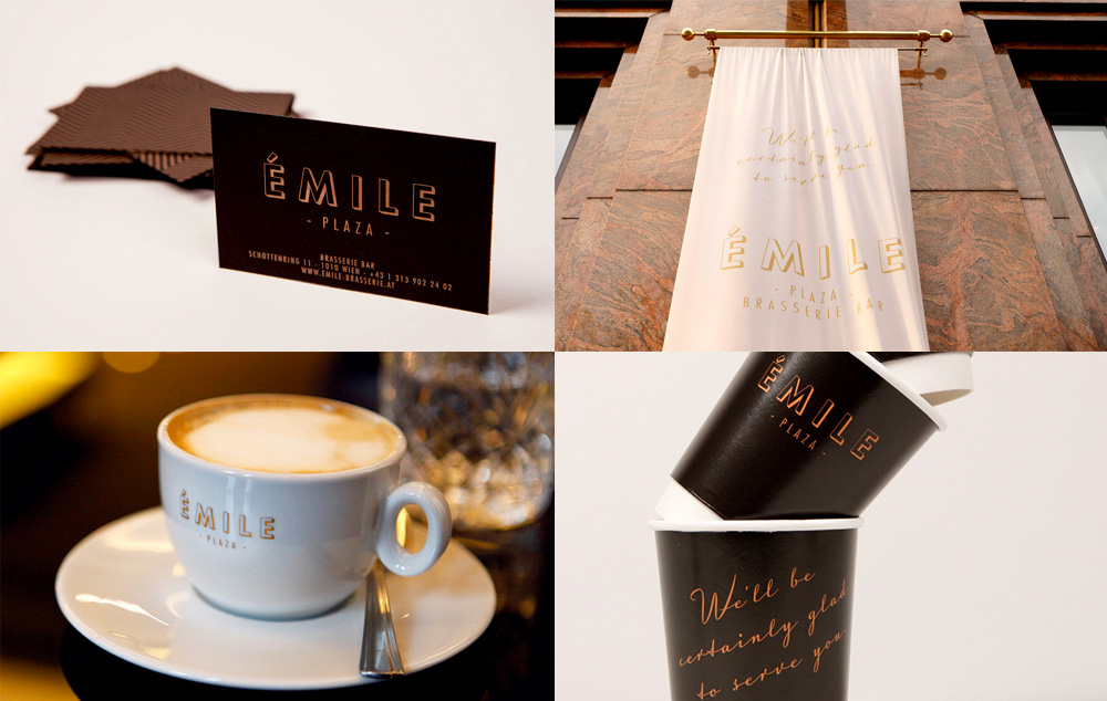
Émile is a brasserie and bar located at Hilton Vienna Plaza in Vienna, Austria. Designed by local firm Moodley Brand Identity, the identity can be unrelentingly vintage and too much of a facsimile (instead of an interpretation) of the era but the main wordmark is quite lovely and the identity is at its best when pared down as seen in the coffee cups or welcoming banner when the wordmark is paired with a script font and placed on black or white backgrounds. See full project
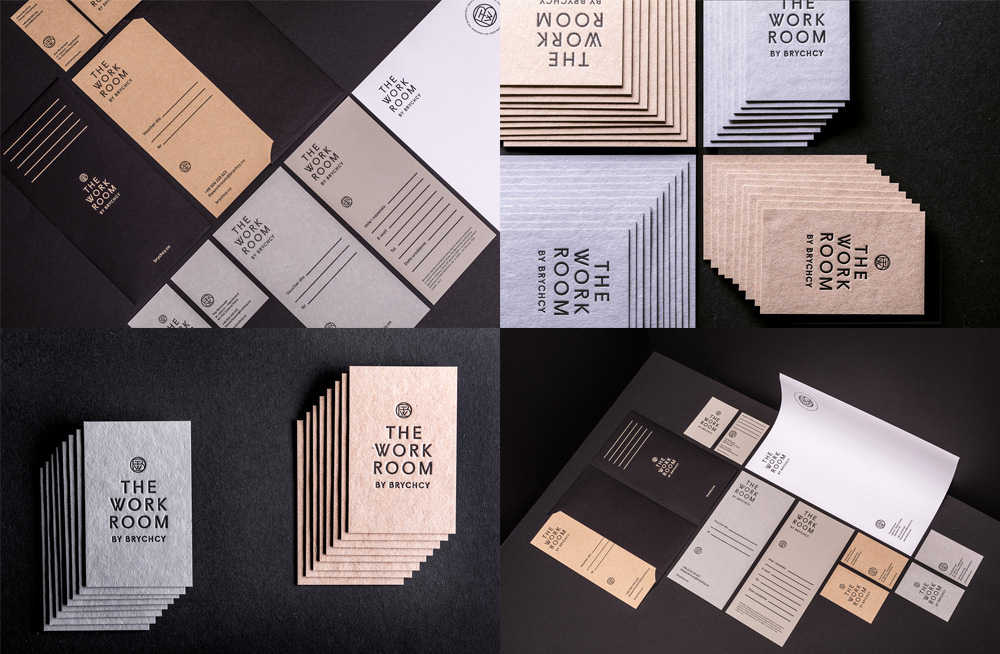
The Work Room by Brychcy is a hairdressing salon in Zielona Góra, Poland, founded by Jakub Brychcy. The identity by Krakow, Poland-based Blürb Studio is the least overt 1920s/30s/Art Deco of today’s selections but still has enough of a hint with the crossed “W” and overlapping monogram (which I think may be missing the “R” from “Room”). The typography on the logo is simple and elegant with the high-waisted “R”s adding a touch of personality. The highlight, though, is the paper selection and printing process, foregoing the trendy foil stamping in favor of the previously trendy letterpressing, which looks great on that rugged paper. See full project

 Новости Союза дизайнеров
Все о дизайне в Санкт-Петербурге.
Новости Союза дизайнеров
Все о дизайне в Санкт-Петербурге.