Обзор лучших ресурсов по разработке бренда, разработке упаковки
contact us | ok@ohmycode.ru
contact us | ok@ohmycode.ru
Some maximalist projects today for various food establishments with work from New York, Melbourne, and Charleston.
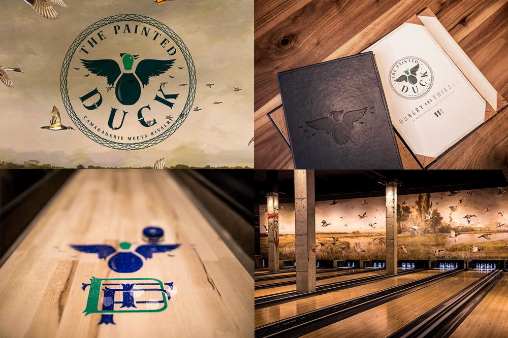
The Painted Duck is a duckpin bowling alley (slash drinkery, slash gaming parlor) in Atlanta, GA, inside an industrial 1900s building. The identity, designed by New York, NY-based BoyBurnsBarn, wastes no time in making the visual connection between the name of the establishment and the squat shape of the duckpin pin to draw a logo that’s, well, a duck-pin — it’s kind of satisfying in its straightforwardness of concept. The logo is complemented with a groovy, feathered monogram and a slew of funky typefaces that add some vintage/hipster flavor to the place and give it a chic eccentricity.See full project
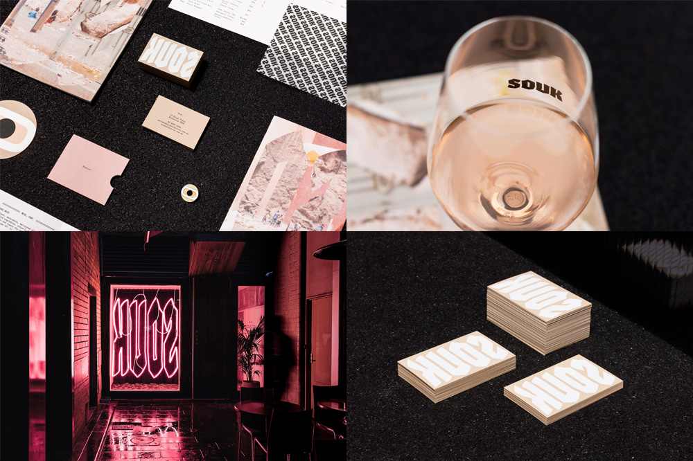
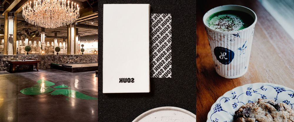
Souk is a restaurant in Melbourne, Australia, serving Middle Eastern cuisine with flavors and dishes from Arabia, North Africa, and Anatolia. The identity, designed by local firm Mildred & Duck, takes a few cues from the Middle East, most notably a logo that is meant to be read from right to left. I had to read the designers’ description to understand why the logo was “flipped” as it wasn’t immediately clear when I first saw it. It’s a daring move but it pays off with what a cool wordmark it is. The identity also introduces a variation on the evil eye mark which adds a funky element to an already funky place filled with neon signs and plenty of attention to detail, including the logo debossed on custom-made plates. It’s all nicely thought out and has a great, weird vibe. See full projectVia The Brand Identity
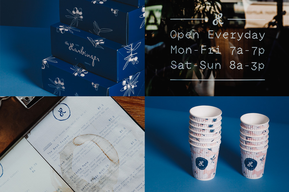
The Harbinger is a coffee house and bakery in Charleston, SC, making everything from scratch, all from a mega-Instagram-able, rustic location. The identity, designed by local firm Fuzzco, has a similar vibe with a funky combination of a script wordmark (which looks like crumble pie), a nature-y illustration (which looks like the start of a mushroom trip; not that I would know), and a super weird angled font that even though it has no logical business there it’s super awesome. It’s a little bit of everything, all blended in through the same blue, and oddly working together nicely. See full project

 Новости Союза дизайнеров
Все о дизайне в Санкт-Петербурге.
Новости Союза дизайнеров
Все о дизайне в Санкт-Петербурге.