Обзор лучших ресурсов по разработке бренда, разработке упаковки
contact us | ok@ohmycode.ru
contact us | ok@ohmycode.ru
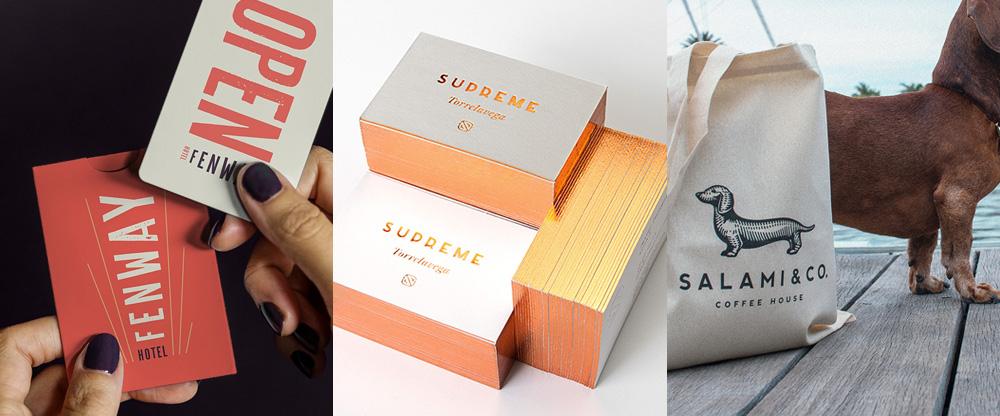
Some playful projects this week with work from Tampa, Santander, and Miami.
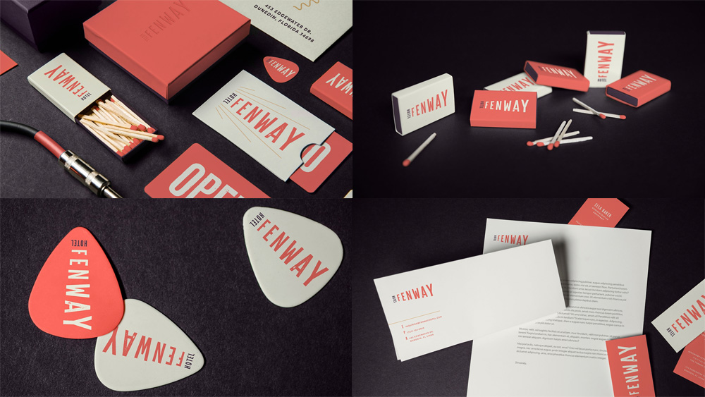
Fenway Hotel is a small hotel in Dunedin, FL, that first opened in 1925 but unlike other hotels it happened to house a radio station; transmission towers and everything. During the 1960s the building became a college’s campus then exchanged many ownerships, sat vacant for a while, and is now set to reopen soon as a hotel again. The identity, designed by Tampa, FL-based Spark, draws some inspiration from the building’s radio past with a logo that could be interpreted as airwaves going out into the world but also a radio tower. The particular combination of letters in the “FENWAY” name lend themselves well for this style of execution and the word “HOTEL” anchors it nicely. The coral red and muted purple color palette are quite pleasing and the logo, despite its extra wide (or extra tall, depending on orientation) proportion works surprisingly well in all the applications, from business cards to guitar picks. See full project
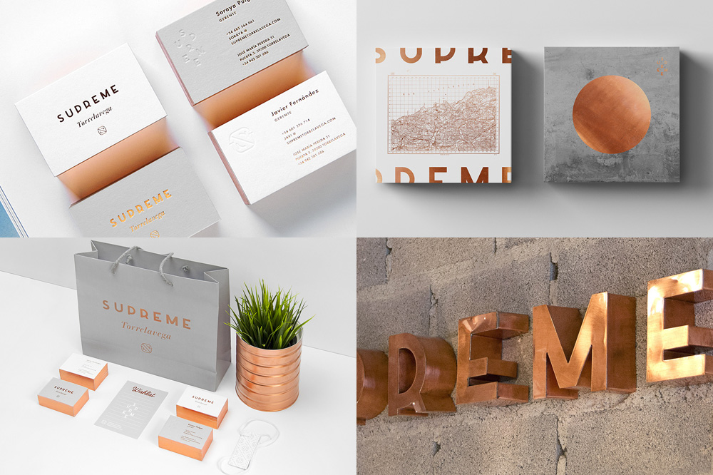
Supreme Torrelavega is a clothing boutique in Torrelavega, Spain, offering a curated selection of accessible men and women fashion brands like Fred Perry, Levi’s, Sperry, and others. The identity, designed by Santander, Spain-based Mubien features a set of three or four logos that work together to shape the physical space, tags, labels, and retail decoration. The main logo is particularly endearing with its extra low x-height that barely gives the “R” a leg but makes it stand out from the number of Art Deco-style wordmarks out there. The lock-up where the letters are split across seven lines is pretty cool too and, as usual, the use of foil, this time in copper, gets my vote. See full project
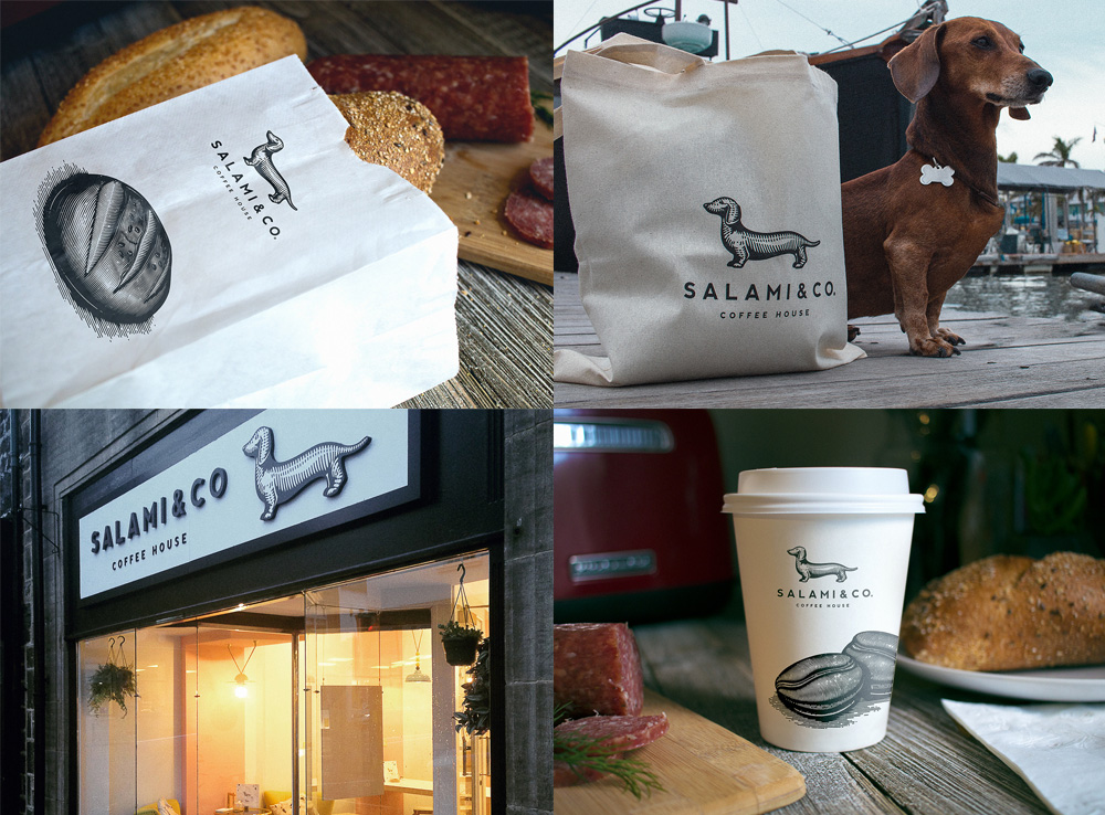
Salami and Co. is a cafe in the small England town of Otley in West Yorkshire, that caters as much to humans as it does to dogs — if you like pups I recommend their Instagram account for a dose of cuteness. The logo, designed by Miami, FL-based Oscar Bastidas is a lovely rendition of “Salami”, the cafe’s owners’ dachshund and, in my opinion, there aren’t enough dachshund logos in the world for it would be a better place. Just… so cute. The Salami drawing pairs nicely with the simple sans serif and the applications are all straightforward, clean, and there is a dachshund named Salami on them so even if it were typeset in Papyrus this would be a win. See full project

 Новости Союза дизайнеров
Все о дизайне в Санкт-Петербурге.
Новости Союза дизайнеров
Все о дизайне в Санкт-Петербурге.