Обзор лучших ресурсов по разработке бренда, разработке упаковки
contact us | ok@ohmycode.ru
contact us | ok@ohmycode.ru
Plenty of food-related goodness this week, with work from Ho Chi Minh City, Minneapolis, and Sydney.
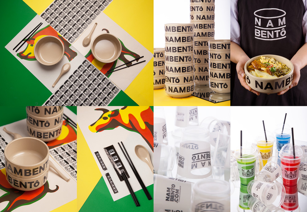
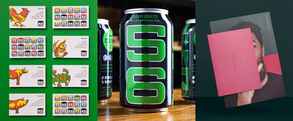
NAMBENTô is a quick service restaurant in Ho Chi Minh City, Vietnam, serving traditional Vietnamese food. The identity, designed by local firm The Lab Saigon, is quite simple and while the logo isn’t ideal — the “N A M” part is way too open — those bowls with the name wrapped around are everything. It’s something we haven’t seen before and it makes a fantastic statement… literally, check this example of someone Instagramming their experience at the restaurant. Boom. NAMBENTô. No questions asked. The logo is not bad, really, and the repeating pattern makes it look its best. There are some colorful illustrations of the animals you are about to eat — sorry vegetarians — and while they are pretty cool they don’t seem so well integrated or perhaps necessary. Still, those bowls. See full project
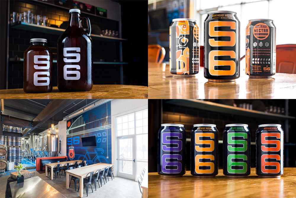
56 Brewing is a micro brewery in Minneapolis, MN, that operates as a Community Supported Brewery, much like Community-Supported Agriculture where members get a monthly box of produce from farmers but instead you get growlers of beer, so, win. The brewery recently introduced cans to their operation and they have been slickly designed by local firm Erickson Design Co., who made sure the “56” was visible and, boy, is it. At this point nothing is much surprise when it comes to micro brewery packaging as everyone does whatever they want so even though it’s a free for all, these cans and growlers stand out nicely through a friendly-industrial-minimalist vibe. See full project
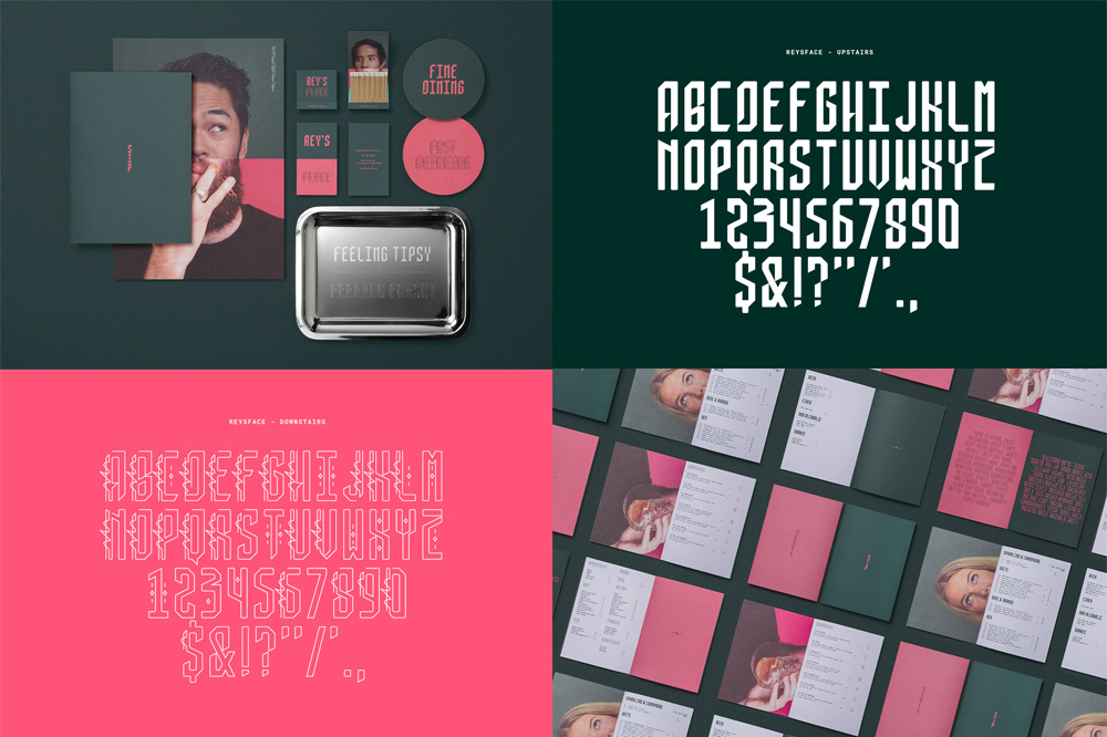
Rey’s Place is a new Filipino fine dining restaurant in Sydney, Australia, that is split into two: the fine dining experience in the upper floor and a dive bar in the lower floor. Designed by local firm Re, the identity revolves around a custom type family, inspired by traditional Filipino calligraphy, that is also split into two: a relatively elegant solid version and a wilder stroked version. Both are funky and a little exotic and they support the overall identity that aims to show the duality of the establishment, all in a rich contrasting palette of dark green and dark pink. See full project

 Новости Союза дизайнеров
Все о дизайне в Санкт-Петербурге.
Новости Союза дизайнеров
Все о дизайне в Санкт-Петербурге.