Обзор лучших ресурсов по разработке бренда, разработке упаковки
contact us | ok@ohmycode.ru
contact us | ok@ohmycode.ru
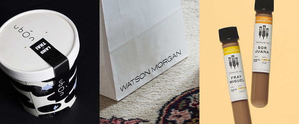
A varied selection of projects and industries this week with work from Chihuahua, Macedonia, and Mexico City.
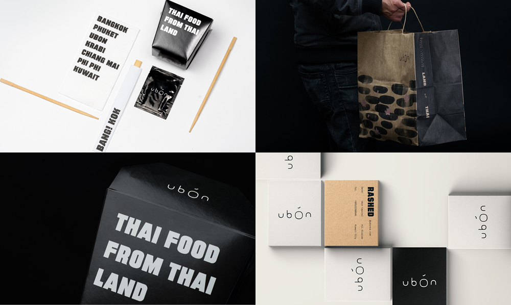
Ubón is a contemporary bistro serving Thai food with three locations in Kuwait. The identity, designed by Chihuahua, Mexico-based Estudio Yeye is an eccentric combination of things: a thin wordmark that has some interesting non-round proportions and spacing, an extra bold headline typeface, a lovely waterlily illustration, and a range of odd illustrations and icons taken from Buddhist culture. As I was about to write that the identity had a kind of mystical yet casual vibe, I just noticed that on one of their project images that’s what the caption reads. It’s like a serene, trippin’, upscale, punk aesthetic that doesn’t quite make sense but it’s captivating nonetheless. See full project
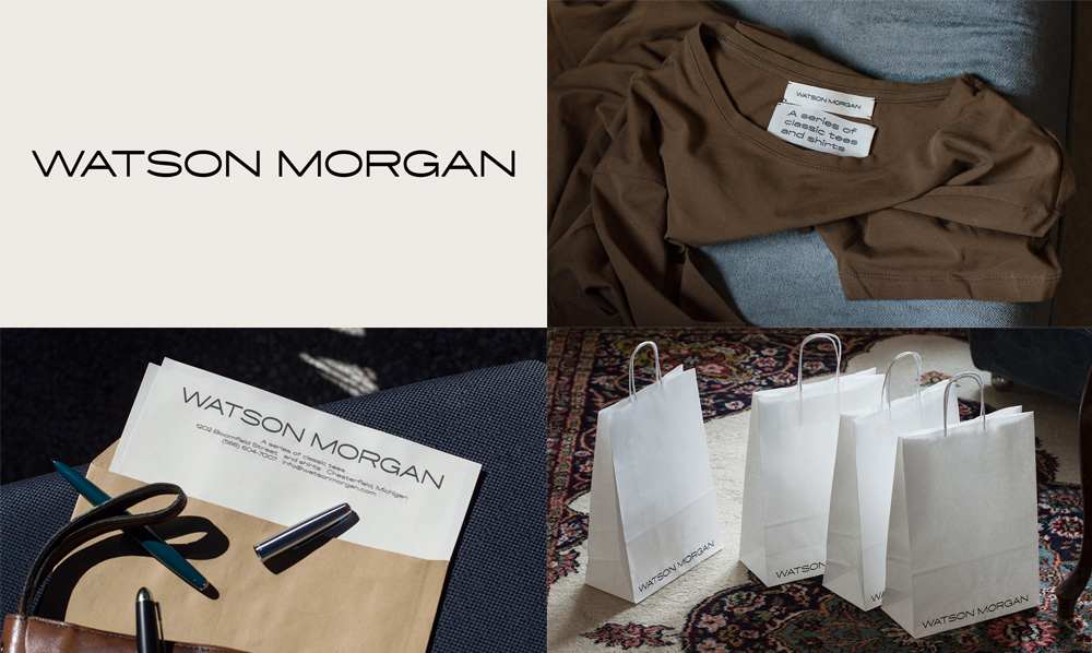
Watson Morgan is a small clothing brand based in Chesterfiled, MI. (Sorry, no website available). Designed by Macedonia-based Vencho Miloshevski, I doubt this will be a large crowd pleaser but I found the typography to have just the right amount of extra flair to be interesting, taking a common extended wordmark and slightly thickening the horizontal strokes. I also liked the application of the logo extra large across the letterhead and bottom of the bags. The typography becomes even more interesting in the lowercase letters… would love to see more of this identity, if it does exist in the real world. See full project
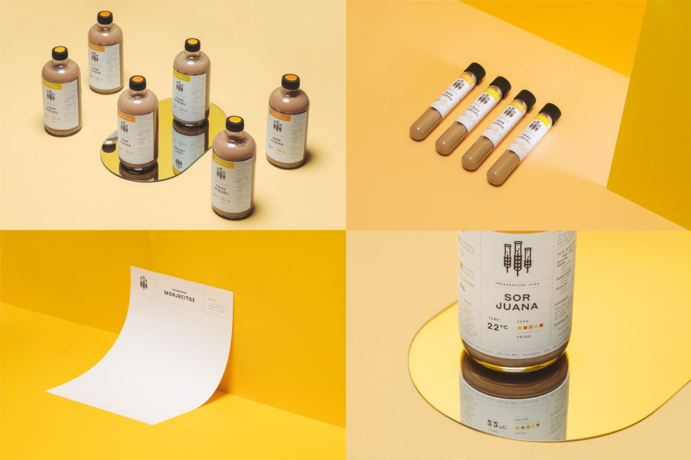
Monjecitos (a weird name that translates as cute, little monks) is a company in Mexico that specializes in making yeasts for craft beer brewing. The identity, designed by Mexico City-based Futura takes a playful approach to the identity — given the name this could have gone dark and medieval — with a fun logo where hops/barley/wheat sprigs spring into bubbling test tubes. I know it’s not highfalutin’ design but it’s pleasing. The applications have a sort of clinical presentation but with a name like little monks it’s hard not to take it in with a dose of the intended irony. See full project

 Новости Союза дизайнеров
Все о дизайне в Санкт-Петербурге.
Новости Союза дизайнеров
Все о дизайне в Санкт-Петербурге.