Обзор лучших ресурсов по разработке бренда, разработке упаковки
contact us | ok@ohmycode.ru
contact us | ok@ohmycode.ru
From elegant to playful to sizzling typography, we have you covered this week, with work from Queenstown, Hamburg, and Oklahoma City.
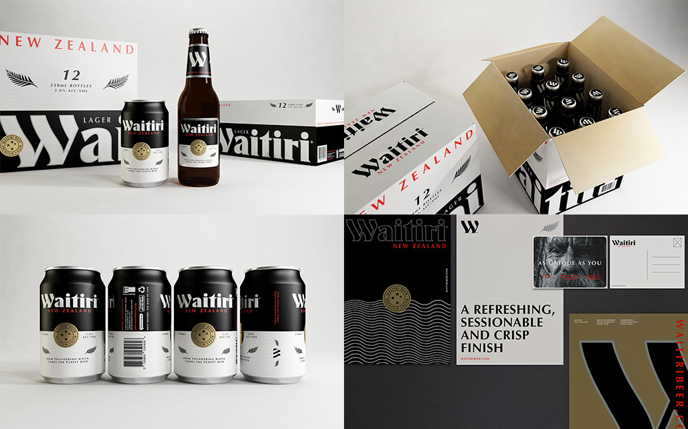
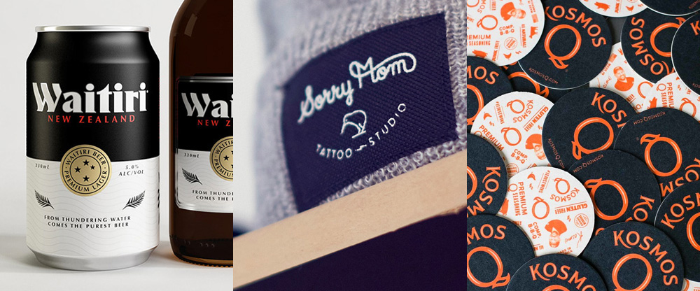
Waitiri is a new lager beer from Cargo Brewery in Queenstown, New Zealand. The identity and packaging, designed by local firm makebardo (who also designed the identity for Cargo Brewery, featured on Friday Likes 171), is a beautiful combination of elements, starting with the custom wordmark that defies any current trends in logo or craft beer packaging. I would say it’s more of a throwback. The packaging very evidently and proudly sports some New Zealand iconography, like the fern and a stamp with the southern cross. The typography throughout is excellent and the way the elements are rearranged and resized across the different applications as it maintains a crisp consistency is great. See full project
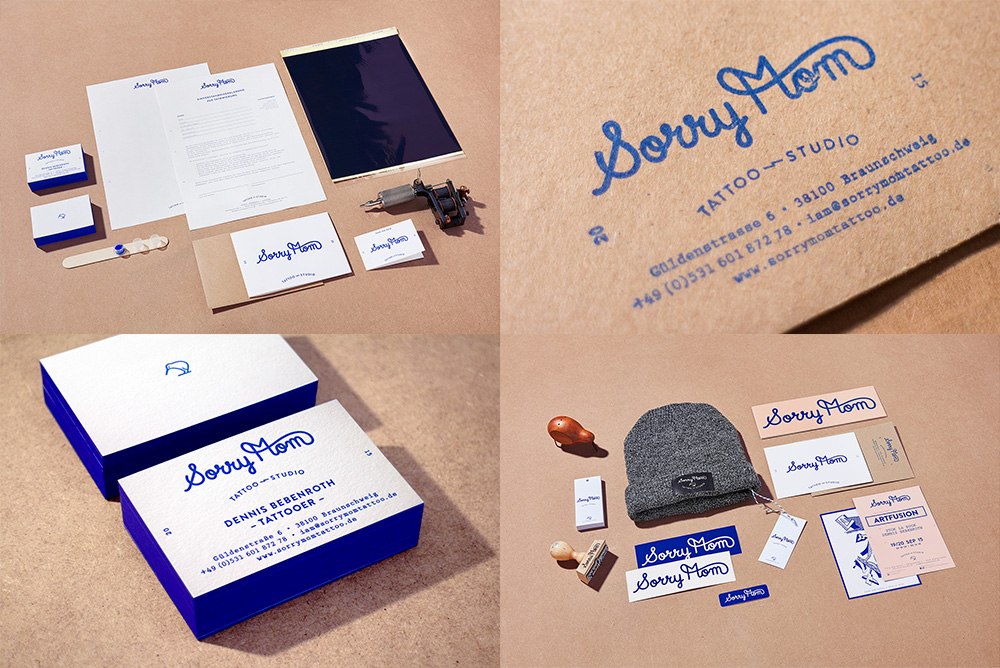
Sorry Mom is a tattoo studio in Braunschweig, Germany, with the best name a tattoo studio could have. The identity, designed by Hamburg, Germany-based We Are Büro Büro takes the classic monoweight lettering style of sailor tattoos to create a simple script wordmark that’s friendly, approachable, and something you might send to, well, mom in a card. The applications all look nice and calm, making the studio feel less rebellious and grungy and more like an art gallery slash German engineering lab where you get to walk out with bitchin’ tattoos. Sure, it’s a little hipstery but if you can’t be hipstery with a tattoo studio identity then that’s no world I want to be part of. See full project
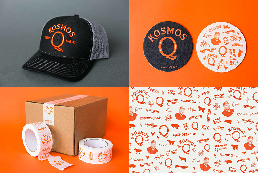
Kosmo’s Q is both a line of BBQ rubs, sauces, and injections, as well as the brand of professional BBQ competitor Darian Kozz, who has been competing for about 15 years and started selling his sauces to help pay for competition travel costs and fees. The new identity, designed by Oklahoma City, OK-based Joel Schierloh, tempers down the previously flaming logo for a much more mainstream rendition that still has personality and uniqueness. The inline in the logo provides just enough texture to the typography to satisfy the need for flaming graphic and the pattern is all kinds of kitschy in a good way. The identity has a great lowbrow-yet-refined aesthetic that’s perfect for grilling aficionados. See full project

 Новости Союза дизайнеров
Все о дизайне в Санкт-Петербурге.
Новости Союза дизайнеров
Все о дизайне в Санкт-Петербурге.