Обзор лучших ресурсов по разработке бренда, разработке упаковки
contact us | ok@ohmycode.ru
contact us | ok@ohmycode.ru
A stylish, elegant, and luxurious set of projects this week, with work from Brussels, Nashville, and Atlanta.
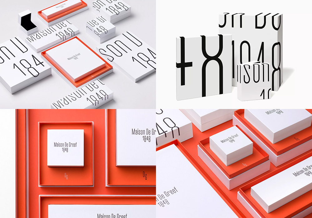
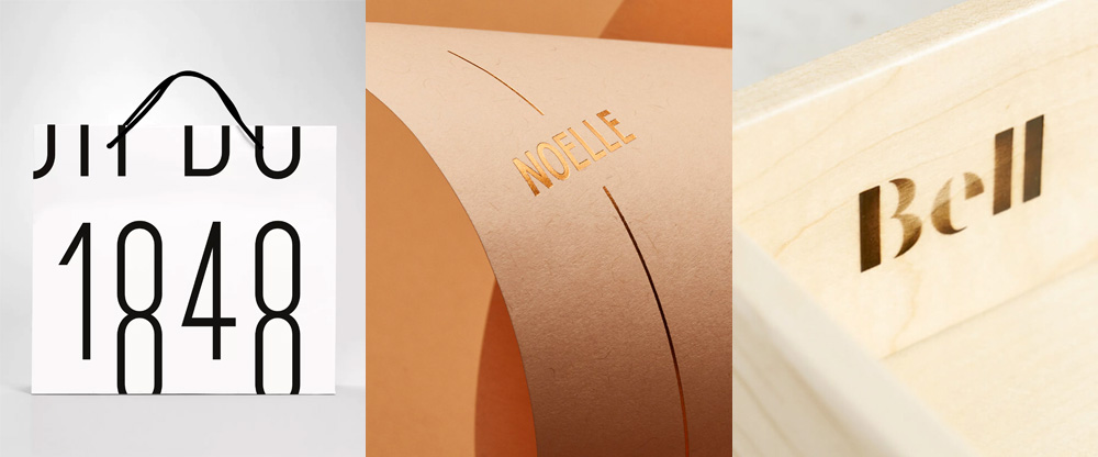
Maison De Greef is a high-end jewelry house in Brussels, Belgium that has been family-owned, for seven generations, since 1848 and recently worked with the local office of Base to design a new identity, which revolves around a thin, condensed logo. Typeset in the otherwise not-exactly-elegant-looking Cactus font, the logo is both elegant and contemporary yet classic. The “1848” numerals look like they were customized and it’s a detail that creates a lot of the personality in this project. The logo is then enlarged, cropped, and wrapped around a beautiful set of stark-white packaging with flashes of a muted orange color. The combination of materials, management of color, and playfulness of scale make for a vibrant and luxurious identity that also feels youthful and energetic, ready for the eighth generation. See full project
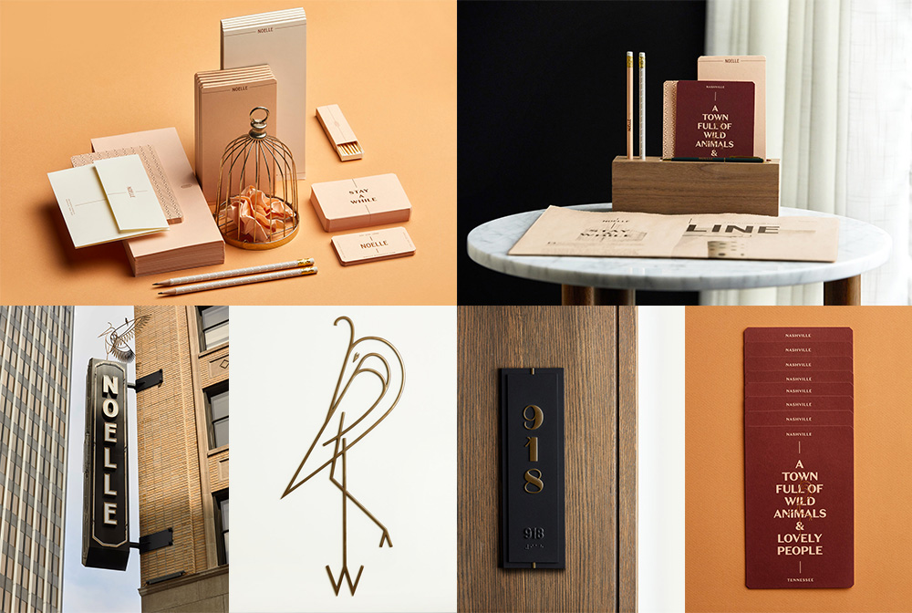
Noelle is a new boutique hotel in downtown Nashville, TN, occupying a building from the 1930s that has been beautifully restored to house 224 rooms, a restaurant, a coffee shop, a rooftop bar, and even a portrait and print studio. The identity, designed by local firm Peck & Company adds to the nostalgic luxuriousness of the space with a stunning set of elements that include beautiful line-drawings of herons, custom numerals for the rooms, elegant typographic treatments, and sophisticated print production. The six pictures above barely begin to make the project justice. Definitely check out the full project link or, better yet, stay a night or two at Noelle if you can. See full project
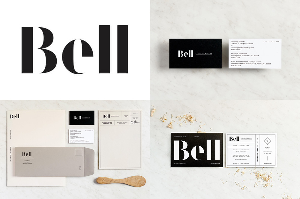
Bell is a cabinetry and design company based in Georgia, making and installing cabinets for those who have outgrown (and out-salaried) the IKEA options. A new identity, designed by Atlanta, GA-based Matchstic features a great stencil logo that, although it follows a common execution (of the elegant, Dala Floda-esque style), it excels in this particular set of letters and the finessing in its spacing and curves. The cabinetry-like layouts in the applications are a nice tie-in to the product. See full project

 Новости Союза дизайнеров
Все о дизайне в Санкт-Петербурге.
Новости Союза дизайнеров
Все о дизайне в Санкт-Петербурге.