Обзор лучших ресурсов по разработке бренда, разработке упаковки
contact us | ok@ohmycode.ru
contact us | ok@ohmycode.ru
A limited palette of black and white reigns this week, with projects from London, Athens, and London again.
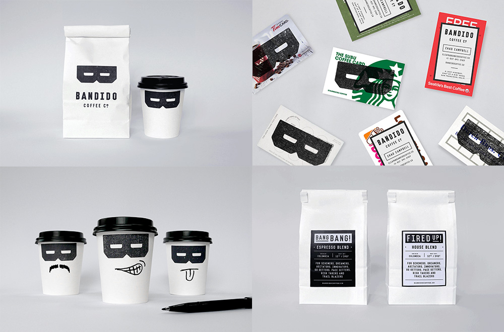
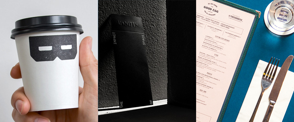
Bandido Coffee Co is a soon-to-be coffee shop in Los Angeles, CA. Its name — “Bandit” in English — has been very, very cleverly used by London, UK-based Magpie Studio to create a “B” monogram that doubles as a classic thief, ruffian, bandit mask. In application on the cup, this is one of those solutions that fills you with envy that the idea wasn’t yours. The choice of a woodblock-style “B” and the roughed up aesthetic really make this work. I also like the concept of stealing other coffee shops’ gift cards and vandalizing them with Bandido’s own branding as their business cards. When wrong-doing feels so good. See full project
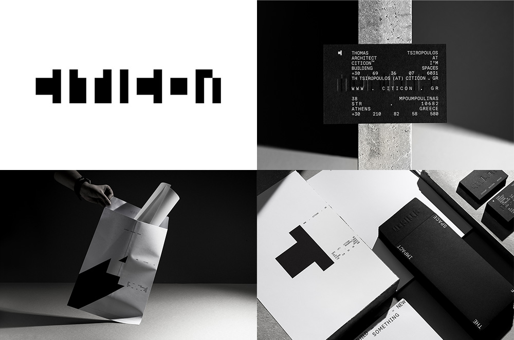
Citicon is a developer and construction company in Athens, Greece, specializing in commercial and retail buildings and spaces. Its new identity, designed by local firm Luminous Design Group, uses negative space to create a sturdy, engaging logo that plays with perception in both entertaining and frustrating ways, coming in and out view. The applications further build on the abstractness of the logo by debossing it when possible and mixing it up with justified typography. To top it off, the “C” from the logo is often used on its own and it looks like a sideways “T” but focusing on it as a “C” makes it quite compelling. 10/10 would hire for build. See full project
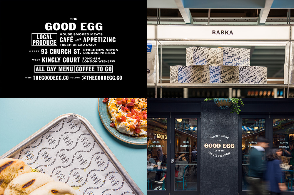
The Good Egg is a restaurant in London, UK, with two locations serving up good things like bagels, beer, and coffee. Designed by London-based EverythingInBetween, this is a purely typographical solution that may not stand out as much as the two other Friday Like companions today but it’s quite nicely done all throughout. I especially like that the “G”s in “EGG” look like eggs. In general, the combination of the bold chiseled sans serif with both condensed and extended sans variations is really well handled in so many various configurations, including the very pleasing wavy tray liners. See full project

 Новости Союза дизайнеров
Все о дизайне в Санкт-Петербурге.
Новости Союза дизайнеров
Все о дизайне в Санкт-Петербурге.