Обзор лучших ресурсов по разработке бренда, разработке упаковки
contact us | ok@ohmycode.ru
contact us | ok@ohmycode.ru
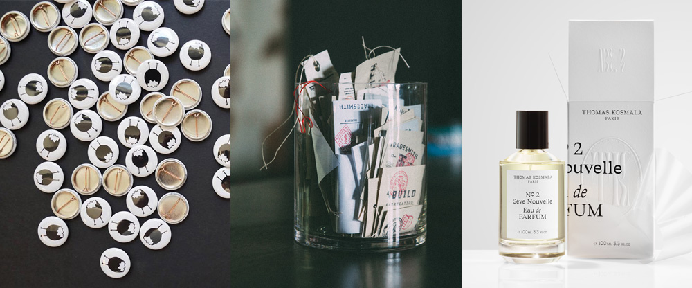
A varied collection of clients, vibes, and aesthetics this week, with work from Los Angeles, Dallas, and Toronto.
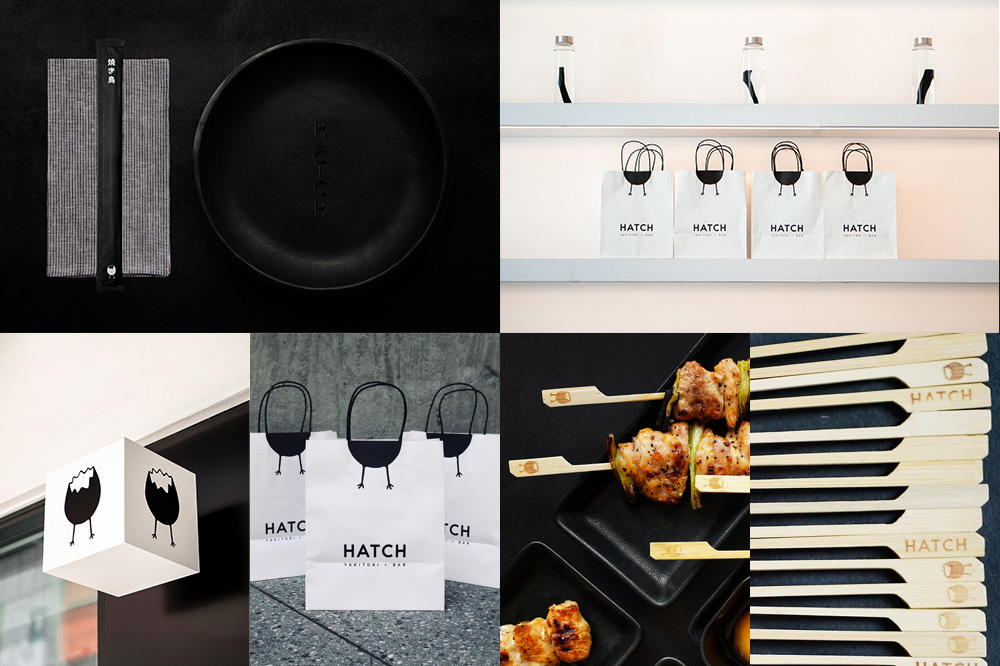
Hatch is a new restaurant in Los Angeles, CA, specializing in yakitori (the traditional chicken as well as more inventive options like skewered okra) along with a raw bar and plenty of sake. Designed by local firm, Brand Name Studio, the identity revolves around a hatched egg logo anthropomorphised with stick legs. Kind of cute, kind of deranged — a combination of feelings offset by the sophisticated application, from the debossed eggs on the yakitori sticks to the clever crop on the bags. The deadpan wordmark also helps balance out the quirky egg and make a fine pair together, like pointy wooden sticks and tender juicy chicken. See full project
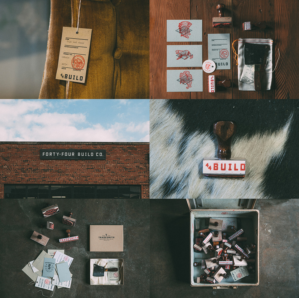
44BUILD is a custom fabrication company in Dallas, TX, that specializes in hand-made furniture pieces built from reclaimed and locally-sourced materials. The identity, designed by local firm Tractorbeam, uses multiple type treatments as a flexible set of non-logos, creating an overarching aesthetic that establishes the chic, rugged, industrial, too-cool-for-school vibe of the company and its work — which is the stuff non-conformist Instagram photo dreams are made of. It may sound like sarcasm but, no, 44BUILD’s work and this identity is enviously good. As a bonus, there are some applications for Tradesmith, their showroom and storefront for prêt-à-porter salvage-looking stuff. If you ever wanted to convince a client on the merits of rubber stamps, this case study is for you. See full project
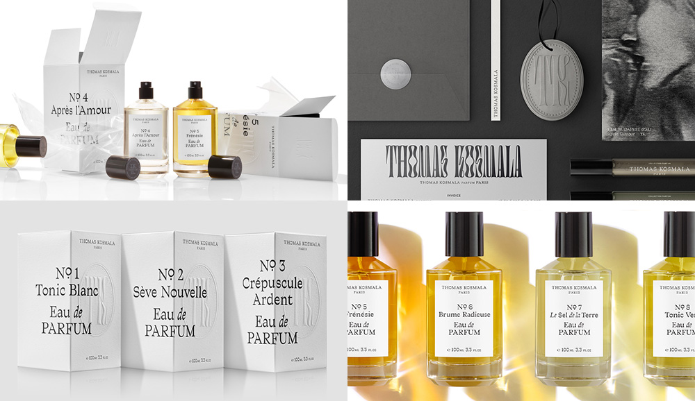
Thomas Kosmala is the eponymous brand of Poland-born, Paris-trained, London-based perfumer Thomas Kosmala, whose perfumes are most well-known amongst Middle East customers. Looking to build on its base and establish a stronger presence in other markets, Thomas Kosmala worked with Toronto, Canada-based Concrete to create a new identity and packaging system. The type-based packaging looks exotic, a little sexy, and all kinds of high-end. The chosen serif is full of personality and when paired with the wilder “TK” monogram in the psychedelic-like lettering — of which I want to see more of, please, and thank you — it’s breath of fresh, perfumed air. See full project

 Новости Союза дизайнеров
Все о дизайне в Санкт-Петербурге.
Новости Союза дизайнеров
Все о дизайне в Санкт-Петербурге.