Обзор лучших ресурсов по разработке бренда, разработке упаковки
contact us | ok@ohmycode.ru
contact us | ok@ohmycode.ru
Some combos of simplicity and exuberance this week, with work from Kharkov, London, and Santa Monica.
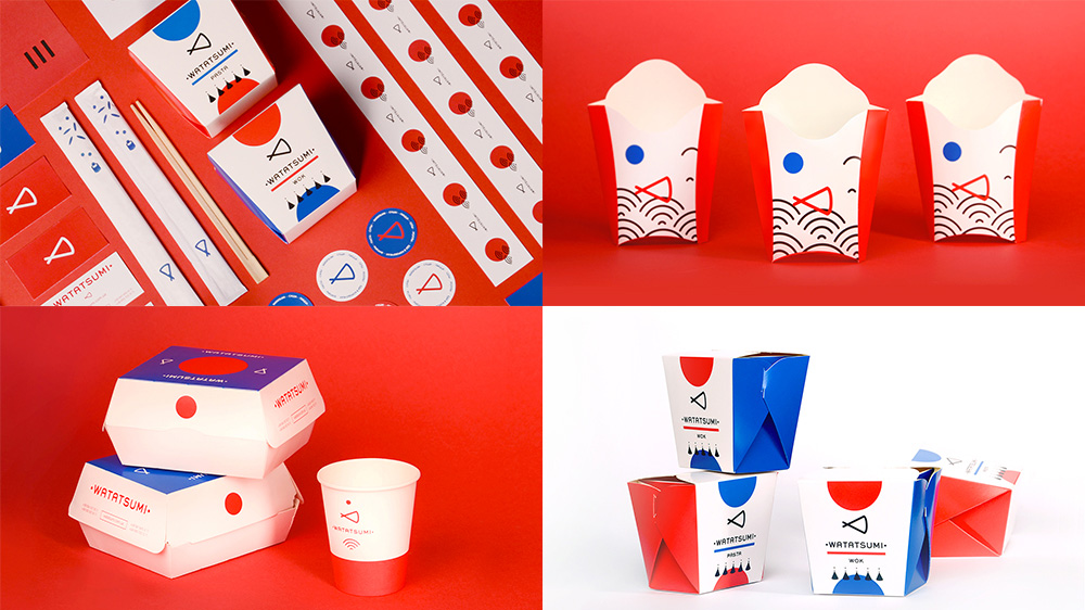
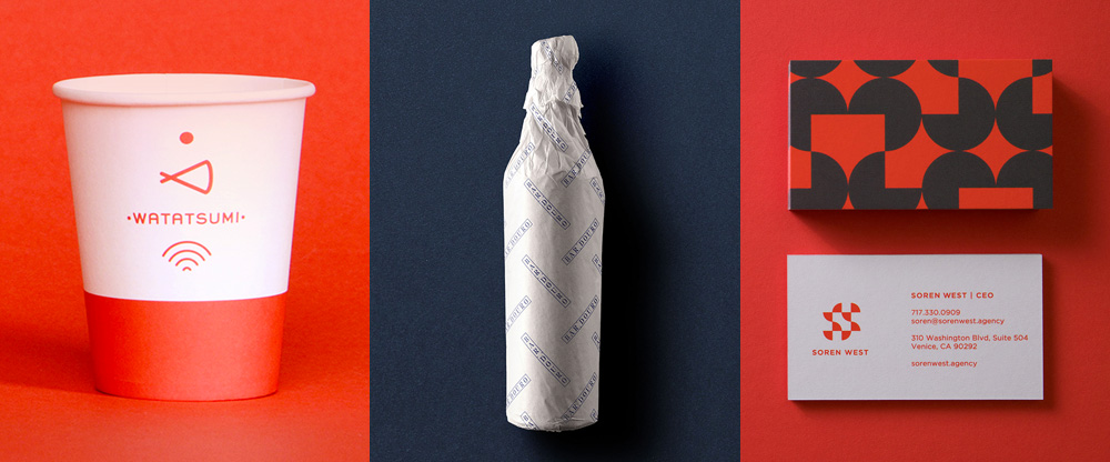
Watatsumi is a food delivery service in Dnipro, Ukraine, that specializes in sushi. And pizza. And hamburgers. If this sounds (and looks) vaguely familiar it’s because it’s from the same company as Roll Club (that was in Friday Likes 241) and also designed by Kharkov, Ukraine-based Canape. Admittedly, this one isn’t as cool as Roll Club but it displays the same kind of eclectic aesthetic and kinetic energy in mixing a number of graphic elements in fun, bold designs. The logo is a set of chopsticks with a line uniting them to make a fish, which is kind of endearing. The Wi-Fi-signal-looking icon are meant to be fish scales and it’s accompanied by big red rising suns. The typography is not super great but the french fry box alone is worth a Friday Like. See full project
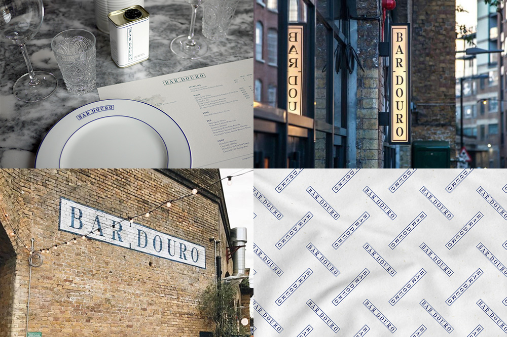
Bar Douro is a Portuguese restaurant in London, UK. The identity, designed by local firm Studio91 Design, references Portugal’s classic blue tiles — which adorn the interior of the restaurant — through a blue and white color palette and a modular wordmark that looks just as good horizontally as it does vertically as it does on a curve. It’s a fairly straightforward logo but the custom letterforms have a great look and its integration into everything from plates to ghost sign to tissue paper pattern is quite nice. See full project
Soren West, in Los Angeles, CA, develops original entertainment properties and experiential programming for brand partners, real estate holders, and investors. Their logo, designed by Santa Monica, CA-based TRÜF is what attracted me to this project, executed with utter simplicity to make an abstract “S” out of two circles. I know it’s not a showstopper but it has a lovely Mid-century Modern aesthetic as well as old-, old-school logo construction. It has a couple of great animations at the link and some cool patterns for the business cards. My only complaint is there aren’t more applications to show. See full project

 Новости Союза дизайнеров
Все о дизайне в Санкт-Петербурге.
Новости Союза дизайнеров
Все о дизайне в Санкт-Петербурге.