Обзор лучших ресурсов по разработке бренда, разработке упаковки
contact us | ok@ohmycode.ru
contact us | ok@ohmycode.ru
An eclectic, food-themed range of projects this week, with work from Pasig, Mérida, and Yokohama.
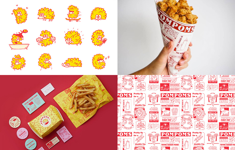
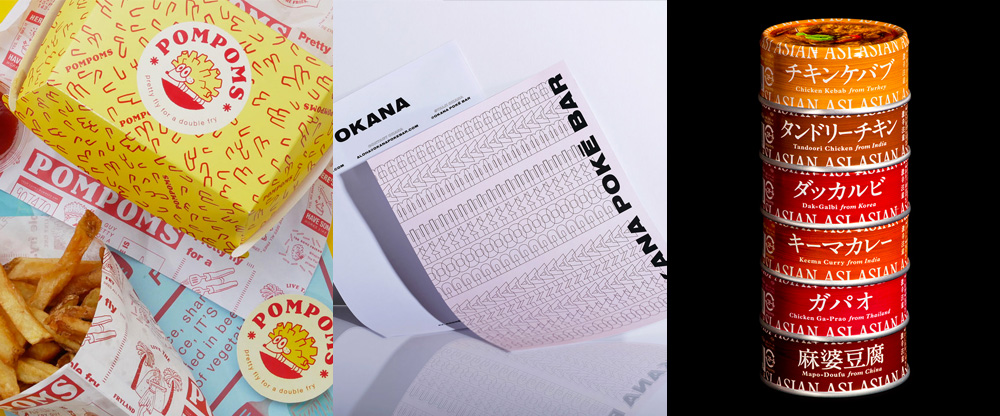
Pompons is a small, fast casual restaurant in Manila, Philippines, serving fries. Twice fried. Sometimes thrice fried. The identity, designed by Pasig, Philippines-based Serious Studio, is anything but serious, with a hedgehog logo that has fries instead of spines. It makes no sense and it’s awesome. Paired with a bold 1970s-esque serif, the identity has a fun, rascally look. The paper the fries are served in, with quirky and purposely bad fry puns and illustrations, is the perfect delivery mechanism for what look like pretty damn fly fries. See full project
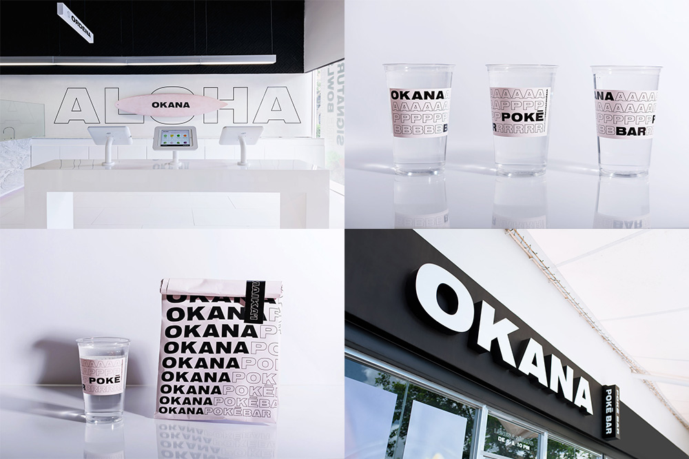
OKANA is a poke bar in Merida, Mexico, with a tech-savvy angle of tablet-based ordering. The identity, by local firm vegrande is fairly straightforward and uses the trendy approach of repeating words ad nauseam but I won’t lie: it looks slick. The font choice is right, the light pink is right, the combination of solid and stroke type is right, and it all matches with the trendy, modern vibe of the physical space. The one thing I could do without is the overlapping-stroke-shadow effect but the one thing I could do with is some poke from the Yucatan peninsula. See full project
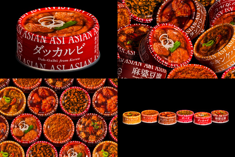
Asian Asi is a range of pre-packaged dishes sold in cans that span different classic dishes from different parts of Asia. The line of products is made by Maruha Nichiro Corporation and comes in a very unique can shape and packaging aesthetic designed by Yokohama, Japan-based NOSIGNER. I don’t know if this will be to the majority’s liking as it’s not exactly the kind of design I usually pick for Friday Likes but there is something really great about these cans. The way the type wraps over the top of the can and leads into the picture of the product is pretty cool. I’m usually not a fan of cooked product photography on packaging but there is a great bluntness and matter-of-fact-ness to these that makes it work. The color palette of both the photos of the dishes and the yellow-to-brown product distinction is oddly harmonious. Even the somewhat unsophisticated serif in the product description works well. See full project

 Новости Союза дизайнеров
Все о дизайне в Санкт-Петербурге.
Новости Союза дизайнеров
Все о дизайне в Санкт-Петербурге.