Обзор лучших ресурсов по разработке бренда, разработке упаковки
contact us | ok@ohmycode.ru
contact us | ok@ohmycode.ru
We get a little weird this week with projects from Moscow and St. Petersburg, Tallinn, and Barcelona.
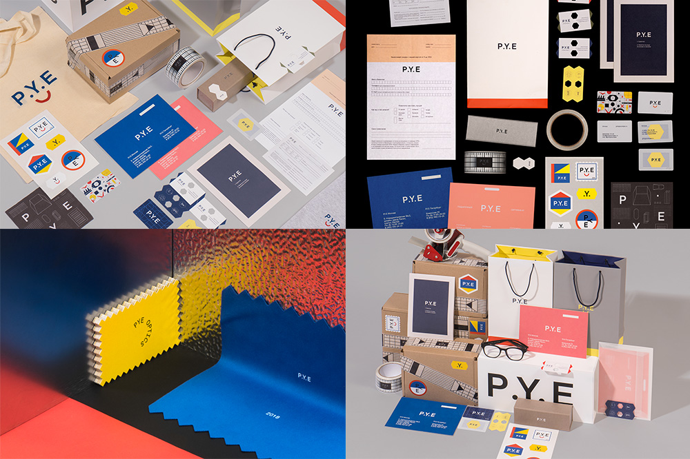
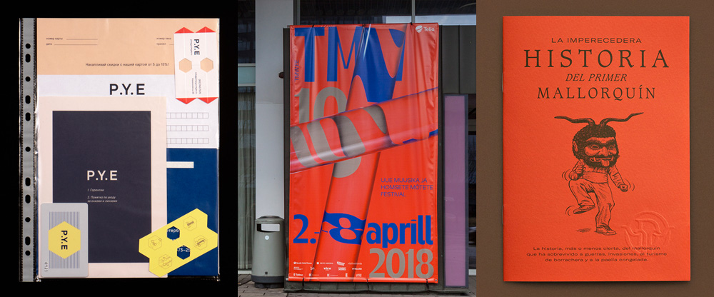
P.Y.E, short for Pimp Your Eyes, is a small chain of optical stores in Russia, with two retail locations each in Moscow and St. Petersburg. Their identity, designed by Facultative Works, is all kinds of funky and unhinged from any conventions about retail stores that sell eyeglasses. It’s hard to describe and/or discern either the concept or the aesthetic other than “have fun” and “make it look cool”, which may not always fly in this industry but when done with so much conviction and detail as here, well, it’s damn enjoyable. I love how the P.Y.E transforms into a smiley face, I love all the random shapes and lines, I love the color palette which is a simple muted version of primary colors, and I love all the knickknacks and stickers they’ve come up with. On top of the fun-ness, there is a great design rigor that ties everything together. See full project here and here
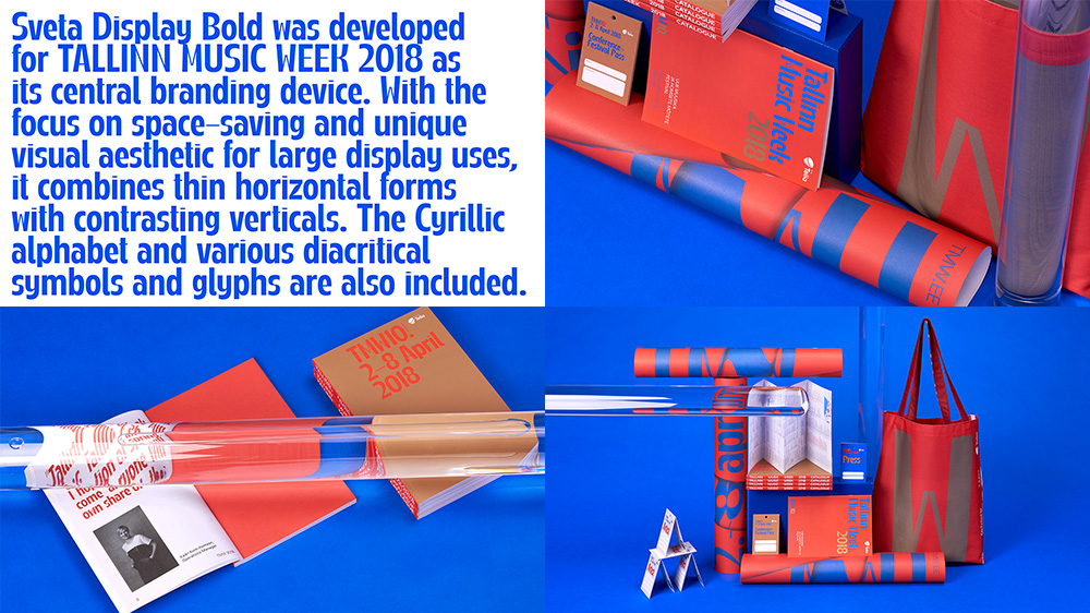
Tallinn Music Week is a week-long music festival held every spring since 2009 in Tallinn, Estonia. This year’s identity, designed by local firm AKU, revolves around a super funky custom font with highly contrasting thin horizontal strokes and thick vertical strokes in a condensed structure that amplifies the contrast. The identity is rendered in a retina-challenging color palette of red, blue, and tan that may be a little on the extreme side but it does look cool. Additionally, there is a surprise element of transparent rods that distort elements of the layouts. I don’t know their meaning but as a graphic effect I dig it and it certainly goes along with what looks like a fairly avant garde event and audience. See full project
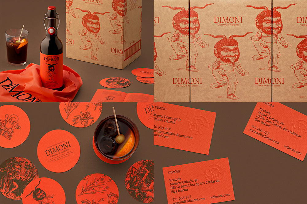
Dimoni is a vermouth named after the devil (demon, dimoni) that features in the story of Sant Antoni and the annual celebration of Sant Antoni’s day in Mallorca, Spain, where people don large devil masks. Designed by Barcelona-based Forma, the identity and packaging feature a great illustration by Mallorca-based Ata Lasalle that is creepy AF but makes for an image with surprising flexibility to use across various materials. The primary serif font for “DIMONI” is beautiful and is nicely complemented with a more contemporary, extended sans serif. The low contrast approach — whether it’s red-on-tan or black-on-red — gives it a nice, serious mood and aptly matches the tone of the drink itself. See full project

 Новости Союза дизайнеров
Все о дизайне в Санкт-Петербурге.
Новости Союза дизайнеров
Все о дизайне в Санкт-Петербурге.