Обзор лучших ресурсов по разработке бренда, разработке упаковки
contact us | ok@ohmycode.ru
contact us | ok@ohmycode.ru
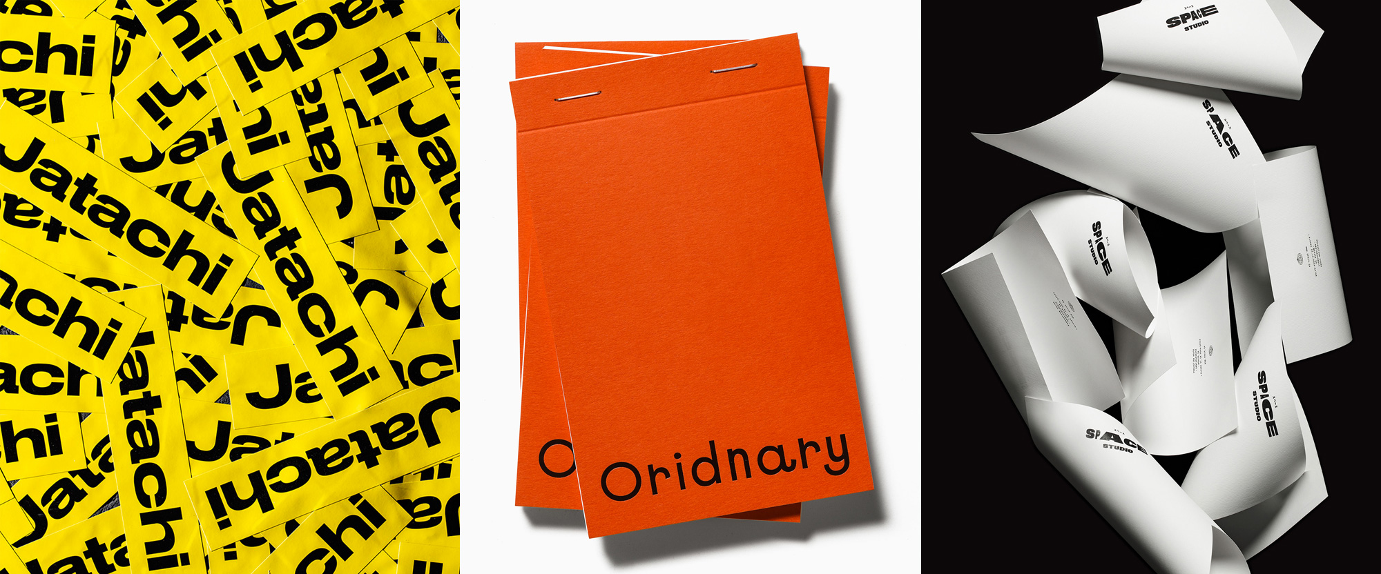
A selection of relatively minimalist sans serif wordmarks taken to some pleasant extremes this week with work from Barcelona, Stockholm, and Mexico City.
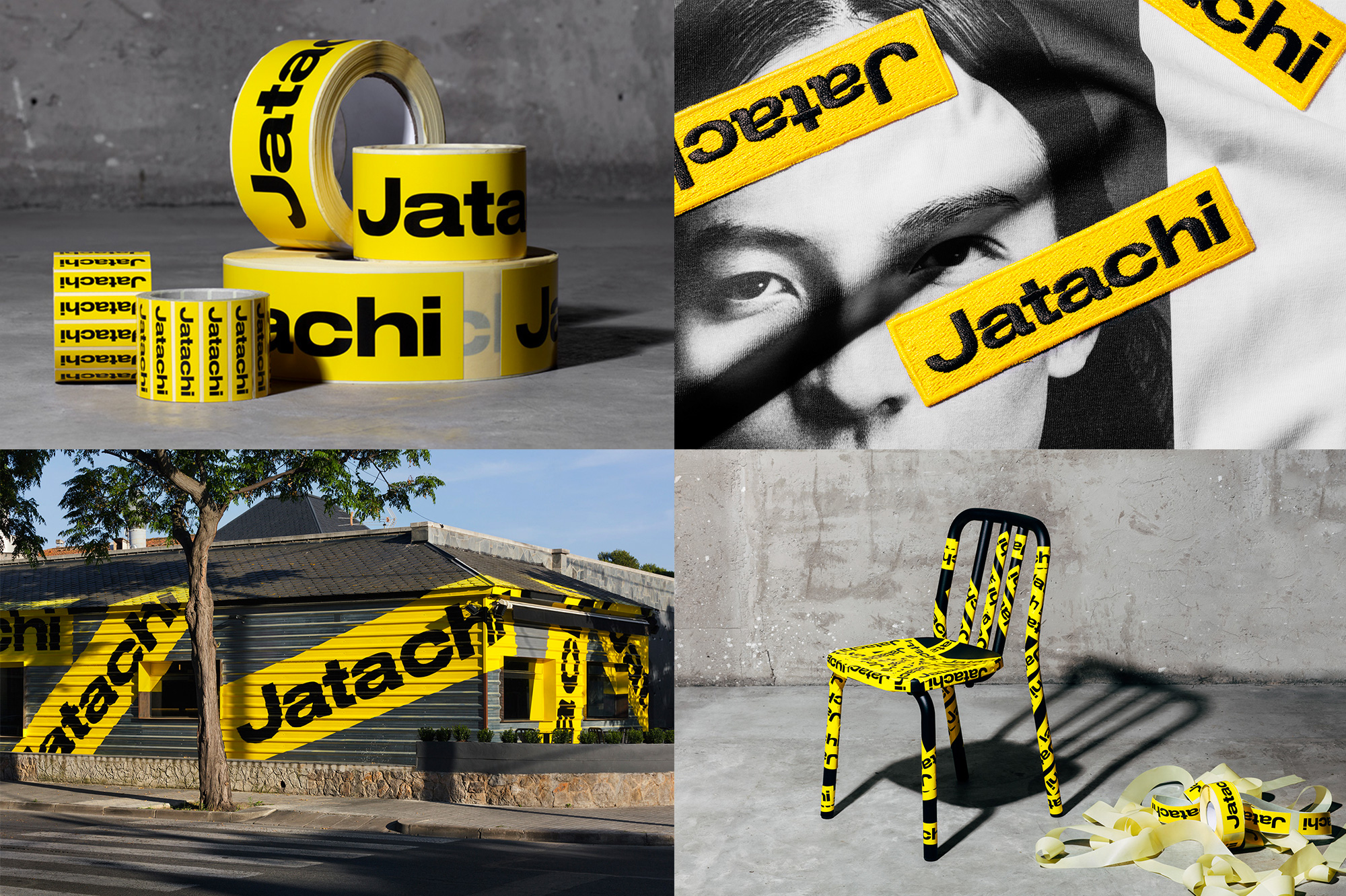
Jatachi is an Asian street food restaurant in Barcelona, Spain. The identity, designed by local firm Pràctica features a relatively standard wordmark typeset in a bold, extended sans serif but its applications take on a whole other dimension as it takes the form of small, medium, large, and extra large stickers (sometimes literally, sometimes metaphorically as in the exterior of the restaurant) that, through massive invasion, transform any object or surface into a Jatachi-branded one. This is one of those projects where it’s the follow-through on the concept, at all scales, that makes it awesome. Check out their Instagram account for a few more instances of the sticker takeover. And, finally, click around on Jatachi’s website to leave stickers of your own. See full project
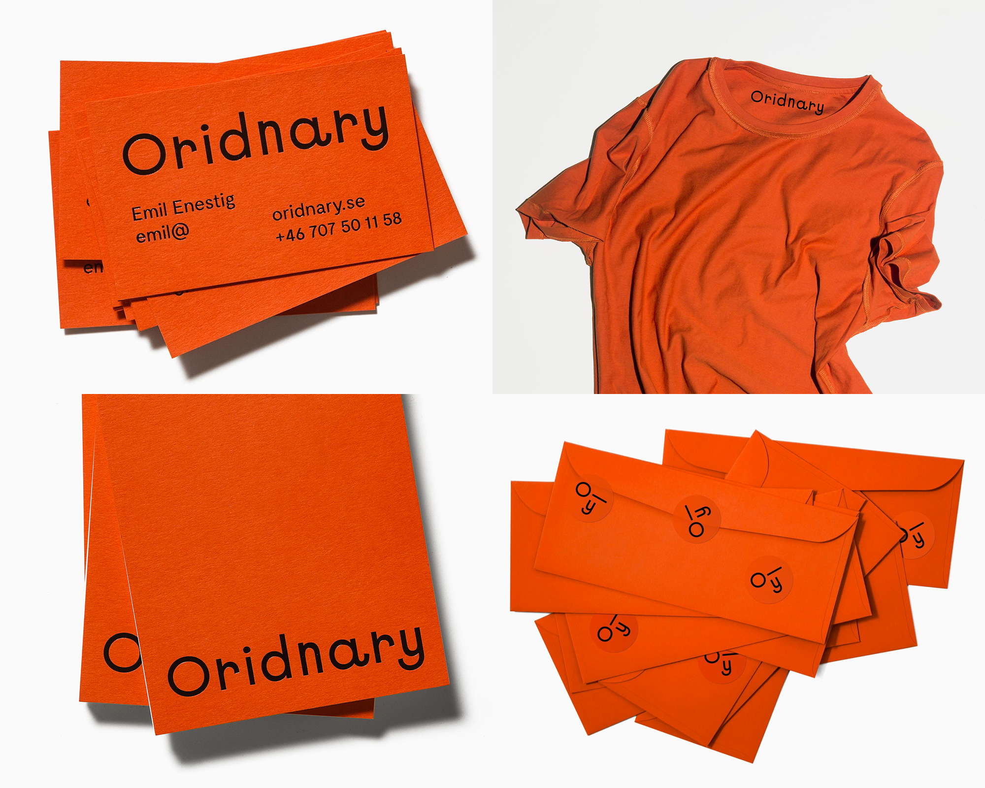
Oridnary is a digital studio in Gothenburg, Sweden, developing websites and digital concepts focusing on artists and creatives as their clients. The identity, designed by Stockholm, Sweden-based Bedow is ordinary on the surface but it’s beautifully and quirkily nuanced. The name of the company is purposefully set as Oridnary and the spelling mistakes continue all the way to the website, which auto-corrects as you scroll. The logo is kind of ugly (also on purpose) but utterly charming with some exaggerated details like tail of the “a”, the rising stem of the “r”, or the weirdly condensed “n”. There is an “O—y” shorthand that’s a little confusing but looks cool and the whole sparsity of the system is well pulled off in the ornage-driven palette. See full project
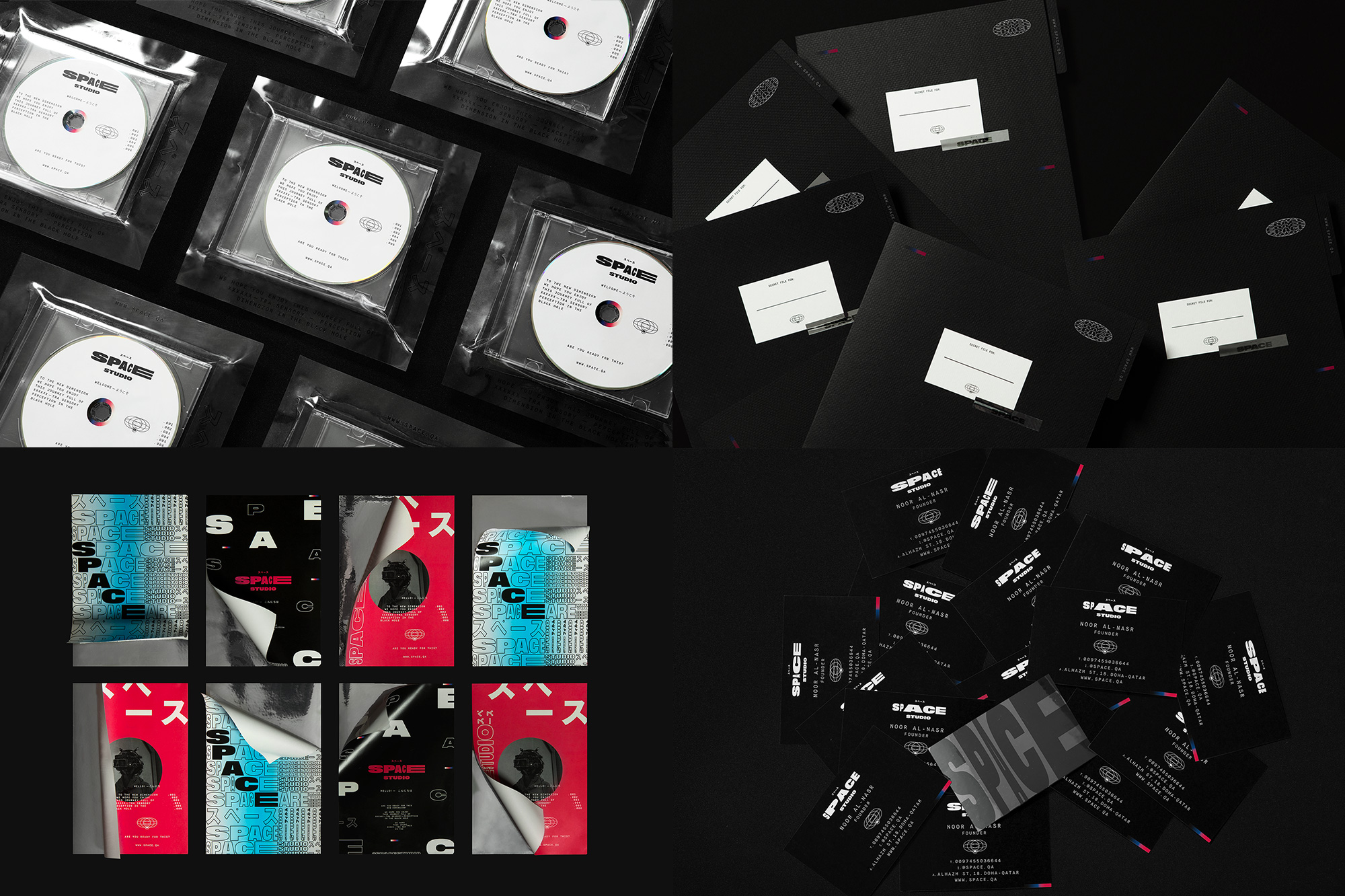
Space is a production and film house based in Doha, Qatar. (No website or clear social media to speak of but we’ll roll with it). The identity, designed by Mexico City, Mexico-based Futura is out there — and given that the company is called Space, it’s apropos — with a funky system that can turn the volume up and down, from the subtle letterhead design to the overstimulating posters. To be honest, I’m not sure exactly what’s going on or why but it’s a very engaging, trippy identity that I simply enjoy looking at and questioning it too deeply doesn’t serve much of a purpose this Friday morning. See full project

 Новости Союза дизайнеров
Все о дизайне в Санкт-Петербурге.
Новости Союза дизайнеров
Все о дизайне в Санкт-Петербурге.