Обзор лучших ресурсов по разработке бренда, разработке упаковки
contact us | ok@ohmycode.ru
contact us | ok@ohmycode.ru
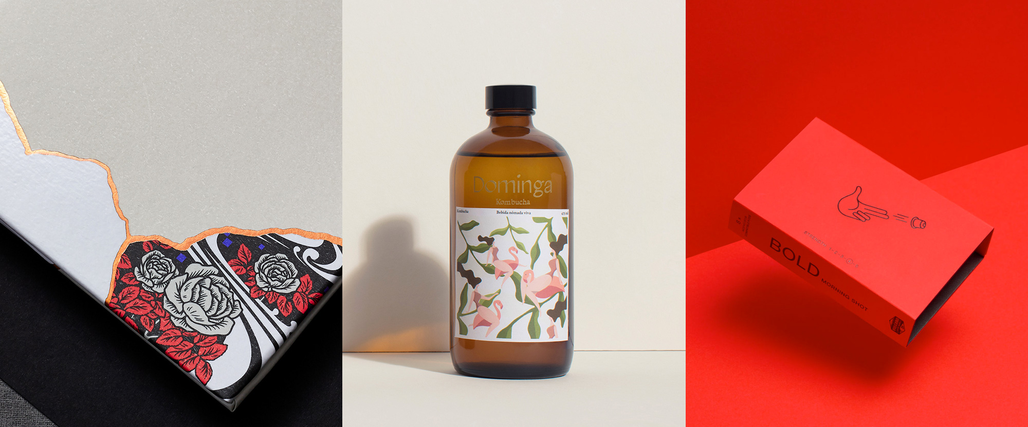
A varied mix of styles this week, with work from London, Mexico City, and London again.
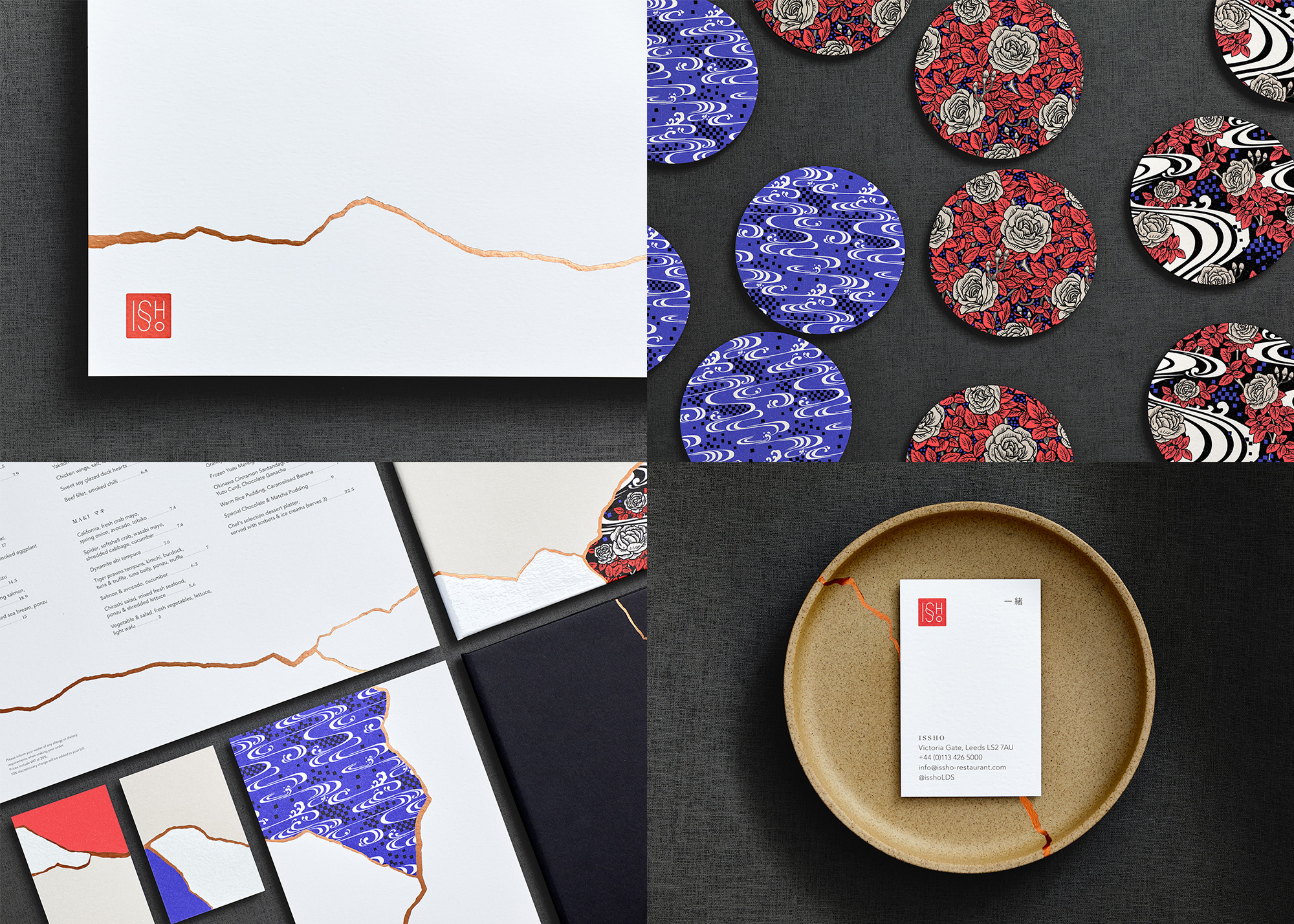
Issho is a Japanese restaurant based in Leeds, Yorkshire, England — its name translating to “Togetherness” in Japanese. The identity, designed by London-based Dutchscot, builds on the name by pairing it with Kintsugi, an ancient Japanese art form where repairing an item with gold joins makes the object more desirable than before. Applied as copper foil, the menus and some of the other materials appear to be broken and mended with the technique. Dishes, paintings, and other physical elements of the restaurant also elegantly implement Kintsugi. A set of rich, floral patterns, designed by Eley Kishimoto, complements the identity in an unexpected way with sudden heavy bursts of ornamentation. As a bonus, the thin-line logo is quite nice too. See full project
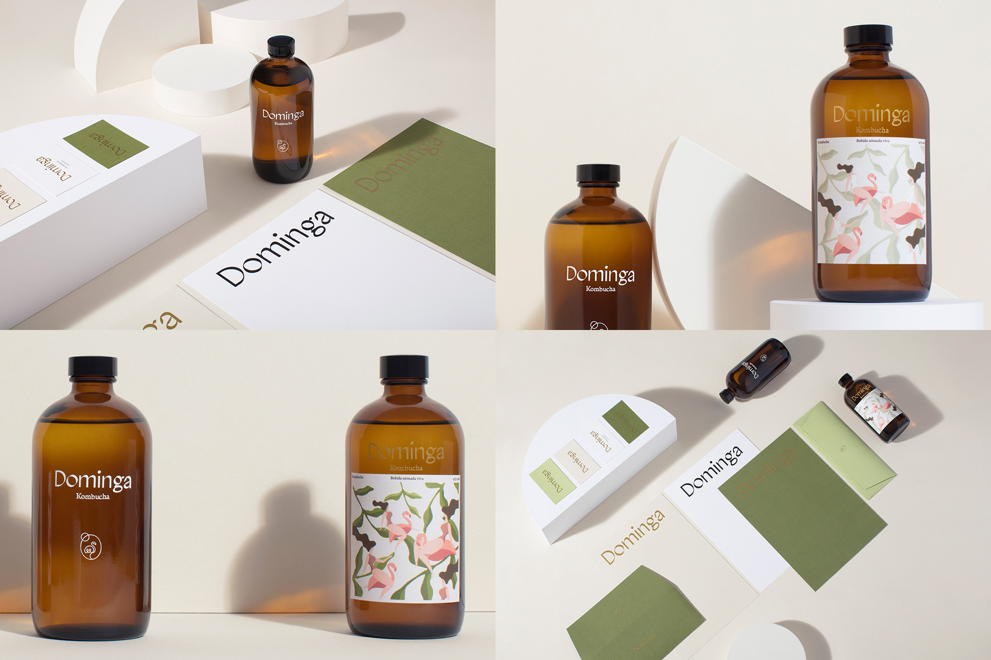
Dominga is a small batch Kombucha producer and retailer in Mexico City. The identity and packaging, designed by local firm Latente, doesn’t seem to have an evident concept other than looking groovy (which is not a bad thing). The logo is a funky chiseled sans serif with enough personality to ferment its own bacteria. That’s a complement. What attracted me the most to this project, though, is the lovely illustration on the packaging — which you can see better in their Instagram account (and, yes, it’s a woman riding a flamingo) — that has a light, breezy, and playful attitude that looks great against all the different colors of the available kombucha flavors. See full project
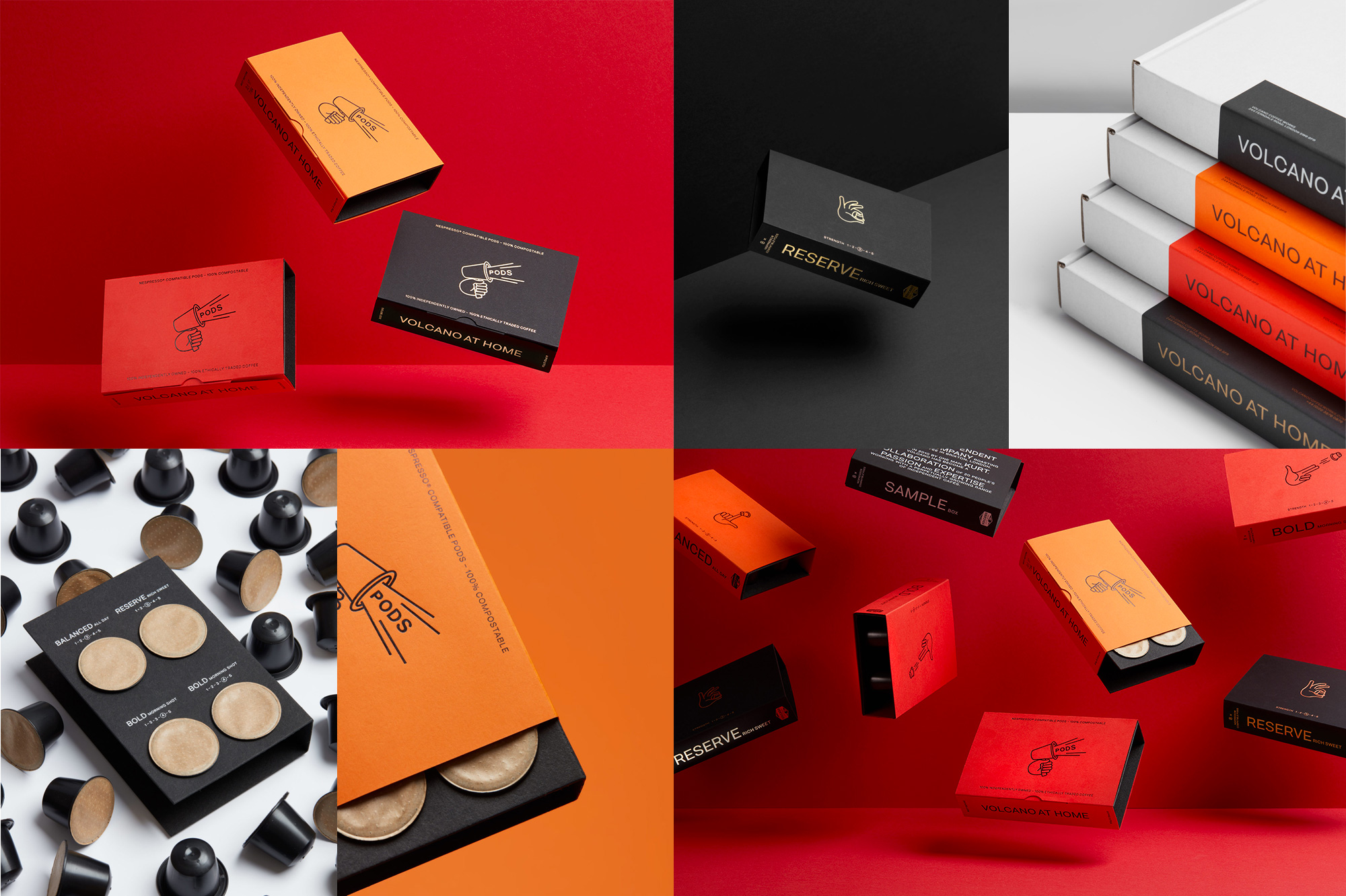
Volcano At Home is a new offering of Nespresso-compatible pods from London-based, micro roaster Volcano Coffee Works. The identity and packaging for the product range, designed by local firm Commission, has a great deadpan playfulness to it with a series of line illustrations of hands interacting with pods, each subtly alluding to the characteristics or name of each coffee (e.g., the “Balanced” product features a hand balancing a pod). The illustrations are complemented by barebones sans serif typography and layouts that, in this case, work great as presented in the colorful card sleeve wraps. See full project

 Новости Союза дизайнеров
Все о дизайне в Санкт-Петербурге.
Новости Союза дизайнеров
Все о дизайне в Санкт-Петербурге.