Обзор лучших ресурсов по разработке бренда, разработке упаковки
contact us | ok@ohmycode.ru
contact us | ok@ohmycode.ru
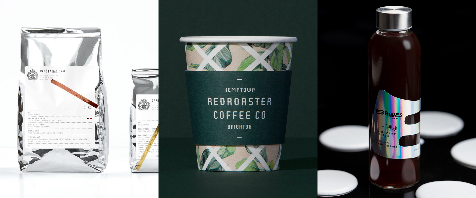
A trifecta of coffee-related projects this week, with work from Monterrey, Melbourne, and Monterrey again.
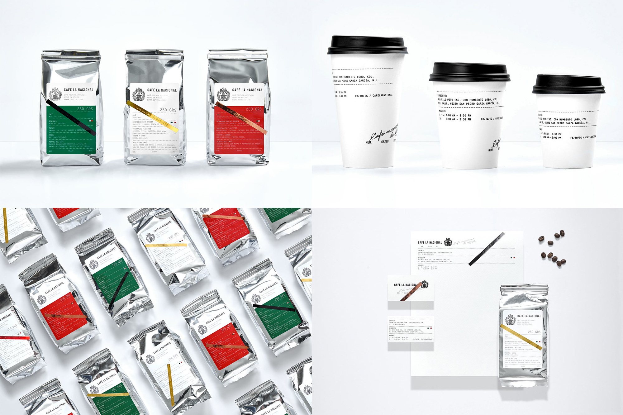
Café la Nacional is a micro coffee roaster in San Pedro, Nuevo León, Mexico, that sources its beans only from growers in Mexico and sells its coffee to retailers and other wholesalers. The identity and packaging, designed by Anagrama (whom we hadn’t featured in a while), is a great mix of elements starting with the logo that features a condensed sans serif, a very thin script, and an eagle (like the one in Mexico’s flag) sitting on an old coffee roasting pot and surrounded by coffee plants. The packaging is nicely applied as a big label with crisp typography and punctuated by colorful, old school Dymo labels. In other applications the typography comes across as some kind of government document that, paired with the emblem-looking logo and the name of the business, could totally pass as a legit memorandum from El Presidente. See full project
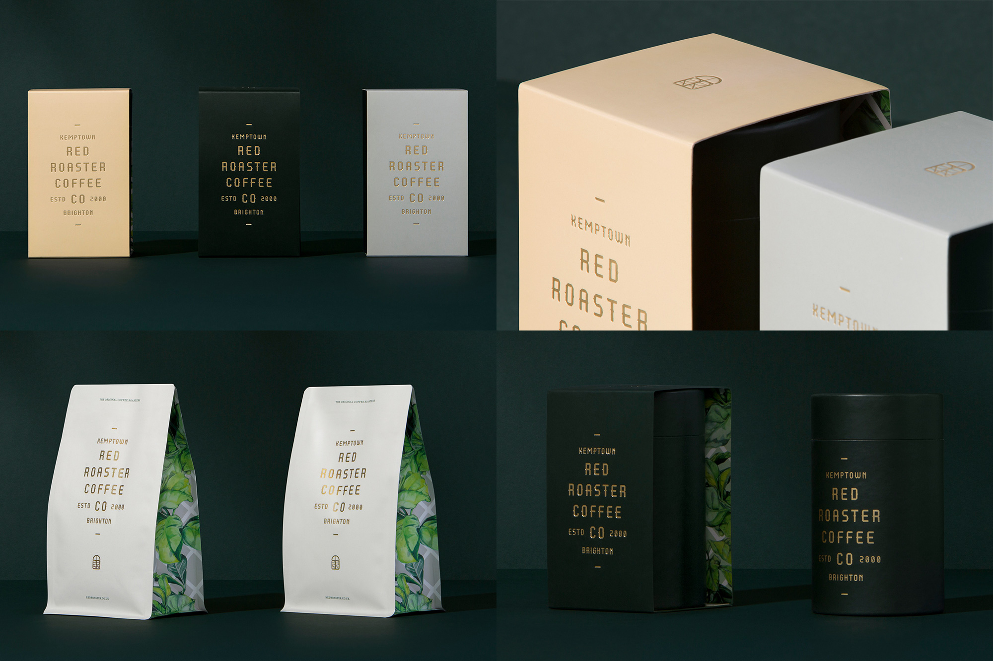
Redroaster is a certified organic coffee roaster and restaurant in Kemptown, Brighton, UK. They recently opened a new restaurant in a former post office building that has been transformed with a bevy of plants among other amazing details by interior designer Hana Hakim. The identity, designed by Melbourne, Australia-based Pop & Pac, plays off of the interior with a deep green color as the main identifier, gold accents, and a botanical pattern that peeks through various applications. A custom, mildly spiky font serves as the primary typography and it’s hard to tell what it’s implication is but, nonetheless, it looks great on the packaging. See full project
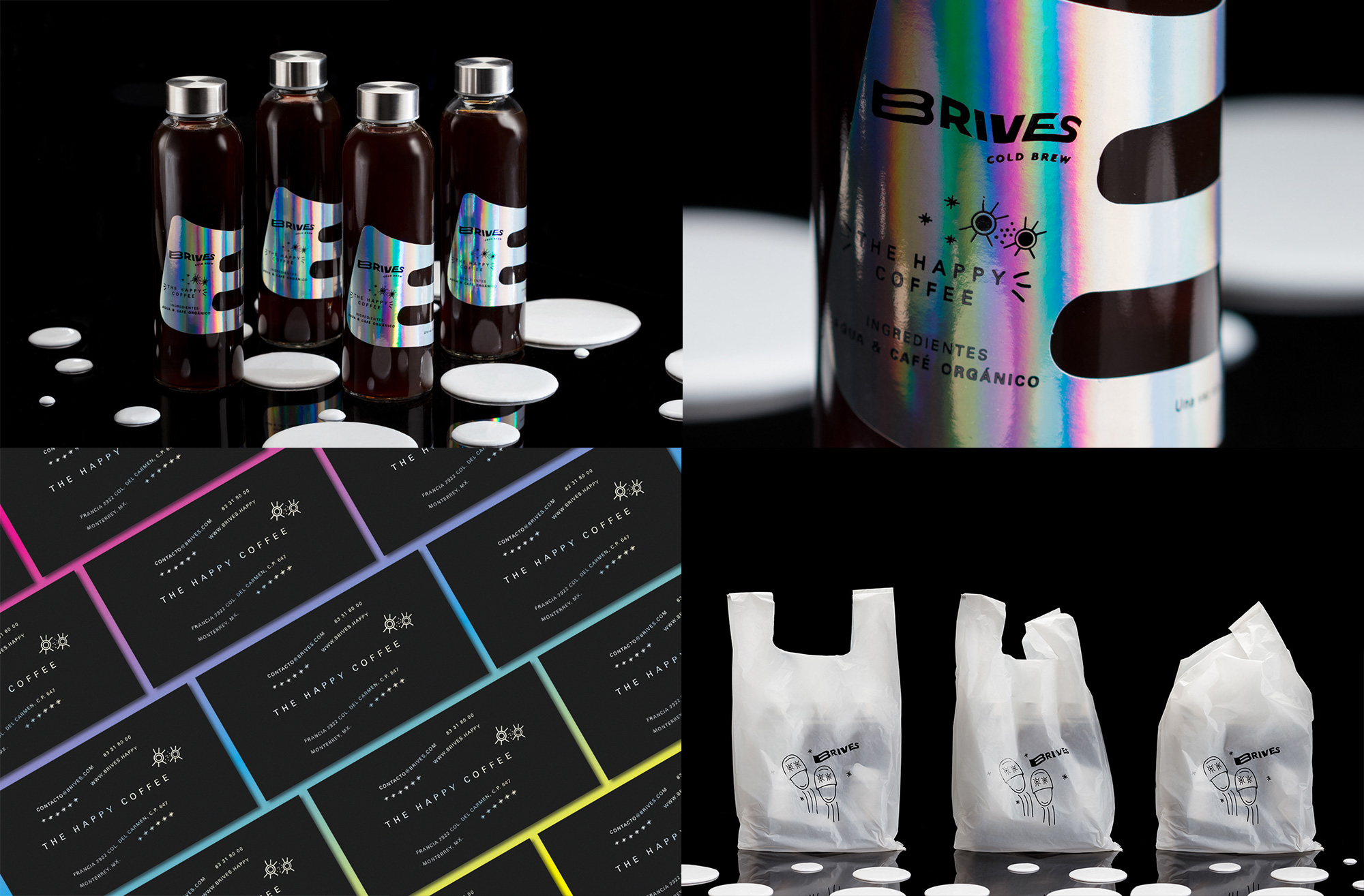
Brives (a contraction for “Bright Vibes”) is a very young start-up in Monterrey, Mexico, of cold brew coffee. (Based on their Facebook posts they look to only be getting started with promotion and distribution as well as a less ambitious bottle design for now.) The drippy-trippy-vibes look has been designed by local firm Jerome & Zimmerman who created an iridescent melted “B”-shaped label that certainly stands out and breaks from the norm. In general, the typography isn’t quite great but it has a fun, deadpan look that pairs really well with the funky line illustrations (which you can see more of at the project link) that include bright-eyed slippers and horn-tooting moons because bright vibes, dude. See full project

 Новости Союза дизайнеров
Все о дизайне в Санкт-Петербурге.
Новости Союза дизайнеров
Все о дизайне в Санкт-Петербурге.