Обзор лучших ресурсов по разработке бренда, разработке упаковки
contact us | ok@ohmycode.ru
contact us | ok@ohmycode.ru
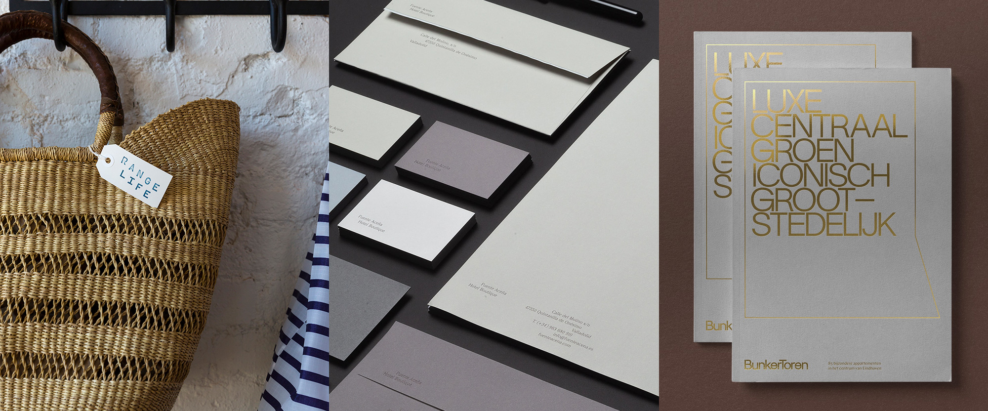
A range of serene and simple identities — all with very Instagrammable locations — this week, with work from Philadelphia, Gijón, and Eindhoven.
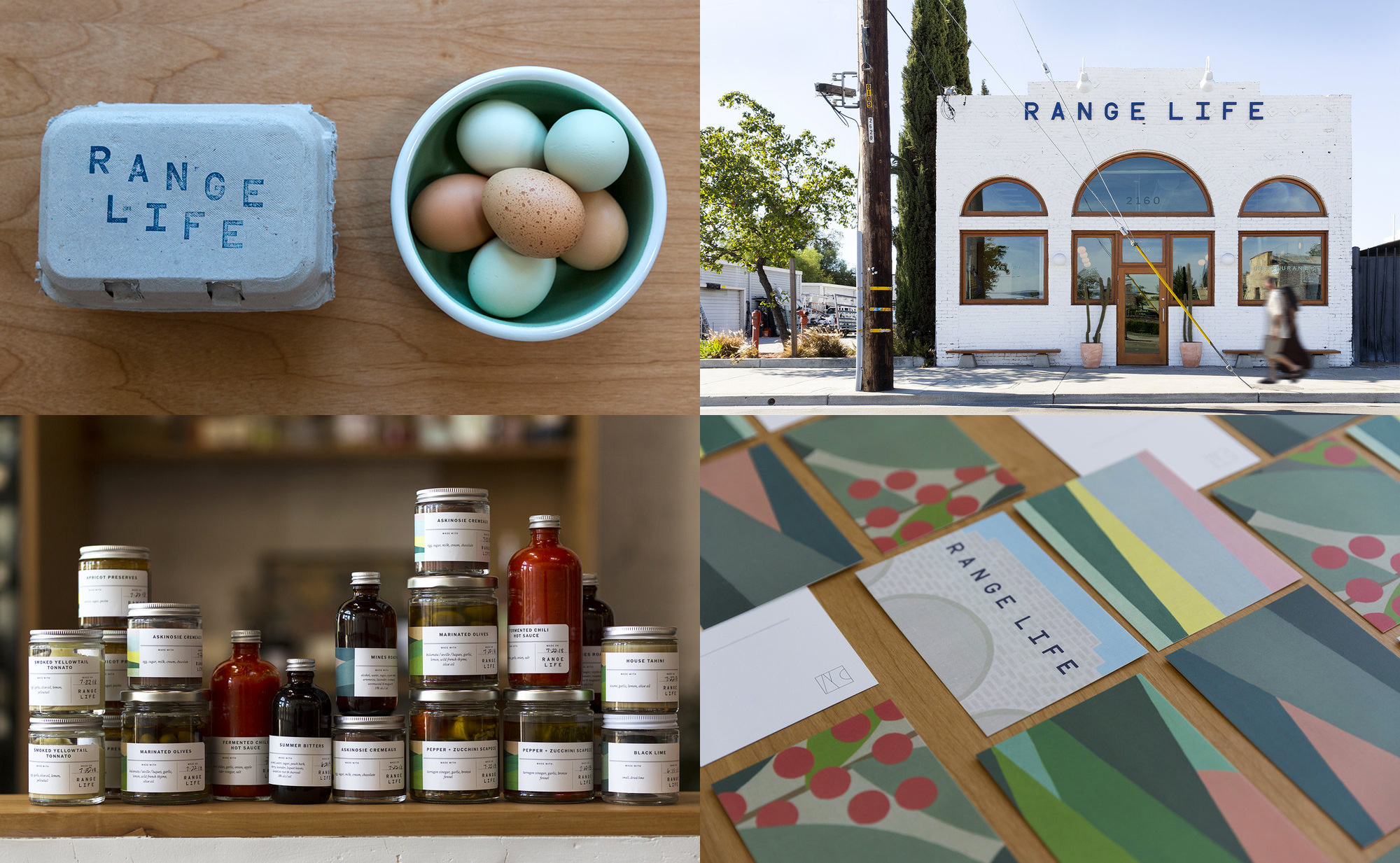
Range Life, in Livermore, CA, is a small restaurant, bar, and market all rolled into one, offering California-style cuisine and products from local farmers and ranchers, all from a charming 1800s building. The identity, designed by Philadelphia, PA-based Jason Rothman, offers a similar rustic but contemporary aesthetic by mixing a monospace logo with a set of beautiful, calming illustrations into a surprisingly large variety of applications, many of them hand-applied, giving it an extra warm and fuzzy feeling. The project page better captures the breadth of work for this small but mighty enterprise. See full project
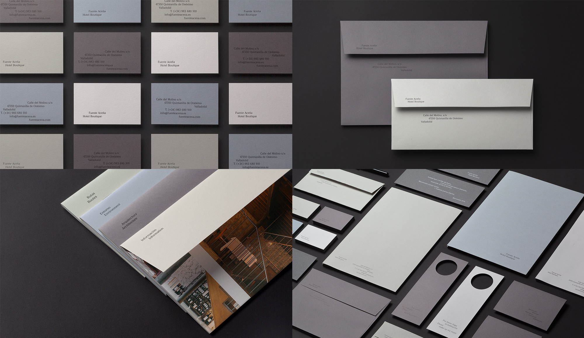
Fuente Aceña is a boutique hotel in Valladolid, Spain, housed in a beautifully refurbished flour mill that sits on the banks of a river. The identity, designed by Gijón, Spain-based atipo, uses the river as a subtle influence by allowing the typography throughout the applications to shift alignments and positions to create its own flow and tide. The purely typographic approach is delivered in a custom serif designed by atipo that is elegant, contemporary, and refreshingly unique in an era of geometric sans serifs and bold-spiky serifs. The applications use a lovely selection of color papers in grays and tans that add to the serenity of the hotel. See full project
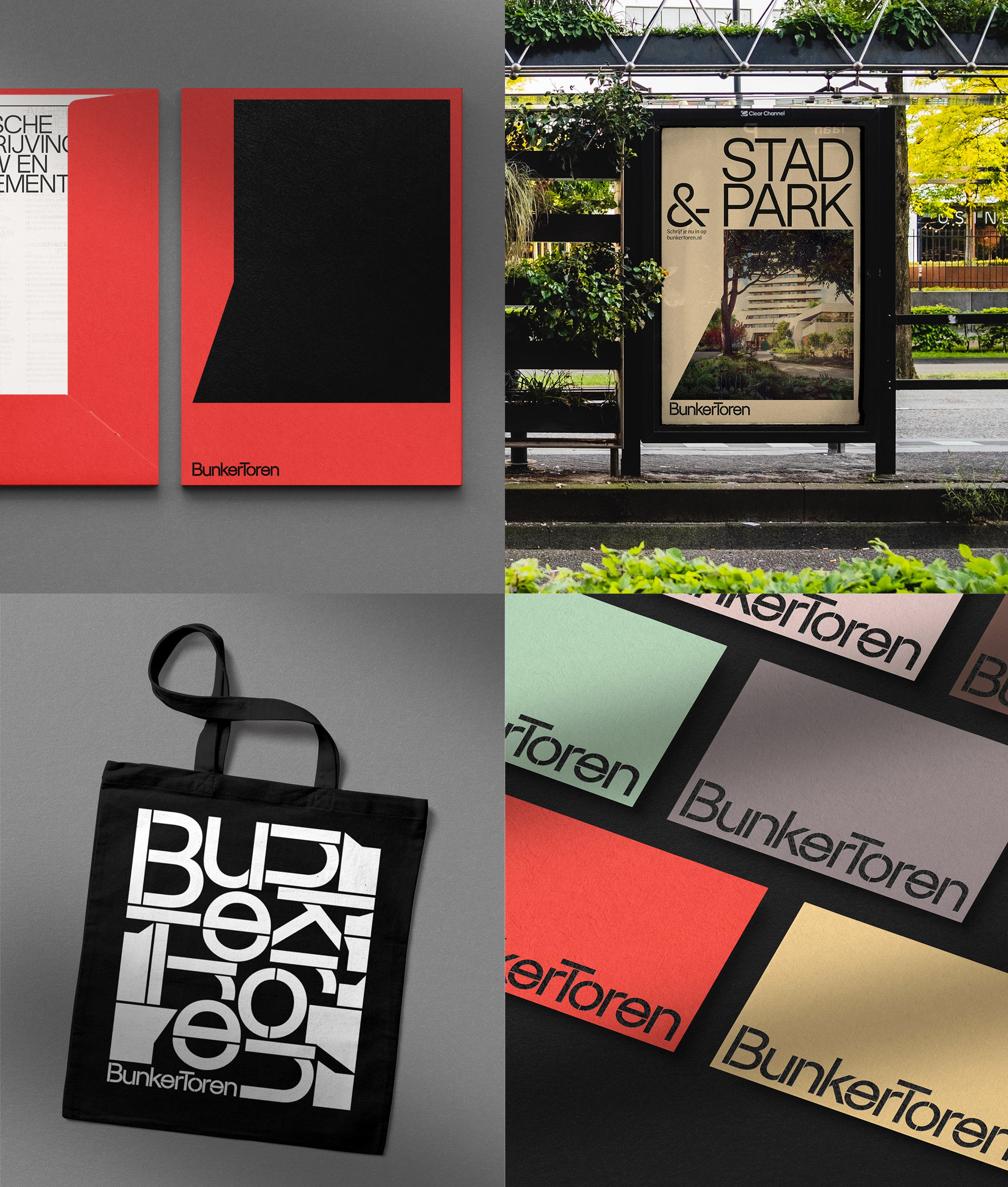
BunkerToren (Bunker Tower in English) is a new residential tower in Eindhoven, Netherlands, that sits on top of a renovated Brutalist building from the 1960s designed by architect Huig Maaskant that served as a student centre. The identity, designed by local firm George&Harrison, follows the Brutalist roots of the building with the somewhat typical typography of the style, except better and more considerate, with a delicate stencil approach that adds a welcome twist. The heavy-handed — but still light — typography is complemented with varying silhouettes of the building that can be used as bold ornaments or as frames and windows for imagery. The combination of elements and approaches to layout yields an interesting luxurious yet raw aesthetic for the building. See full project

 Новости Союза дизайнеров
Все о дизайне в Санкт-Петербурге.
Новости Союза дизайнеров
Все о дизайне в Санкт-Петербурге.