Обзор лучших ресурсов по разработке бренда, разработке упаковки
contact us | ok@ohmycode.ru
contact us | ok@ohmycode.ru
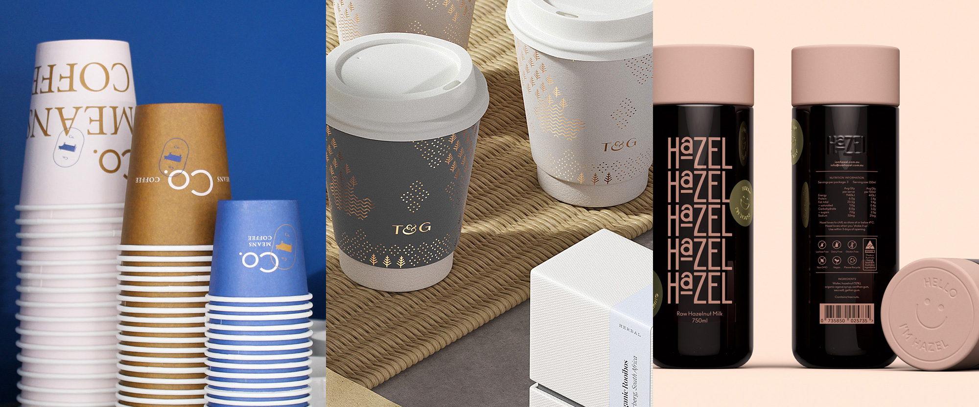
A liquids-only set of clients with soft-colored palettes this week, with work from Kharkiv, London, and Melbourne.
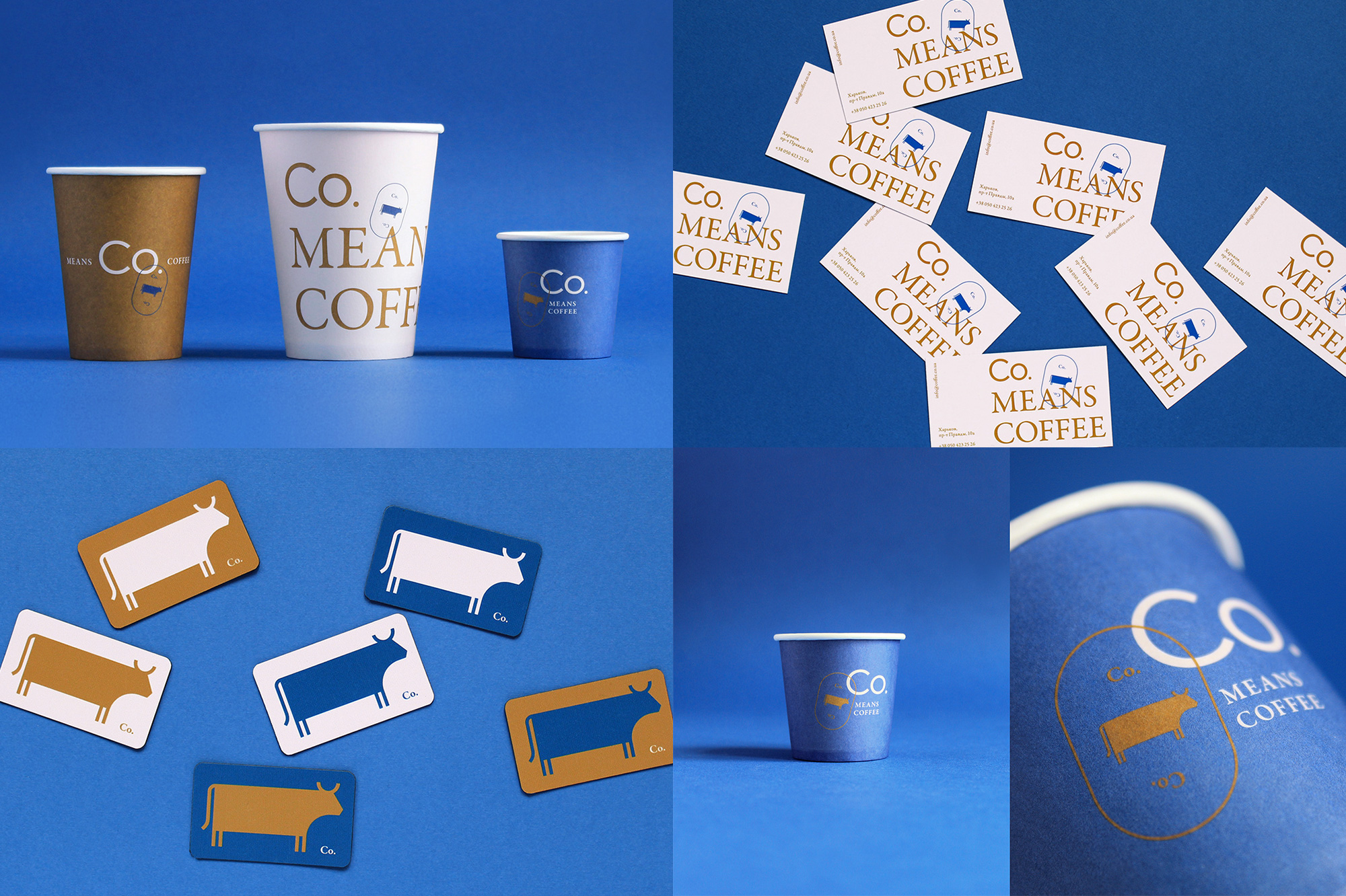
Co. Means Coffee is a small, pet-friendly coffee shop in Kharkiv, a city in northeast Ukraine. What first caught my attention about this project was the cow, as coffee don’t come from no cow. The explanation was not what I expected. Designed by local firm Canapé, the cow comes from them playing off of the “Co” name, which was the start for relevant words like “coffee”, “cocoa”, and “company”, which led them to chose “cobalt” blue as the key color and “cow” as the mascot. Naturally. Both the cow and the identity lean minimalist, with a funny geometric construction of the cow and a simple almost unnoticeable combination of sans and serif in the wordmark. The cobalt blue works great with the muted gold and cream colors while the cow pastures its way through the applications. See full project
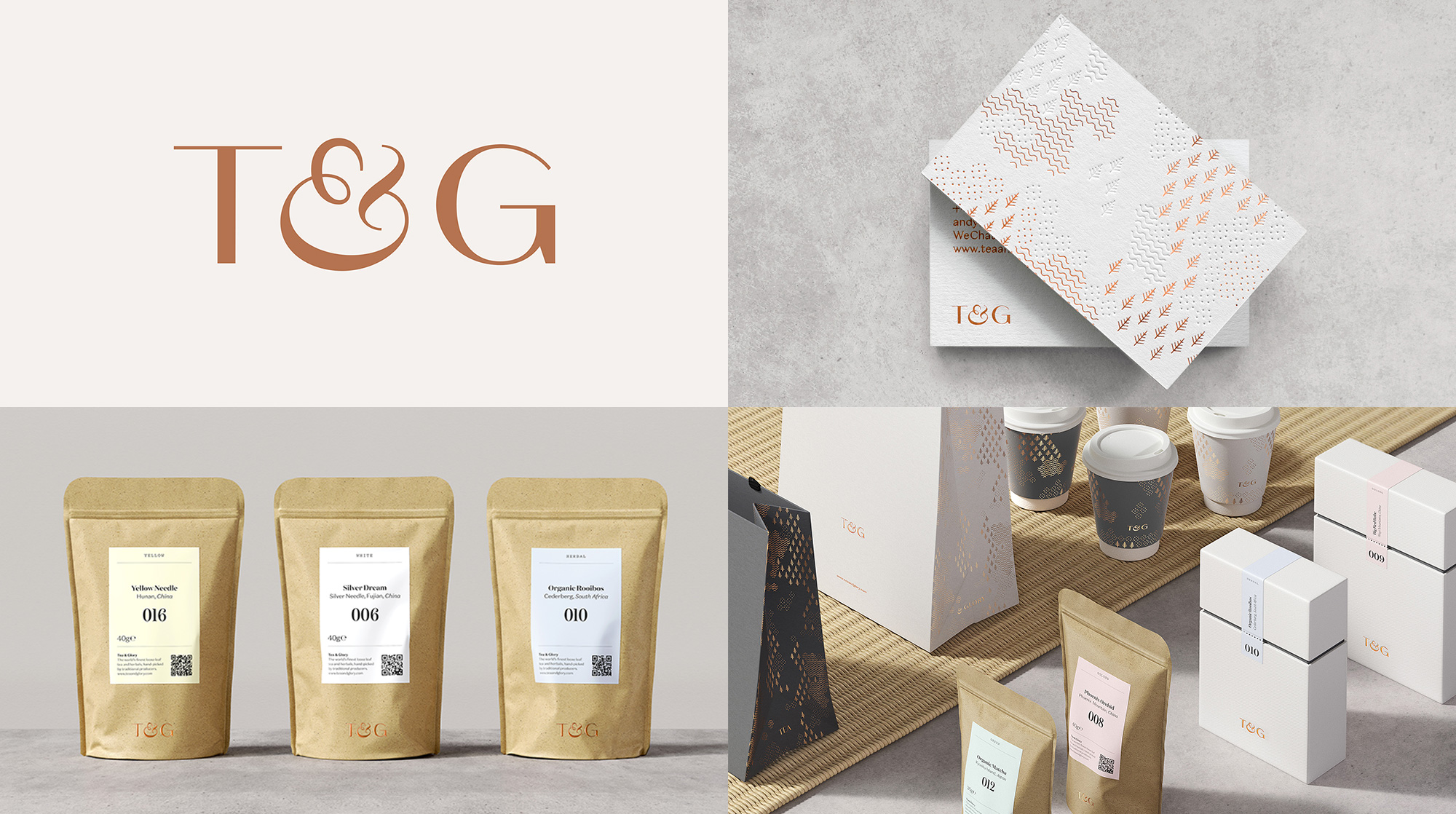
Tea & Glory is a new, premium loose-leaf tea bar in London, UK. The identity, designed by local firm SocioDesign, features a lovely pattern made of abstract soil, water, and trees that can be arranged in any configuration as each single element is placed in an hexagon, allowing it to mix infinitely. (BP&O has some images of the guidelines showing this better than I can write about it.) Reproduced in gold foil, the patterns are absolutely decadent. The elegant logo features an ampersand that evokes a small tea cup with steam coming out and it accentuates all the applications quite nicely. The one odd thing are the labels on the bags — too much QR code and not enough soil/water/tree pattern which I would never tire of. See full project
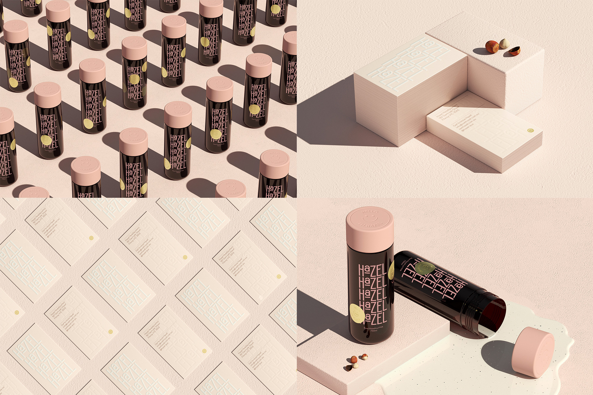
Hazel (as in hazelnut) is a new milk alternative product (made of hazelnut, in case there was doubt) created by a group of baristas and is available in a limited selection of coffee shops and specialty grocery stores in Australia. The packaging, designed by Melbourne, Australia-based Pop & Pac, comes in a fun tube bottle topped off with a bold pink cap that repeats the color of the logo. The logo is not particularly great but its repetition in both bottle and business card becomes oddly endearing and more interesting than if it were there only once. The white on pink application in the business card is pretty nice and the gold sticker accents with a happy face add a fun touch across the brand — especially on the website. See full project

 Новости Союза дизайнеров
Все о дизайне в Санкт-Петербурге.
Новости Союза дизайнеров
Все о дизайне в Санкт-Петербурге.