Обзор лучших ресурсов по разработке бренда, разработке упаковки
contact us | ok@ohmycode.ru
contact us | ok@ohmycode.ru
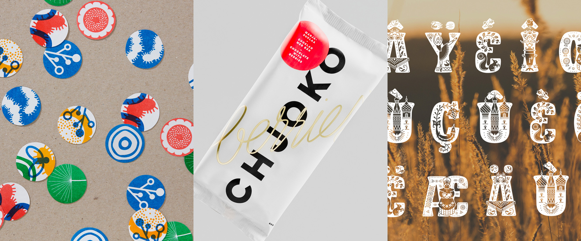
An eclectic mix this week, with work from London, Helsinki, and Tomsk.
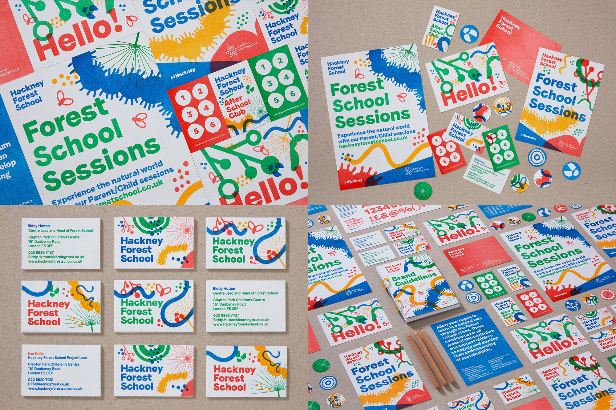
Hackney Forest School is not a full-time-enrollment school but an extracurricular initiative that brings children from London (and surroundings) to learn from nature at the Hackney Marshes. The identity, designed by London, UK-based Spy Studio revolves around a quirky, colorful collection of abstract critters, flora, and other nature-y sprinkles, all piled one on top of the other. The irreverence is capped off by a wordmark where the letters seem to have living limbs of their own with some crossbars going their own way. It’s playful, joyful, and manages to capture a great balance of urban-ness and outdoorsy-ness AND speak to both children and adults. When I grow up I want to go to Hackney Forest School. See full project
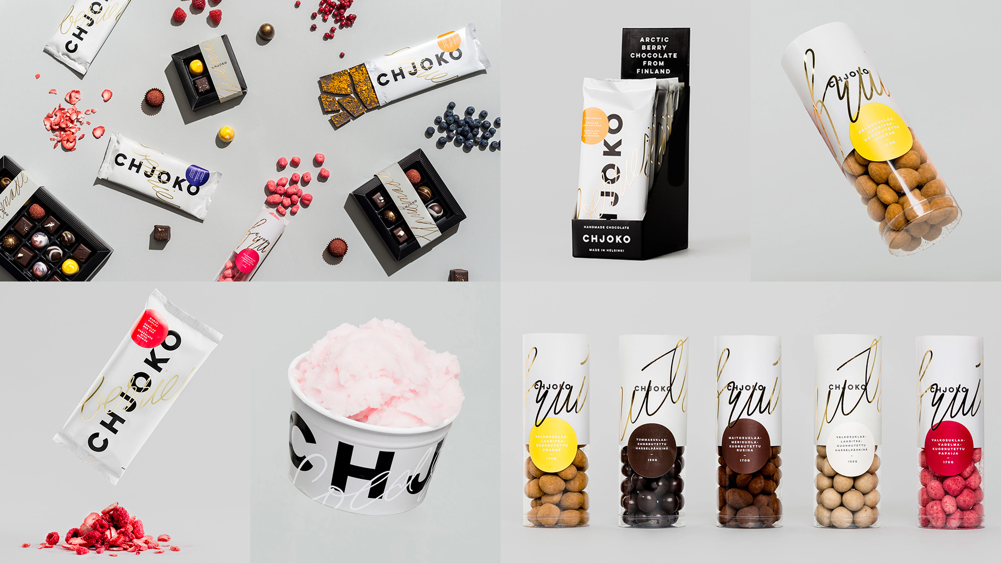
Chjoko is an artisanal chocolate shop based in Helsinki, Finland, specializing in modern chocolates, pralines, and other delicacies. The identity, designed by local firm Werklig, brings together a bold, minimalist, nicely spaced-out sans serif wordmark with more effusive, hand-drawn calligraphy overlaid in gold. At times it’s difficult to read what the scripts say but they look absolutely stunning against the black type and white backgrounds — I also like how the script looks like swirl decoration would on an actual chocolate. The bonus application of the ice cream cup, with the white script, seals the deal for me. See full project
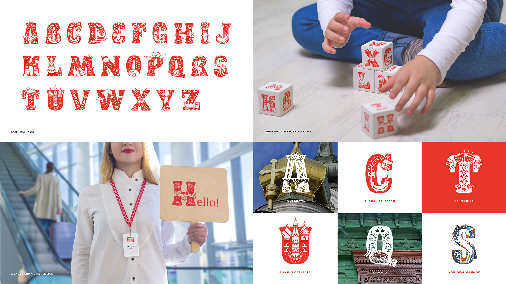
Artel Troika is a travel agency based in Moscow with a commitment to show a better representation of Russia through custom itineraries for tourists who may be looking for alternatives to the typical destinations. The identity, designed by Tomsk, Russia-based LOVEMEDO, introduces a fantastic alphabet where each letter represents something from Russia, from landmarks to folk art to historical artifacts and more. Usually, I choose Friday Likes with actual executions photographed in real life and steer clear of renders and mock-ups but I made an exception here because that alphabet is amazing and a peculiar tool to build an identity around. The logo (not shown) is also quite nice, with an Art Nouveau spin that avoids the Constructivist cliché. Field trip! See full project

 Новости Союза дизайнеров
Все о дизайне в Санкт-Петербурге.
Новости Союза дизайнеров
Все о дизайне в Санкт-Петербурге.