Обзор лучших ресурсов по разработке бренда, разработке упаковки
contact us | ok@ohmycode.ru
contact us | ok@ohmycode.ru
All selections this week come from the finalists of the LAD Awards that were announced this month and of which, disclaimer, I was a judge of. It’s an exuberant range of projects, with work from São Paulo, Brooklyn, and New York.
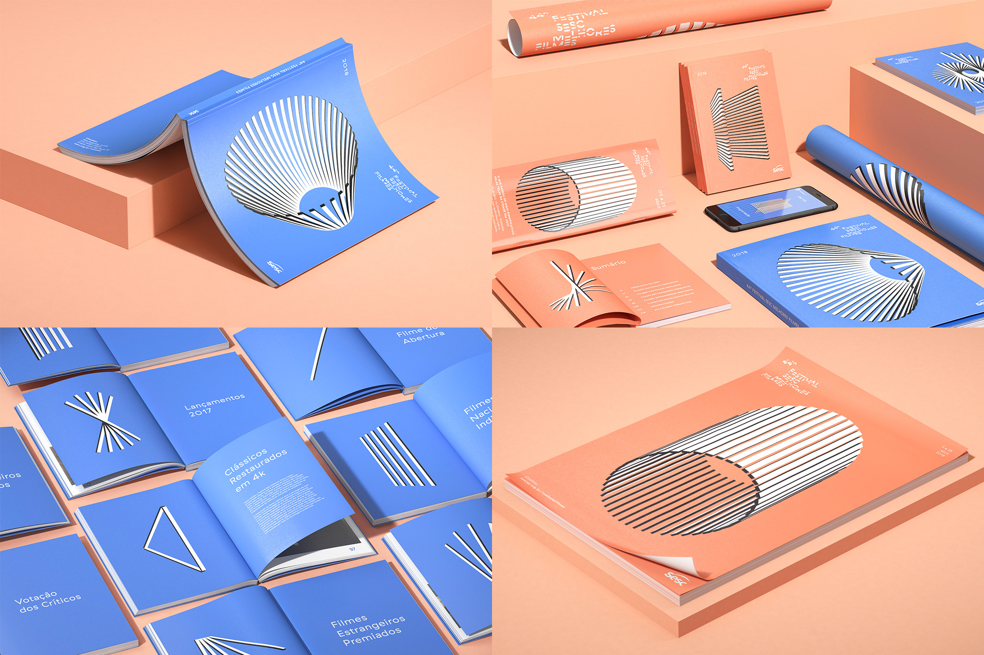
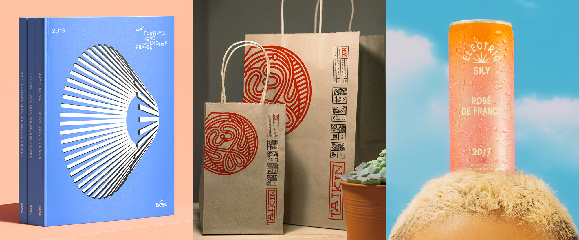
The Sesc Melhores Filmes Festival — managed by Sesc, an organization that “believes in social transformation through intense cultural action” — is the oldest film festival in São Paulo, Brazil, that celebrated its 44th edition this past April. Designed in collaboration by local firm Daó and local designer Pedro Veneziano, the identity revolves around 44 revolving slabs that come together in different, trippy arrangements. The concept is that their “proposal plays with the idea of movies being composed by a multitude of parts, diversely arranged into an infinity of outcomes. We developed a set of shapes by combining the same 44 elements in different ways, conceptually playing with the multiplicity of the cinema universe — each film is unique and open to various interpretations”. I doubt many viewers made the jump but visually, these are charged full of energy and tension and the black and white slabs manage to establish a funky, connecting thread as they rest on the light blue and peach colors. Don’t miss the motion explorations at the link. See full project
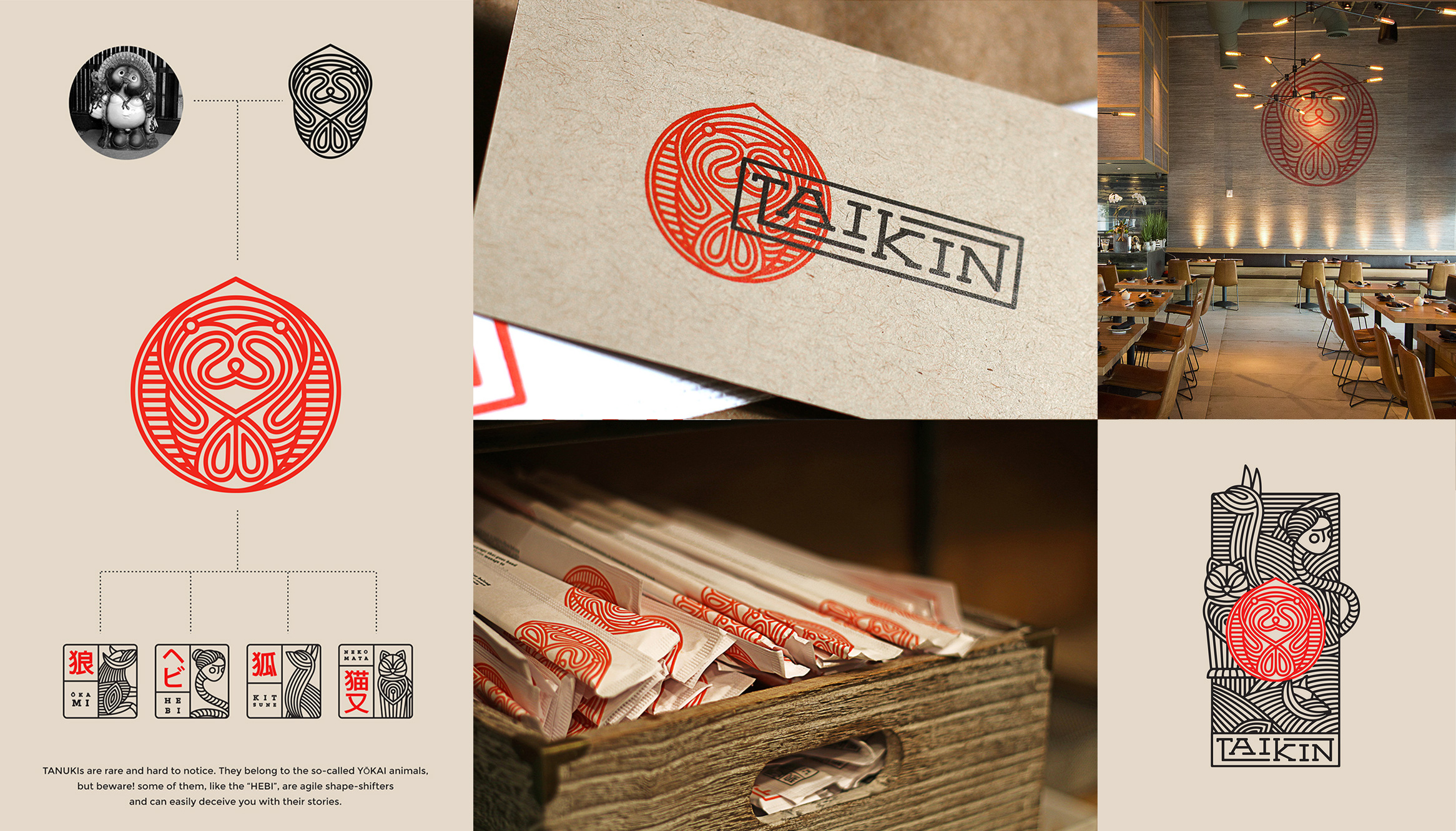
Taikin (which means “Fortune” in Japanese) is an Asian fusion restaurant in Doral, FL. Its identity, designed by Brooklyn, NY-based Oscar Bastidas, features an abstract “Tanuki”, a Japanese folklore character that some people place in their homes and businesses to attract good fortune. Once abstracted, it’s really hard to decipher what it is but as a piece of illustration it’s enigmatically cool and the other illustrations that spawn from it create a cool menagerie of thick-line mystical animal-human-things. On their own they look great but also in the megatron illustration where they all come together. The logo is a little awkward, probably more than it needs to be given all the other stuff happening around it but the range of applications are cool and eclectic. At the link, also dig the restroom graphics. See full project
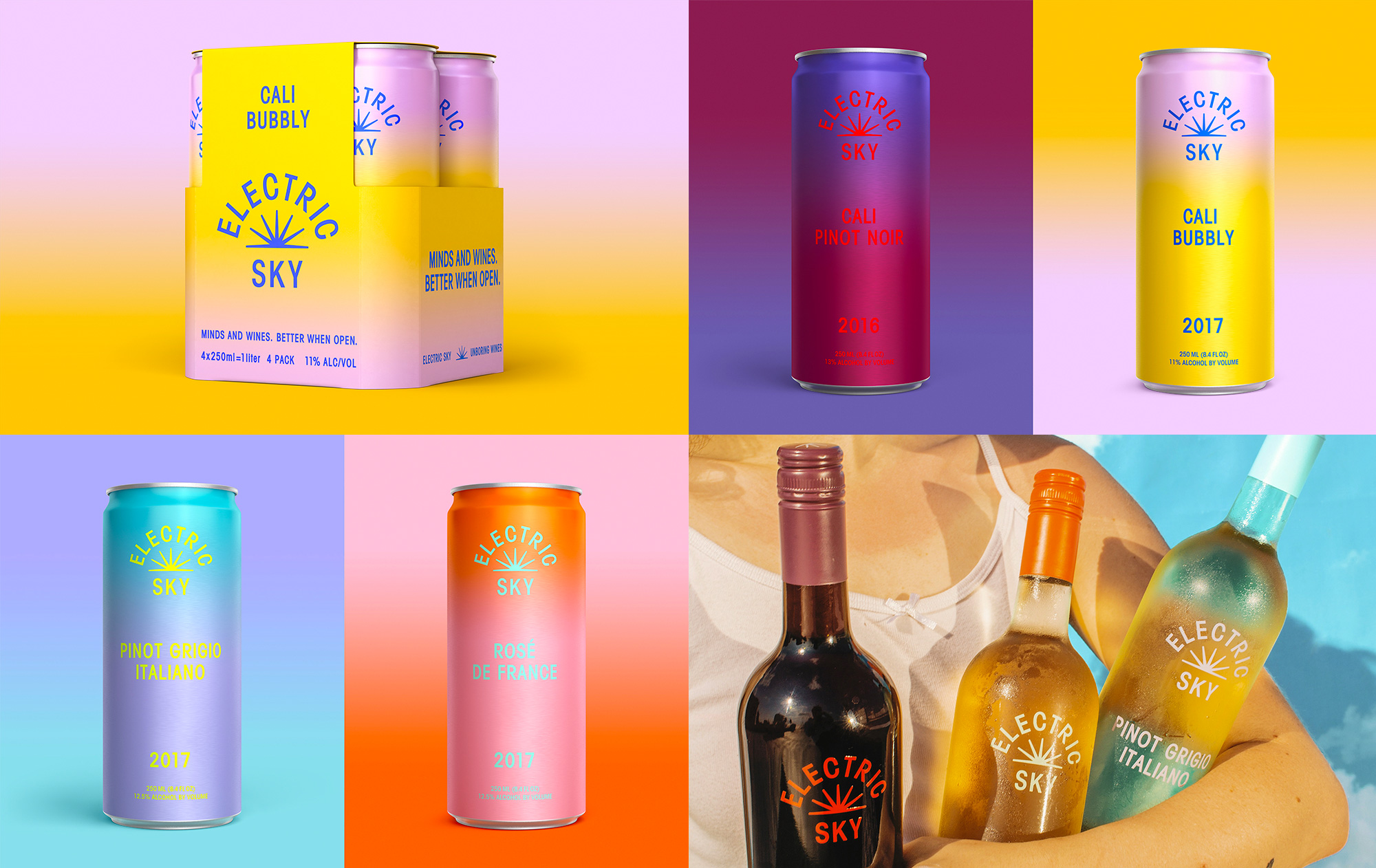
Electric Sky, based in Los Angeles, CA, offers wine in a can and, yeah, that’s that. The packaging, designed in collaboration by Brooklyn, NY-based Felipe Rocha and New York, NY-based Leo Porto, has a fairly electric presence, with pastel-hued gradients accentuated by clashing colors for the logo and typography. I know this might not be everyone’s cup of tea — or can of wine — but I enjoy the stark minimalism of the layouts against the retina-burning color concoctions. The logo, in all its hipness, is very nicely constructed. Bottom’s up. See full project

 Новости Союза дизайнеров
Все о дизайне в Санкт-Петербурге.
Новости Союза дизайнеров
Все о дизайне в Санкт-Петербурге.