Обзор лучших ресурсов по разработке бренда, разработке упаковки
contact us | ok@ohmycode.ru
contact us | ok@ohmycode.ru
A classy range of projects this week, with work from Los Angeles, Denver, and Portland. (I think this might be the first time in a while that all projects are from the U.S. — not that it matters, just an observation.)
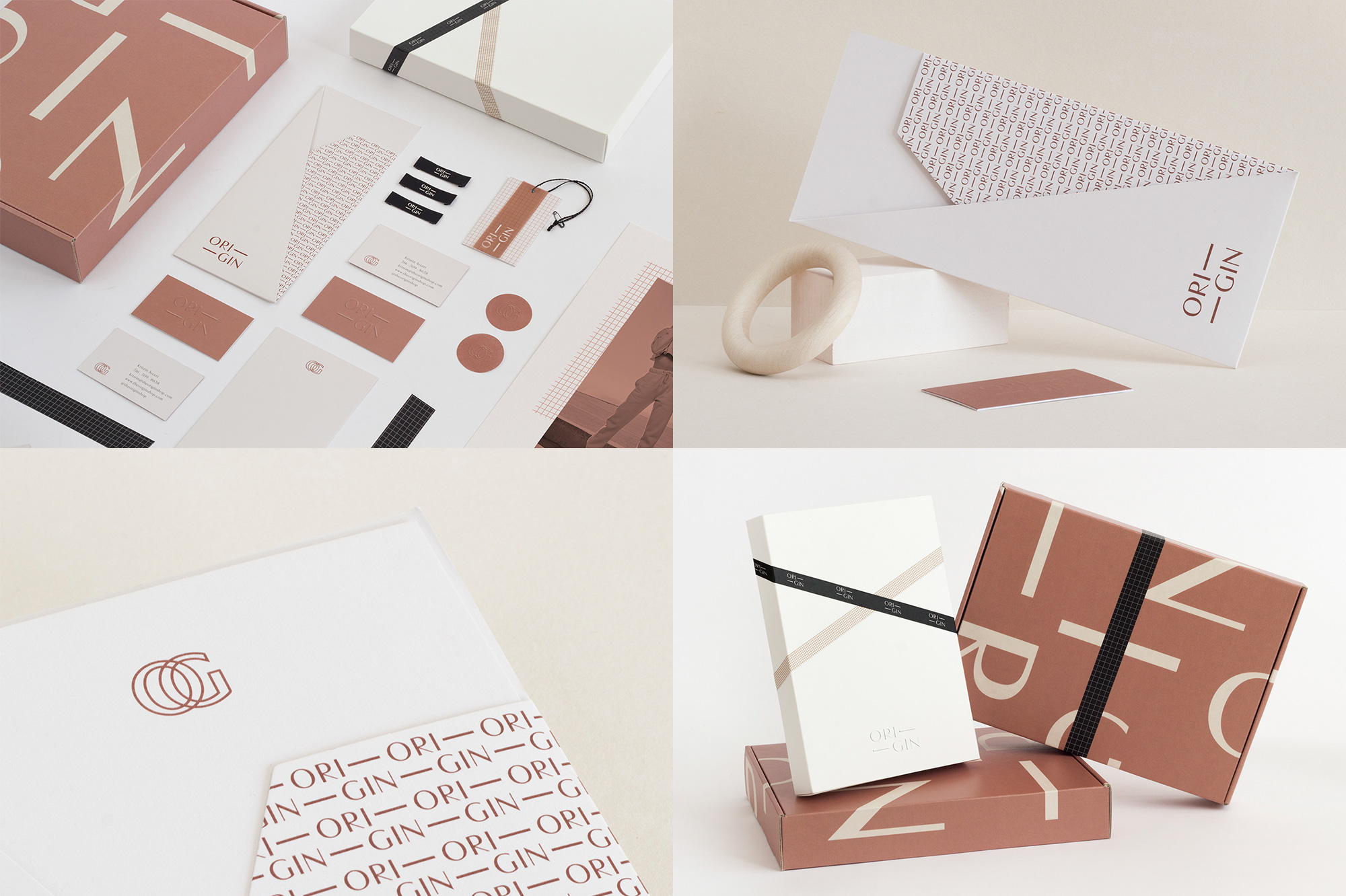
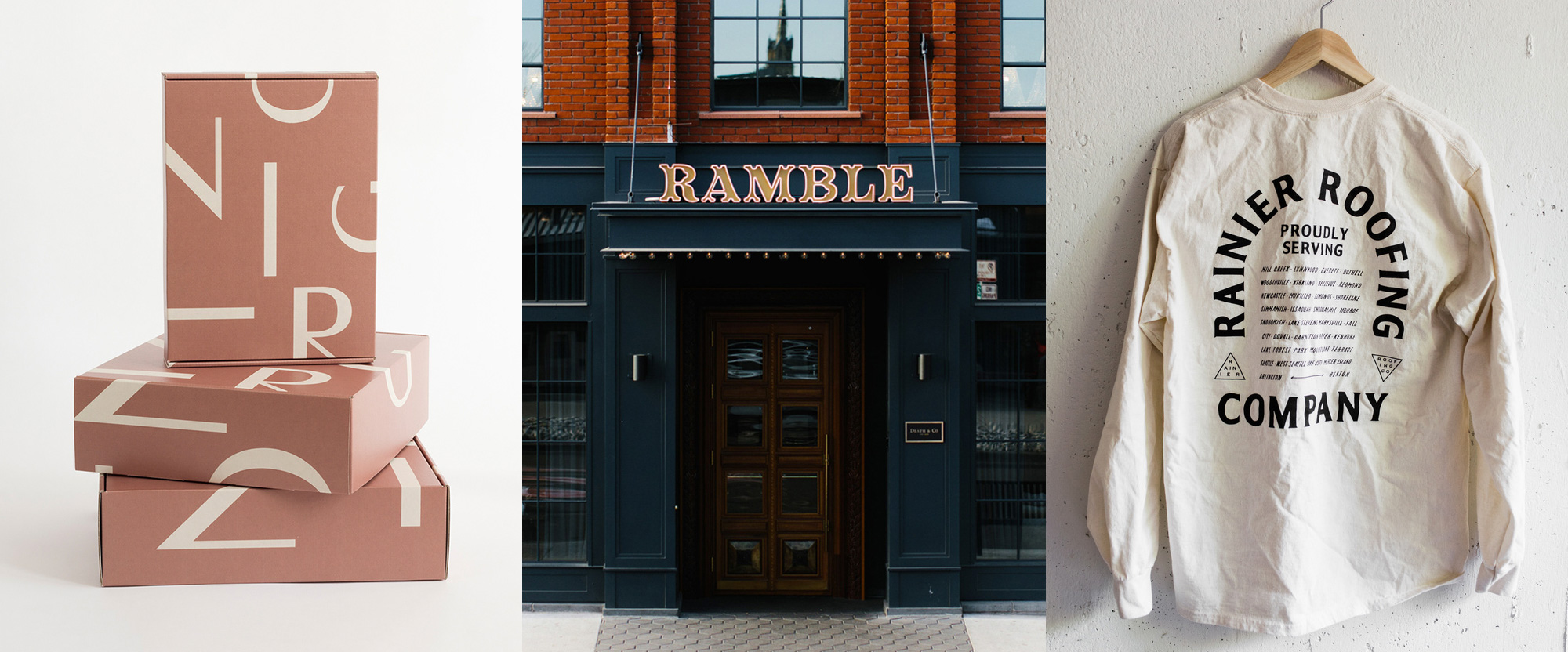
Origin is an online women’s clothing boutique with a selection that aims to capture a “mixture between femininity and streetwear”. The identity, designed by Los Angeles, CA-based Kati Forner Design, revolves around a lovely high-contrast sans serif that’s used in the logo and a secondary treatment that displaces the letters more freely. The “ORI—” “—GIN” logo creates a great tension in its layout and looks particularly good as a pattern. The boxes, with the looser arrangement of letters, also look great with the more abstract typographic composition. The color is hard to define… copper salmon? Who knows. It’s weird. But I very much dig it. The subtle use of the square grid pattern adds a fun touch in unexpected ways like tape and vellum overlays. The bonus “OG” monogram is sweet too. See full project
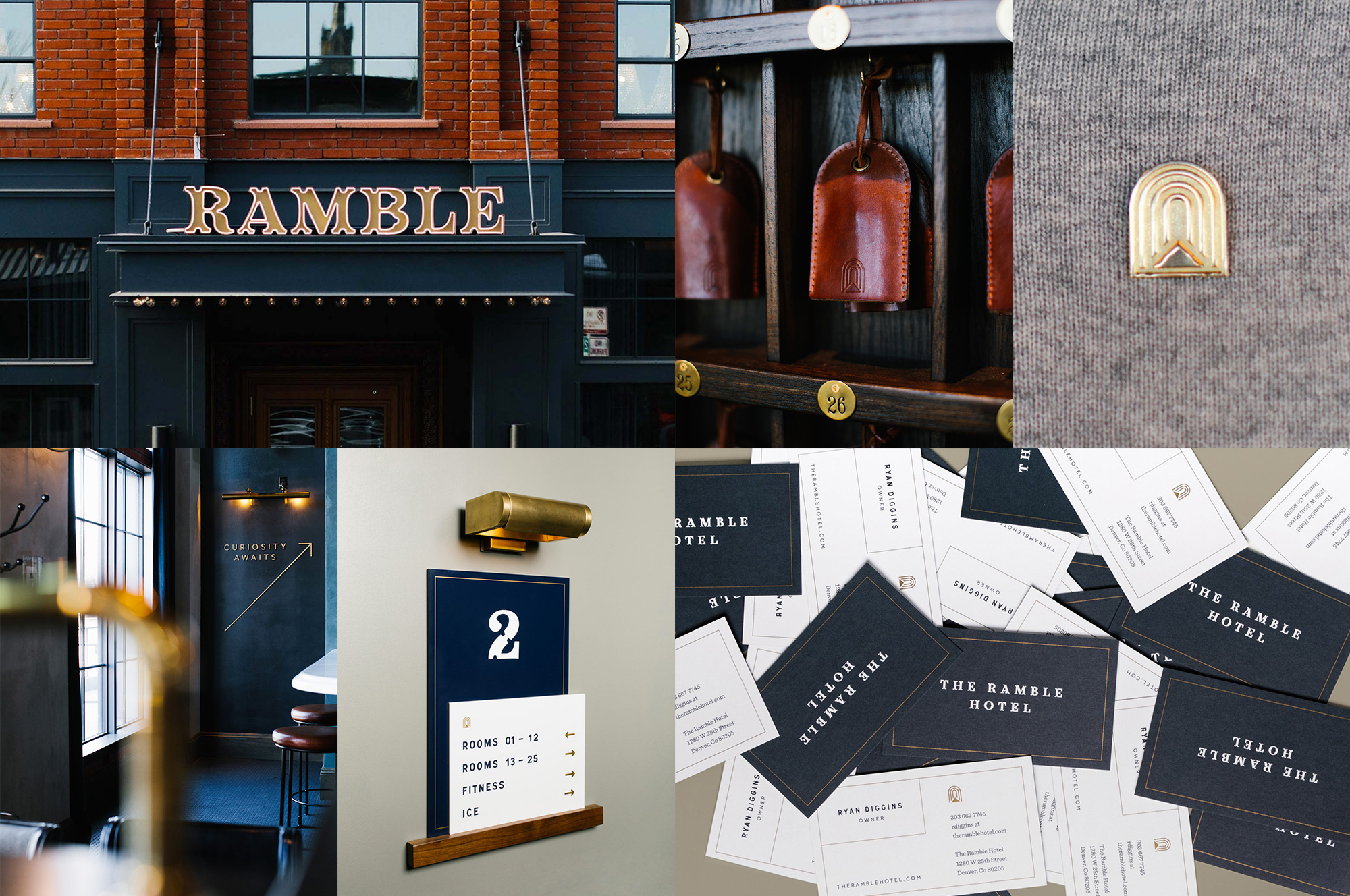
The Ramble is a 50-room boutique hotel in Denver, CO, that takes its inspiration from Madame Rambouillet’s French Salons of the 17th century. The identity, designed by local firm Mast, makes use of various references to Paris: the logo is inspired by ornate Parisian store-front signage; the icon is an abstraction of seeing the Louvre’s pyramid through the Arc de Triomphe du Carrousel; and the supporting font is Signal, which is based on Paris’ street signs. On paper this could all look like a French-heavy gimmick but all the elements are very nicely balanced in a contemporary approach with subtlety and a great attention to detail. The wordmark and custom font (designed by Badson) are my favorite part of the project and I love how they have used both elements sparingly. Would definitely want to stay here based on the identity alone. See full project
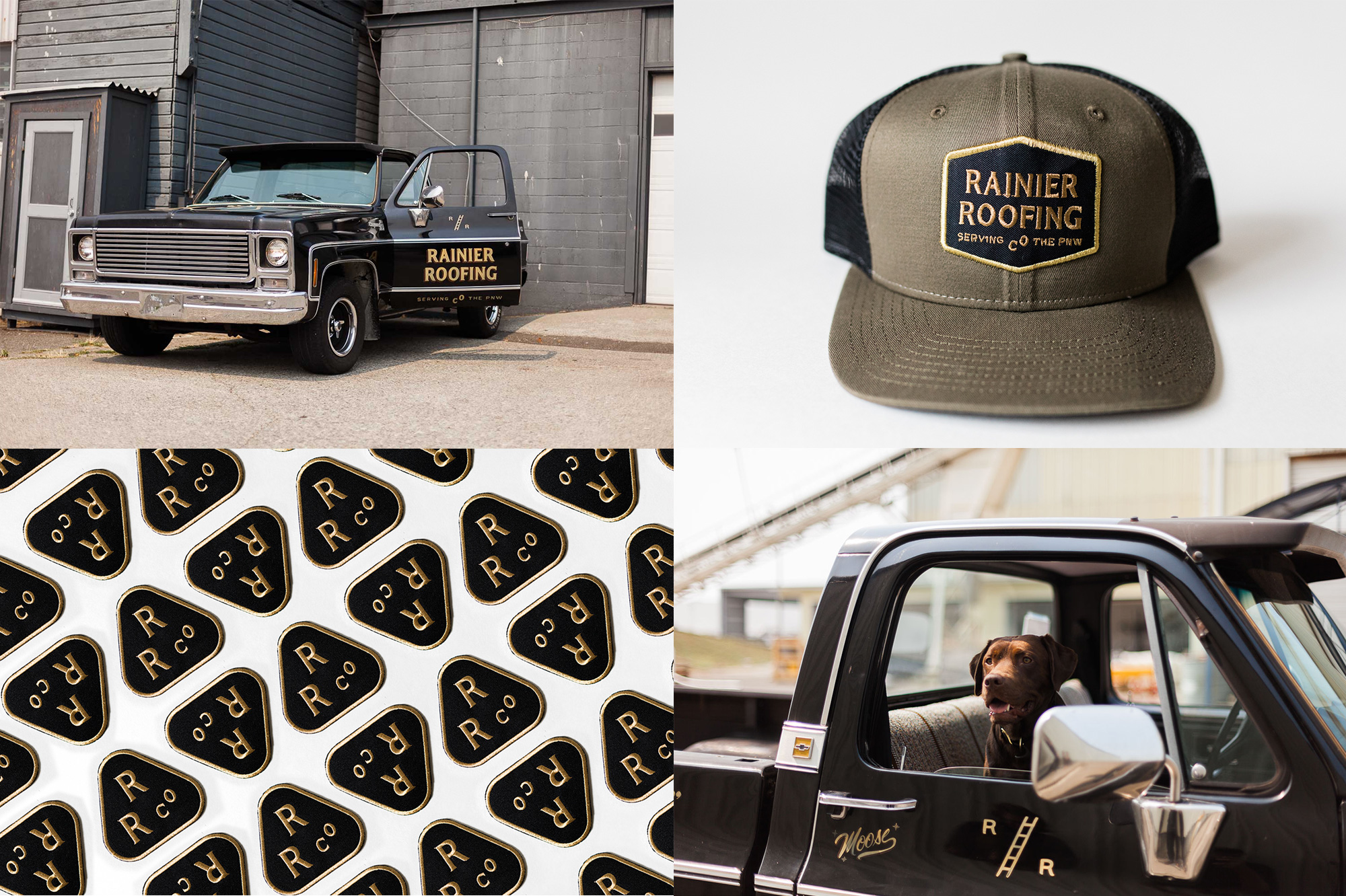
Rainier Roofing, as its name implies, is a roofing specialist company based in Lynnwood, WA, near Seattle. The identity, designed by Portland, OR-based Old Friend, is the best identity you will probably ever see for a roofing company. Even if they made their roofs out of bubble wrap I would hire them, no questions asked. (Yes, I’m exaggerating… I would haggle on price obvs.) Kidding aside, this is a fun, expressive, detailed identity that establishes Rainier Roofing as a craft-focused company — you get the sense they will care about their work and do it with focus and commitment. I love the “R / R” graphic with the ladder but all the other graphic doo-dads make for a great set of ingredients — as does the dog. See full project

 Новости Союза дизайнеров
Все о дизайне в Санкт-Петербурге.
Новости Союза дизайнеров
Все о дизайне в Санкт-Петербурге.