Обзор лучших ресурсов по разработке бренда, разработке упаковки
contact us | ok@ohmycode.ru
contact us | ok@ohmycode.ru
A relatively wacky project splits two more buttoned-up projects this week, with work from Ho Chi Minh City, Seoul, and Montréal.
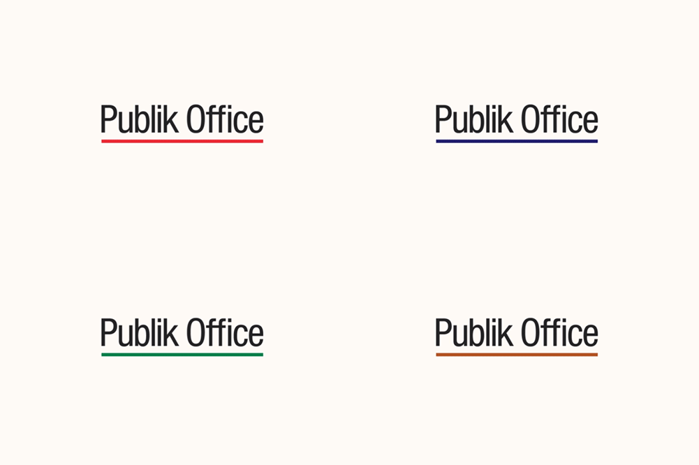
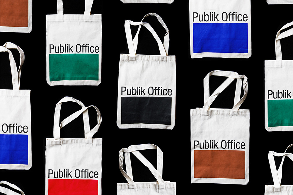
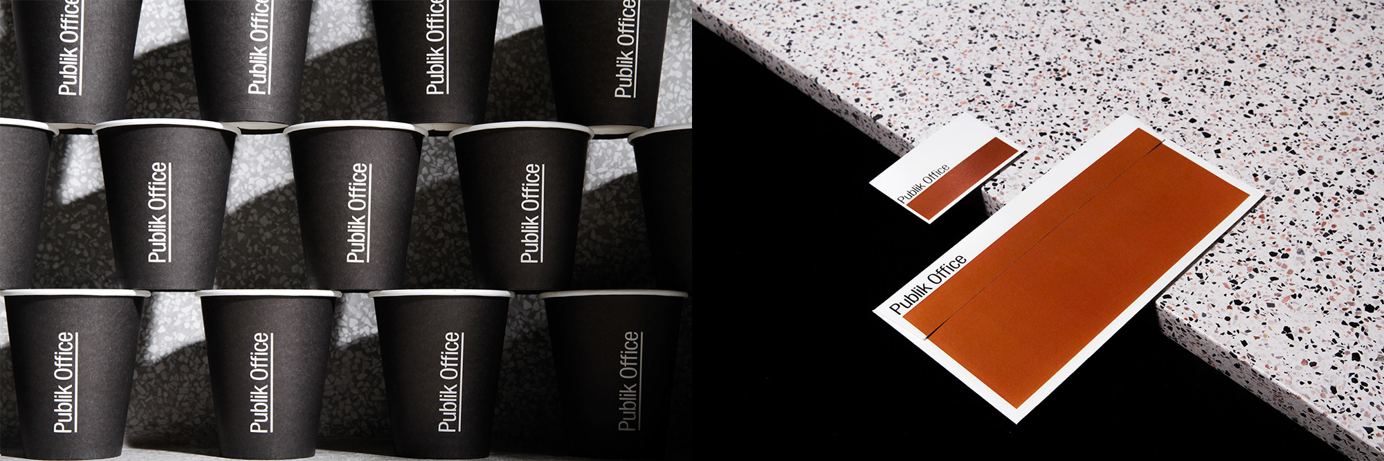
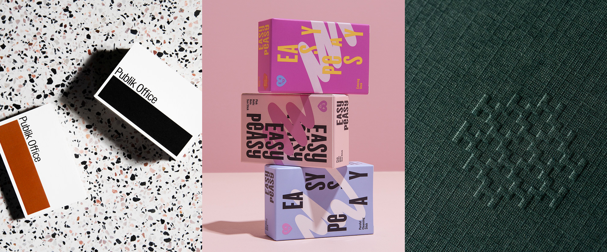
Publik Office is a co-working and event space in Ho Chi Minh City, Vietnam, with a very slick space by SDA Architects. The identity, designed by local firm Rice Creative, brings to life Publik Office’s mission to “Boldly Occupy Space” by transforming the logo’s underline into spacious rectangles that, well, boldly occupy spaces. It’s a very straightforward identity but the very few elements in play are very well balanced and presented to create a distinct look. I’m not a fan of Helvetica and much less its condensed counterpart but I can acknowledge the limitations of my own blanket dismissal of anything Helvetica because this logo, in Helvetica Neue Condensed, looks quite good. See full project
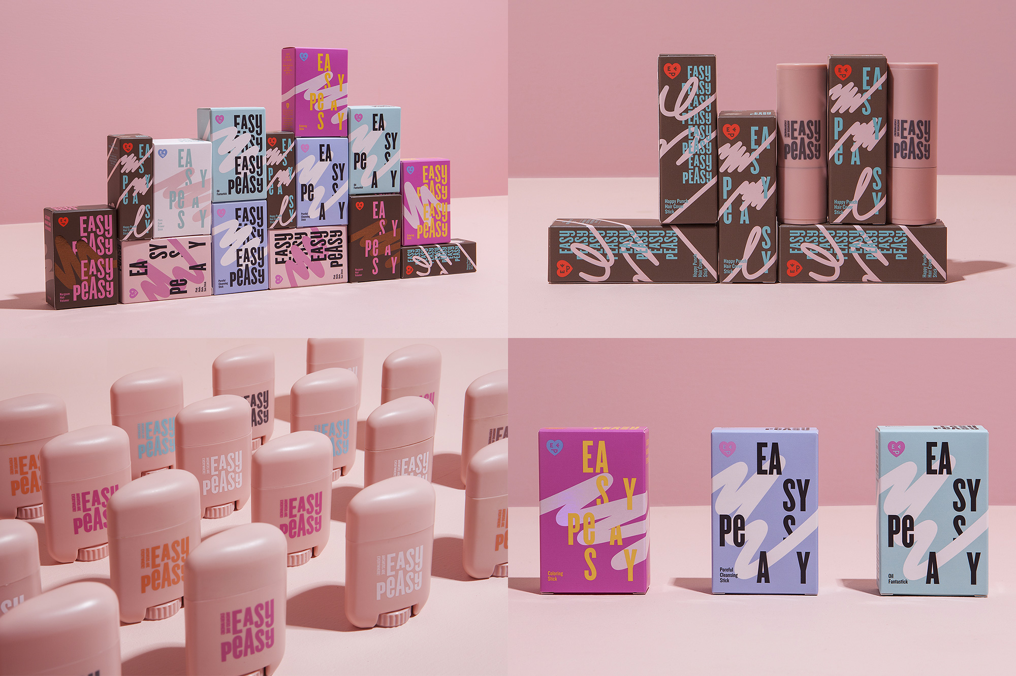
Easy Peasy is a new cosmetic brand recently launched by Amore Pacific, a well-known Korean skincare product company. (I couldn’t find a direct link to the product line but it looks legit.) The identity, designed by Seoul, Korea-based CFC, has a fun 1980s vibe with the thick squiggly line running across packaging and the color palette of Patrick Nagel paintings but, at the same time, it is not so heavily 80s as to be its only merit. The condensed typography is playful and bouncy while the heart-face icon thing in the corner adds another spark. This looks geared towards a younger audience and, in that regard, it works perfectly. See full project
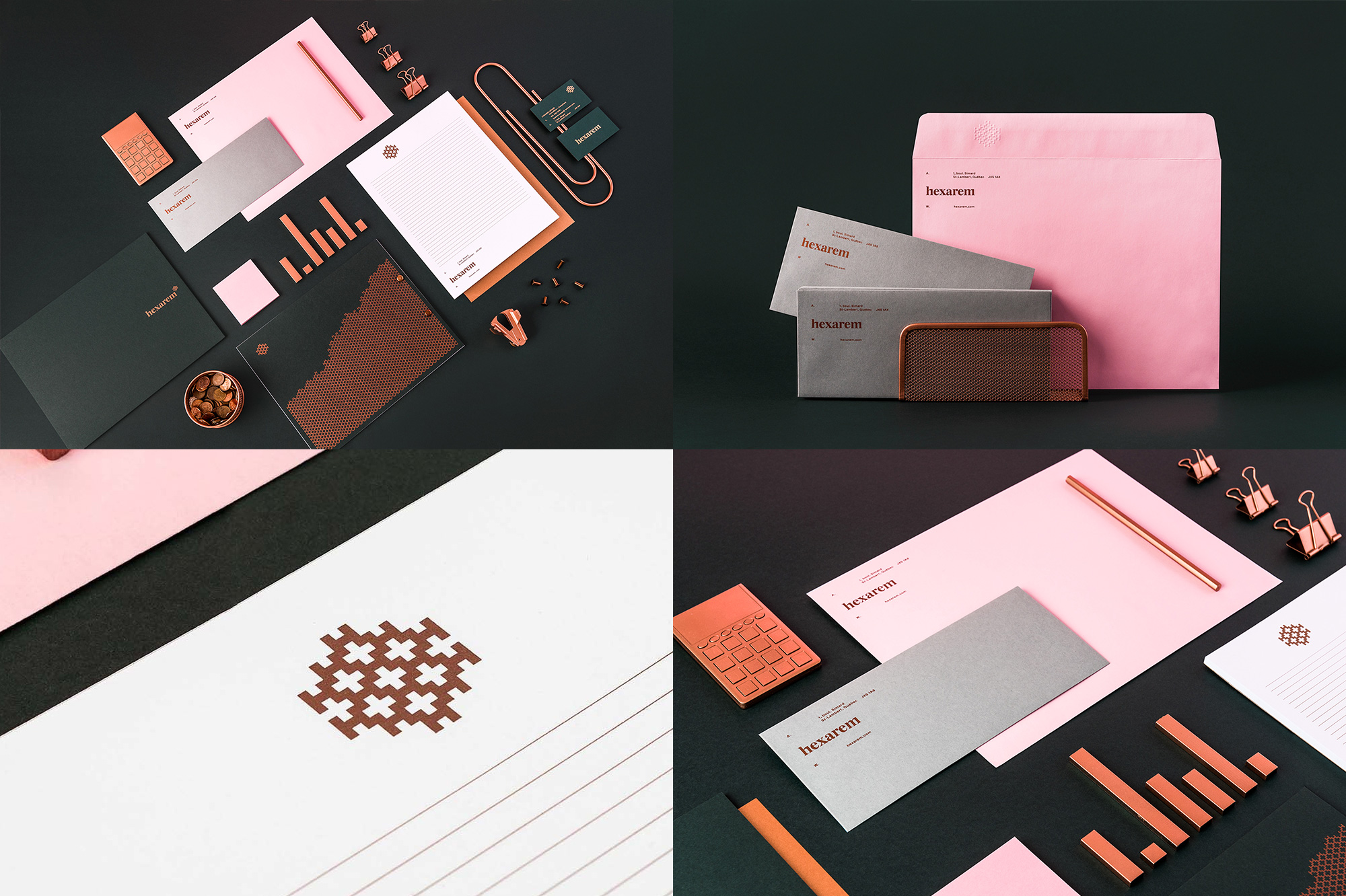
Hexarem in Montréal, Québec, provides executive compensation advisory services to companies. Meaning, I think, that they figure out how much of a lot of money to pay to officers and executives. Ergo, it’s fancy. The identity, designed by local firm BANGBANG, features an icon made from combining various “H”s into a hexagon shape that yields a very elegant and intriguing graphic element. Paired with the somewhat off-kilter serif, it creates a corporate but not too corporate vibe while the color palette of pink, gray, and green creates a sophisticated vibe with a bit of opulence through the use of copper ink. I’m not a big fan of the “H” pattern but I don’t mind it too much. What I want to know, though, is where does one procure giant copper paper clips? See full project

 Новости Союза дизайнеров
Все о дизайне в Санкт-Петербурге.
Новости Союза дизайнеров
Все о дизайне в Санкт-Петербурге.