Обзор лучших ресурсов по разработке бренда, разработке упаковки
contact us | ok@ohmycode.ru
contact us | ok@ohmycode.ru
Some fun, lighthearted fare this week, with projects from St. Petersburg, Miami (Australia), and Kansas City.
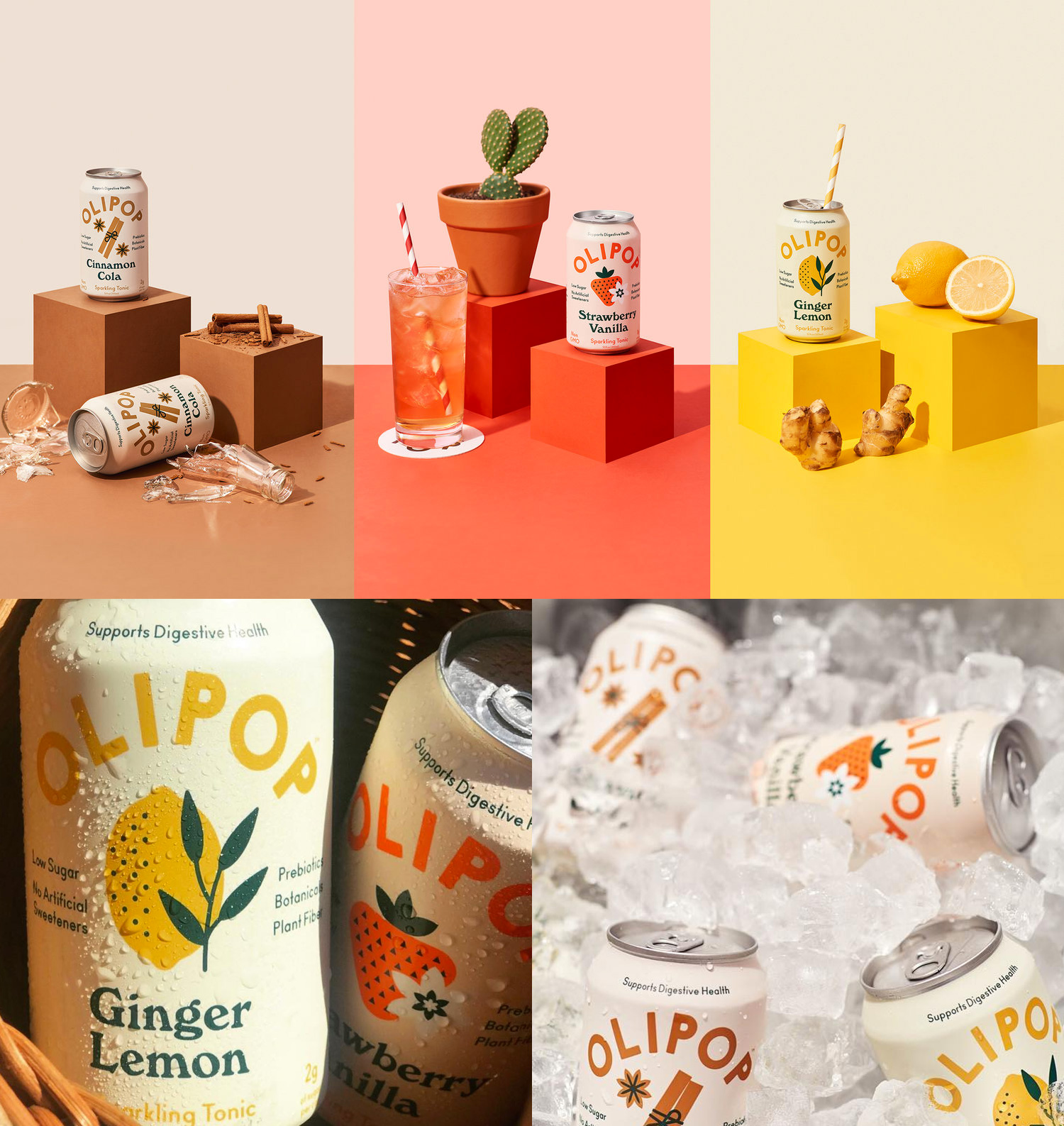
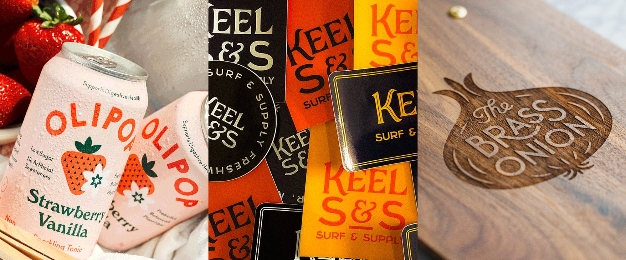
OLIPOP is a sparkling tonic beverage made for digestive health with fiber, probiotics, and botanical extracts. (It used to look like this.) The new packaging, designed by St. Petersburg, FL-based Break Maiden (no relationship to Iron), has a fun mix of elements in the clean sans serif logo on a curve — that, in some applications breaks from the curve and goes whacky — the lovely set of flavor illustrations, and the on-trend Windsor, all in a lovely color palette tied in by the dark green color. Not only will you poop good but you will look good in preparation for doing so while drinking this. See full project
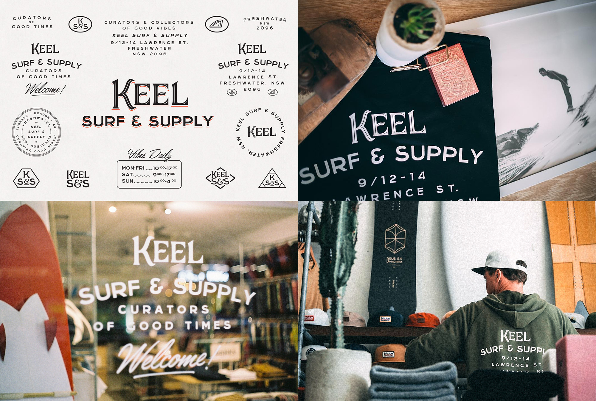
Keel Surf & Supply is, as its name implies, a surf shop for boards and accessories, located in Freshwater, a suburb of Sydney, Australia. The identity, designed by Miami, Queensland-based Chaptr, is pretty straightforward and unsurprisingly surf-shop-y but it’s somehow super pleasing. The combination of decorative serif with the slightly quirky sans serif works great and I like how the main lock-up used in most applications includes the address. All the little graphic doodads are a fun addition. See full project
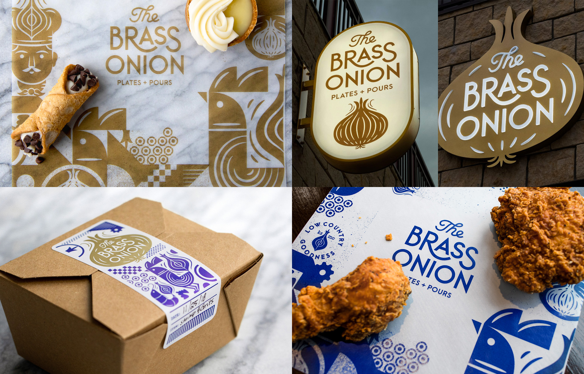
The Brass Onion is a restaurant on Overland Park, KS, serving a contemporary and refined take on comfort food. The identity, designed by Kansas City, MO-based Carpenter Collective, has a comforting feel all its own with some great illustrations that all charmingly revolve around onions while the typography in the logo provides a refined accent for the system. The brass/gold and blue combo is surprisingly nice but what is not surprising is that I want that fried chicken. See full project

 Новости Союза дизайнеров
Все о дизайне в Санкт-Петербурге.
Новости Союза дизайнеров
Все о дизайне в Санкт-Петербурге.