Обзор лучших ресурсов по разработке бренда, разработке упаковки
contact us | ok@ohmycode.ru
contact us | ok@ohmycode.ru
A range of minimalist projects this week, with work from Sydney, Montréal, and Gijón.
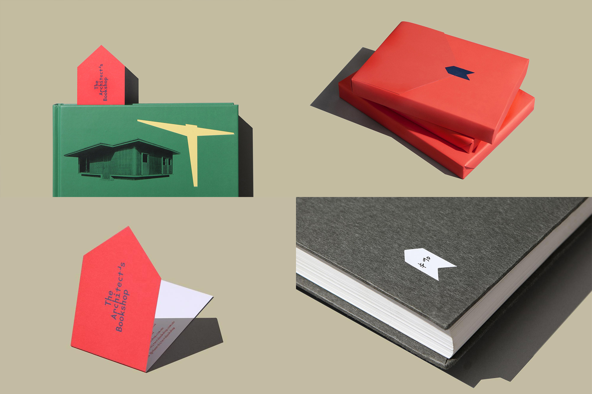
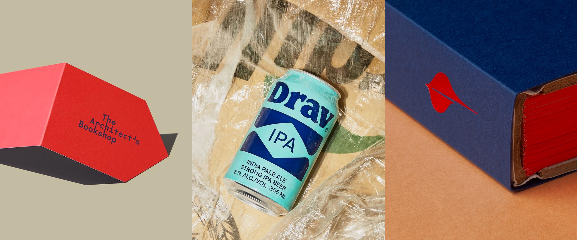
The Architect’s Bookshop is, as its name implies, a new architecture and design bookstore in Sydney, Australia. The identity, designed by local firm Garbett Design, takes the minimalist approach you would expect for an architecture bookstore but manages to imbue it with plenty of personality through the oddball wordmark in a monospace font — Klim Type Foundry’s The Future Mono — that is half futuristic, half Art Deco, and has handy “h”s that look like chairs that have been neatly lined up. The oversize apostrophe is particularly fun too. Additionally, a chevron/arrow device serves as a recurring icon and can become its own bookmark. The subtle red and blue color palette is unexpected and a pleasant surprise. See full project
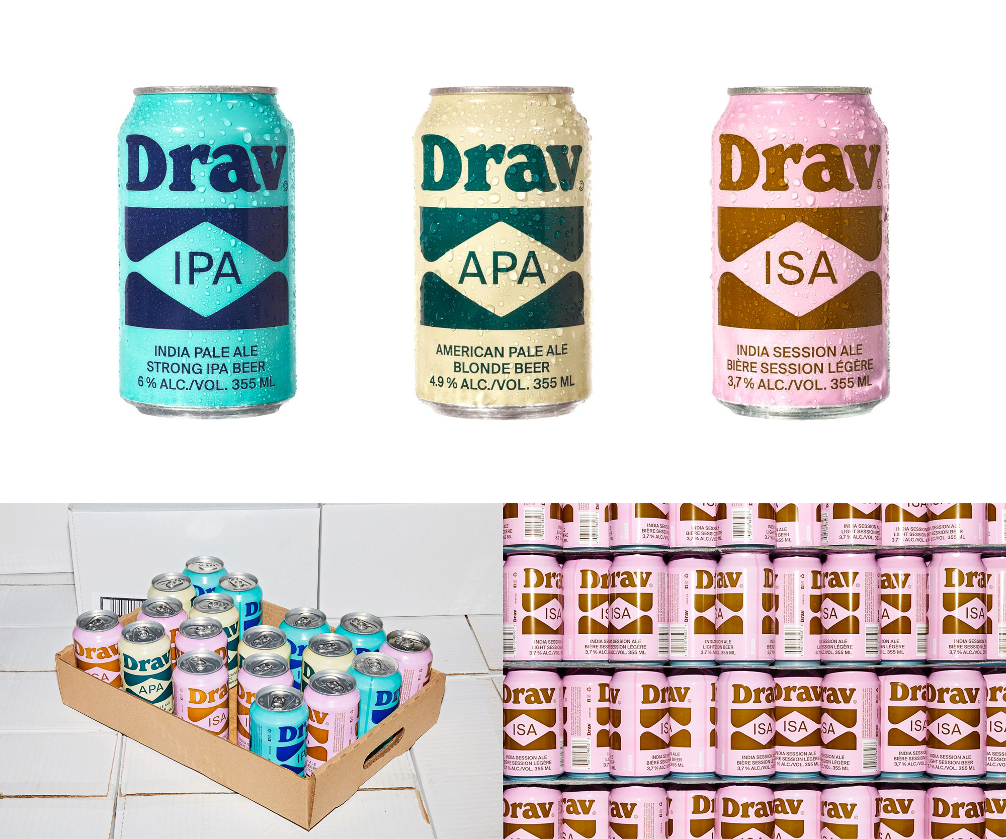
Drav is a brewery that launched last year in Clermont, Québec, to produce beers for “those whose left hand gets cold, but never get cold feet”, whatever that may mean. The packaging, designed by Montréal, Québec-based Wedge, has a hipster aesthetic that, to be honest, I’m not sure I like yet I can’t look away. The cans combine the name in Windsor, naturally; some odd holding shape; and a deadpan sans serif, all in a retro color palette and photographed as if they were models being photographed by Terry Richardson with the bright flashes. I don’t want to like it, but I do. I’m weak. See full project
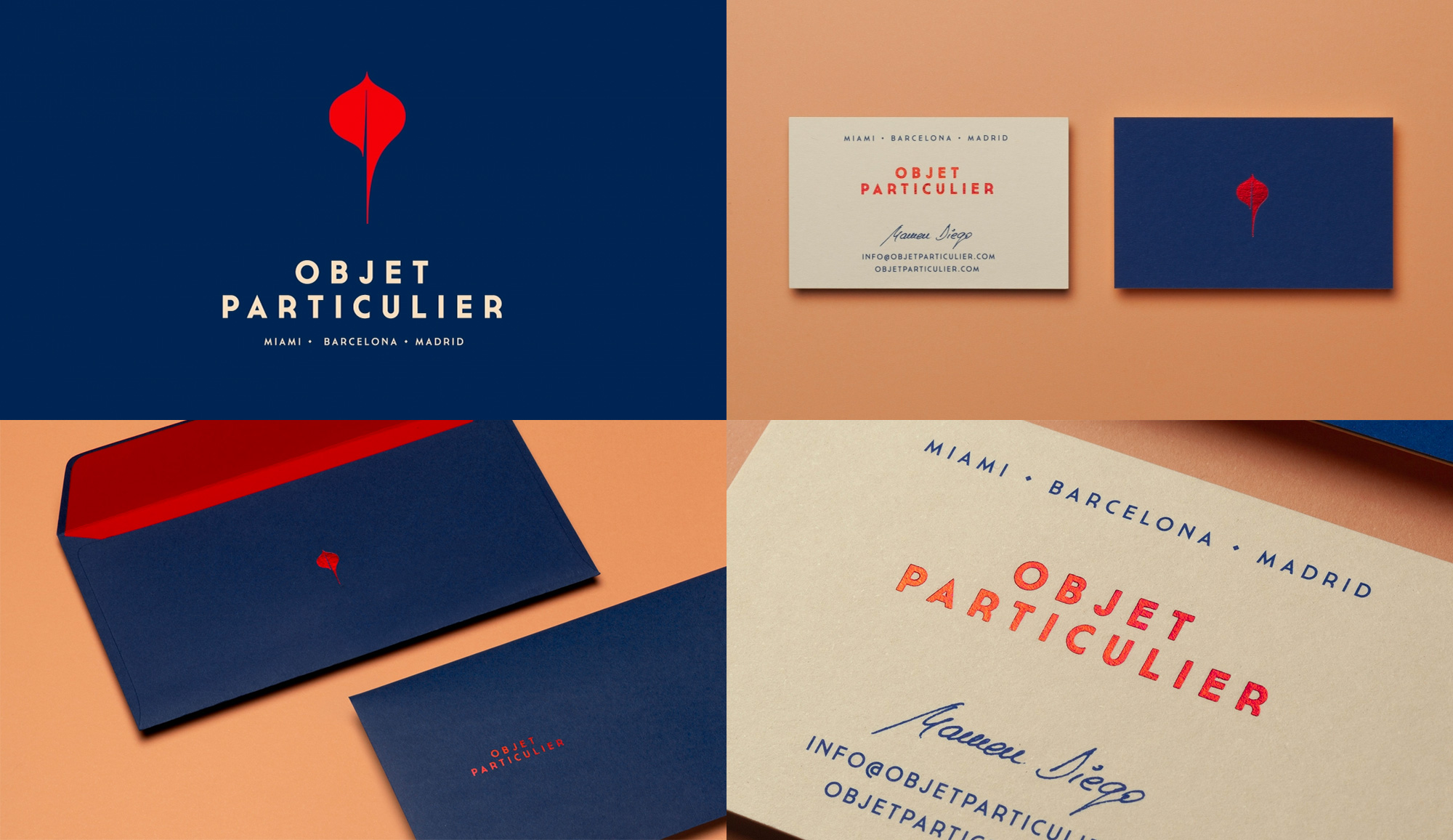
Objet Particulier is a studio in Gijón, Spain, that produces furniture and interior design elements using galuchet, a special kind of leather made of manta ray skin. The identity, designed by local firm atipo, features a lovely icon of a manta ray that forms an abstract “op” monogram. As I write this, I shed a tear for the manta rays, but I digress. Paired with a slightly quirky sans serif and in another blue and red color palette, the icon works as its own particular object, looking elegant and a little eccentric in the applications. See full project

 Новости Союза дизайнеров
Все о дизайне в Санкт-Петербурге.
Новости Союза дизайнеров
Все о дизайне в Санкт-Петербурге.