Обзор лучших ресурсов по разработке бренда, разработке упаковки
contact us | ok@ohmycode.ru
contact us | ok@ohmycode.ru
No recurring theme or connecting thread this week, with projects from Moscow, Graz, and Stockholm.
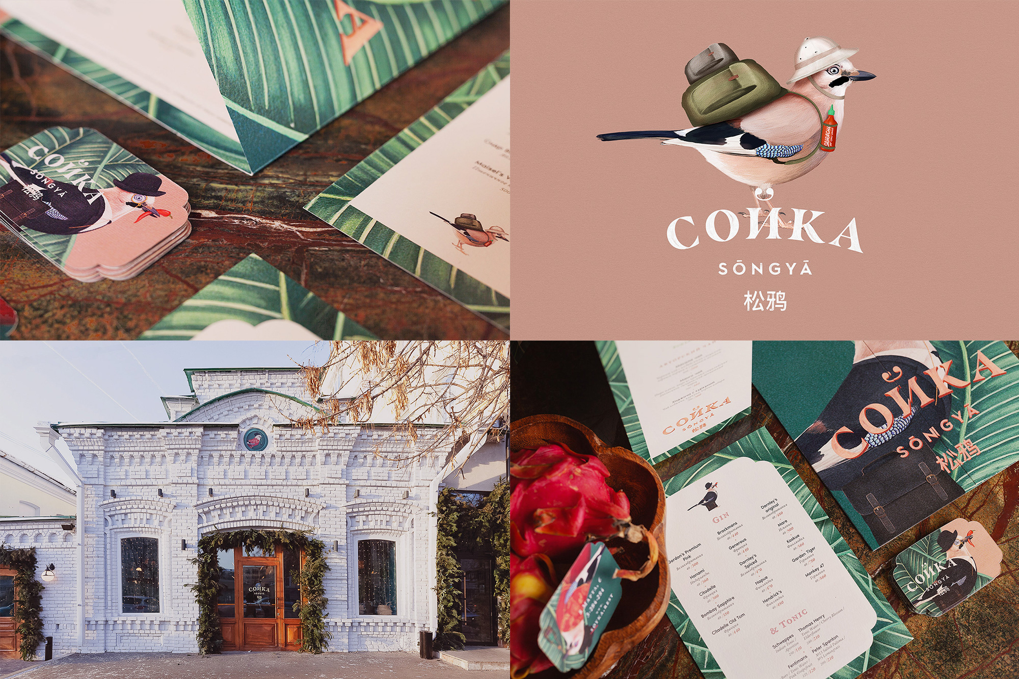
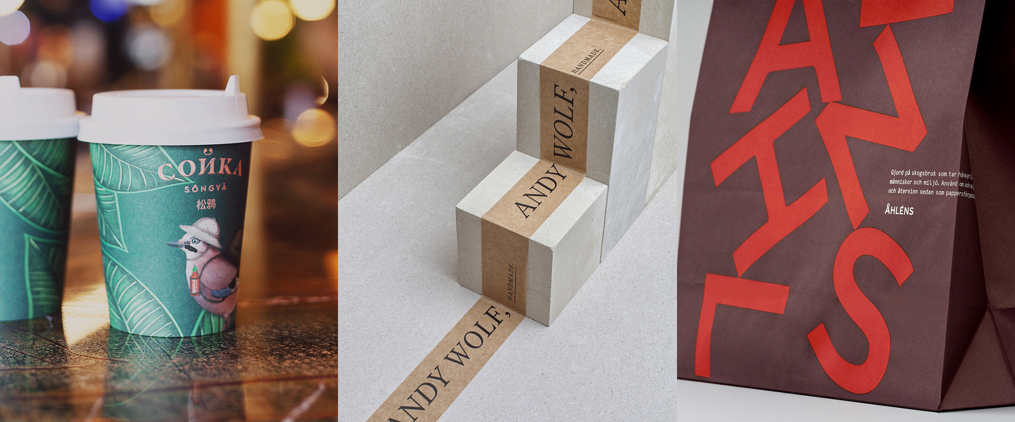
Сойка (“Soyka” phonetically, meaning “Jay” in Russian) is a restaurant in Yekaterinburg, Russia, combining flavors from South East Asia and China. From its stunning little building that looks like a tiny castle to its identity, designed by Moscow, Russia-based The Nineteen, there is a fun surrealism to it. A series of charming illustrations of jays and heavy foliage manage to capture the intent of the designers that is a “playful and juicy visual language that has a strong colonial times general asian flavour with a little Singapore accent” — I would have never been able to put my finger on it but after reading their description it’s, like, yes, it’s exactly that. The detailed illustration style, textured typography, and general lack of white space add up to a rich, ornate, and unique design. See full project
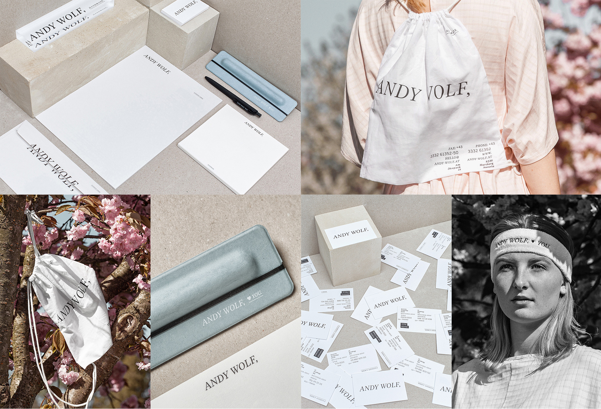
Andy Wolf is an eyewear company based in Hartberg, Austria, that designs, manufactures, and distributes a classy evolving selection of glasses. (Disclaimer: This identity is a bit old, 2016, but still looks fresh.) The italic logo, which existed before but in a different font and with a period, was updated by Graz, Austria-based von K, with a crisper font and changed the period to a comma, adding a bit of whimsy to it, looking like an unfinished, open thought. The applications have a minimalist aesthetic that make the logo with the comma stand out even more. A few instances, like the business cards and tote, have some more relatively intricate type layouts that add some visual texture to the applications. The “♥ YOU” detail goes a long way too. See full project
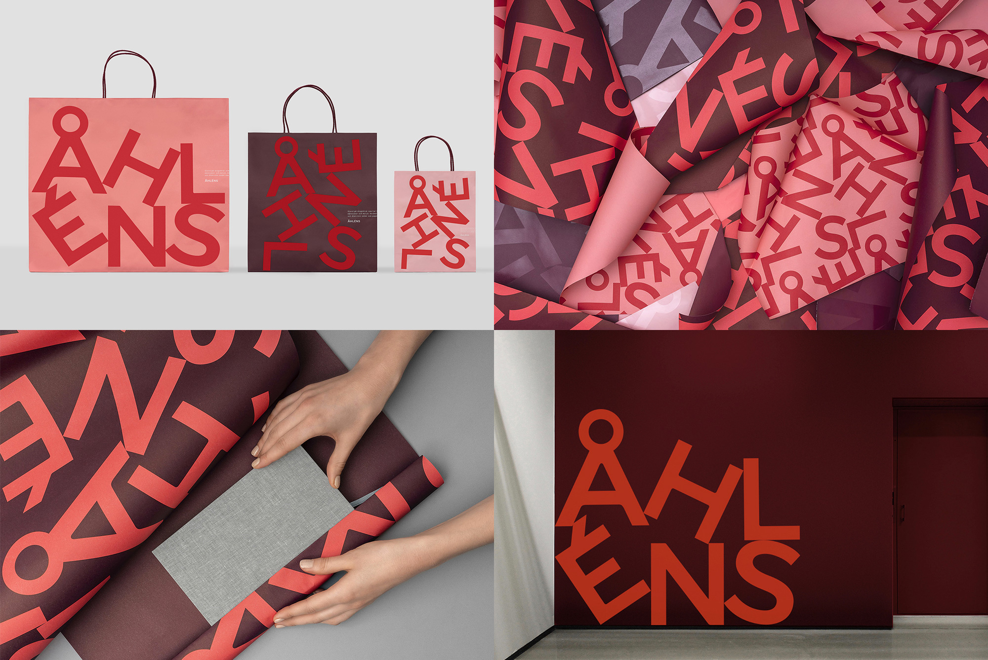
Åhléns is a large retailer in Sweden, with more than 50 department stores across the country and a history that dates back to 1899. A recent update by Stockholm, Sweden-based Happy FB, takes the well-known logo and disassembles it in a playful jumble that can be rearranged to fit in different-shaped areas. The color palette of maroon, red, and pink is sophisticated but also feels a little rebellious somehow. I can’t imagine any American department store looking like this so it’s quite the more enjoyable knowing that this can happen in other parts of the world. See full project

 Новости Союза дизайнеров
Все о дизайне в Санкт-Петербурге.
Новости Союза дизайнеров
Все о дизайне в Санкт-Петербурге.