Обзор лучших ресурсов по разработке бренда, разработке упаковки
contact us | ok@ohmycode.ru
contact us | ok@ohmycode.ru
A range of moody and a little offbeat work this week, with projects from Los Angeles, Dallas, and Brisbane.
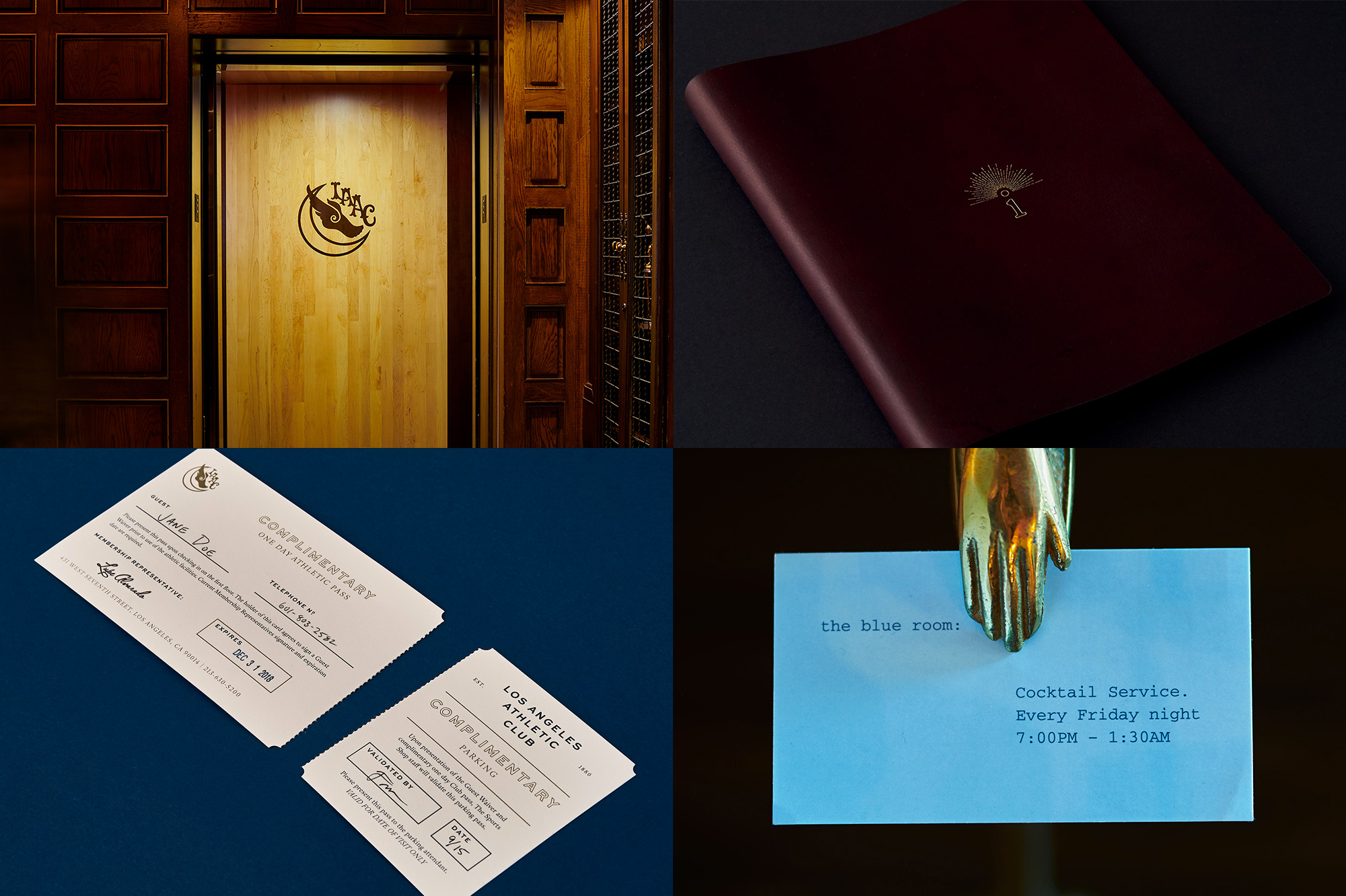
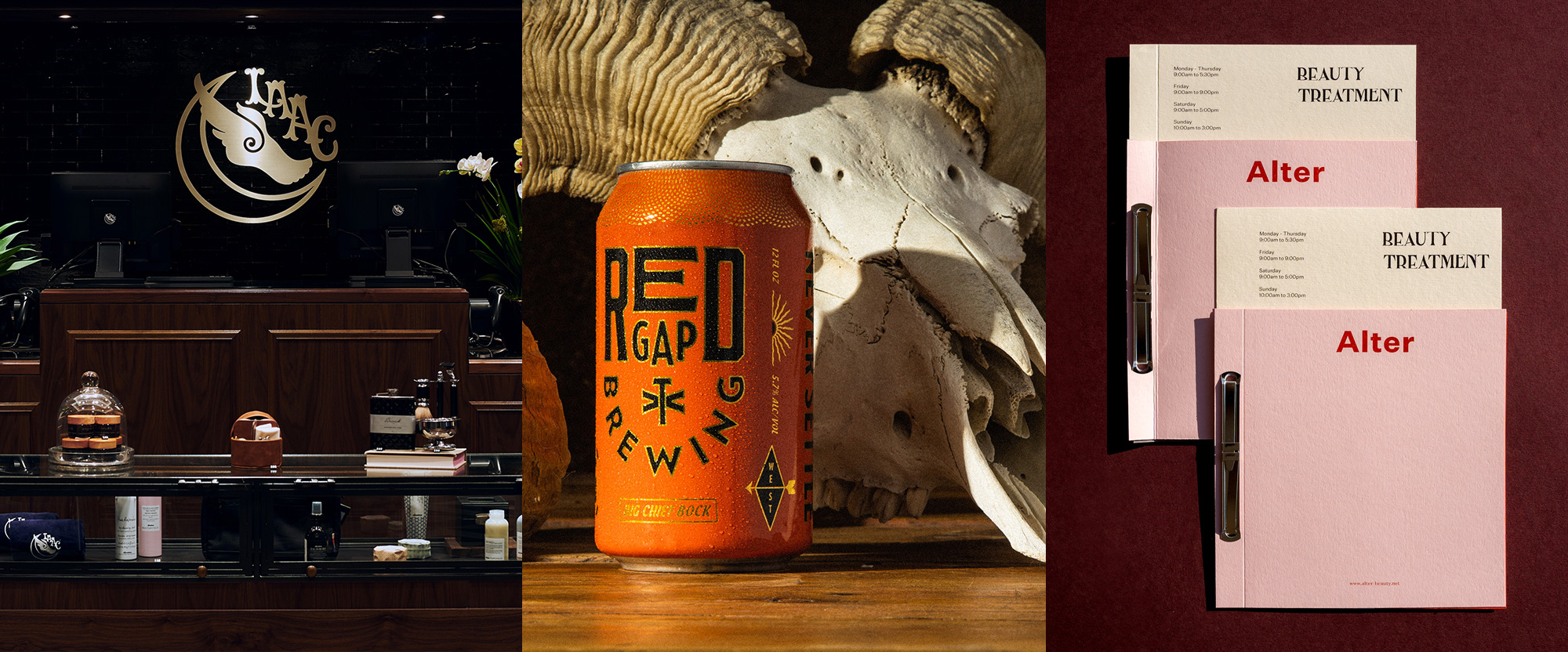
Founded in 1880, the Los Angeles Athletic Club was the city’s first first private club and is now a boutique hotel that has kept the exclusive membership club appeal going, offering an 88,000 square foot fitness facility (with indoor pool and basketball), dining, and a speakeasy bar accessed through a secret bookcase door. Holiday Inn it ain’t. The identity, designed by local firm Club, is subtle and takes a back seat (or plays a complementary role) to the building and its interiors and history by breathing new life into the club’s historic logo. It’s not a stop-you-in-your-tracks identity but there is a lot of nice restraint throughout and a couple of fun sparks in the additional identities for Invention Bar and Blue Room, both with a quaint but luxurious aesthetic. See full project
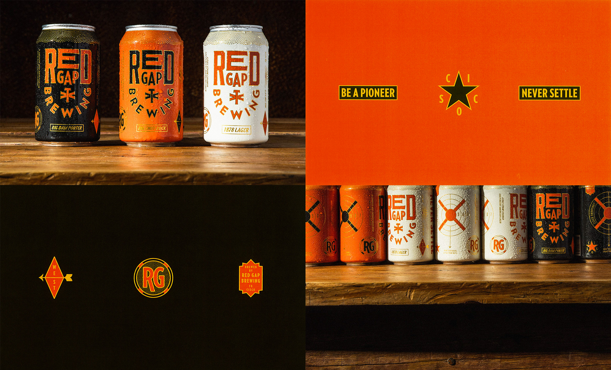
Red Gap Brewing is a micro brewery in Cisco, TX, with a killer taproom in the downtown of this small West Texas town. The identity and packaging, designed by Dallas, TX-based Matchbox Studio is all kinds of small-West-Texas-town goodness, which is a useless thing to say as form of written opinion but there you have it. There is a rugged and clunky genuineness to this that feels right at home. Half the stuff (graphics and patterns and thingamajigs) on the cans, I don’t know what they are or mean but they are very cool to look at all the typographic badges I would wear on a t-shirt without hesitation. The cans are so Texas they have a shooting target on them. See full project
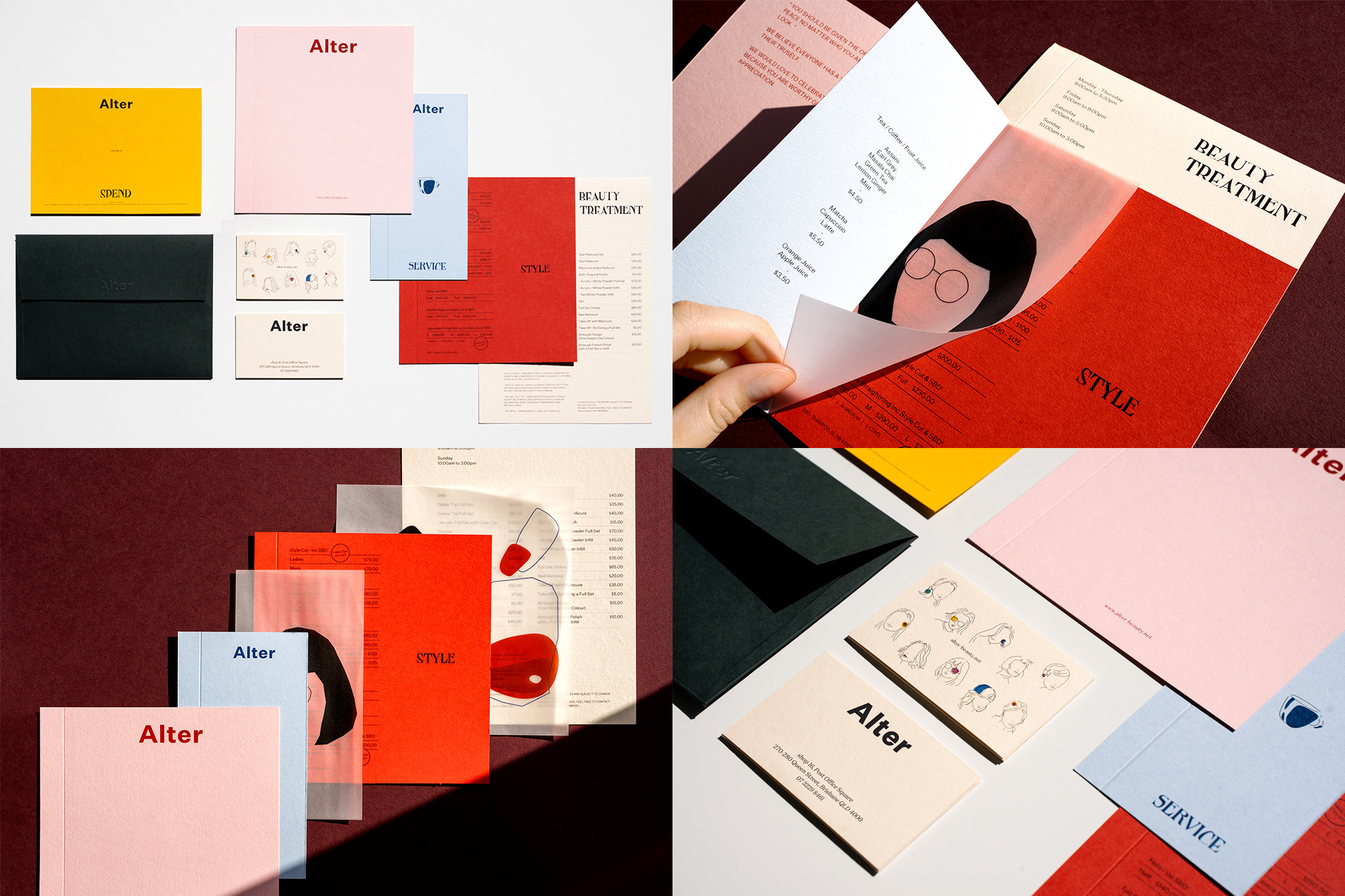
Alter (as in alter ego) is a beauty salon in Brisbane, Australia, specializing in hair and manicure treatments. (I couldn’t find a link or social media account for them but it looks to be real.) The identity, designed by local designer URFD, has an interesting, subtle alter ego thing going with the use of a deadpan sans serif for the name and an extra funky serif as a secondary brand typeface. There are also some illustrations that I’m not a big fan but what got me about the project was the awesome “menu” for the salon’s services, presented in a great combination of color stock brought together with a prong fastener. I really just wanted to write “prong fastener” this Friday. See full project

 Новости Союза дизайнеров
Все о дизайне в Санкт-Петербурге.
Новости Союза дизайнеров
Все о дизайне в Санкт-Петербурге.