Обзор лучших ресурсов по разработке бренда, разработке упаковки
contact us | ok@ohmycode.ru
contact us | ok@ohmycode.ru
Plenty of textures this week, with work from Athens, Brooklyn, and Cape Town.
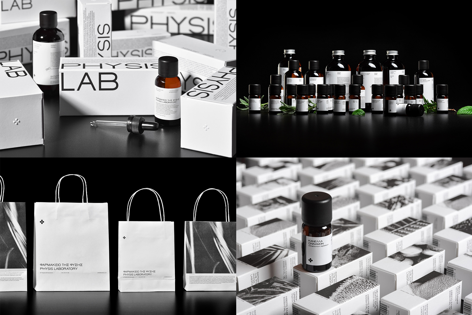
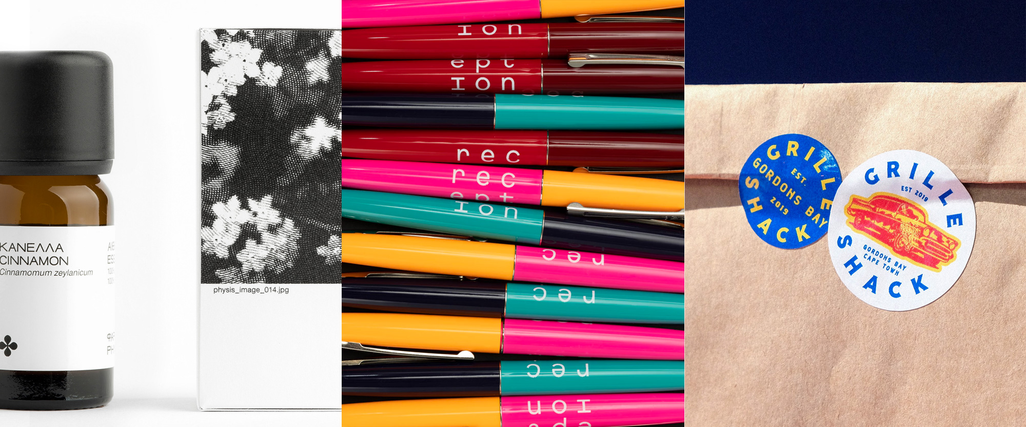
Physis Laboratory is a producer and retailer in Thessaloniki, Greece, of natural wellness products, including homeopathy, tinctures, supplements, oils, as well as cosmetic products and more. Its identity and packaging, designed by Athens, Greece-based Caparo Design Crew has a strict minimalist approach and at first glance may not be the most exciting but after you see the insane amount of products and categories it has been applied to — the project page is non-stop — it will be hard to not nod in agreement. The essential oil packaging with the tight photo crops of its main ingredient with the file name underneath is my favorite but, really, it’s all quite fantastic and so effortlessly adaptable to adding colors and photography when needed without breaking character. As a bonus, a little four-leaf-clover-like icon ties everything nicely together. See full project
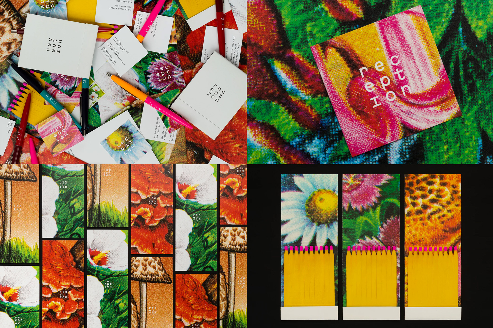
Reception is a Korean cocktail bar in New York, NY, specializing in uniquely flavored cocktails and non-alcoholic drinks. Its identity, designed by Brooklyn, NY-based Order, features beautiful, extremely close-up reproductions of archival Korean postage stamps that reference the herbal ingredients in Reception’s cocktails. The halftone textures and color saturation of the stamps provide a great backdrop for the contrasting monospace typography used in minimal doses. This project also gets the award for best use of stock pen swag — that’s a great vintage-looking find. See full project
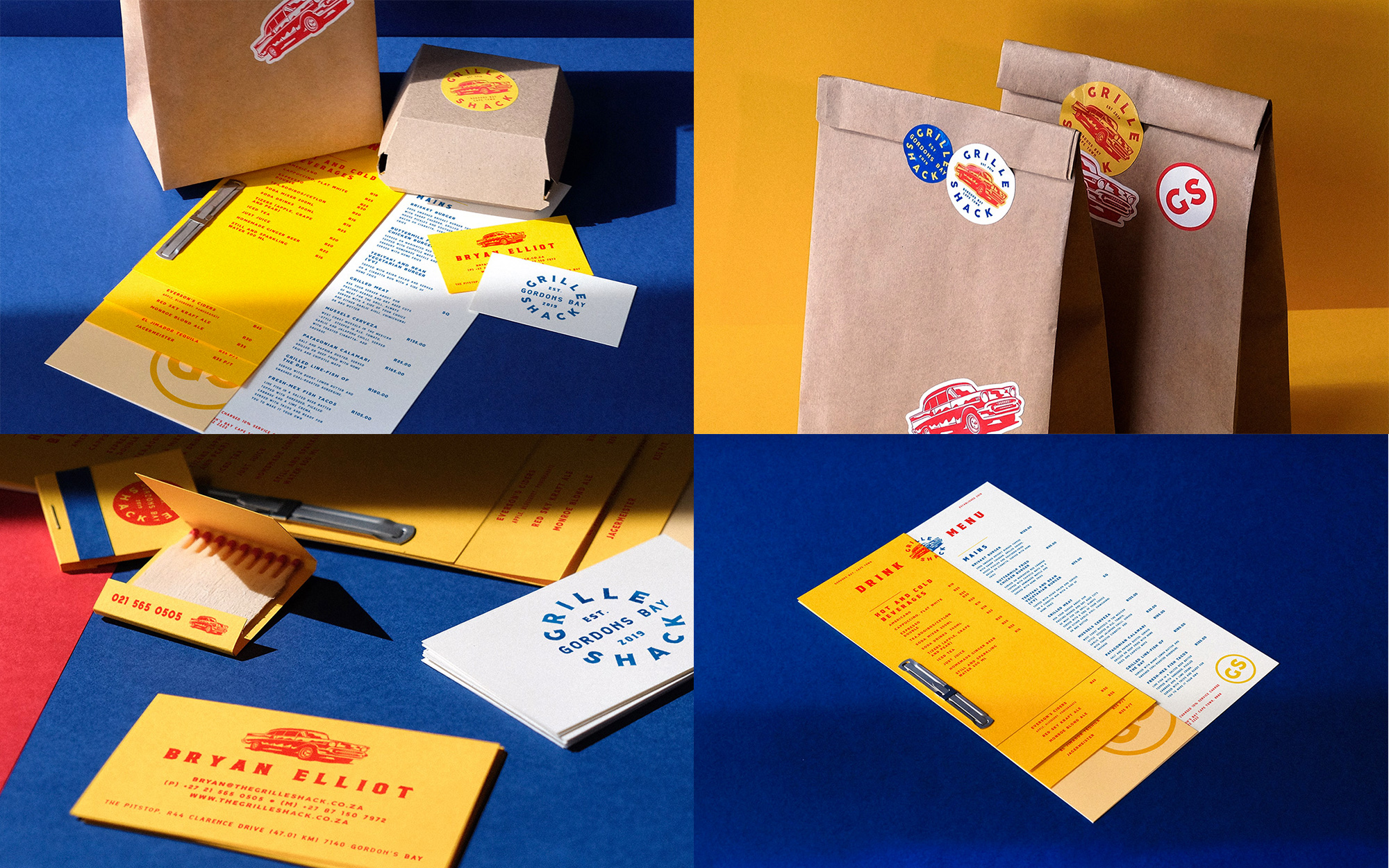
Grille Shack is a restaurant in Gordon’s Bay, a harbour town in the Western Cape province of South Africa, that fuses American BBQ, Fresh-Mex, and Baja California flavors. Its identity, designed by Cape Town, South Africa-based MADE Agency, goes full in for the vintage 1950s Americana aesthetic and nails it through a nice combination of typography, badges, and a killer car illustration. It’s a bit of low-hanging fruit in terms of echoing the style but it’s all nicely done and I think that the menu takes things up a notch, bringing together all the elements nicely, including the color palette with the yellow paper. The use of stickers is a great way to affordably brand all kinds of food take-out packaging. It’s no Love Shack but if you find yourself in Gordon’s Bay, that’s where it’s at. See full project

 Новости Союза дизайнеров
Все о дизайне в Санкт-Петербурге.
Новости Союза дизайнеров
Все о дизайне в Санкт-Петербурге.