Обзор лучших ресурсов по разработке бренда, разработке упаковки
contact us | ok@ohmycode.ru
contact us | ok@ohmycode.ru
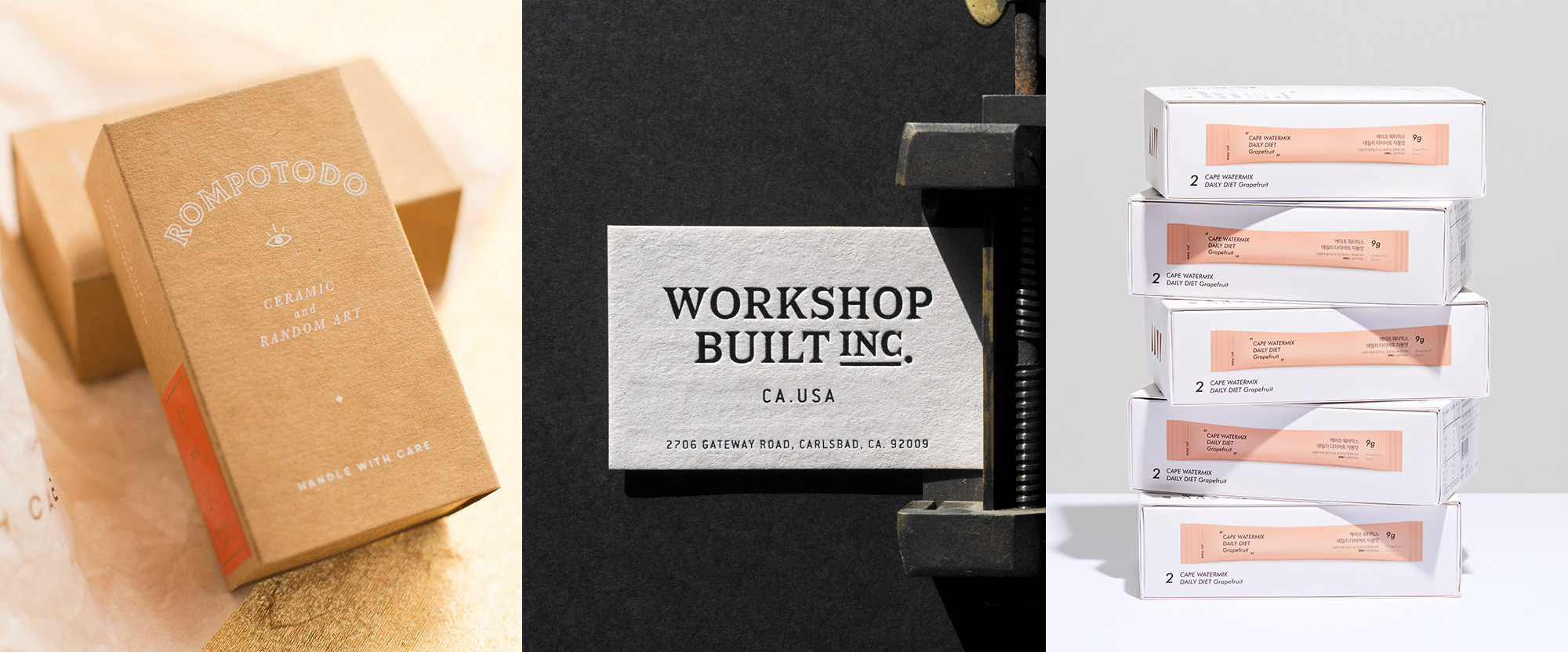
A range of quirky, sturdy, and crisp projects with work from Buenos Aires, Carlsbad, and Seoul, respectively.
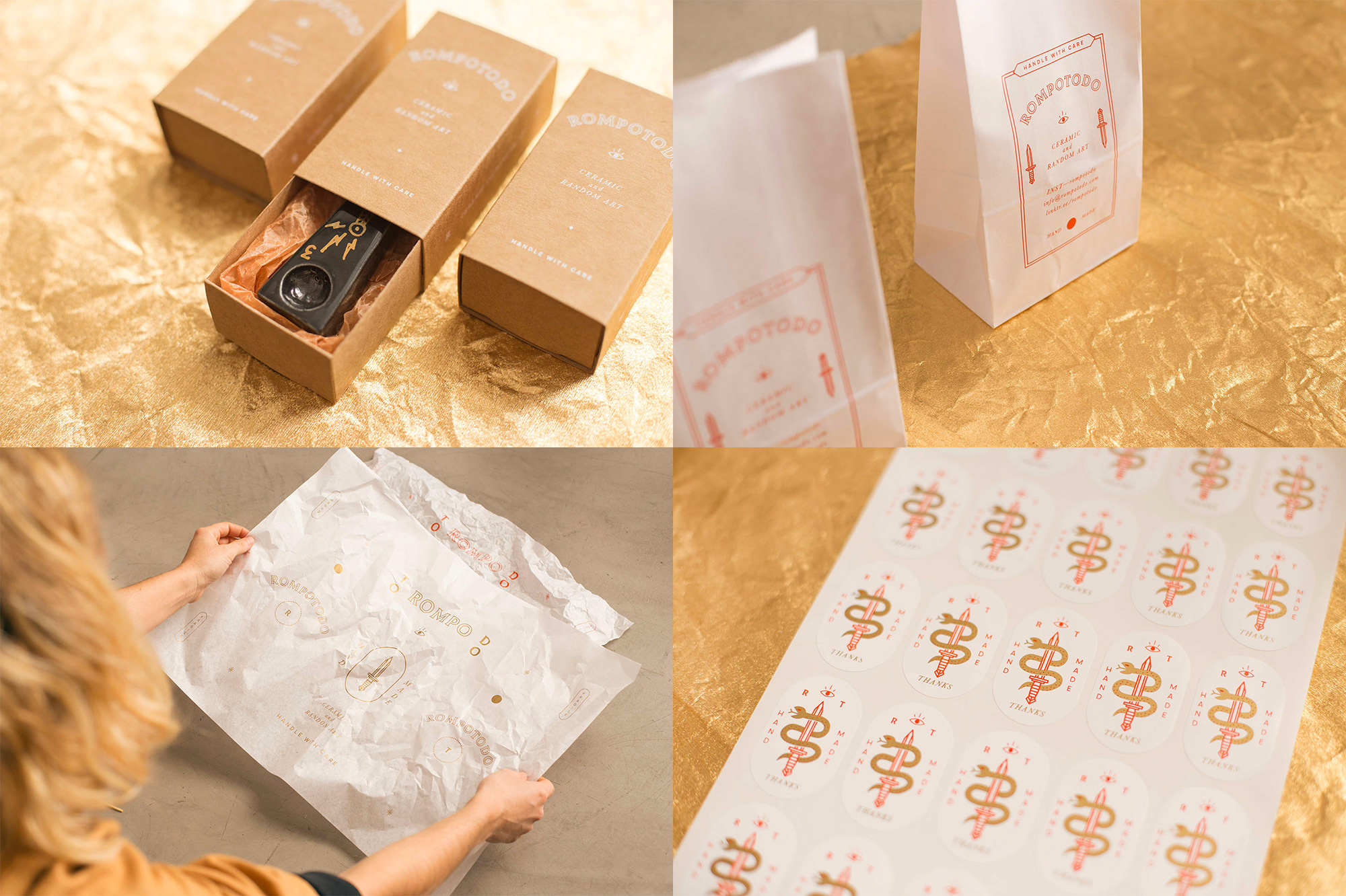
Rompotodo (“Ibreakeverything” in English) is a boutique, handmade ceramic business in Buenos Aires, Argentina, that makes everyday items like salt shakers, coasters, cannabis pipes, and other knickknacks. The identity, designed by local firm Un Barco, checks off a lot of hipster-y treatment boxes — random floating eye, curled serpent, badges, awkward type arrangements, and multiple logos — but it’s hard to not enjoy it. The gold, orange, and kraft-box-brown color palette is great and all the elements are very nicely executed and once you see how eyes, cats, serpents, and other mystical flotsam and jetsam adorn Rompotodo’s products, the identity isn’t as gratuitous as it comes off at first glance. I also like all the different “soft” materials like the tissue paper and wax bags, which serve as a great canvas for all the graphic stuff. See full project
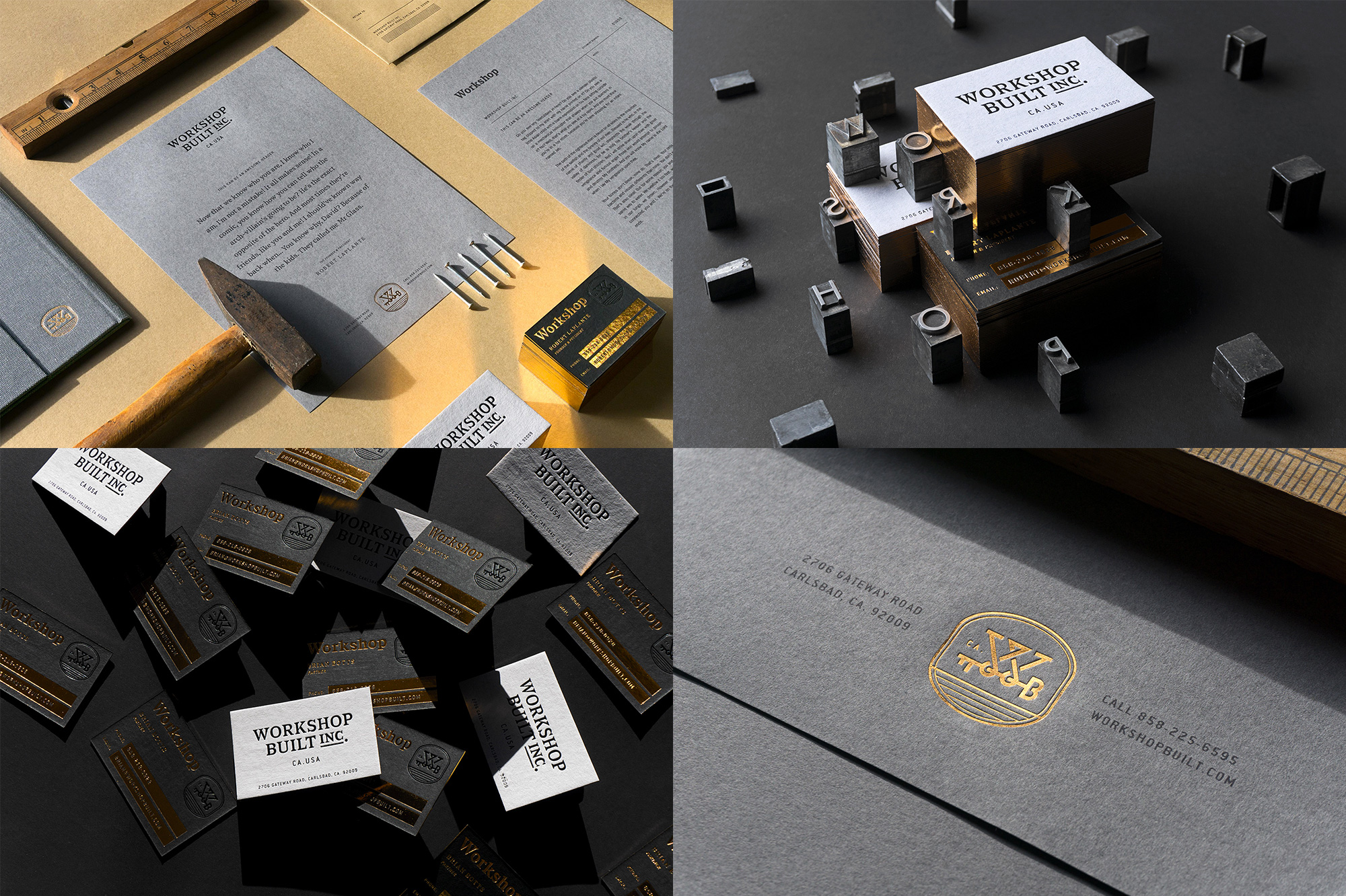
Workshop Built Inc. is a “growth agency, helping to grow business through systems, branding, marketing and sales” based in Carlsbad, CA. The identity, designed by the local office of Mubien (who is a part of Workshop Built Inc.), puts the work and built in Workshop Built Inc. with a combination of a bad-ass serif and a slick sans serif all produced in stunning selections of paper, finished off in Mubien’s own, in-house printing studio. The whole case study is pretty impressive. See full project
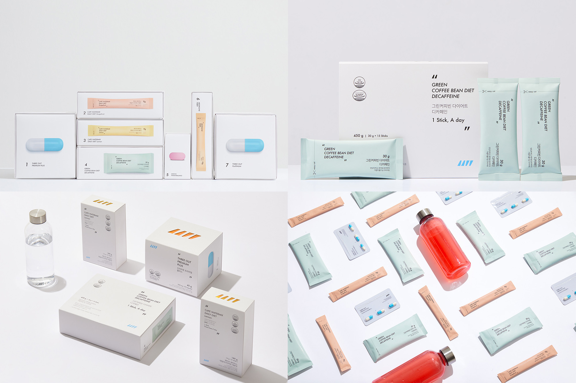
SPRX is — sorry, I couldn’t find a link for it but the whole thing looks too real to be fake — is, reportedly, a diet-management and health-supplement brand offering different kids of pills and powders, possibly in Seoul, South Korea, where AURG Studio, who designed the packaging, is based. Lots of conjecture, I know, but to make up for it is a lovely packaging system with a lot of white space and pastel colors that, if nothing else, will sooth your calories into peaceful bliss. You will see a range of diagonal tick marks and they are meant to be curly quotes so that the packaging can say things to you. The product names, on the boxes and individual packets, are all framed within the quotes — kind of hard to pick up on them without being told but now you’ve been told. The primary use of italic type (for the Latin text) is unexpected and looks quite nice. Overall, 10/10 would dissolve in my water. See full project

 Новости Союза дизайнеров
Все о дизайне в Санкт-Петербурге.
Новости Союза дизайнеров
Все о дизайне в Санкт-Петербурге.