Обзор лучших ресурсов по разработке бренда, разработке упаковки
contact us | ok@ohmycode.ru
contact us | ok@ohmycode.ru
All packaging, all luxury this week, with work from Helsinki, London, and Ho Chi Minh City. Special shoutout this Friday to The Brand Identity, which is a constant source of reference for Friday Likes and in this edition all projects were spotted there first (except for Henua, which I ended up on after clicking through another project).
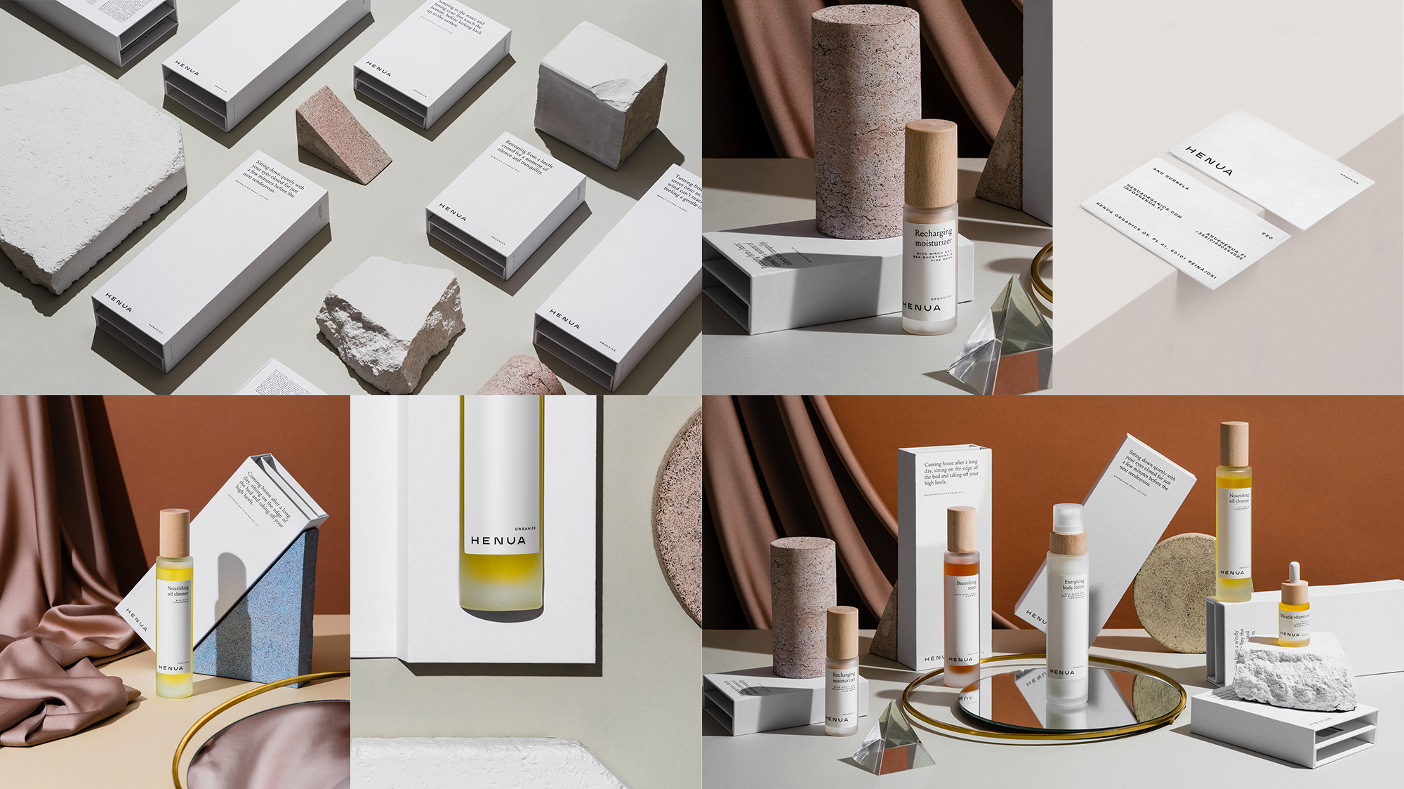
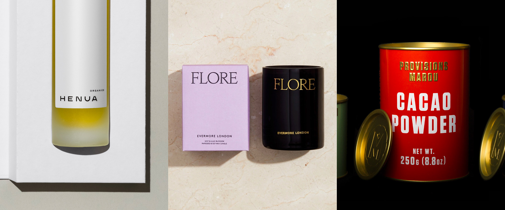
Henua Organics is a premium skincare brand based in Finland that contains organic and only active ingredients, including Nordic classics like birch sap. The identity and packaging, designed by Helsinki, Finland-based Werklig, equally evoke a Nordic state of mind with an extra clean, contemporary, and just the right amount of weird approach. The latter is manifested in the wordmark where the “N”, “U”, and “A” look as if they have been cropped very tight on the top and bottom, transforming an otherwise basic sans serif into something much more interesting. The packaging uses 205TF’s Louize with Trade Gothic for a lovely set of boxes and labels with a stark simplicity that complement the beautiful frosted bottles with wooden caps. Would definitely smear on my mug after a long day of blogging. See full project
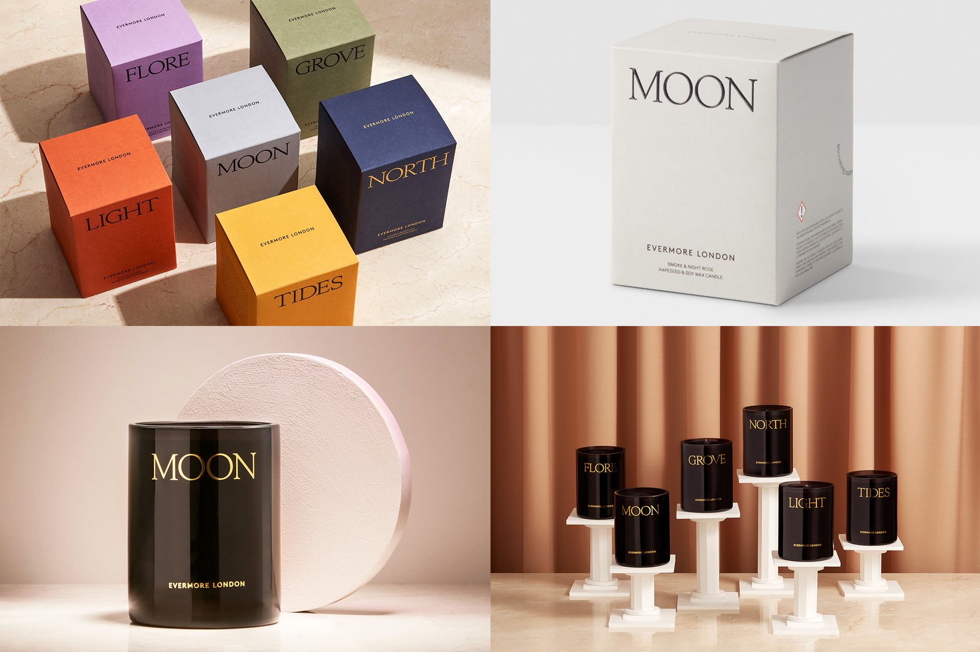
Evermore London is a brand of hand-crafted, sustainable, vegan, luxury candles based, as its name implies, in London. The packaging, designed by local firm POST revolves around an elegant serif — anyone able to identify it? — that is confidently and prominently used in the boxes and candle vessels. The former in a lovely range of colored, textured paper in black foil and the latter in a bad-ass black cylinder in gold foil, all punctuated by a Gill Sans-esque sans. The only questionable element (not shown above) is the back of the vessels that have some text in a curve as if it were the smoke of the candle which is oddly cheesy. But we are here to celebrate, so light up those sustainable vegan candles y’all! See full project
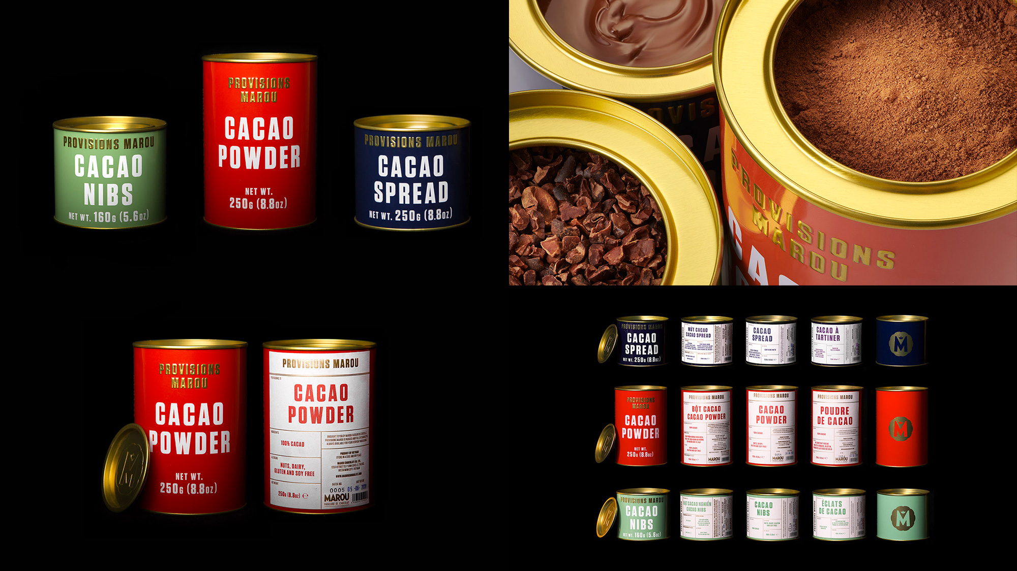
Provisions is the not-as-luxurious range of cacao powders, nibs, and spreads from Vietnam-based luxury chocolatier Marou. Designed by Ho Chi Minh City, Vietnam-based Rice Creative, who have designed most (maybe all) of Marou’s products (and identity), the packaging is as straightforward as it gets with a single typeface — Tungsten — and nothing more. But it’s the loose spacing in the product type, the embossed gold reproduction of the product range, and the rich colors contrasting against the gold cans that make this a beautiful exercise in simplicity. To top it all off you then have the mouthwatering chocolate color once you open the cans as the most magnificent color in the palette. (Sorrynotsorry, I love chocolate.) See full project

 Новости Союза дизайнеров
Все о дизайне в Санкт-Петербурге.
Новости Союза дизайнеров
Все о дизайне в Санкт-Петербурге.