Обзор лучших ресурсов по разработке бренда, разработке упаковки
contact us | ok@ohmycode.ru
contact us | ok@ohmycode.ru
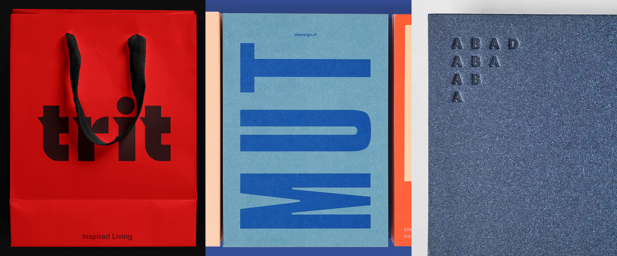
A range of typographic-driven identities this week, with work from Melbourne, Toronto, and Getxo.
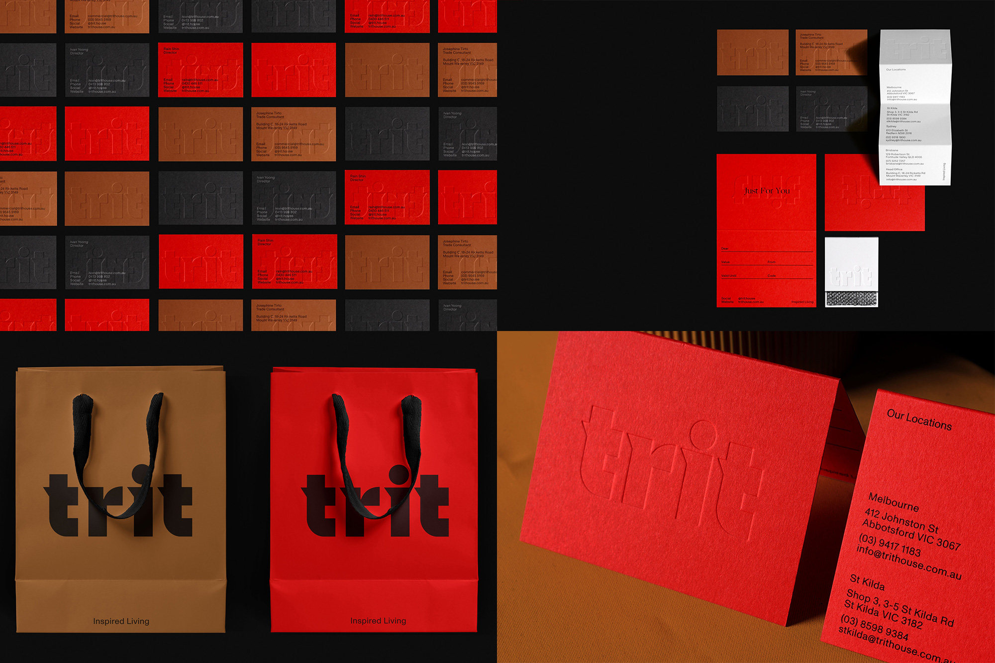
Previously named “Clickon Furniture”, Trit House is a furniture designer and retailer with five showrooms across Australia that aside from selling their own products offers a selective curated collection from other brands. Trit’s new identity, designed by Melbourne-based Office of SPGD, revolves around a fantastic custom wordmark in a style that defies categories, unless you consider Heck Yeah a typographic category. I really like the boldness, the tiny spikes, the giant tittle, and the odd “r”. It looks even better in applications where it’s embossed/debossed as it adds an even stronger sense of weight and density to it. The color palette of red, black, and dark mustard is super tasty and even cozy, perfect for some furniture shopping. See full project
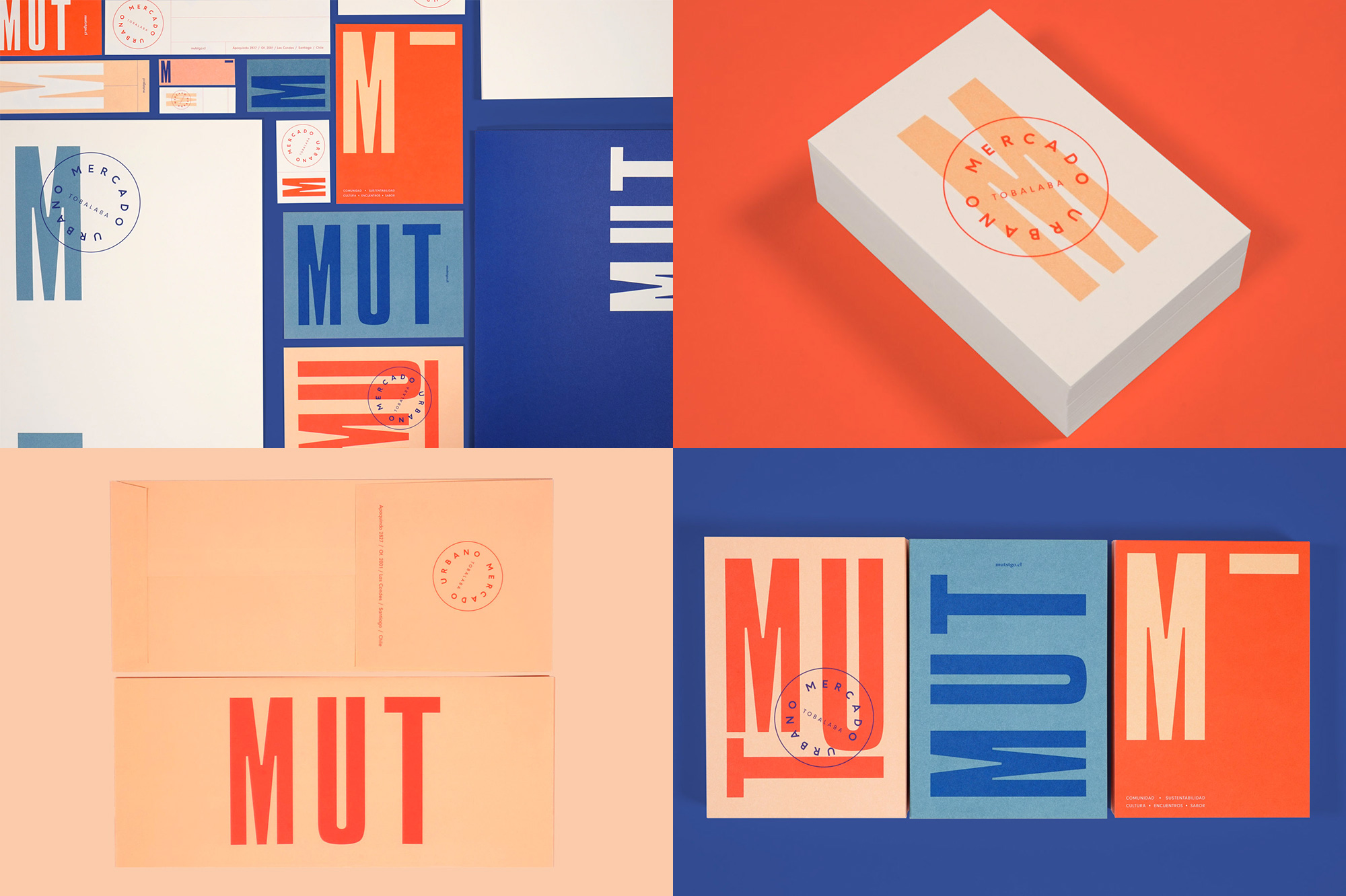
MUT (Mercado Urbano Tobalaba) is a mixed-use development in Santiago, Chile, that brings together eight floors of retail, four office towers, and over 92,000 square feet of green space. The identity, designed by Toronto, ON-based Blok Design, is self-described as “[honoring] its sense of place with a typography inspired by local iconography and colours taking their cues from the Chilean landscapes and textiles”, which, since I have not been to Santiago myself I cannot attest to but what I can attest to is that I really like the extra tall, extra loosely spaced, extra ink-trapped letters for the logo as well as the light/dark blue and orange color palette and even the hipstery type-in-a-circle seal-like device. The applications are pleasant, energetic, and nicely varied, sort of conveying a sense of the multiple options and possibilities of this new development. See full project
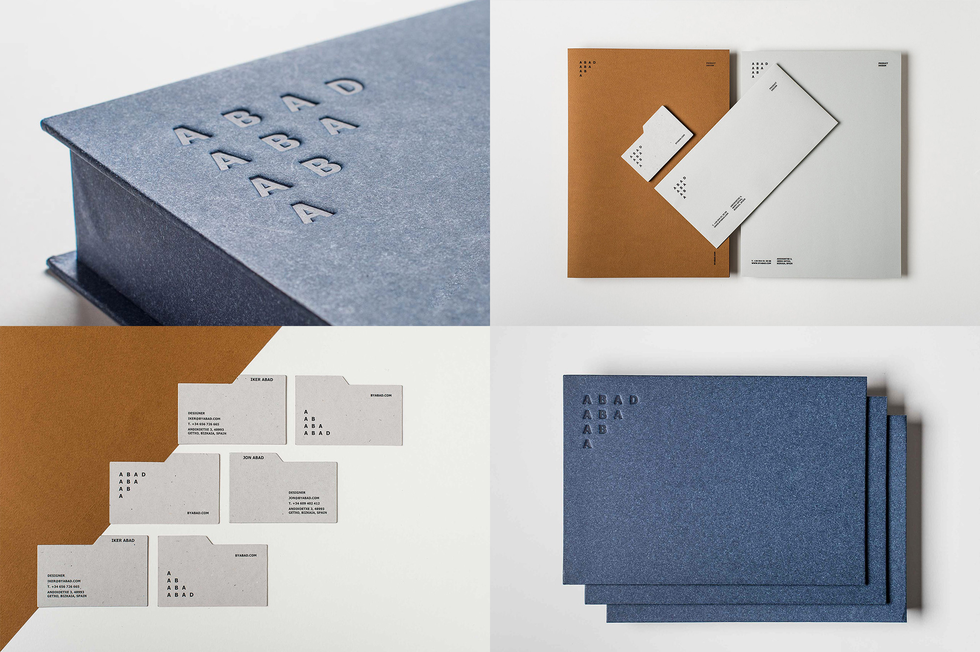
Abad is the product design studio of brothers Jon and Iker Abad in Getxo, in Basque Country, Spain. The identity, designed by local designer Marina Goñi Estudio, features a great wordmark that takes advantage of the four-letter name in a novel and playful way, repeating the letters in a way that forms a strong angled composition and allows the name to be read once horizontally and once diagonally again. It’s such a simple typographic exercise and it looks so good. I wish the applications used something other than Verdana as I get heavy IKEA vibes and even the tab-folder device is a little odd but the color palette and paper stocks are great and the debossed application on the box is scrumptious. See full project

 Новости Союза дизайнеров
Все о дизайне в Санкт-Петербурге.
Новости Союза дизайнеров
Все о дизайне в Санкт-Петербурге.