Обзор лучших ресурсов по разработке бренда, разработке упаковки
contact us | ok@ohmycode.ru
contact us | ok@ohmycode.ru
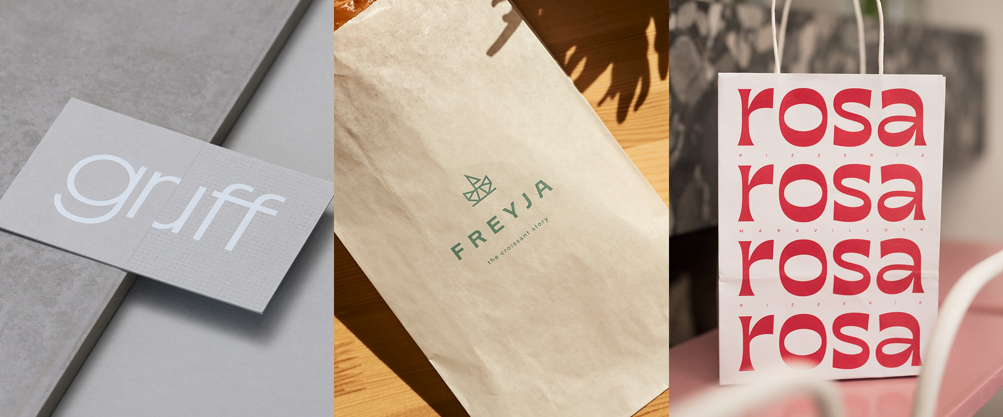
A minimalist-ish and fun-ish range of projects this week, with work from London, Budapest, and Montevideo.
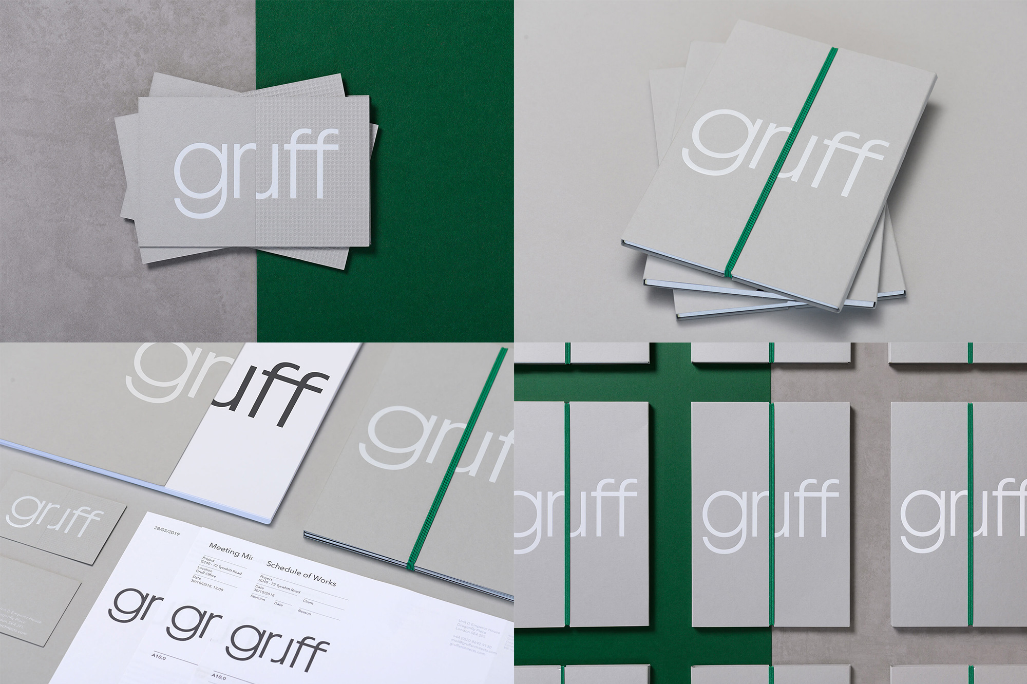
Gruff is an architecture firm in London, UK, with a wide practice in retail, residential, and commercial projects. (Their work is pretty nice.) The new identity, designed by local firm TM, revolves around a great wordmark with a clever — and, to my eyes, previously unseen — treatment of “ru” where the “u” is the “r” rotated. This makes the “r” and the “u” appear very condensed next to the other letters but when you look at it more like a ligature, the “ru” pair has a similar width to the “g” and the actual “ff” ligature. The trick is obviously better when there is something that divides the “r” from the “u”, whether it’s the pattern on the business cards or the green band in the project packet but even on its own I find it highly satisfying. The applications are great too, with the gray, white, and green color palette all working to accentuate and highlight the logo. See full project
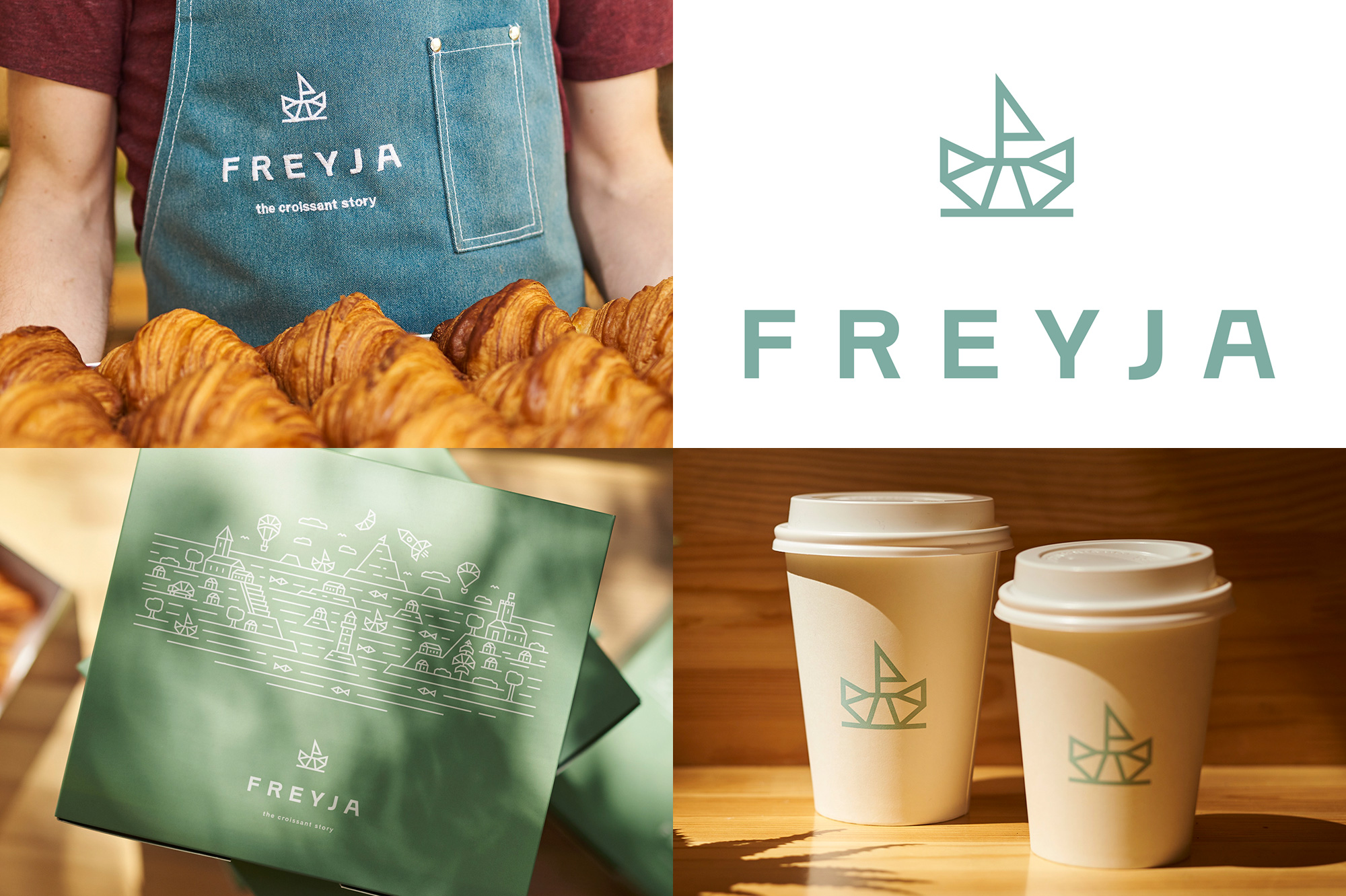
Freyja is a croissanterie in Budapest, Hungary, that makes some decadent-looking croissants and then fills them with sweet and savory options. Designed by local firm Studio NUR, the identity is very straightforward with a lot of white space and a limited color palette of jade green and white with the logo on things… but, folks, the logo is a cute boat made from a croissant and I’m dying. It brought a smile to my face when I saw it. It’s a simple, charming idea and it’s complemented with a cool wordmark that follows the hard-angle construction of the icon (at least the “A” does). I kind of wish the identity were a little bit “louder” with a bigger logo, bigger colors, and overall bigger presence, but I can appreciate the peace and calmness they went with. As a bonus, there is a large illustration where everything depicted in it is made of croissants. Insert crying-laughing emoji here. See full project
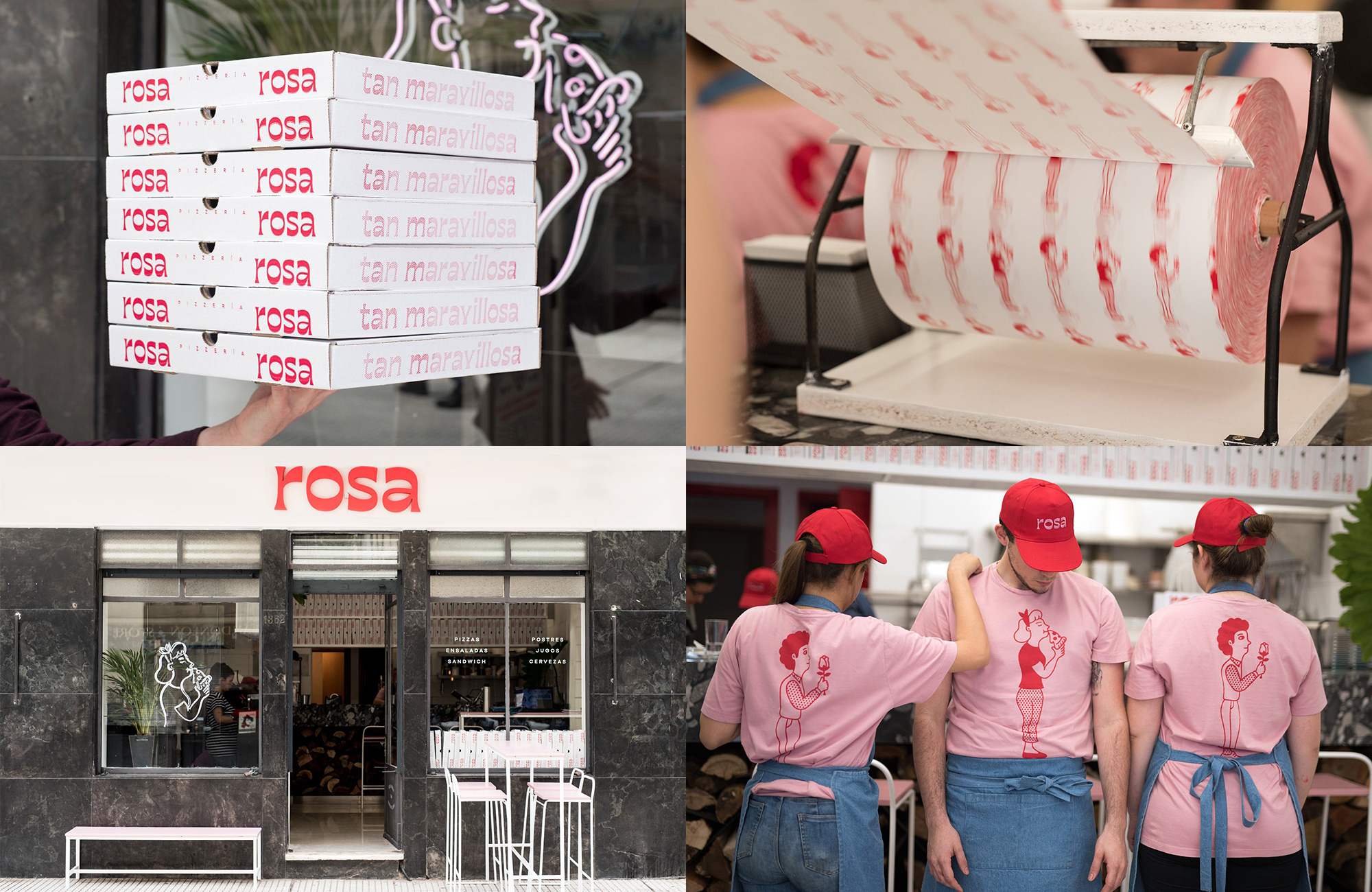
Rosa is a pizzeria in Montevideo, Uruguay, slinging “slow-fermenting dough pizzas cooked in a wood-fired oven” pies. The name, aside from translating to rose, the flower, also translates to pink in Spanish and this is the pink-est pizza place identity you are most likely to see. Designed by local firm, Mundial, the identity revolves around a very quirky flared serif full of personality that looks great everywhere, from pizza boxes to hats to facade. Unrelated to the logo but fun in their own right are a set of illustrations of a man with a rose and a woman with a pizza and if human relations were as simple as that — not focusing on the genders but the gesture of rose + pizza = life — we would all be better off in this world. Also if we used more fun fonts. See full project

 Новости Союза дизайнеров
Все о дизайне в Санкт-Петербурге.
Новости Союза дизайнеров
Все о дизайне в Санкт-Петербурге.