Обзор лучших ресурсов по разработке бренда, разработке упаковки
contact us | ok@ohmycode.ru
contact us | ok@ohmycode.ru
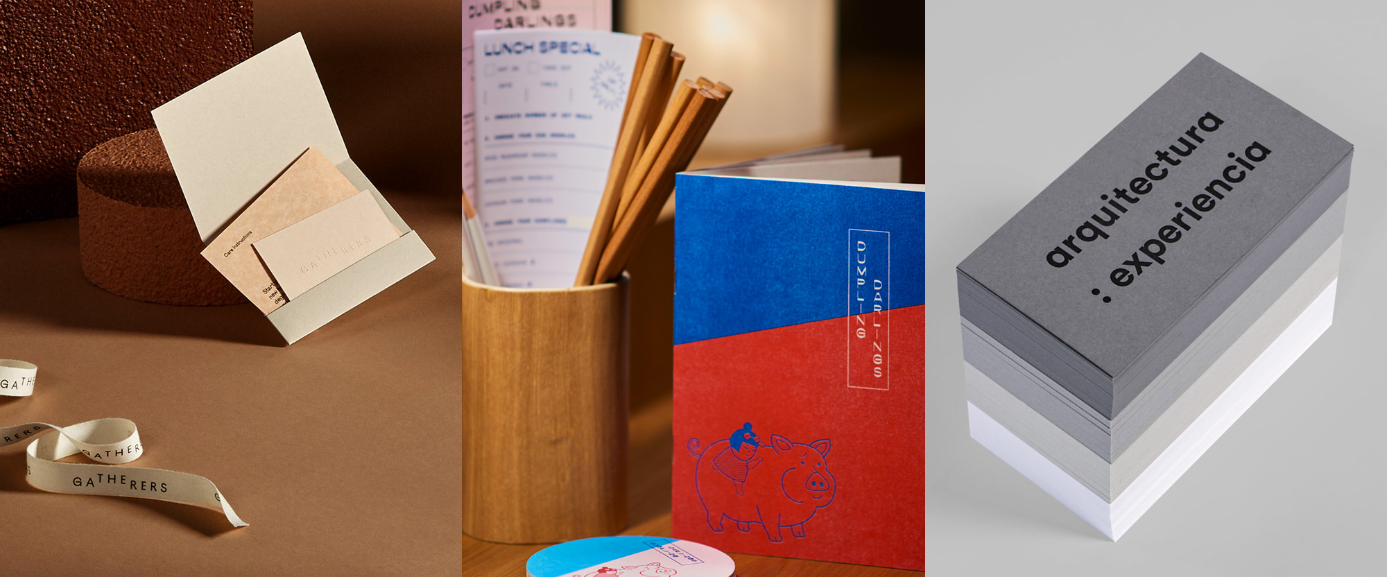
We go from elegant to quirky to business-minded this week, with projects from Melbourne, Singapore, and Toronto.
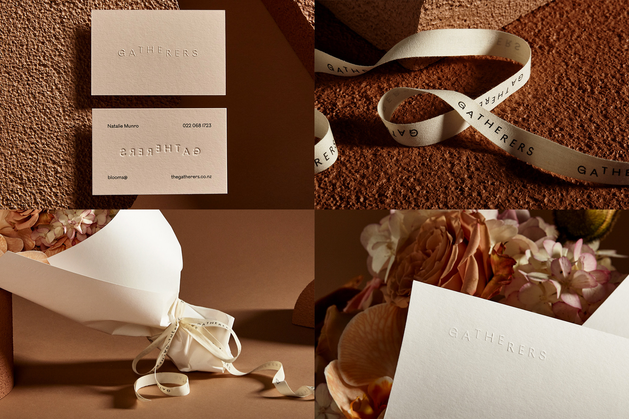
The Gatherers is a floral studio in New Plymouth, New Zealand, that creates some stunning, natural arrangements for weddings and events. The identity, designed by Melbourne, Australia-based Mildred & Duck, is a lovely display of subtlety, combining “THE” and “GATHERERS” into a single word by ever so slightly lifting “THE”. Even if you only read it as “GATHERERS” the raised “THE” could be interpreted as the picking of flowers. The type choice is elegant and the letter spacing adds to that mood, along with the classy production of embossing the logo and choice of natural-looking papers. My favorite element is the ribbon… the long wordmark looks really good on it and I really like its canvas-y texture. 10/10 would gather. See full project
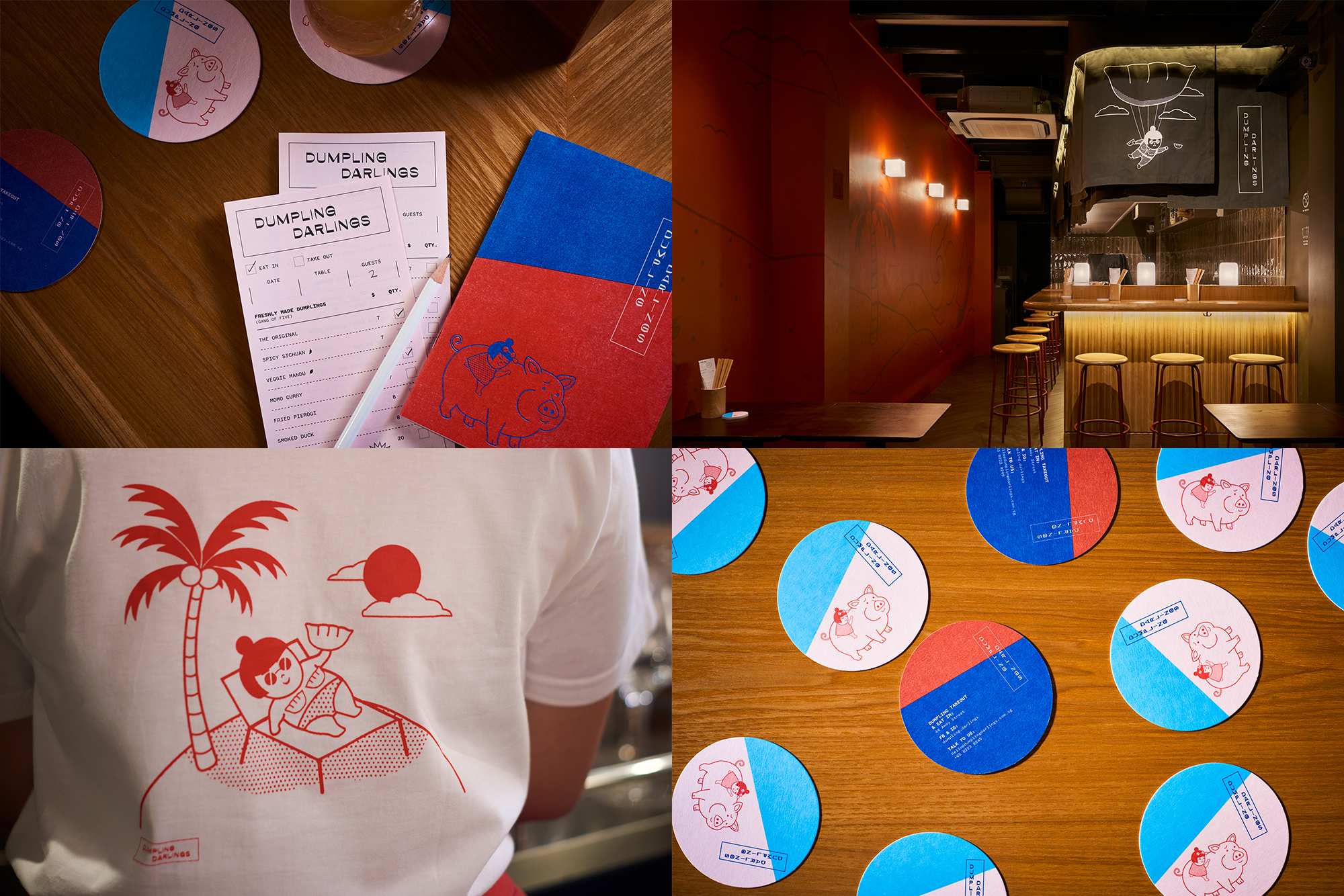
Dumpling Darlings is a new dumpling bar in Singapore. The identity, designed by local firm Foreign Policy, is “inspired by the Japanese manga found in Shokudo (casual Japanese eateries)” and revolves around Jo and her pet pig, Pork Chop, drawn in such a charming style that the prospect of eating anything with pork seems daunting — I mean, look at Pork Chop. The Jo character is great, whether she’s chilling on the beach or dishing dumplings from a dumpling-shaped parachute. The style is fun and quirky and the red and blue color palette adds a dose of vibrancy. The vertical logo is a bit on the expected side but still looks good. Lots of fun more details, like a neon dumpling, at the project link. See full project
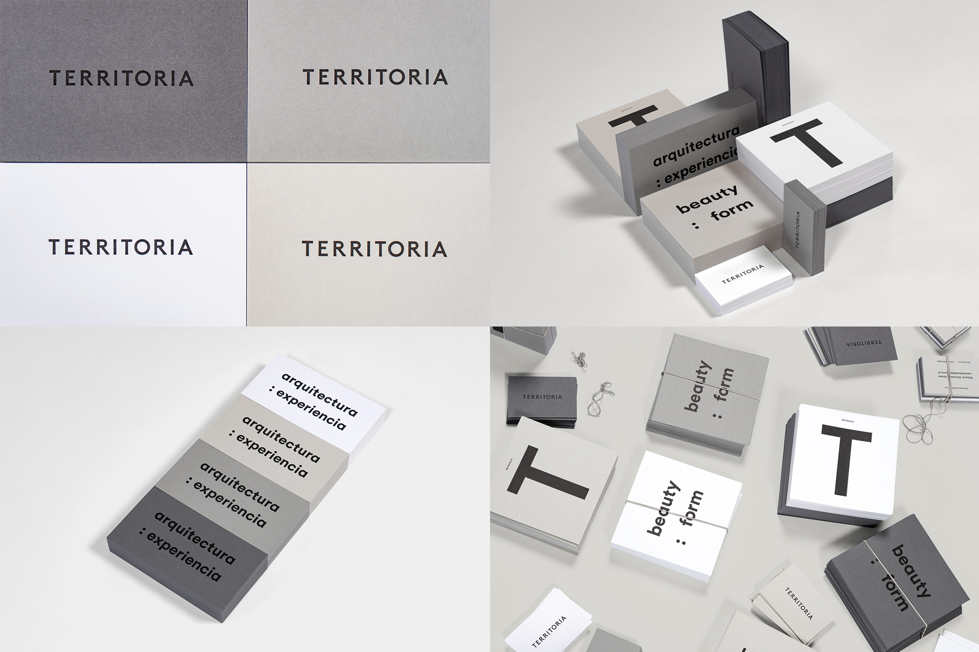
Territoria is an architecture firm based in Santiago, Chile, specializing in large-scale developments for offices, retail, hospitality, and mixed-use. The identity, designed by Toronto, Canada-based Blok, is a super simple wordmark that may not be the most exciting but it’s somehow the right combination of characters in the right typeface — the extra serving of “R”s stand out nicely with their long legs — with the right letter spacing and spot-on kerning. I’m not so sure about the secondary typeface and treatment in large lowercase but I don’t mind it either. The highlight is the range of gray papers used in the applications, echoing the shades of concrete and other materials in the buildings. See full project

 Новости Союза дизайнеров
Все о дизайне в Санкт-Петербурге.
Новости Союза дизайнеров
Все о дизайне в Санкт-Петербурге.