Обзор лучших ресурсов по разработке бренда, разработке упаковки
contact us | ok@ohmycode.ru
contact us | ok@ohmycode.ru
A wide variety of clients and approaches this week, with work from Munich, Lisbon, and Los Angeles.
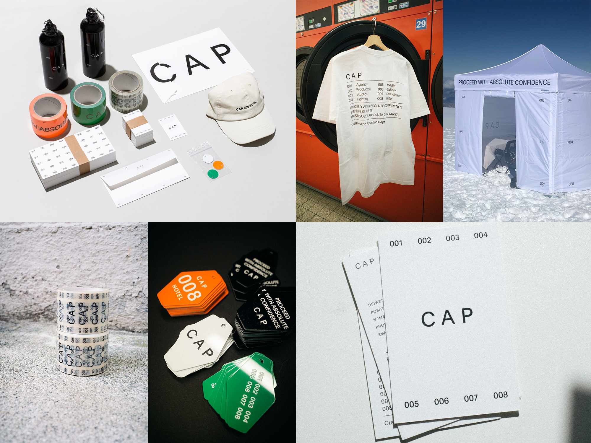
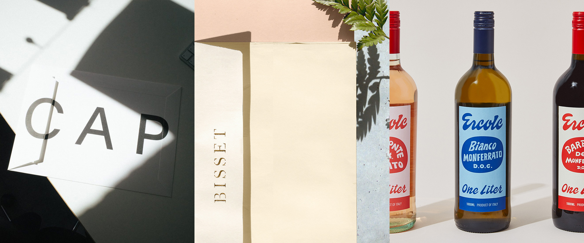
CAP is a creative production agency in Madrid, Spain, specializing in photography/image creation. Their business is divided into eight departments: Agency, Production, Studios, Lighting, Media, Gallery, Foundation, and Hotel. The latter not really a hotel but a kind of hospitality faux brand of swag and amenities for their clients. The identity, designed by Munich, Germany-based Daily Dialogue, highlights the eight departments by using “001” to “008” as design elements for almost all applications, usually surrounding “CAP”, all in a deadpan sans serif. There really is not much at play and it could easily be considered a hipster-brutalist-light approach but the applications are all so damn pleasing to look at — not included is this damn vehicle. Every layout is so well considered with the system adapting slightly different every time but maintaining the same coolness throughout. The only problem with this identity is that they have to stay at eight departments for a while — adding a ninth service would mean a reprint, even of this umbrella. See full project
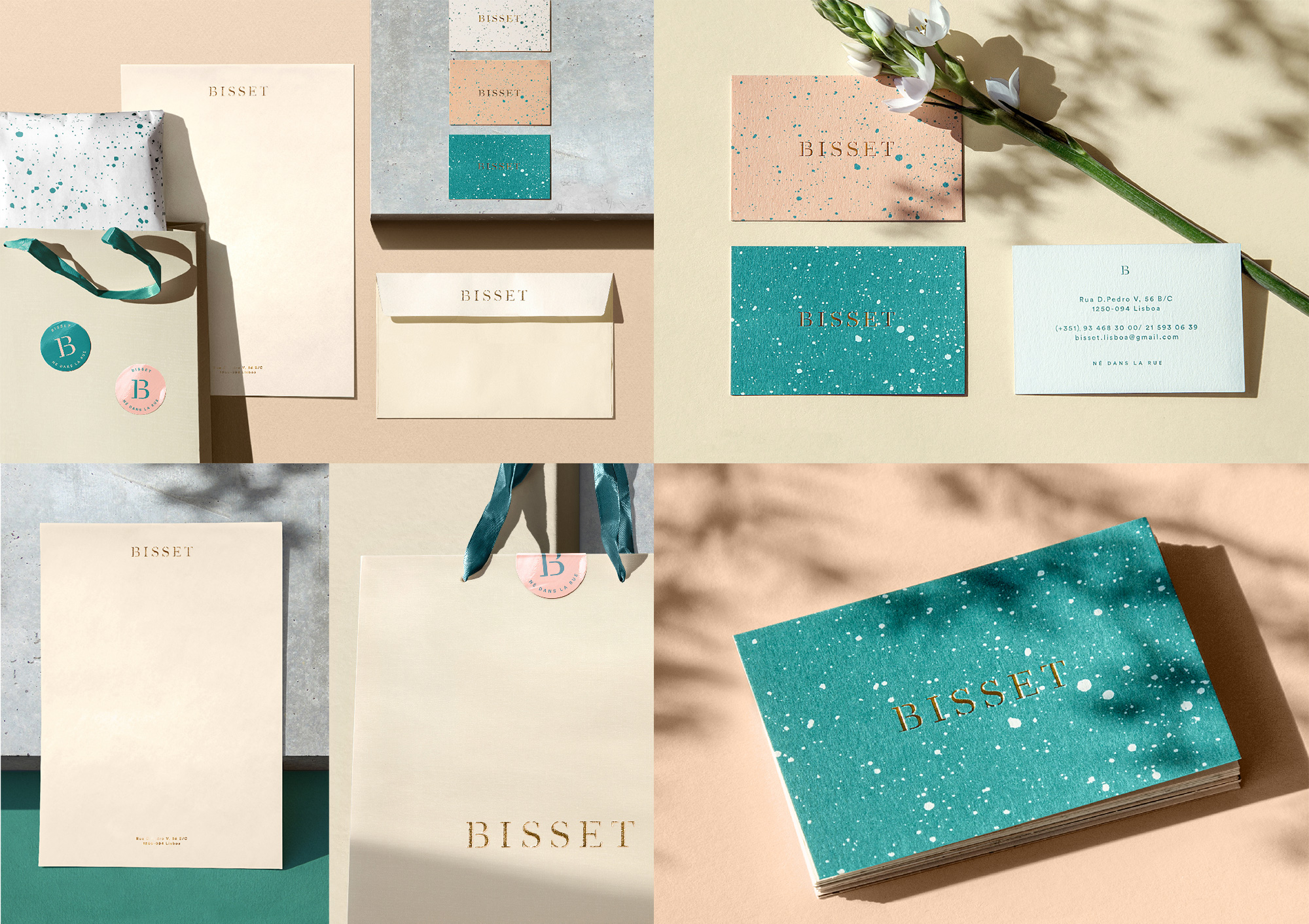
Bisset is a clothing store in Lisbon, Portugal, that brings together “Parisian cult-labels” for women. The identity, designed by local firm Love Street, visualizes the store’s concept of “Né dans la rue” (Born on the street), with a speckled background emulating splattered cement texture but rendered in a soft color palette of peach, teal, and tan, accentuated with a lovely and light stencil serif, for a great combination of rough and delicate. As usual, gold foil stamping is the hero, adding a touch of luxury. See full project
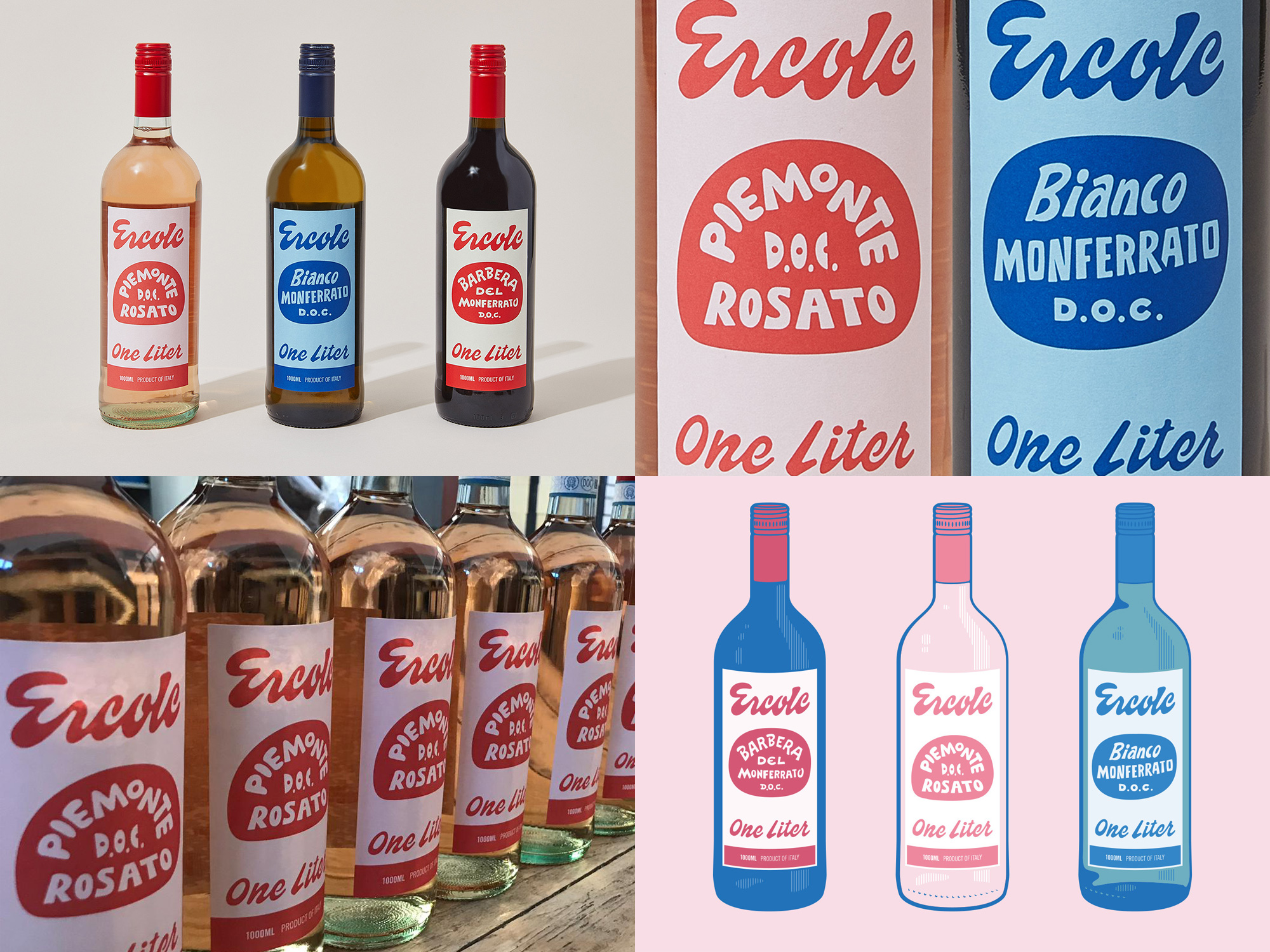
Ercole (Italian for “Hercules”) is a new range of wines created by The Piedmont Guy, who represents and distributes family-owned wineries from the Italian region of Piedmont. The identity and packaging, designed by Los Angeles, CA-based Radical Co-operative, is inspired by vintage Italian signage and features a delightful combination of custom lettering that gives these wines a fun, lighthearted vibe. The primary “Ercole” lettering is really nice, with the heavy bottom curves and the individual lerrering for the three varieties is refreshingly loose and unpretentious. Would totally buy these for the label alone. See full project
 each year since publication began in 2006

 Новости Союза дизайнеров
Все о дизайне в Санкт-Петербурге.
Новости Союза дизайнеров
Все о дизайне в Санкт-Петербурге.