Обзор лучших ресурсов по разработке бренда, разработке упаковки
contact us | ok@ohmycode.ru
contact us | ok@ohmycode.ru
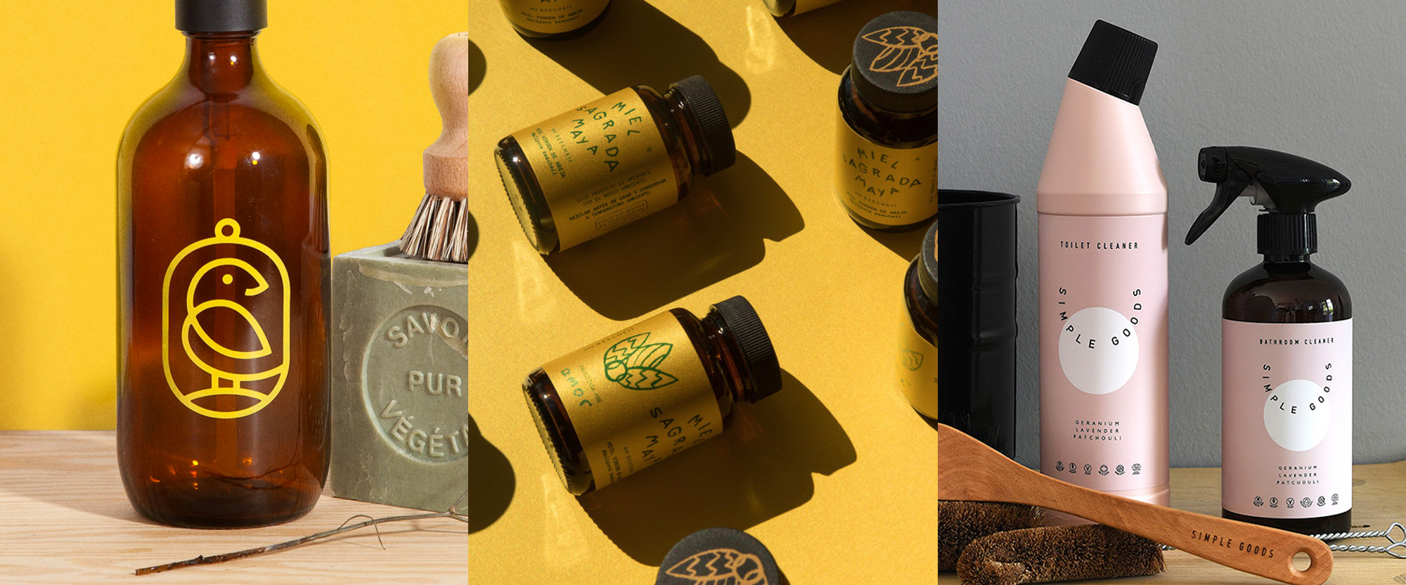
Lots of clean-living and simple designs this week, with work from Alberta, Mérida, and Los Angeles.
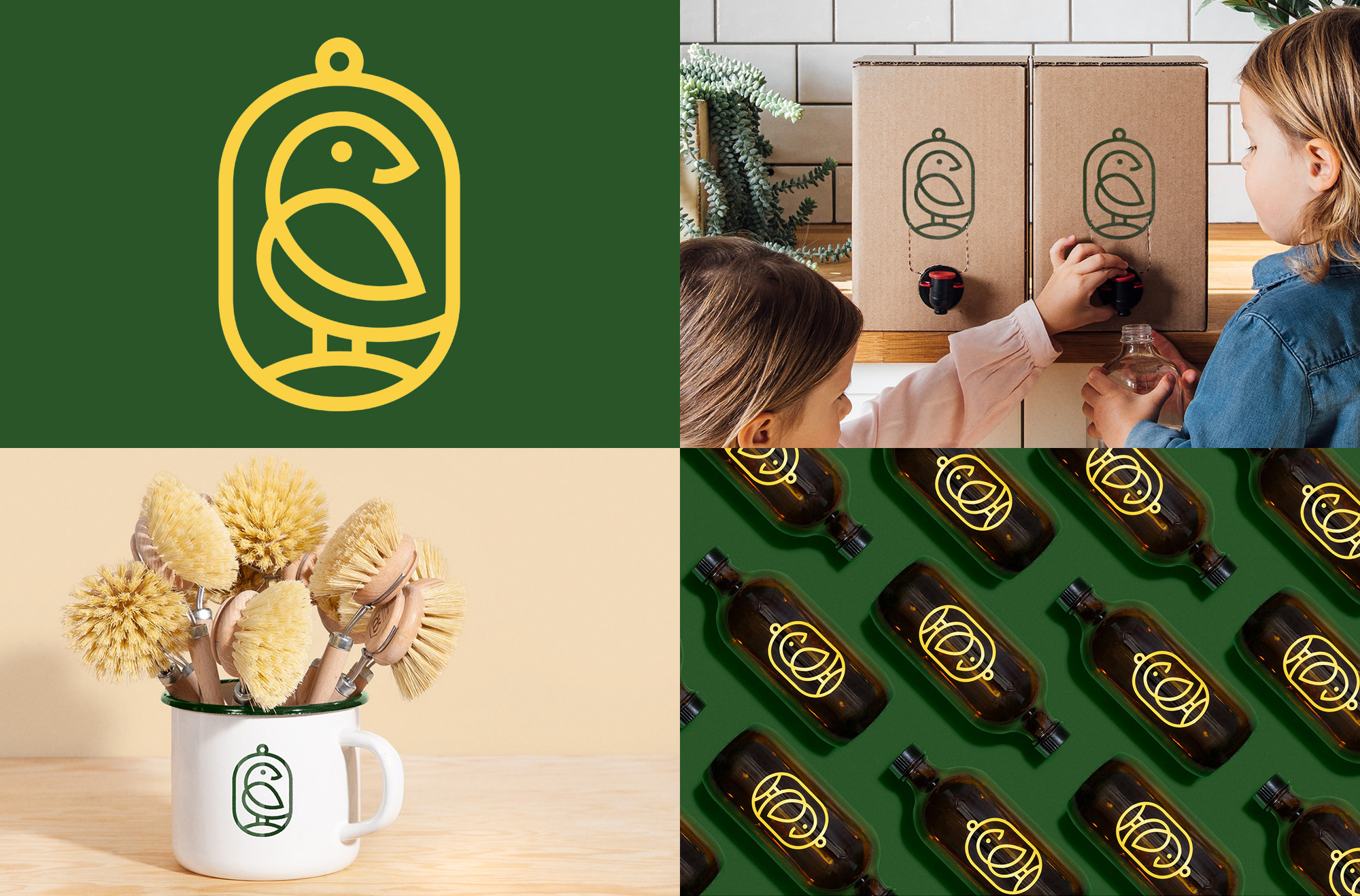
Canary is a zero-waste retail market and refillery in Calgary, AB, offering cleaners, soaps, and personal care products, where customers bring their own container to refill. The identity, designed by local firm Bamff, features, as you might expect, a canary bird and it’s a lovely rendition in a thick-line yet delicate approach. I really like how the body of the canary is a single stroke. It’s not exactly clear what the holding shape is — a bird cage? A tin badge of some sort? — but I also like it. The color palette is warm and inviting and the logo looks great on refillable containers, from soap bottles to totes. Not shown here is a nice accompanying serif, Klim’s Domaine Text, for the wordmark. Overall, a charming, feel-good identity. See full project
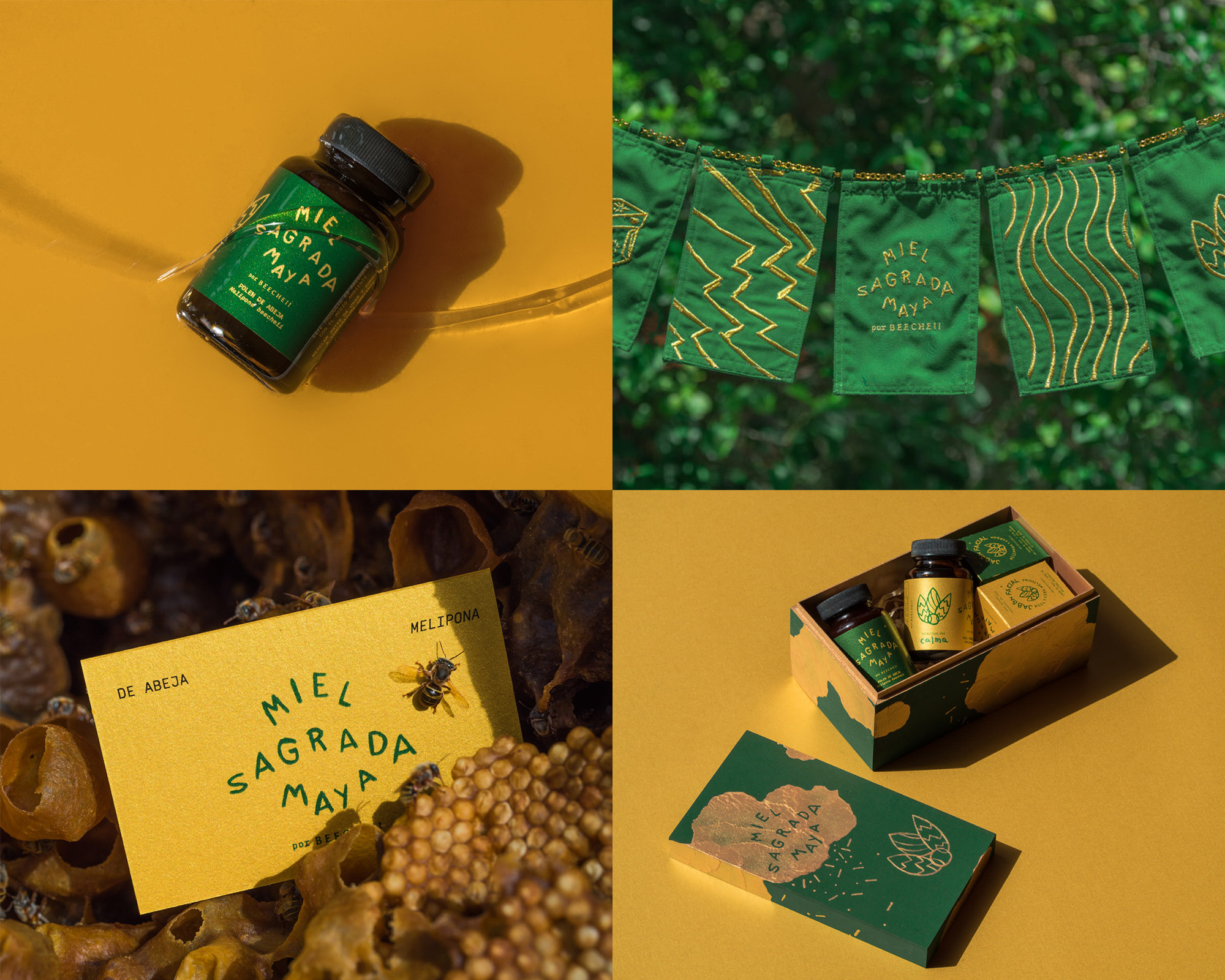
Miel Sagrada Maya (“Sacred Mayan Honey”) is a range of honey-based products created by beekeeper, Beecheii, in Mérida, Yucatán, Mexico. The identity, designed by local firm Bienal, has a great raw and organic aesthetic applied to the wordmark and the icon — which at first I was sure it’s a plant and then I was sure it’s a bee and now I’m confused as to what it is yet visually I like whatever it is. Like Canary above, this has a nice green and yellow/gold color combo that alludes to bee’s environment and their product. What I like most about this is that it feels as if the owners designed this in a naive, undesigned way but it just happened to turn out awesome. See full project
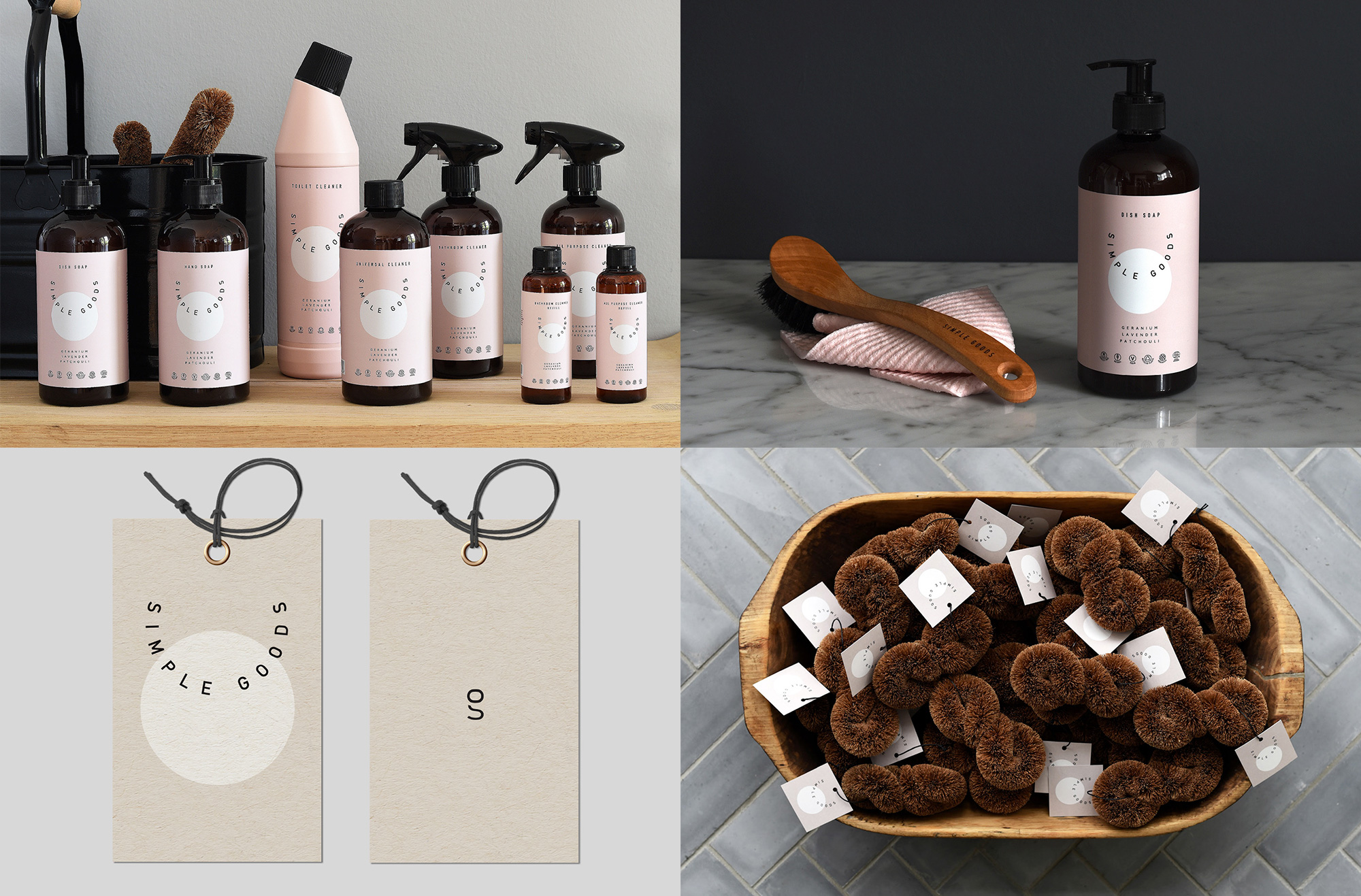
Simple Goods is a new brand in Denmark of non-toxic cleaning products made with natural and plant-based ingredients. The identity, designed by Los Angeles, CA-based Kati Forner Design, honors the name with a simple and good logo that wraps the name inside an implied circle, overlapping a non-implied circle for a nice, clean composition that looks great on the pink and gray backgrounds for the different products. Everything has a clean yet warm aesthetic and it’s the kind of product you might end up buying just for the packaging alone — it’s like a Danish Method. My favorite thing in all of this, though, are the brown scrubby things with the tags, like cute baby porcupines with a side of nice design. See full project
 each year since publication began in 2006

 Новости Союза дизайнеров
Все о дизайне в Санкт-Петербурге.
Новости Союза дизайнеров
Все о дизайне в Санкт-Петербурге.