Обзор лучших ресурсов по разработке бренда, разработке упаковки
contact us | ok@ohmycode.ru
contact us | ok@ohmycode.ru
Some fun and funky work this week with projects from Nashville, Antwerp, and Mexico City. Also, level unlocked: 300 Friday Likes!
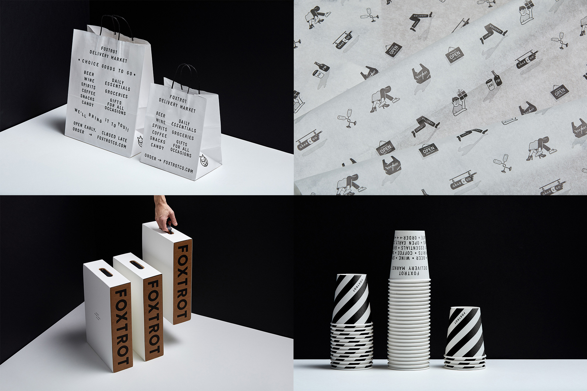
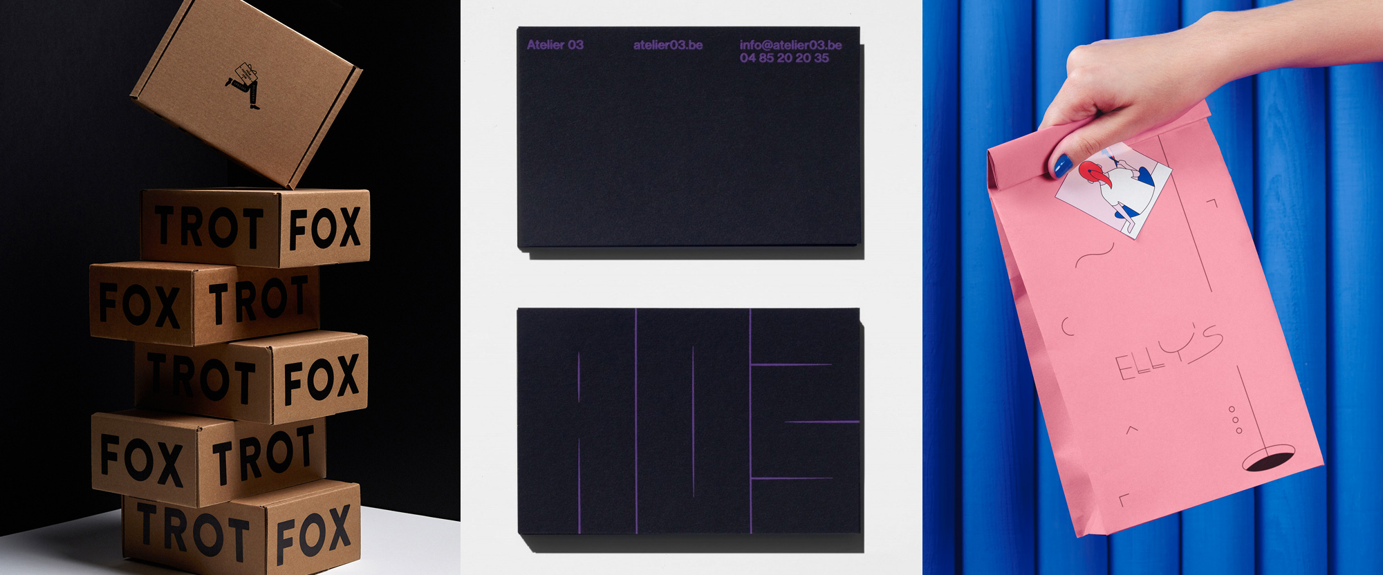
Foxtrot Delivery Market is a semi-upscale convenience store with seven locations in Chicago and one in Dallas that, aside from its cozy brick and mortar operations, specializes in delivery of all kinds of goods, from ice cream to wine to toothpaste to chef-prepared meals. Perhaps as a nod to the variety of products offered by Foxtrot, the identity, designed by Nashville, TN-based Perky Bros, goes in three or four different styles that don’t quite go together cohesively but each and every one of them is cool in their own way. My favorite being the plastic-model typography seen in the carryout bags. Then there are the spot illustrations on the tissue paper which are all very charming and quirky. (The fox logo, by the way, already existed.) Then there is the kraft-box packaging with big bold typography that looks nothing like the carry out bags but, again, they are great on their own. It’s as if each approach could have spawned Friday-Likes-style projects of their own which I would gladly fawn over. See full project
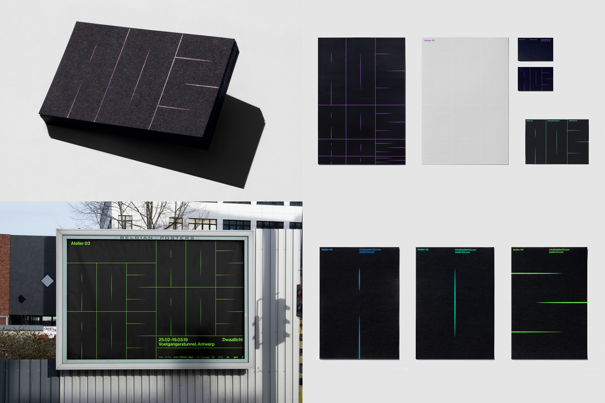
Atelier 03 (A03 for short) is an art and design collective in Antwerp, Belgium that “translates identities into the public space through light, sound and installation art” that, clicking through their website, I think it translates to groovy installations that are often dark and have a light or illumination component. Their identity, designed by local firm Vrints-Kolsteren, plays with a similar element of light by casting thin stripes of bright colors on black backgrounds to form an abstract, grid-based “A03” logo that is amazingly out of the ordinary and hard to read in the best possible way. Without seeing the name written out first I don’t think I could have decoded the “3” on my own but once you know it’s there, it’s such a fun, weird, ugly “3”. To boot, the logo can be squished, stretched, and animated to make it even harder to read, which just makes me like it even more. The electric, rave-ish colors work great on the black backgrounds and the straight-up typography provides a great contrast. For some extra Friday fun, put this video on full-screen mode and set it to loop (by control-clicking). Far out, man. See full project
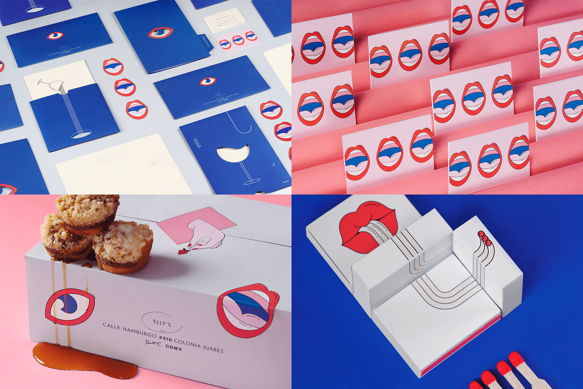
Elly’s is a high-end restaurant in Mexico City, Mexico, serving Mediterranean food. The identity, designed by local firm Futura, features a lot for their usual, awesome WTF-ness with some funky eye and lips illustrations as the key brand visuals in a thin-line style complemented by other spot illustrations of dogs, fishes, hands, wine, and more. These are explained as being inspired by chef Elizabeth Fraser’s childhood memories. Okay. The main logo is as weird as lips slurping noodles, with a thin, Jazzy, wordmark that’s all kinds of disproportionate with a super wide “Y” and “S” but in the scheme of this whole thing, it’s the least odd element. As usual, it’s simply fun to see what unexpected thing Futura does. See full project
 each year since publication began in 2006

 Новости Союза дизайнеров
Все о дизайне в Санкт-Петербурге.
Новости Союза дизайнеров
Все о дизайне в Санкт-Петербурге.