Обзор лучших ресурсов по разработке бренда, разработке упаковки
contact us | ok@ohmycode.ru
contact us | ok@ohmycode.ru
Some fairly weird and unconventional projects this week, with work from Auckland (twice and from the same firm) and Singapore.
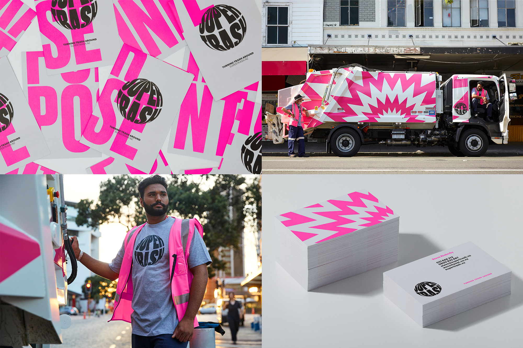
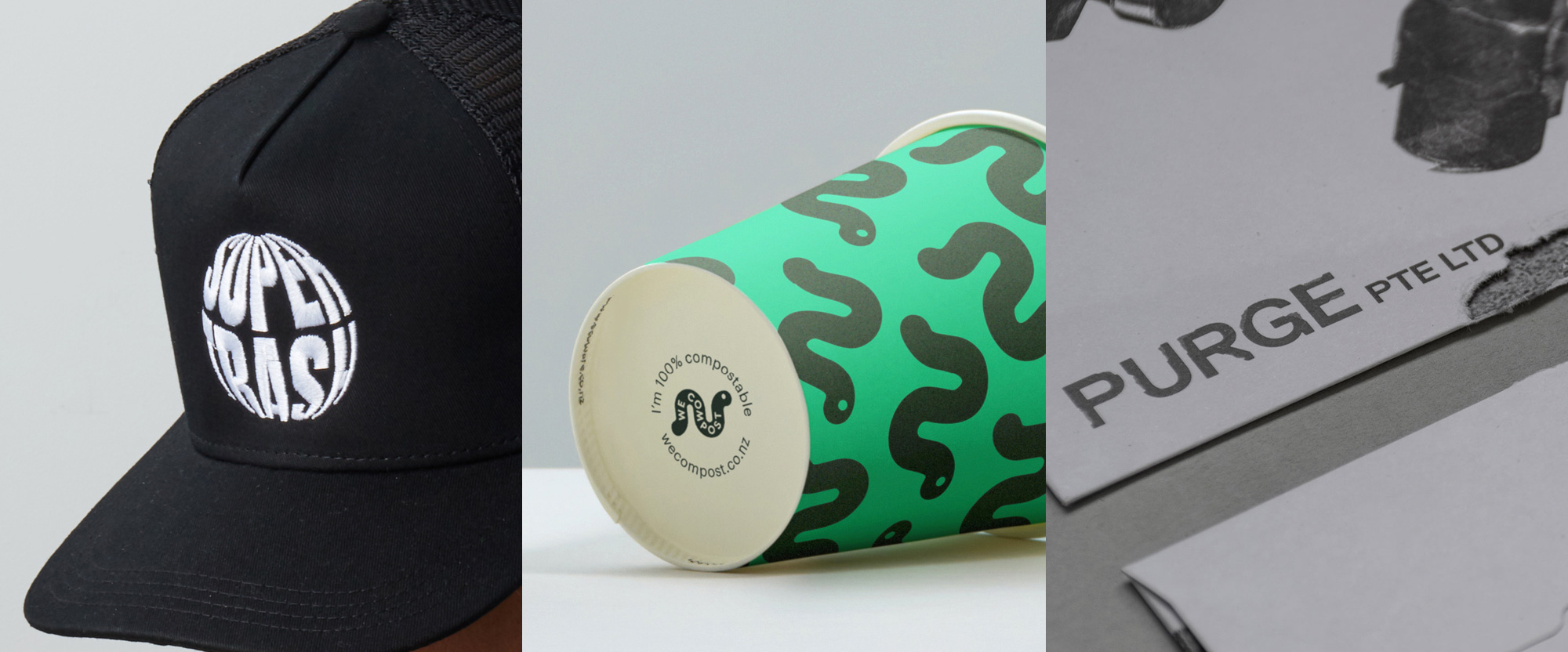
Supertrash is a small, family-run trash collection service in Auckland, New Zealand, that specializes in diverting waste from landfill through circular solutions and disrupting the standard practices of big corporate collection services. One way they are doing the latter is through their identity, designed by local firm Seachange, which features a bright pink color and a unique logo which, although it has a proper conceptual approach by being informed by the idea of a circular economy and supporting the tagline “Turning Trash Around”, it looks — awesomely — as if the typography was being stretched on a big, filled-to-the-brim trash bag. The unexpected logo, along with the color, and supported by radiating, comic-book-like burst graphics makes this the absolute best trash company identity ever. Granted, that’s not a difficult feat but when was the last time you saw a garbage truck that sparked joy? See full project
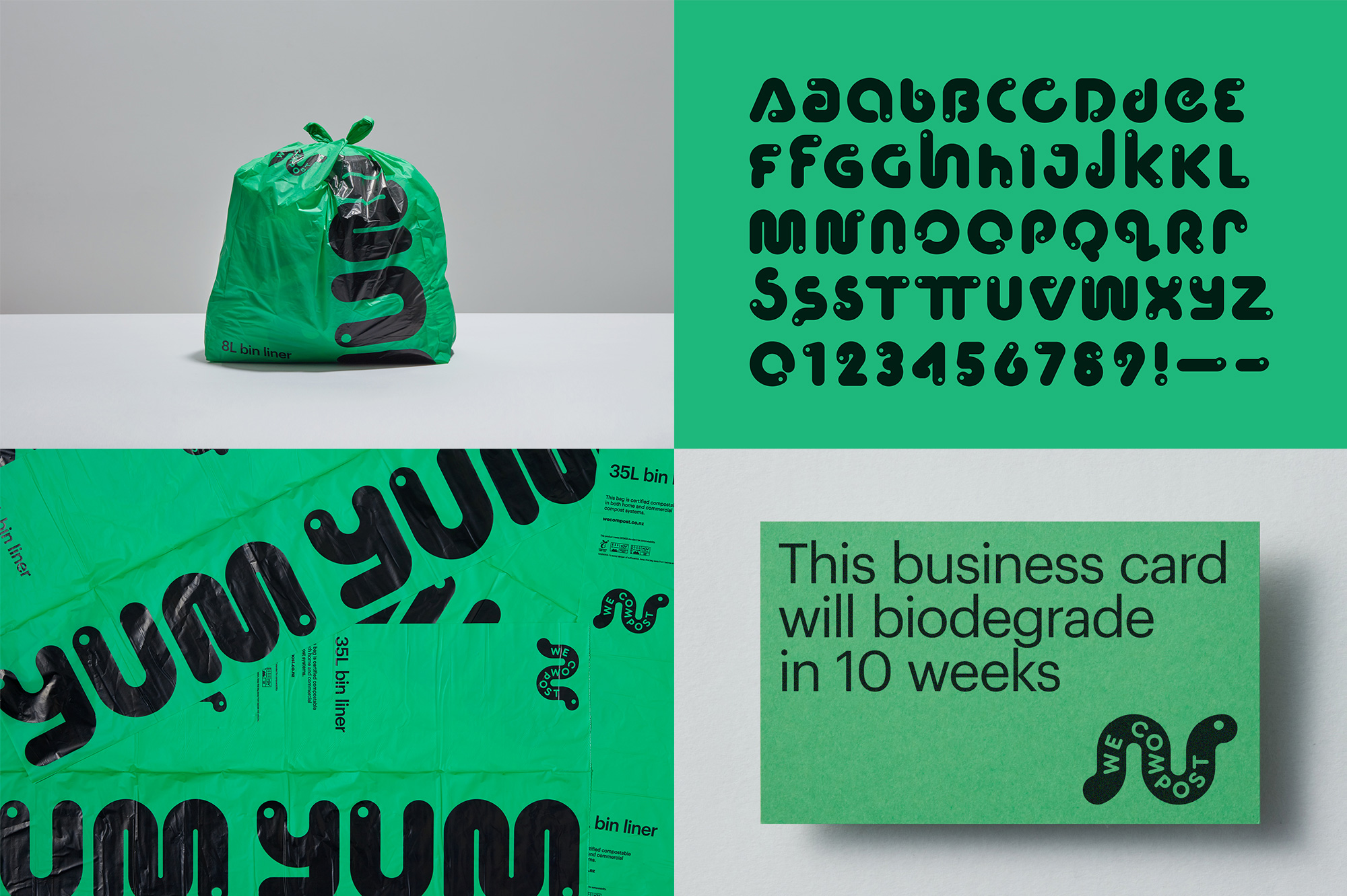
We Compost is one of the services provided by Supertrash and is the leading commercial compostable waste collection service in Auckland, New Zealand, having diverted over 13 million pounds (6 million kilos) of compost from landfills since 2012. The identity, also designed by Seachange, uses an adorable worm as the hero — if you have ever composted, you have experienced the worms — with a minimal, playful, big-eyed drawing and typography running clunkily but charmingly through its body. An expanded alphabet made of worms is absolutely silly but awesome and surprisingly useful and readable. This is such a great example of cleverly breaking away from industry standards and expectations to stand out. See full project
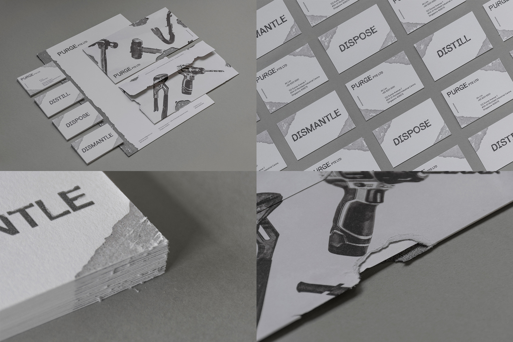
Purge is a team of demolition contractors in Singapore, specializing in dismantling of stuff, hauling of stuff, and disposing of stuff. The identity, designed by local designer Jay Liu, is very different from the usual projects I select for Friday Likes and I would even imagine some people wondering if my design compass has gone haywire because this isn’t the most sophisticated or foil-stamped of designs but there is plenty to celebrate here. The late 1990s grunge typography for the logo is a couple of decades late but it sets up the premise of building a system around destruction that Jay didn’t just complacently Photoshop his way out of but translated into the physical manifestation by scraping away at the corners of the business cards and ripping away pieces from envelopes. It’s the kind of method designing that’s often missing. There are also some blunt images of power tools that are not exactly cool but I would be damned if Purge wasn’t the first demolition company I would call up based on all these ruggedness. Like the trash companies above, this is another great example that fun, effective design can thrive in the unlikeliest of industries and doesn’t have to conform to low expectations. See full project
 each year since publication began in 2006

 Новости Союза дизайнеров
Все о дизайне в Санкт-Петербурге.
Новости Союза дизайнеров
Все о дизайне в Санкт-Петербурге.