Обзор лучших ресурсов по разработке бренда, разработке упаковки
contact us | ok@ohmycode.ru
contact us | ok@ohmycode.ru
Some more ornate and elaborate identities this week, with work from Vancouver, Varna, and Minneapolis.

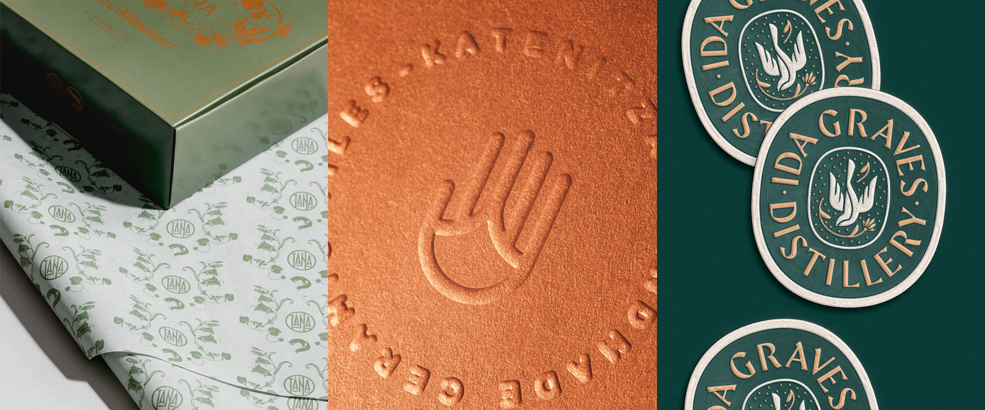
Caffe La Tana is a triple-threat Italian food establishment in Vancouver, Canada, functioning as a cafe, restaurant, and grocery store offering very nice Italian food, pastries, and goods. The interior’s old world charm and green hues inform the identity, designed by local firm Glasfurd & Walker, which is drenched in beautiful and ornate decorations, an elaborate display serif, and a tasty color palette of dark green, burnt orange, and white. The fox depictions relate to La Tana’s sister restaurant Savio Volpe (Cunning Fox) which is thrown into the mix along with a lovely roundel logo that, all together, create a very satisfying contemporary Art Nouveau-ish design experience. See full project
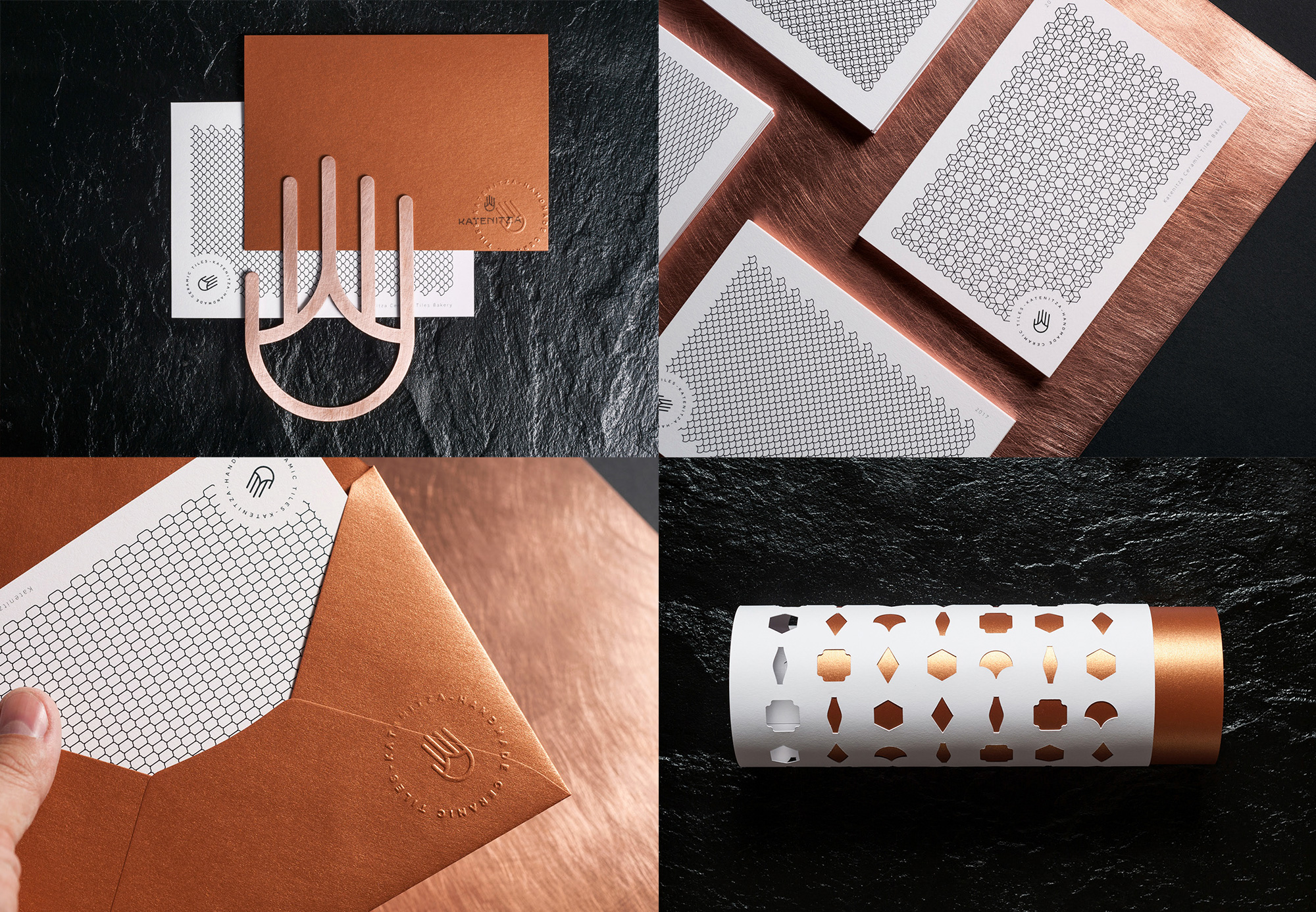
Katenitza is a designer and producer of handmade ceramic tiles in Varna, Bulgaria. The identity, designed by local firm Marka Collective, features a great icon that blends one of Katenitza’s recurring tile shapes with a hand, signifying their handmade approach but also making allusion to Hamsa, the palm-shaped sign that, when used as an amulet, brings its owner happiness, luck, health, and good fortune. It’s a great abstraction and it works so well in all the different applications in this identity, be it embossed, stamped, or straight-up printed. I’m not a huge fan of the wordmark but it pairs very well with the icon has a good exotic vibe that works hand in hand with the icon. The shapes of the tiles also inspire a range of patterns used in different postcards and a mystery tubular thing with die-cut tile shapes that looks all kinds of great. See full project
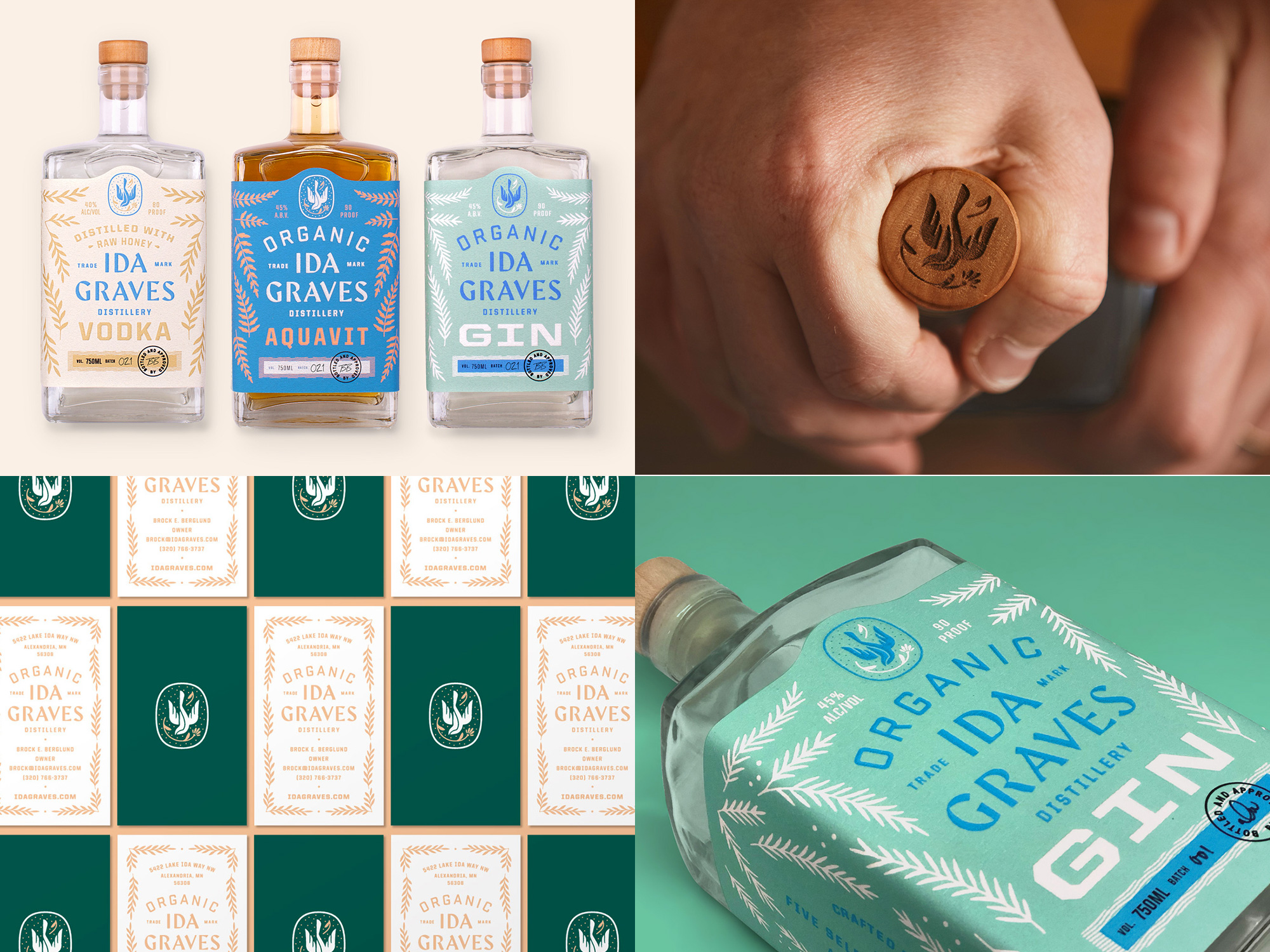
Ida Graves is a certified organic distillery in Alexandria, MN, crafting a series of spirits that include vodka, gin, and aquavit. The identity, designed by Minneapolis, MN-based Buddy-Buddy, pays homage to the idyllic location of the distillery and their commitment to quality ingredients and personal touch through an eclectic mix of typefaces and botanical ornaments that come together beautifully in the packaging and the myriad lock-ups used throughout the website and materials. The pastel color palette on the labels is soft and inviting and all the typography throughout is very finely tuned. I’m not sure about the significance of the bird but it makes for yet another lovely element to the identity. See full project
 each year since publication began in 2006

 Новости Союза дизайнеров
Все о дизайне в Санкт-Петербурге.
Новости Союза дизайнеров
Все о дизайне в Санкт-Петербурге.