contact us | ok@ohmycode.ru
contact us | ok@ohmycode.ru

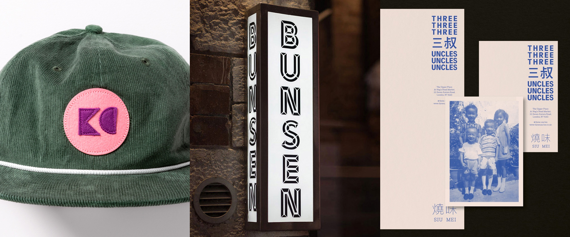
No connecting thread this week, with work from San Francisco, Dublin, and London.

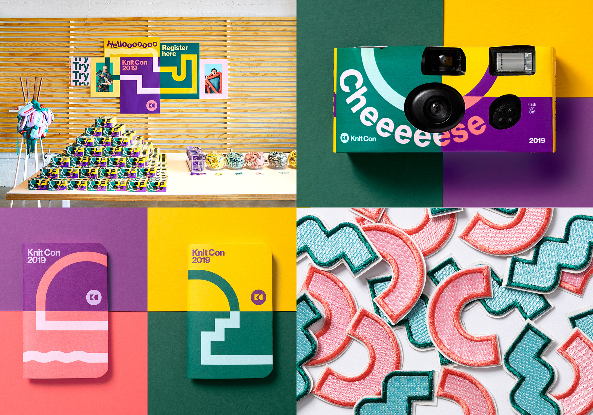
Knit Con is an annual in-house conference at Pinterest where employees share their myriad interests, talents, and hobbies as a way of bringing to life the same kind of random discovery experience one can have on Pinterest. For this year’s event, their fifth, Pinterest worked with San Francisco, CA-based Hybrid Design to create the identity that is literally a kit of parts where little random shapes connect in different ways with typography, photography, and more shapes, tying layouts together as one shape connects with the other. I’m not sure as many of you will be as into this project but I found it quite joyful, sort of liberated from trying to make perfect sense, and very freely applied in fun and different ways. Plus, people got cheap cameras AND fanny packs. See full project

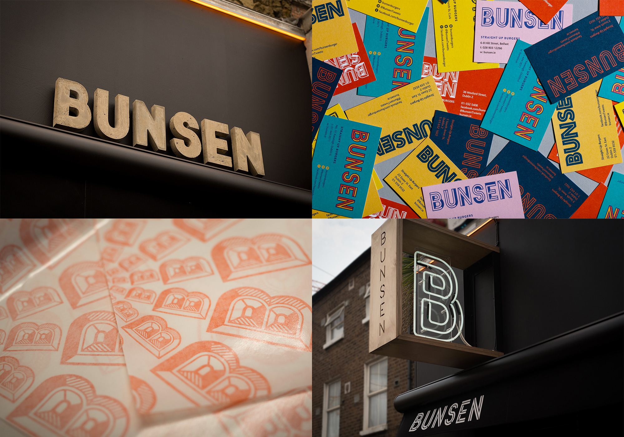
Bunsen is a small chain of hamburger joints with nine locations across Ireland that instead of doing the typical thing of simply replicating restaurants, each location is unique and individually designed by different architects. The identity, designed by Dublin, Ireland-based Revert Design, follows the same premise where each location has a slightly different identity, all revolving around a relatively consistent bold, uppercase, sans serif wordmark that can be inlined, extruded, convoluted-ed, and other kinds of manipulated. The image above shows a small sampling from six Bunsens and I’m sure each Bunsen on its own could fill two week’s worth of Friday Likes — heck, I could do two week’s worth of just posting that concrete sign over and over. See full project

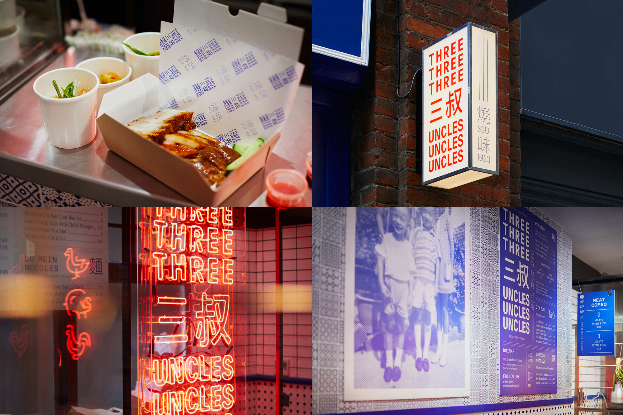
Three Uncles, started by a group of three friends, is a Cantonese roast meat specialist restaurant with two locations in London, UK. The identity, designed by local design firm Studio NinetyOne, revolves around the simple but very satisfying repetition of the name three times in a deadpan sans serif. There really isn’t much to it but the triple play on the name works so well in all the different applications. The only thing I would question is the choice of blue as the primary color because it looks so good when it’s in red as in the neon sign and facade box sign. Nonetheless, all the uncles involved in the identity make for a fun family reunion. See full project

 Новости Союза дизайнеров
Все о дизайне в Санкт-Петербурге.