Обзор лучших ресурсов по разработке бренда, разработке упаковки
contact us | ok@ohmycode.ru
contact us | ok@ohmycode.ru
Some great typography and color palettes this week with work from London, Carlsbad, and Merida.
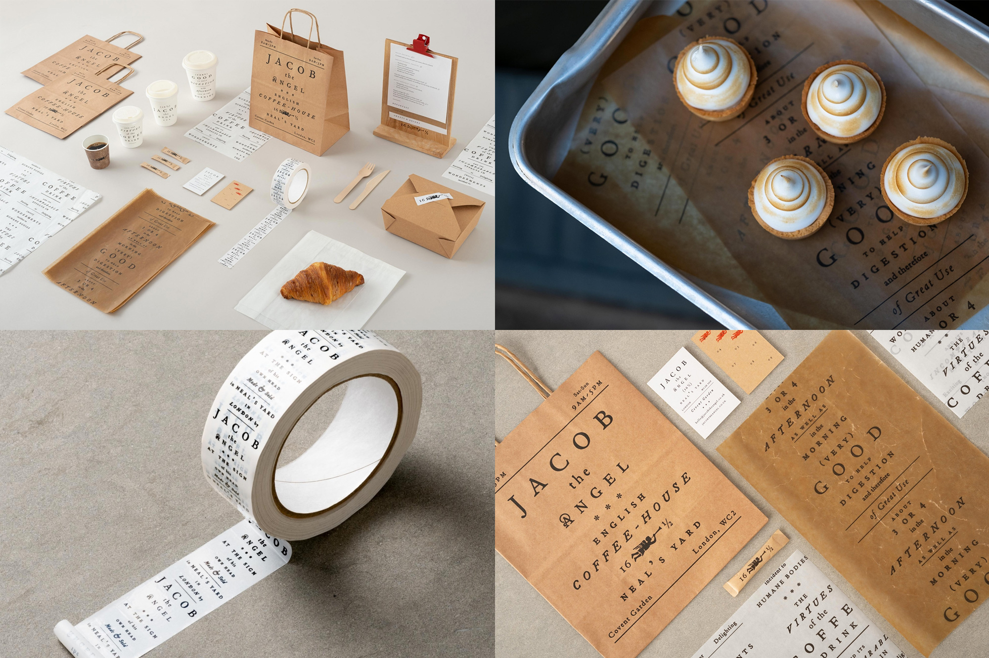
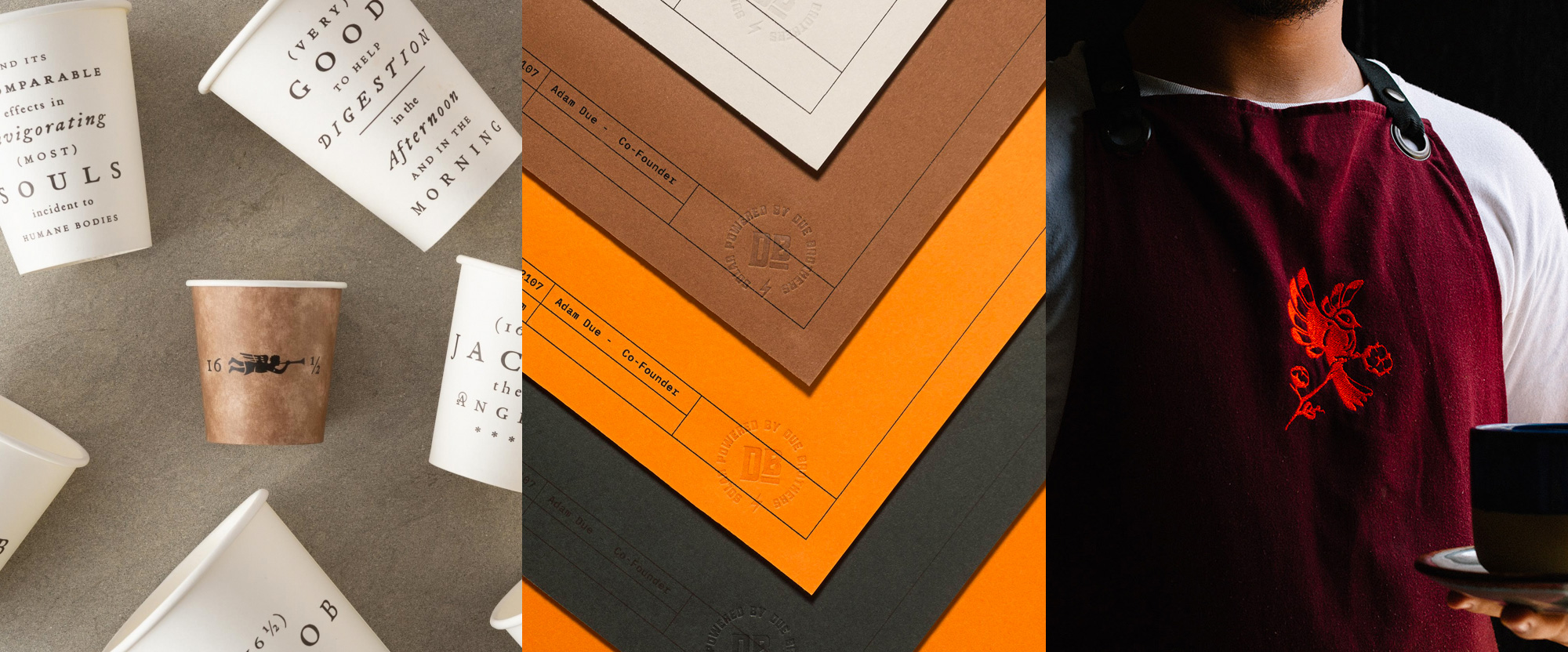
Jacob the Angel is a coffee house, eatery, and bakery in Neal’s Yard, the iconic courtyard in the heart of Covent Garden in London, UK. The identity, designed by local firm Here Design, is “inspired by 17th century advertisements extolling the virtues of coffee” and although I have never seen 17th century advertisements extolling the virtues of coffee before I am now a fan of 17th century advertisements extolling the virtues of coffee if they all have typography as and layouts as great as all these classy arrangements of superbly spaced out serifs. Heck, even the lowercase serif spaced out looks good — and that’s a cardinal sin. I love how well the centered layouts adapt to anything from bags to cups to packing tape, all maintaining the same elegance and freshness equal of a croissant baked this morning. See full project
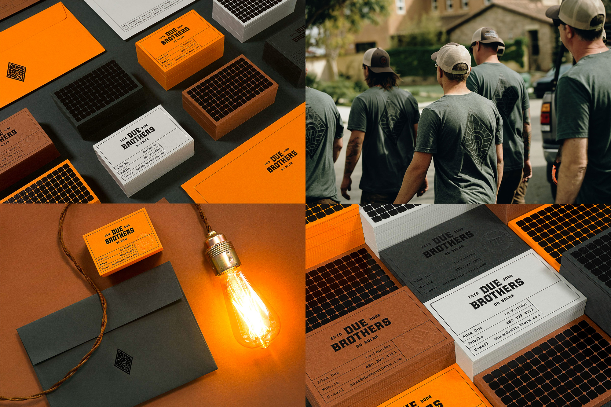
Due Brothers is a family-run construction company that specializes in solar panel installations in San Diego, CA, and its surroundings and probably has the best branding of any solar panel installation company anywhere. Designed by Carlsbad, CA-based Mubien, the identity uses a few hipstery-slash-coffe-house-slash-brewery typographic tricks but everything comes together so well that it doesn’t really matter. Built around the funky Höchstadt, the applications have some crisp typesetting and excellent production on a rich range of colored paper. The solar panel motif in the back of the business cards printed in black foil is a great touch. If I had the money, I would pay these fine folks anything they charged based on their identity alone and how bad-ass they look in their nicely branded t-shirts and hats. See full project
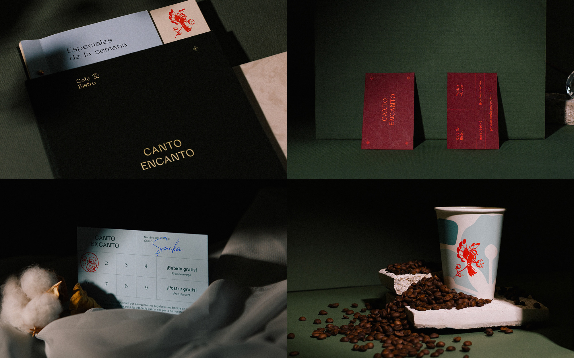
Canto Encanto is a coffee house and eatery in Valladolid, Yucatan, in Mexico. The identity, designed by Merida, Yucatan-based Candid, is inspired by the region’s fauna and flora and features a lovely bird drawing as the establishment’s icon and a quirky, bendy wordmark as its logo that gives way to other interesting type choices throughout the application. While this is not necessarily a showstopper, there is a lot of great subtle elegance in here, especially as swayed by the moody photography. See full project
 each year since publication began in 2006

 Новости Союза дизайнеров
Все о дизайне в Санкт-Петербурге.
Новости Союза дизайнеров
Все о дизайне в Санкт-Петербурге.