Обзор лучших ресурсов по разработке бренда, разработке упаковки
contact us | ok@ohmycode.ru
contact us | ok@ohmycode.ru
Some funky stuff sandwiches elegant stuff in this food-themed week, with work from Montréal, London, and Brooklyn.
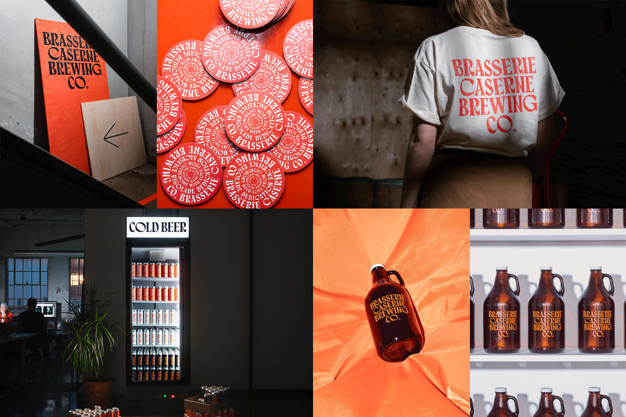
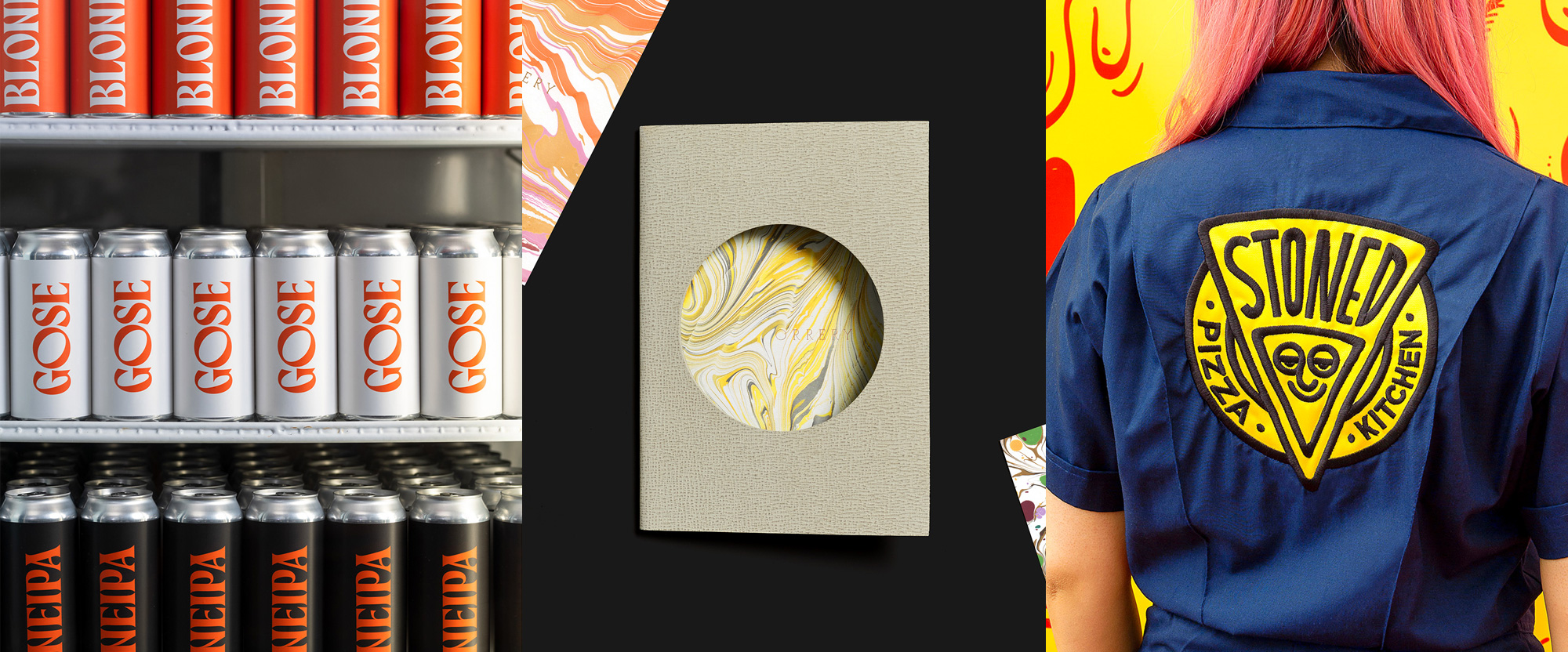
Brasserie Caserne Brewing Co. is neither a brasserie nor a brewery, it was a one-time party for their friends and clients organized by Montréal, Québec-based Caserne for which they created a whole identity around this fake establishment. They created beer cans, growlers, coasters, t-shirts, patches, video content, and more, all revolving around a fantastically funky typeface by local type foundry Coppers and Brasses. While this is mostly self-indulgent in the best of ways — if you are going to design for yourself without restrictions go all out — it could easily be real for a brasserie or brewery as it’s fully-fledged and perfectly crafted with a lot of work and time having clearly gone into it… just filling that fridge must have taken a minute. See full project
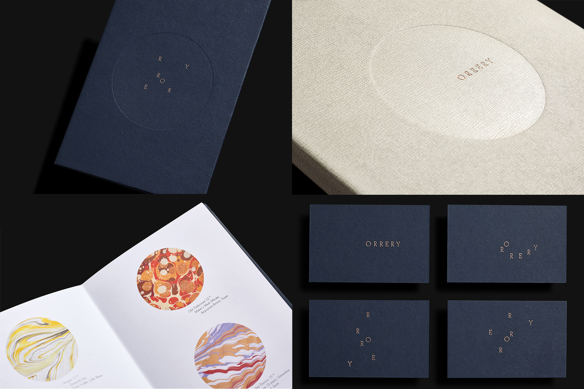
Orrery is a high-end French restaurant in London’s Marylebone Village and takes its name from the “mechanical model of the Solar System that shows the relative positions and motions of the planets and moons”. The identity, designed by local firm Dutchscot, also revolves, at times almost literally, around the principle of the orrery with a slender slab serif where the letters rotate around the “O” in some applications. Elegant and pared down, the applications have some lovely production touches like the debossed circle on the menu, the gold foil stamping, and even the reflective copper finish on the exterior sign (not shown here). As a contrast, the menus feature illustrations and endpapers of custom marbling with a cosmic aesthetic that complement the name and add great bursts of texture and color to the minimalist design. See full project
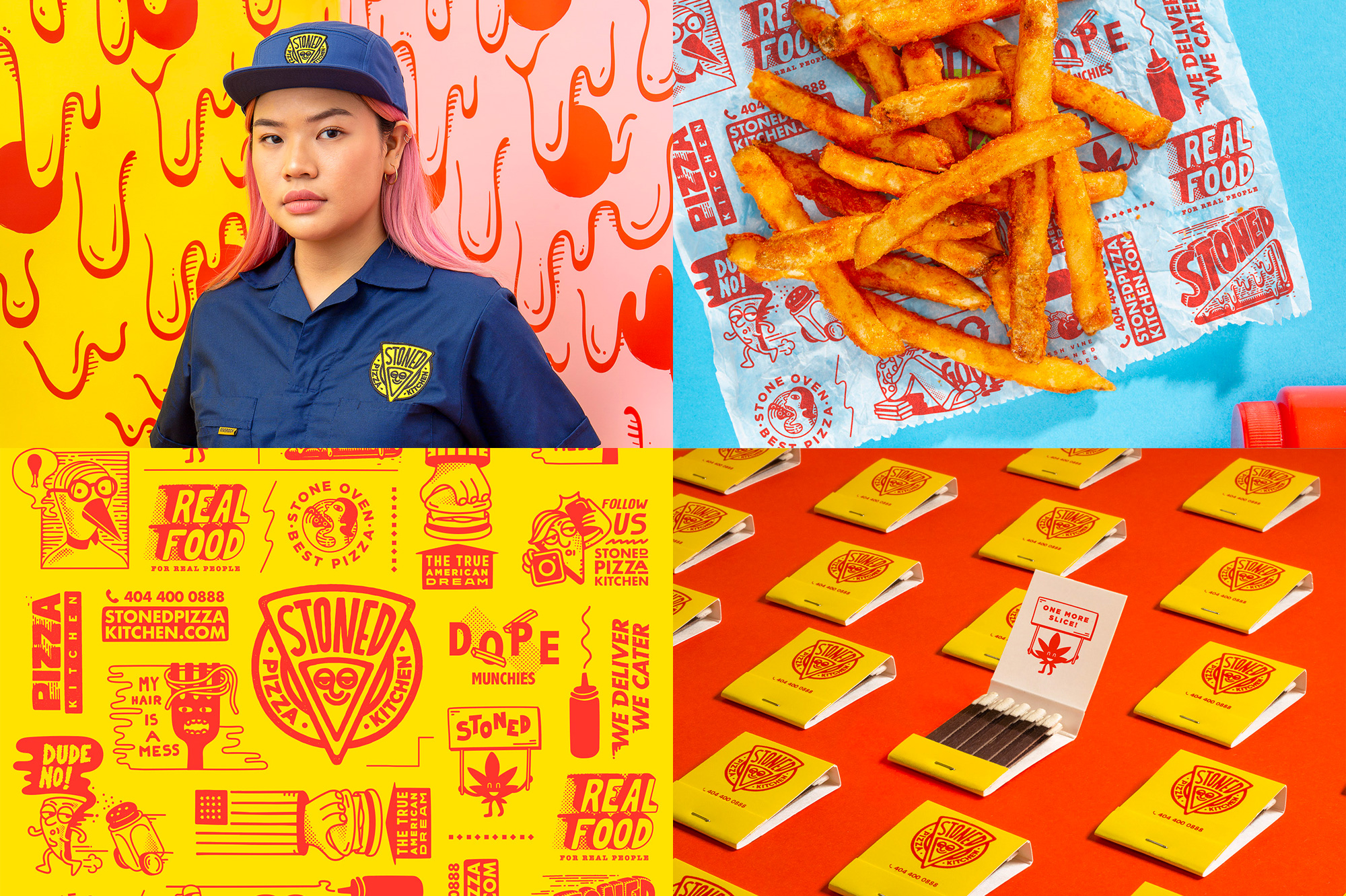
Stoned Pizza Kitchen is a restaurant in Stone Mountain, GA, that serves not just the titular pizza but also burgers, sandwiches, wings, pastas, and other entrées. The identity, designed by Brooklyn, NY-based Oscar Bastidas, is unapologetically blunt (see what I did there?) about the restaurant’s name with a logo of a pizza slice that is clearly high and a range of illustrations that make it evident that they are alluding to pot more than the “stone” in Stone Mountain. The variety of lettering and illustration styles is broad but neatly brought together by the single-color rendering and they are all pretty much loads of fun. On their Instagram account I love all the pictures with the kids and the stoned-dude-eating-pizza illustration in the background on the wall — one day those kids are going to grow up and be like “I can’t believe mom and dad took us to that place with all the pot references”. Props to the this joint’s (see what I did there?) owner for going all in on pot for this family restaurant. See full project
 each year since publication began in 2006

 Новости Союза дизайнеров
Все о дизайне в Санкт-Петербурге.
Новости Союза дизайнеров
Все о дизайне в Санкт-Петербурге.