contact us | ok@ohmycode.ru
contact us | ok@ohmycode.ru

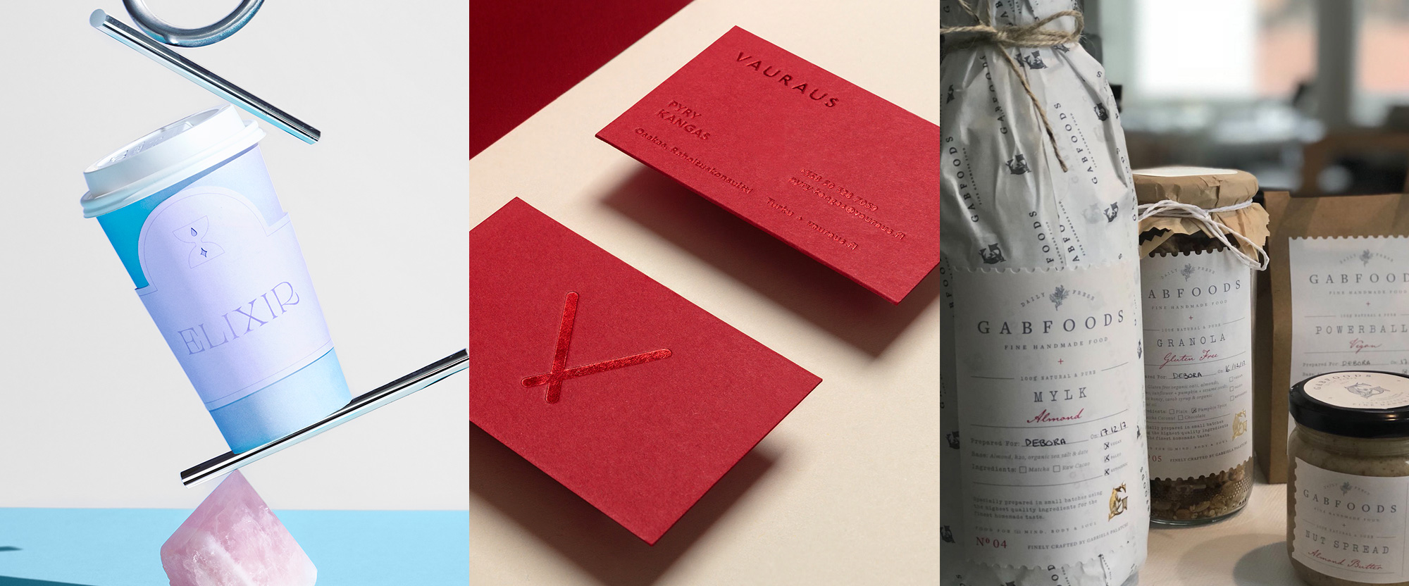
From weird, to minimalist, to classy, we have a little bit of everything this week, with work from Mexico City, Helsinki, and Istanbul.

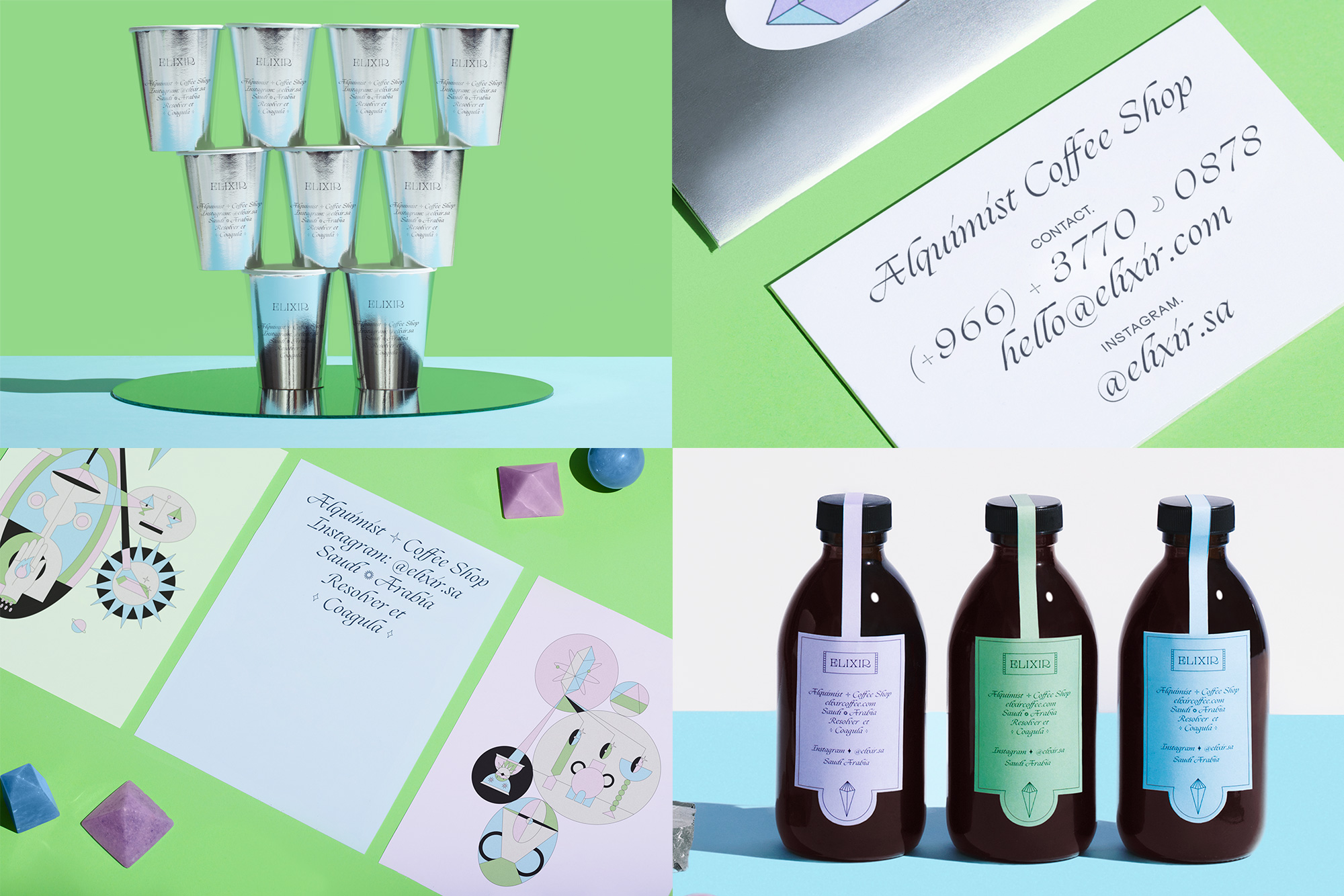
Elixir is a soon-to-be coffee shop somewhere unspecified in Saudi Arabia. The identity, designed by Mexico City-based Futura revolves around an alchemy theme but interpreted through Futura’s warped design filter which leads to an eclectic combination of typefaces: what looks like an exaggerated version of Tenez for the logo and an almost cheesy, wedding-invitation-like script for headline typography. The accompanying illustrations share the lightness and thinness of the typefaces but in general none of the elements are really related except that they — as if by alchemy — come together oddly convincingly in the end. And those silver cups are everything. See full project

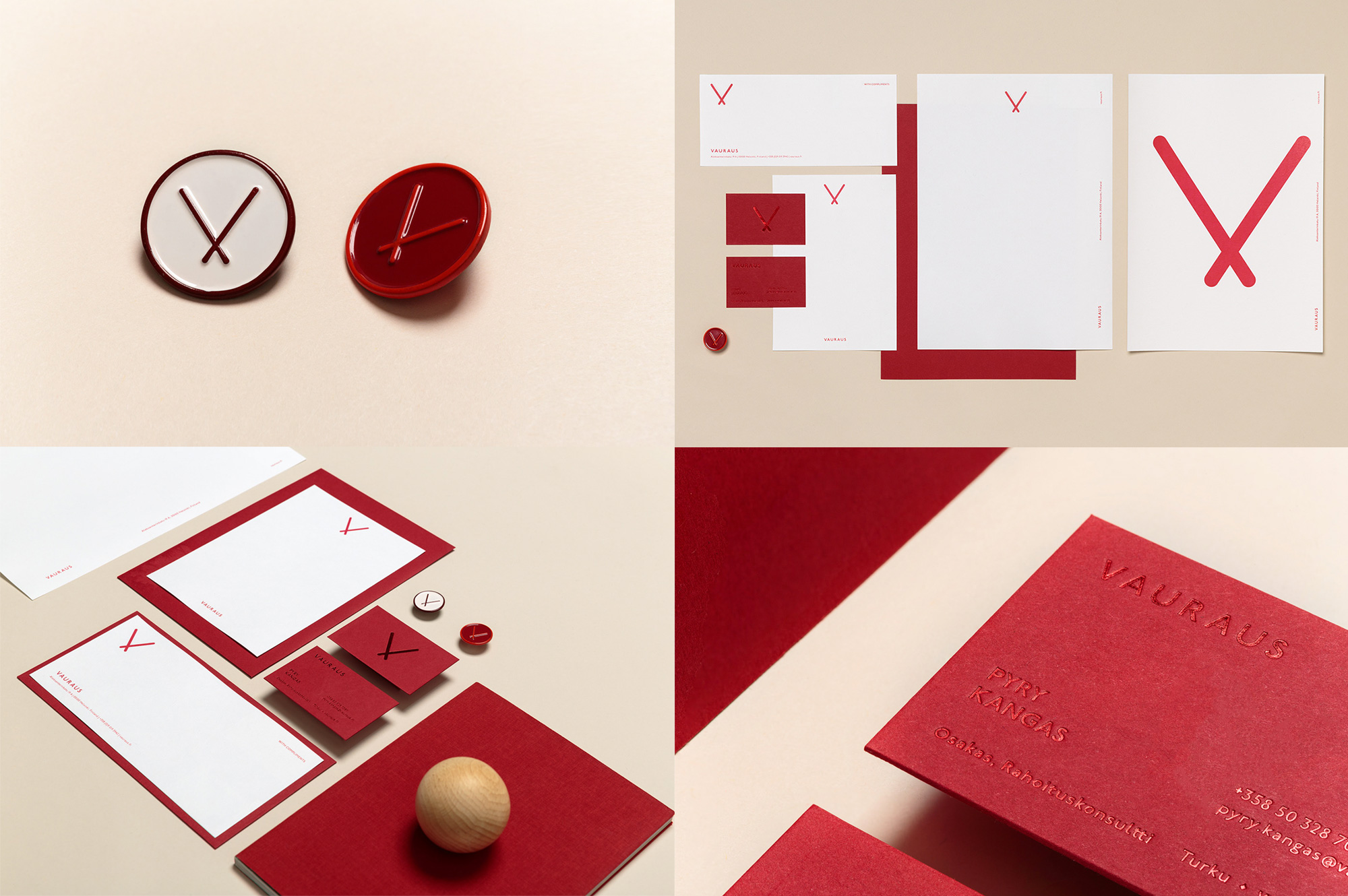
Vauraus is an investment firm in Finland — their name translates to “Prosperity” in English which I bring because I feel like their logo, designed by Helsinki- and Stockholm-based Kuudes, could easily be a universal symbol for prosperity. I know that that’s too philosophical and praise-y for a corporate icon but it’s so simple, minimal, universal, and it looks so damn good as a lapel pin. The rest of the identity is nice and with simple, elegant typography but the highlight is definitely anytime anything goes red-on-red, whether it’s the lapel pin or the business card. See full project

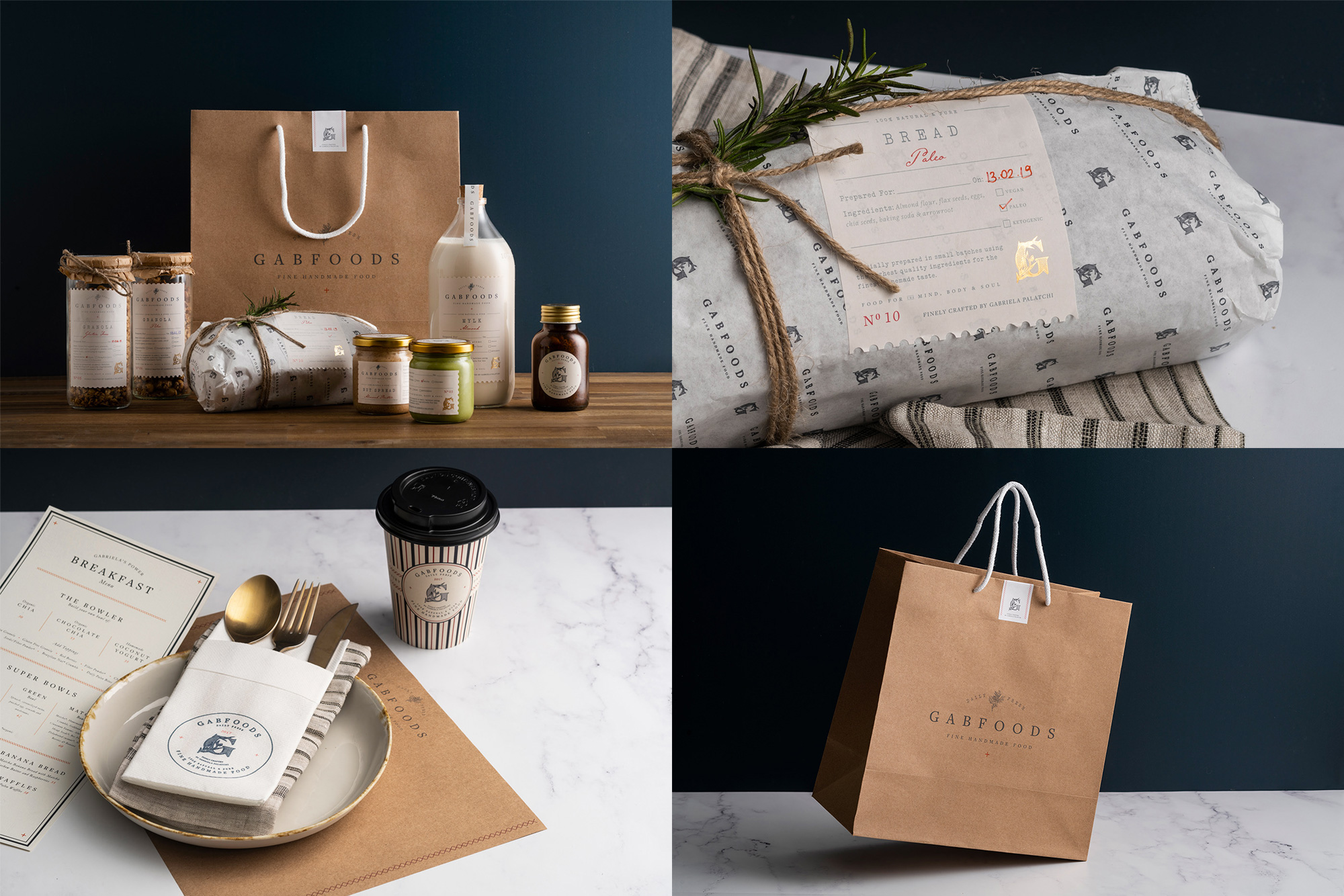
Gabfoods is a gluten-free and sugar-free food emporium in Istanbul, Turkey, making its own granolas, baked goods, spices, and even Kombucha. The identity, designed by local firm Studio Born, has an elegant, earthy, and home-made vibe that looks as delicious as the products, with a classy serif logo, a beautiful “G” monogram, and small accents of red typography and other graphic devices — like, look at that small red plus sign on the bag. Swoon. And that jug of milk. And that granola. I would buy one of everything at this place. See full project

 Новости Союза дизайнеров
Все о дизайне в Санкт-Петербурге.