Обзор лучших ресурсов по разработке бренда, разработке упаковки
contact us | ok@ohmycode.ru
contact us | ok@ohmycode.ru
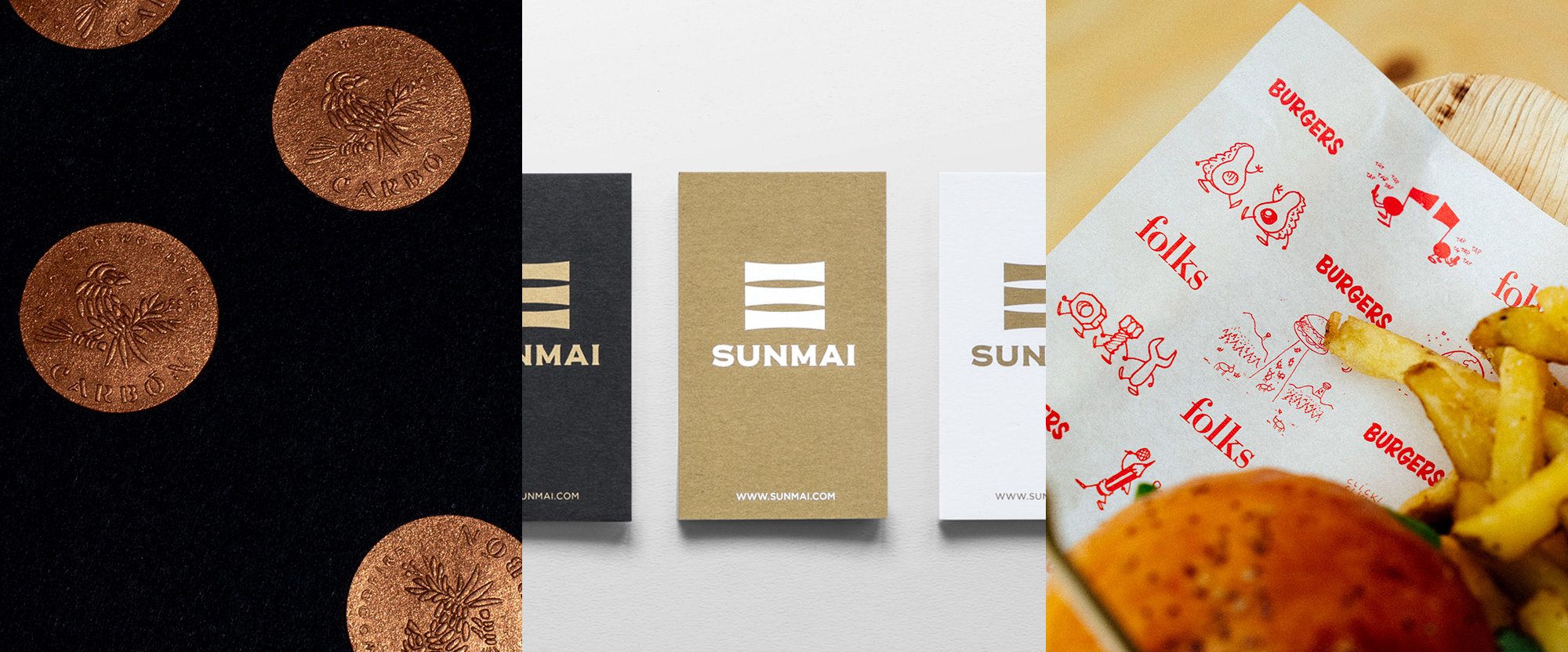
A healthy range of restaurant identities this week, with work from Brooklyn, Taipei, and Barcelona.
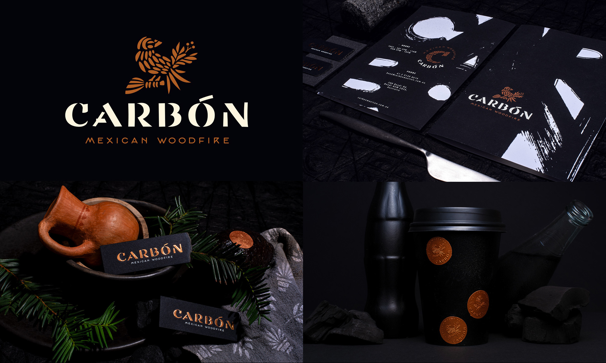
Carbón is a Mexican restaurant in Bondi, New South Wales, Australia, that focuses on wood-fired dishes on a grill, using charcoal (which is the English word for “carbón”). The identity by Brooklyn, NY-based Abraham Lule, features a great logo made up of a combination of a Mexican-cut-paper-like illustration of a bird and an elegant but rugged stencil flared sans serif concoction that’s quite interesting. Reproduced in copper in as many places as possible on black surfaces, the identity has an elegant earthiness to it that is pretty enticing but then again, they already had me at “wood-fired dishes on a grill”. See full project
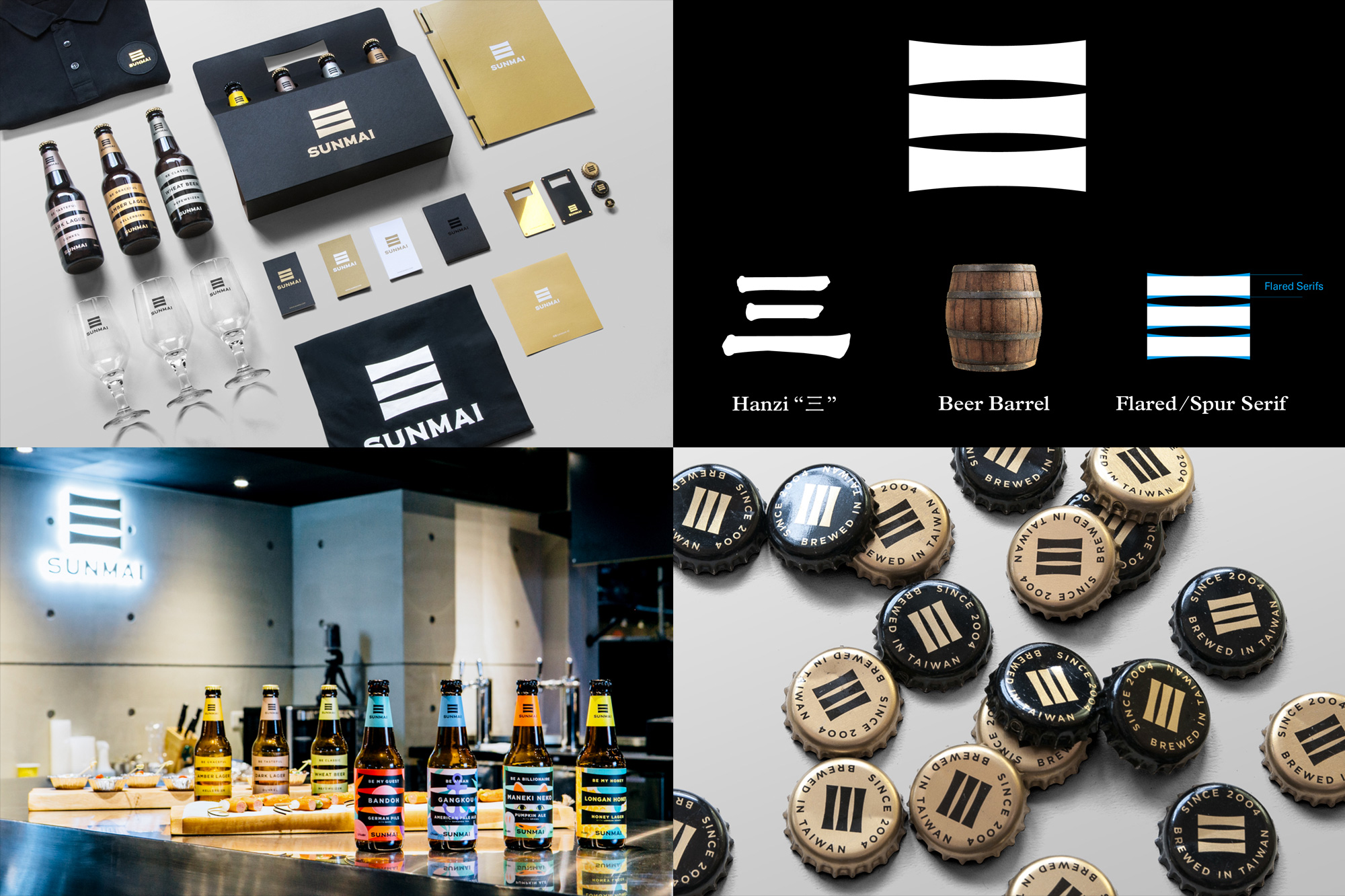
Sunmai is a craft brewery in New Taipei City, Taiwan, combining German and Chinese techniques and sensibilities to create their award-winning beer. The new name, which, if I understand correctly, means “three wheat”, is interpreted by local firm Onion Design Associates, through the Chinese hanzi character for “three” (三) and stylized with flared serifs that give it an elegant, confident symbol to use throughout the identity. I wish the wordmark were a little better or more interesting than a rich man’s Copperplate Gothic but I guess it’s not too bad. I love how they use the icon in the bottles by making it extra large and interact with more contemporary and eclectic illustrations. This isn’t a big, runaway hit but that icon has so much body to it… like a good beer. See full project
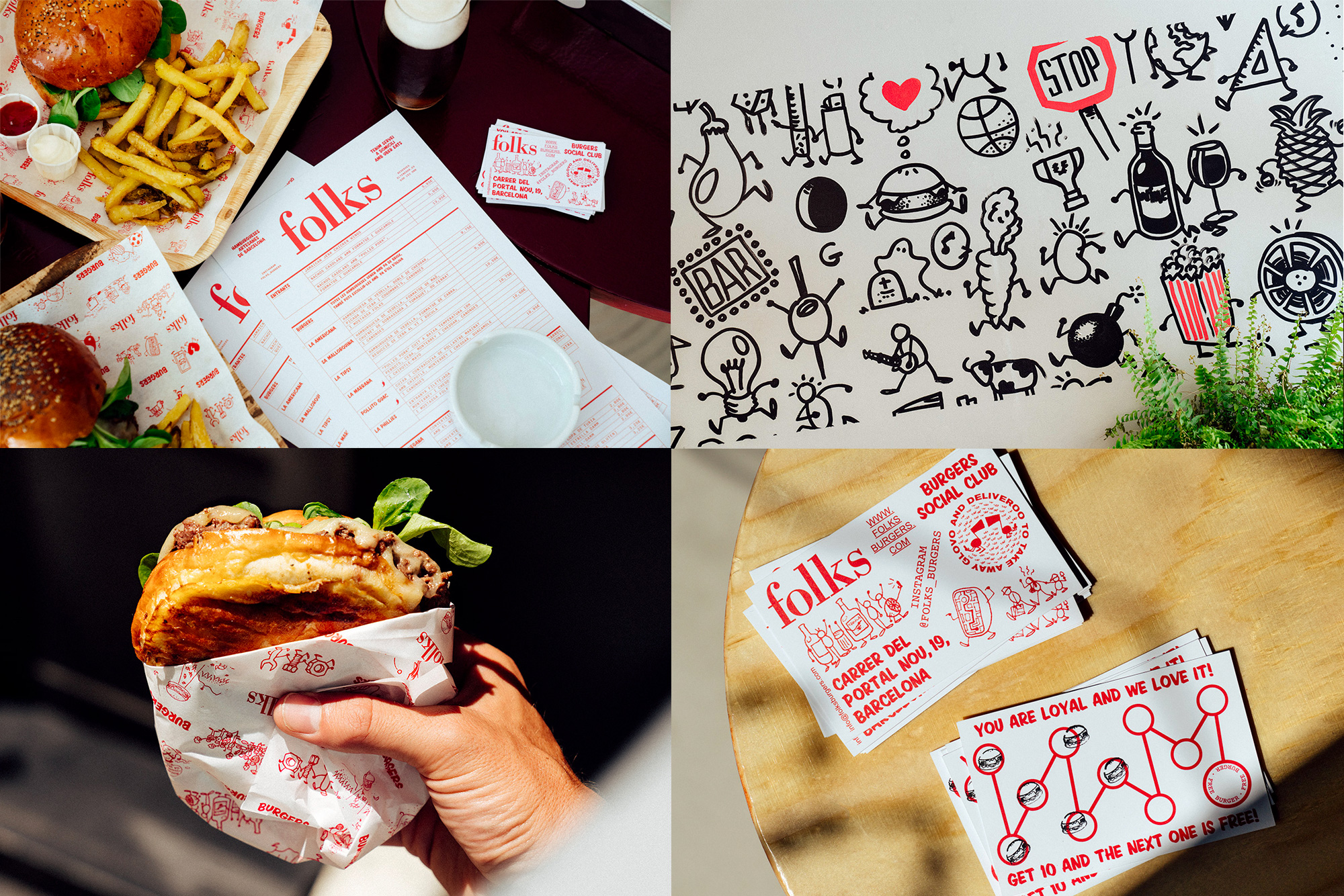
Folks, Social Burger Club is burger joint in Barcelona, Spain, with a small location and a selective menu of only six burgers — based on the photos, they nail those six burgers. The identity, designed by local firm Guud Studio, is a funky combination of an elegant Didone for the “folks” wordmark and a brushstroke font for pretty much everything else. To be honest, I’m not sure it works but, also to be honest, I don’t think it matters because the highlight of this project is a series of illustrations where everything from an avocado to a pencil to a music note is given little hands and feet for no evident reason. So, come for the burgers, stay for the weirdness. See full project
 each year since publication began in 2006

 Новости Союза дизайнеров
Все о дизайне в Санкт-Петербурге.
Новости Союза дизайнеров
Все о дизайне в Санкт-Петербурге.