Обзор лучших ресурсов по разработке бренда, разработке упаковки
contact us | ok@ohmycode.ru
contact us | ok@ohmycode.ru
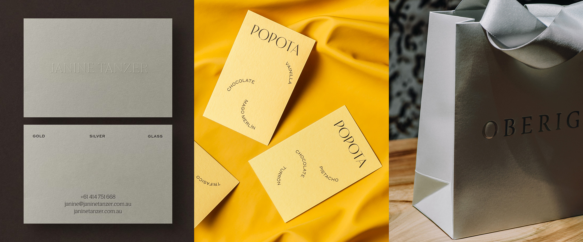
A range of light, elegant, and classy wordmarks take the spotlight this week with work from Melbourne, Barcelona, and Kyiv.
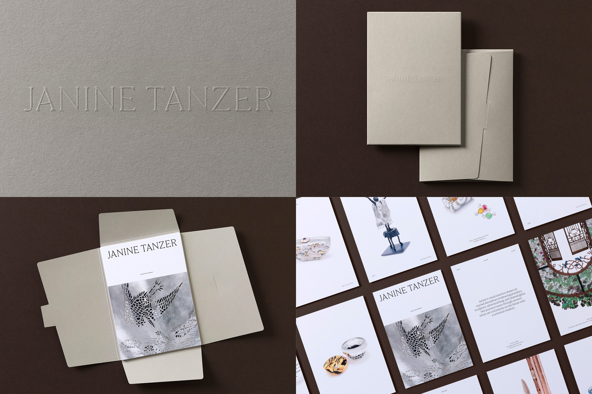
Janine Tanzer is an Australian jeweler, sculptor, goldsmith, and silversmith, who has been perfecting her craft over 40 years. Her identity, designed by Melbourne, Australia-based Studio Brave, focuses on a wordmark that feels as crafted and considered as her pieces. Looking almost like a custom job, the wordmark is typeset in Colophon’s Nib, which looks delightful in its all-uppercase setting. The angles of the crossbars of the “A”s and “E”s have been customized and give the appearance of pieces of metal forged into their new place with a hammer — one of Janine’s skills. The main application of the logo blind embossed highlights the chiseled aesthetic of the typeface and, more simply, looks super slick in the tan paper stock. With so many bold wordmarks these days, this is a nice reminder to keep lighter weights in mind. See full project
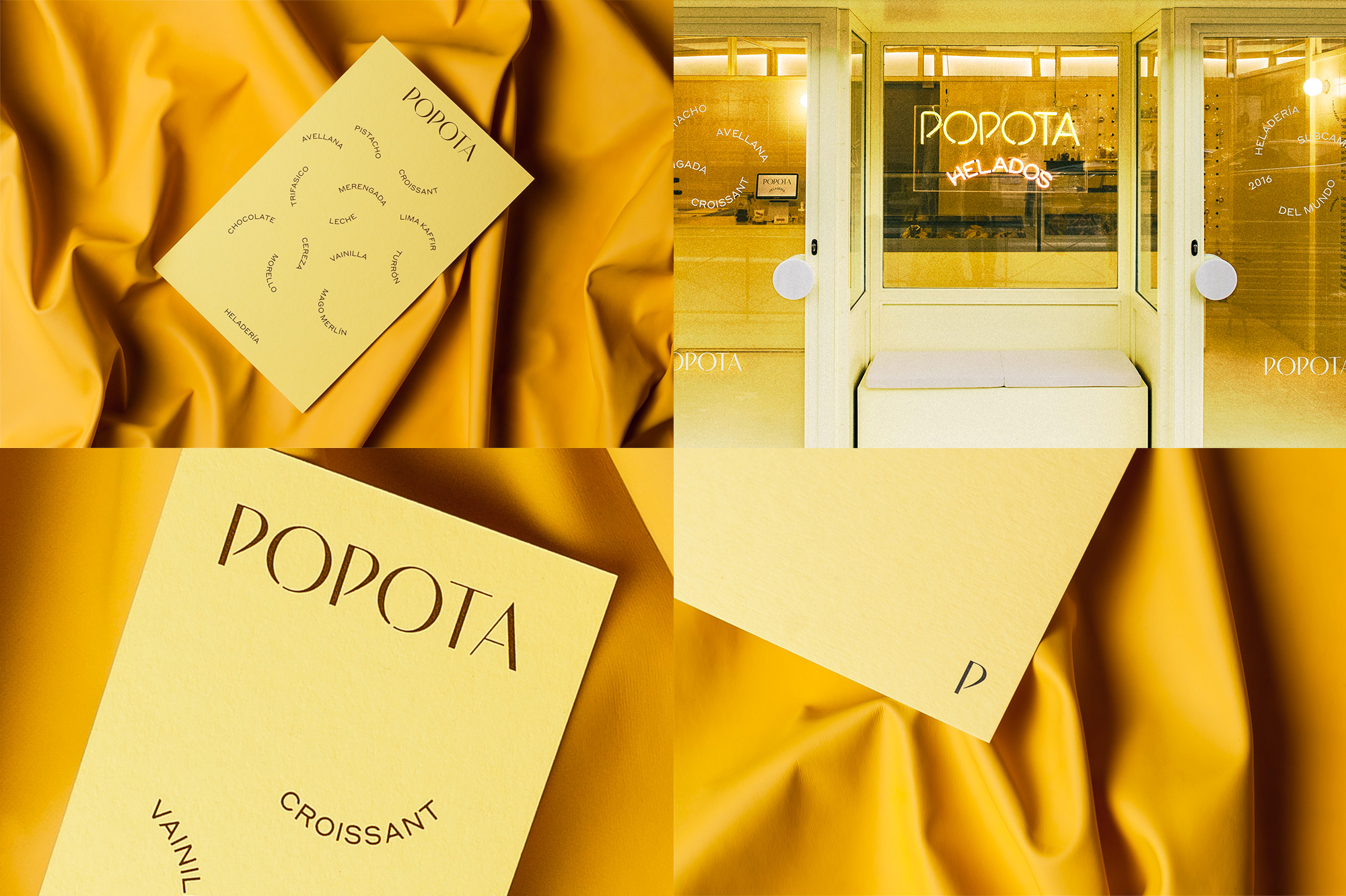
Popota is a sophisticated gelato maker and dispenser in Madrid, Spain, with an adorable, Wes Anderson-inspired storefront. Designed by Barcelona, Spain-based Requena Office, the identity revolves around a lovely and unexpected wordmark in a high-contrast sans serif style with a little stencil detailing mixed in. The “P”s are so unique and are what give the wordmark its strongest flavor. I’m not super crazy about the secondary sans serif choice, there is something very cold and distant about it for a gelat-ery, but I do like the playfulness of how it’s arranged to look as if the letters have been scooped into a ball. The winning element, though, is the awesome translation of the wordmark into neon form, with the stencil details serving as natural breaks for the strips of bent glass. Delicious. See full project
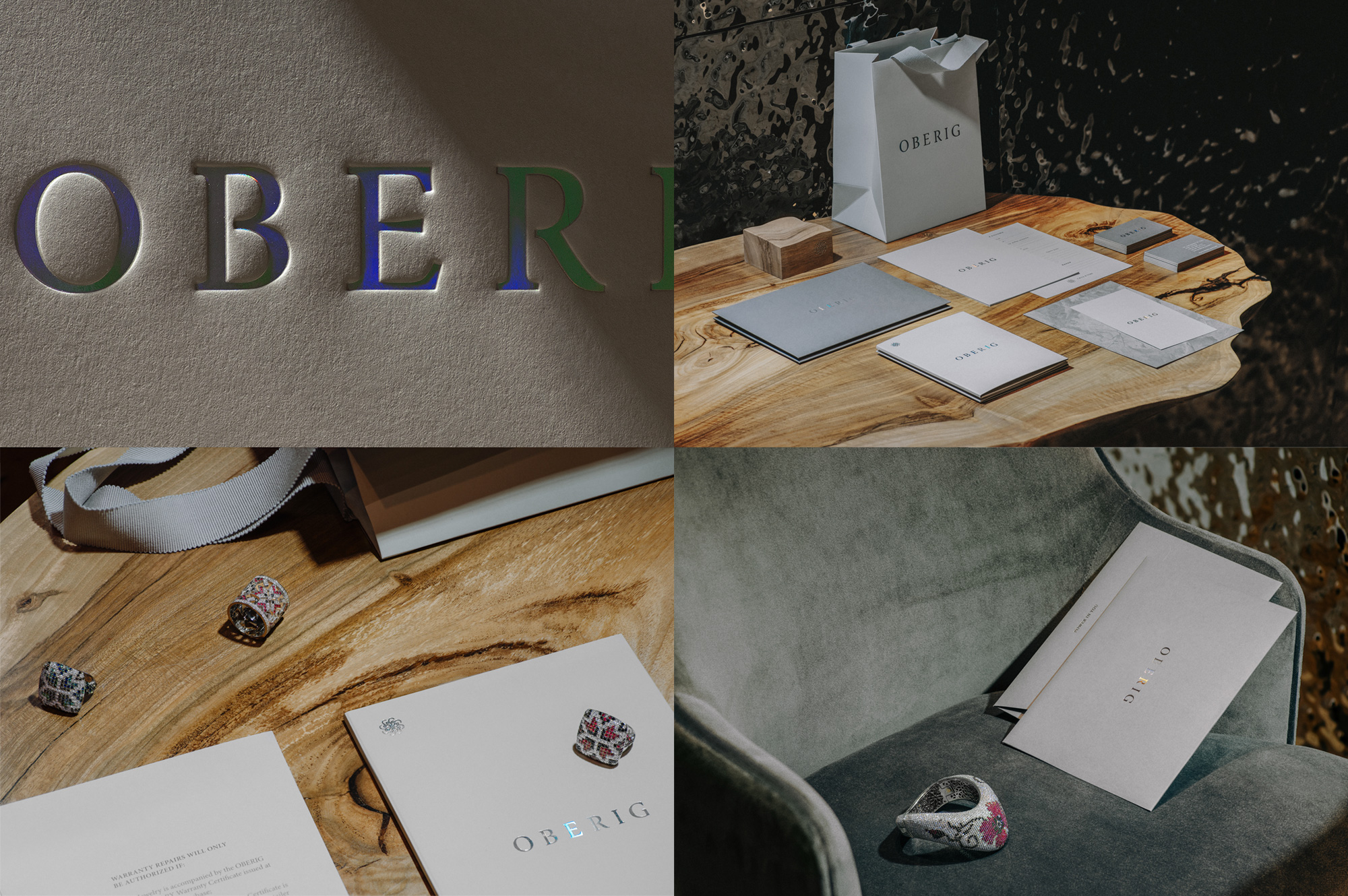
Oberig is a large jeweler in Ukraine blending old traditions and symbols with new production techniques and a high degree of craftsmanship. Their identity, designed by Kyiv, Ukraine-based Fedoriv, isn’t the most flashy of today’s Friday Likes but the wordmark is so well crafted, spaced, and implemented. It’s hard to make such a relatively simple serif look so good but, then again, I am easily swayed by extreme close-ups of holographic foil stamping on high-texture paper. See full project
 each year since publication began in 2006

 Новости Союза дизайнеров
Все о дизайне в Санкт-Петербурге.
Новости Союза дизайнеров
Все о дизайне в Санкт-Петербурге.