Обзор лучших ресурсов по разработке бренда, разработке упаковки
contact us | ok@ohmycode.ru
contact us | ok@ohmycode.ru
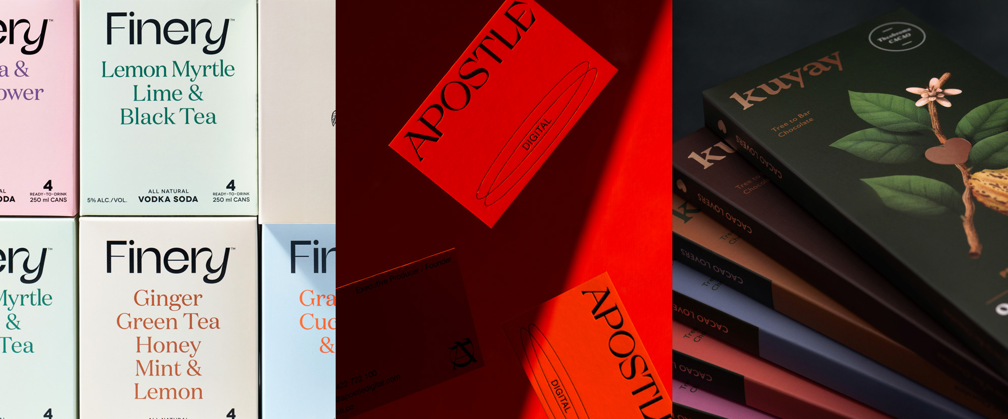
A strong serif showing this week, with work from Auckland, San Diego, and Lima.
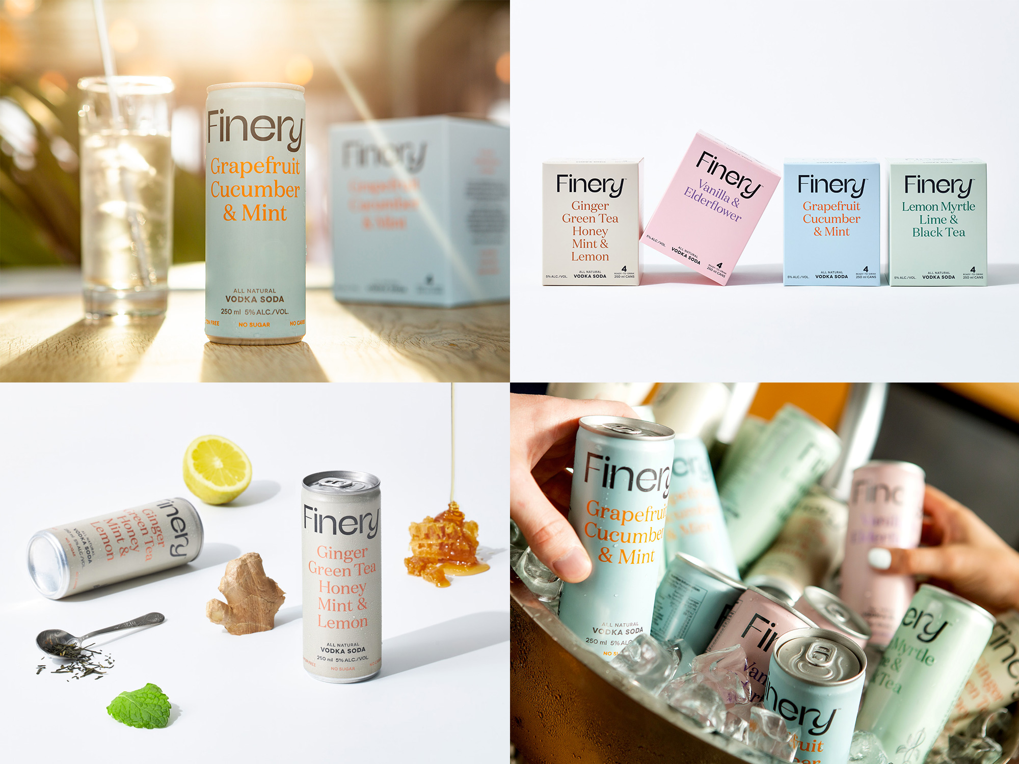
Finery is a new brand of sugar-free, carb-free, gluten-free, all-natural vodka soda available in New Zealand made from seven-times distilled sugar cane vodka, sparkling soda water, and a blend of fruits, teas, and botanicals. The new identity, designed by Auckland, New Zealand-based Onfire Design, is a typographic delight with cans and 4-pack boxes featuring a sans serif with a delightful, unexpected, and novel “ry” ligature that, although I’m not sure what it’s meant to represent, I am liking it very much. The supporting serif and the hints of sans serif are both nicely used as a complement to the logo. The soft pastel color palette is quite nice too, giving the cans a sophisticated look. See full project
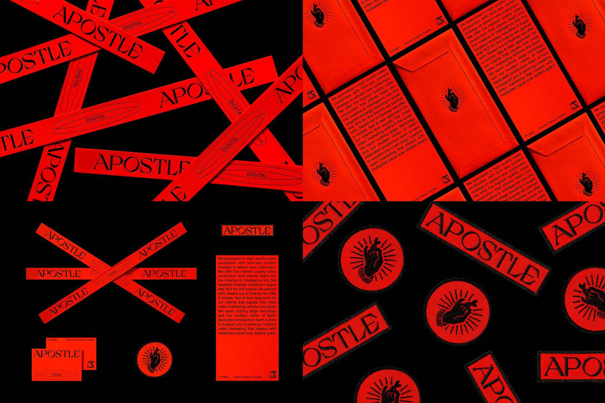
Apostle Digital is a video production and content strategy company in Sydney Australia, creating commercials and mini films for brands like Tesla, Gucci, and Adidas. The identity, designed by San Diego, CA-based Mubien Studio, is red. Very red. Both online, which is easy, and offline, which is hard, but with the paper selected, the same digital vibrancy achieved on screens can be experienced off screens. On top of all that red is a great combination of design elements, including an expressive serif wordmark, a lovely blackletter-ish-looking “AD” monogram, and a great hand illustration. All deployed in black, the contrast and boldness of all the materials is quite arresting and the production, from the foil stamping to the patches, is pretty epic. See full project
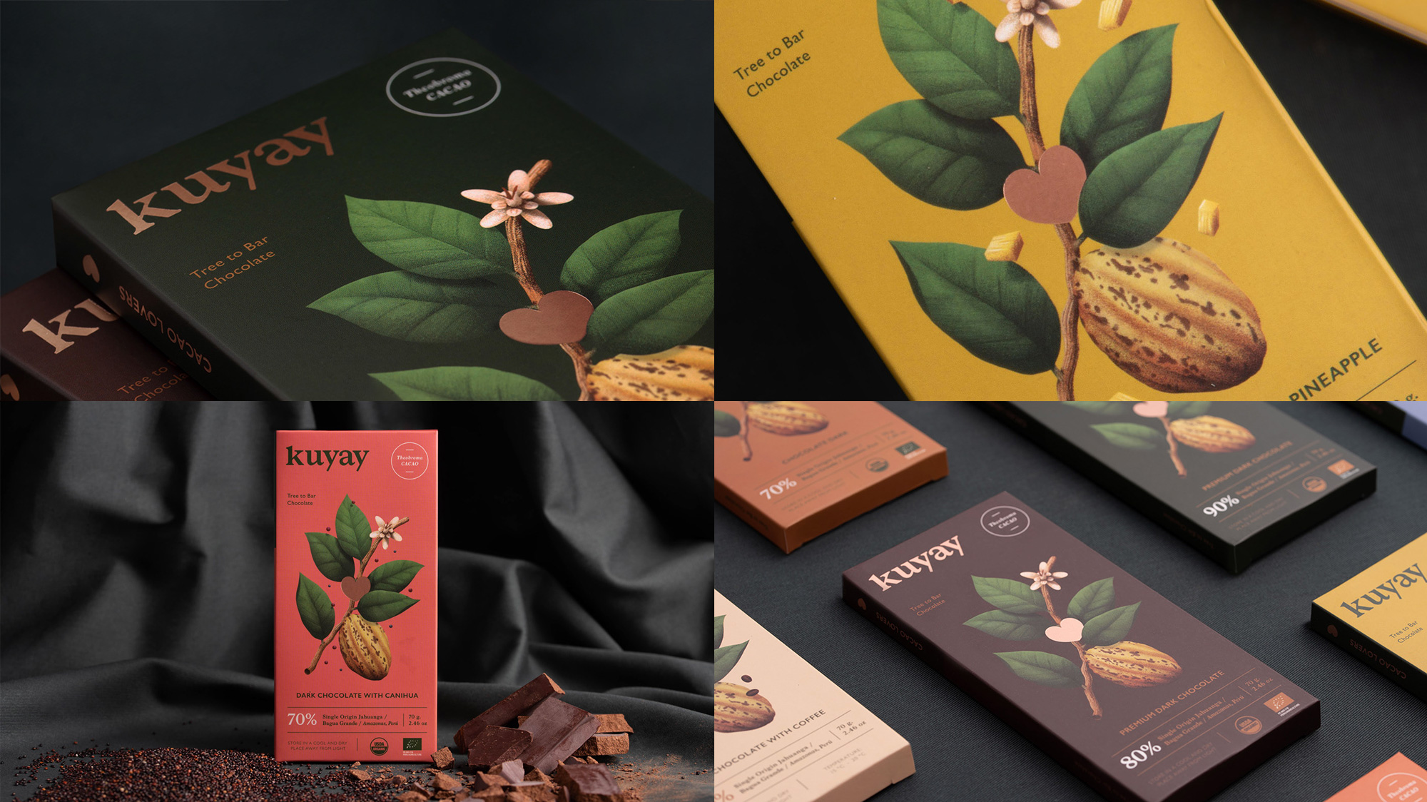
Kuyay is a family-owned brand of organic chocolate in Peru, that harvests its own cacao and is in charge of production from start to finish — its name means love in Quechua (the native Peruvian language). The identity and packaging, designed by Lima, Peru-based Fibra, combines a modest and lovely serif in lowercase — which creates a great horizontal line at the top of the x-height — with detailed botanical illustrations of the cacao plant and the main ingredient that makes up each flavor. What sealed the deal for me on the packaging was the integration of the heart icon as foil stamp in the center of the package that is cleverly “cut” so that it appears to sit behind the leaf, giving the design a subtle sense of depth in an unexpected way. The color palette in rich, dark, warm hues has me feeling all the chocolate feels.See full project
 each year since publication began in 2006

 Новости Союза дизайнеров
Все о дизайне в Санкт-Петербурге.
Новости Союза дизайнеров
Все о дизайне в Санкт-Петербурге.