Обзор лучших ресурсов по разработке бренда, разработке упаковки
contact us | ok@ohmycode.ru
contact us | ok@ohmycode.ru
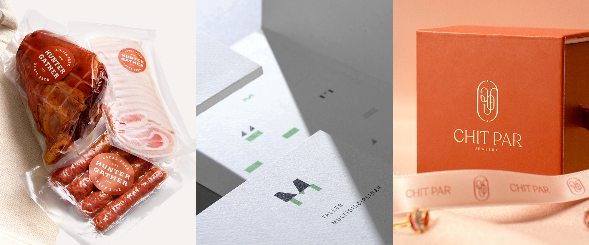
A wide range of styles this week with work from Vancouver, Mexico City, and Yangon.
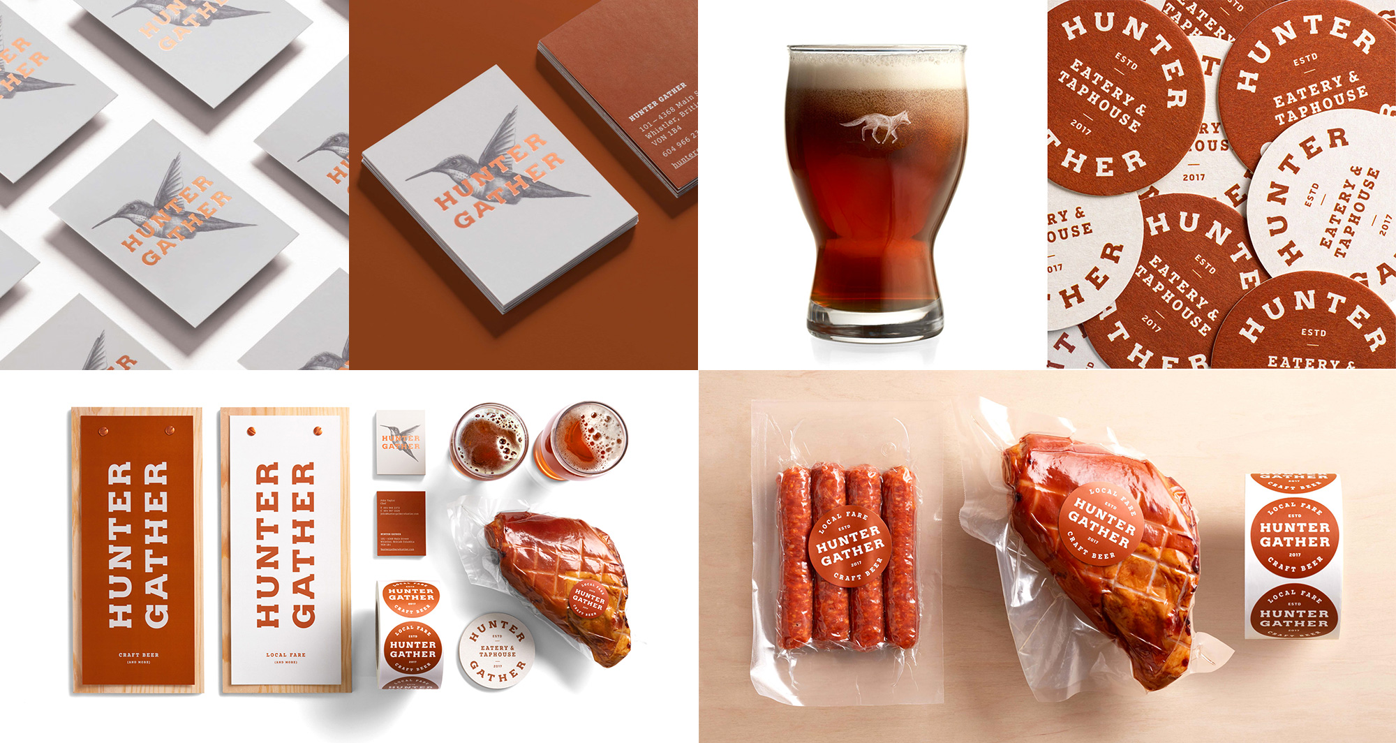
Hunter Gather is a fast casual eatery and taphouse in Whistler, British Columbia, focusing on fresh, local ingredients and great beer. The identity, designed by Vancouver, BC-based Pendo, features a great stacked wordmark in a slab serif, which, side note, I think has been the most underused type style of the decade. But I digress. I love how neatly the two words line up with the “ER”s satisfyingly matching at the end and without it being a monospace font. The orange-red-brown-brick-like color is great and I really like how it’s a single-color identity, yet there is so much texture to it. The animal illustrations are a nice addition and, used sparingly, provide subtle contrasts in different applications. See full project
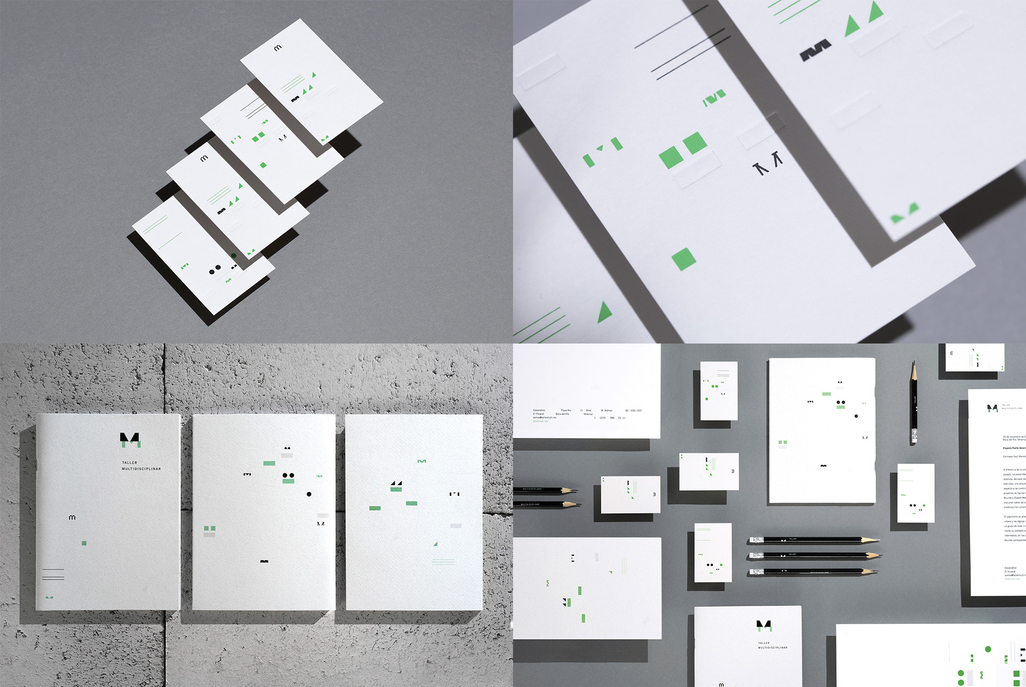
Taller Multidisciplinar is an architecture firm in Veracruz, Mexico, specializing in public spaces. The identity, designed by Mexico City-based Bala, introduces a changing, double-M monogram that alludes both to the idea of a multidisciplinary studio and that the two founders’ names start with “M” (Mauro and Miriam). This doesn’t have the glitz and glam of most Friday Likes but I really like how different it is, in a kind of Designers Republic-lite aesthetic but also just kind of marching to the beat of its own drum. The dots and bars and pieces of “M”s scattered in clusters on each application are pretty cool and the green and black combo with so much white around it looks striking. See full project
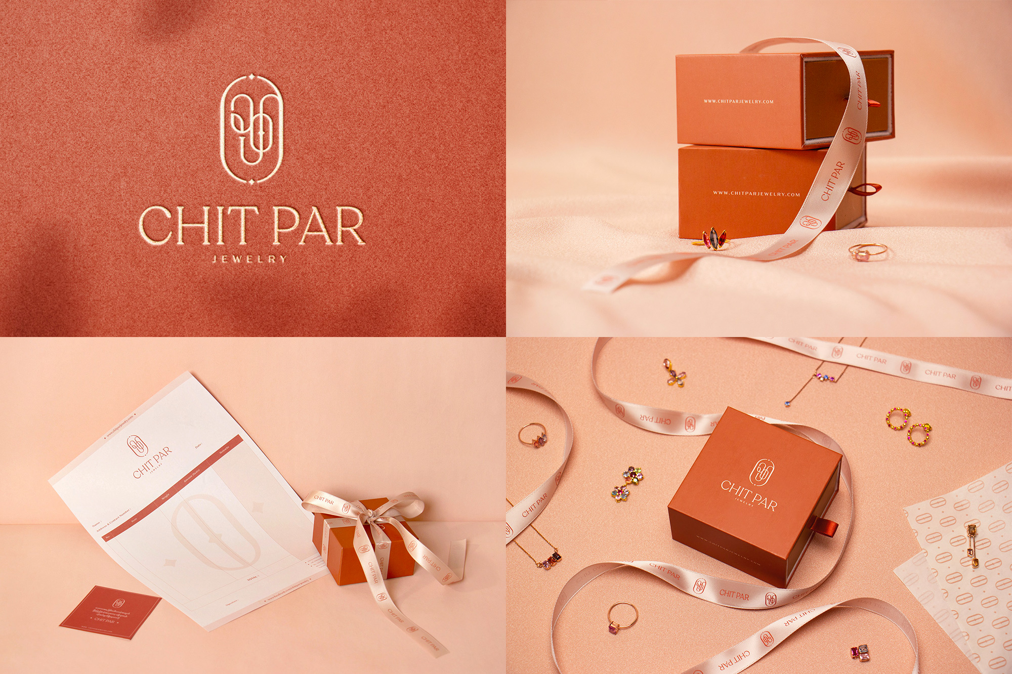
Chit Par Jewelry is a jewelry brand in Myanmar creating rings, necklaces, earrings, and brooches using gemstones. The identity, designed by Yangon, Myanmar-based Poke., has a lovely combination of elements that include a delicate and elegant small-serifs serif wordmark, a high-contrast sans, and a gem-like monogram (that I imagine has letters in Burmese). The identity doesn’t break any conventions but all the elements work great together in the different configurations, from boxes to ribbons, and the rusty orange color is quite nice. Major props for a killer invoice sheet. See full project
 each year since publication began in 2006

 Новости Союза дизайнеров
Все о дизайне в Санкт-Петербурге.
Новости Союза дизайнеров
Все о дизайне в Санкт-Петербурге.