Обзор лучших ресурсов по разработке бренда, разработке упаковки
contact us | ok@ohmycode.ru
contact us | ok@ohmycode.ru
A range of soft-colored projects from very different industries this week, with work from Lisbon, London, and Oklahoma City. (Descriptions are a little shorter than usual due to travel and time constraints this Friday, due to First Round in Portland.)
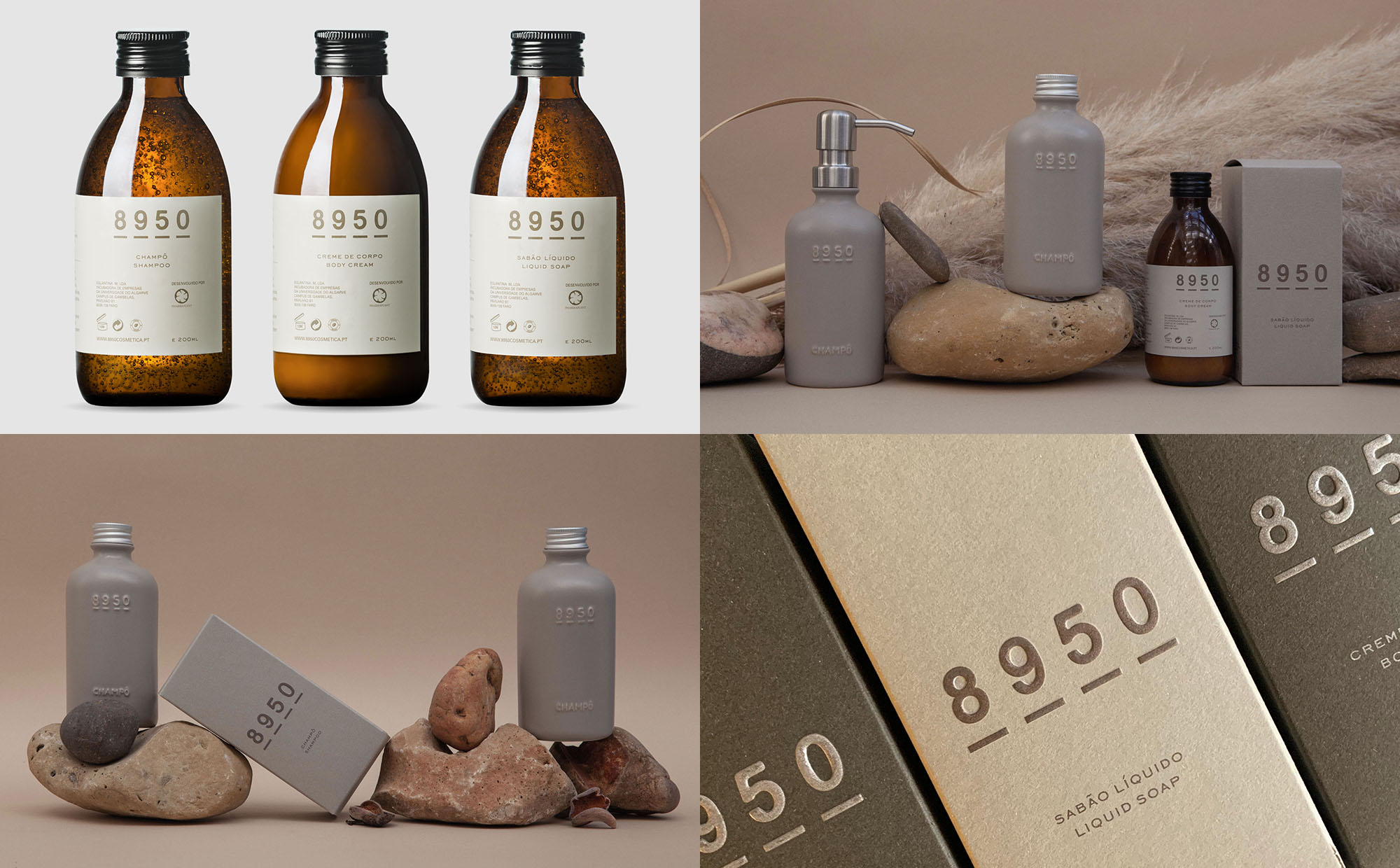
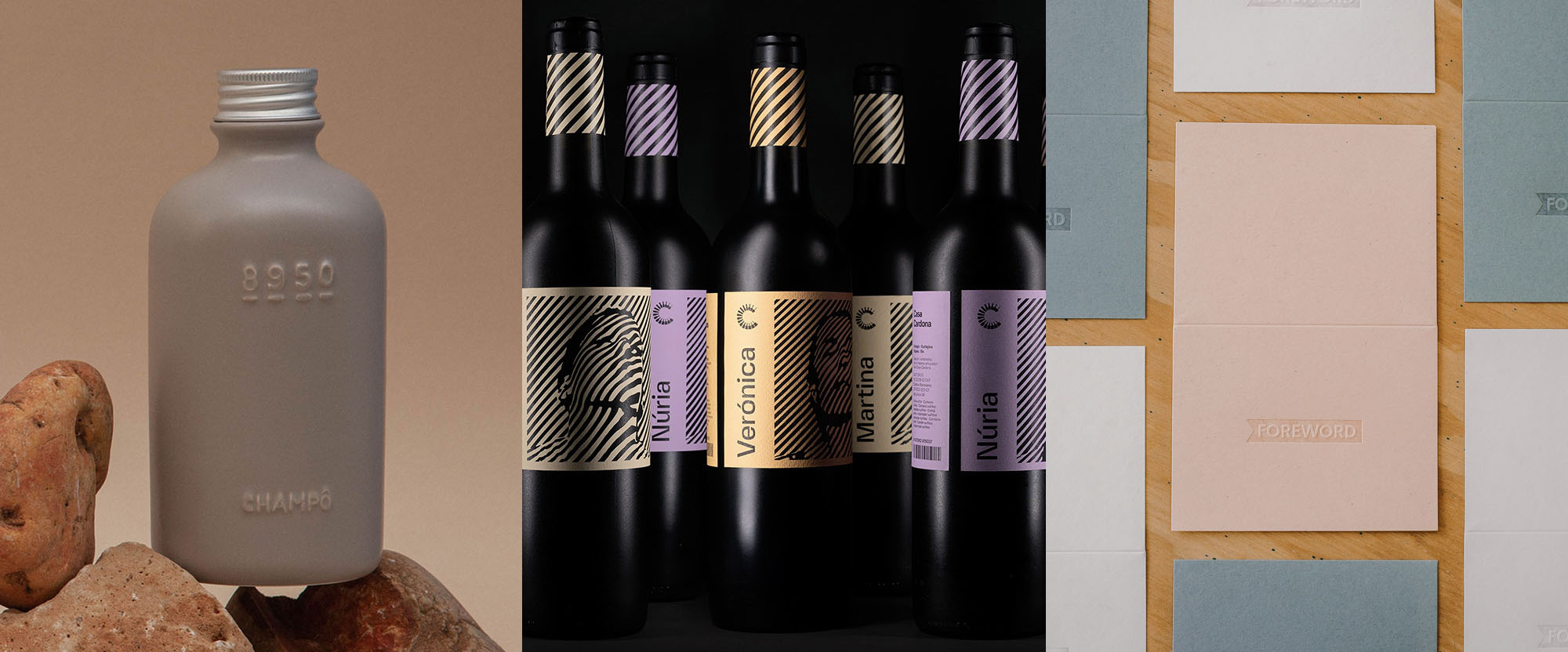
8950 is a brand of skincare products from Portugal using all natural ingredients and plastic-free packaging — instead it comes in a lovely ceramic container. (I couldn’t figure out what the name stands for.) The identity, designed by Lisbon, Portugal-based Joana Areal, is über minimalist, with the name typeset in a simple sans serif and each number underscored… what elevates this beyond another ho-hum simple design is how stunning it looks embossed in the ceramic bottles and the classy color palette for the boxes and labels. I’ll admit that I was also swayed by the rocky presentation. See full project
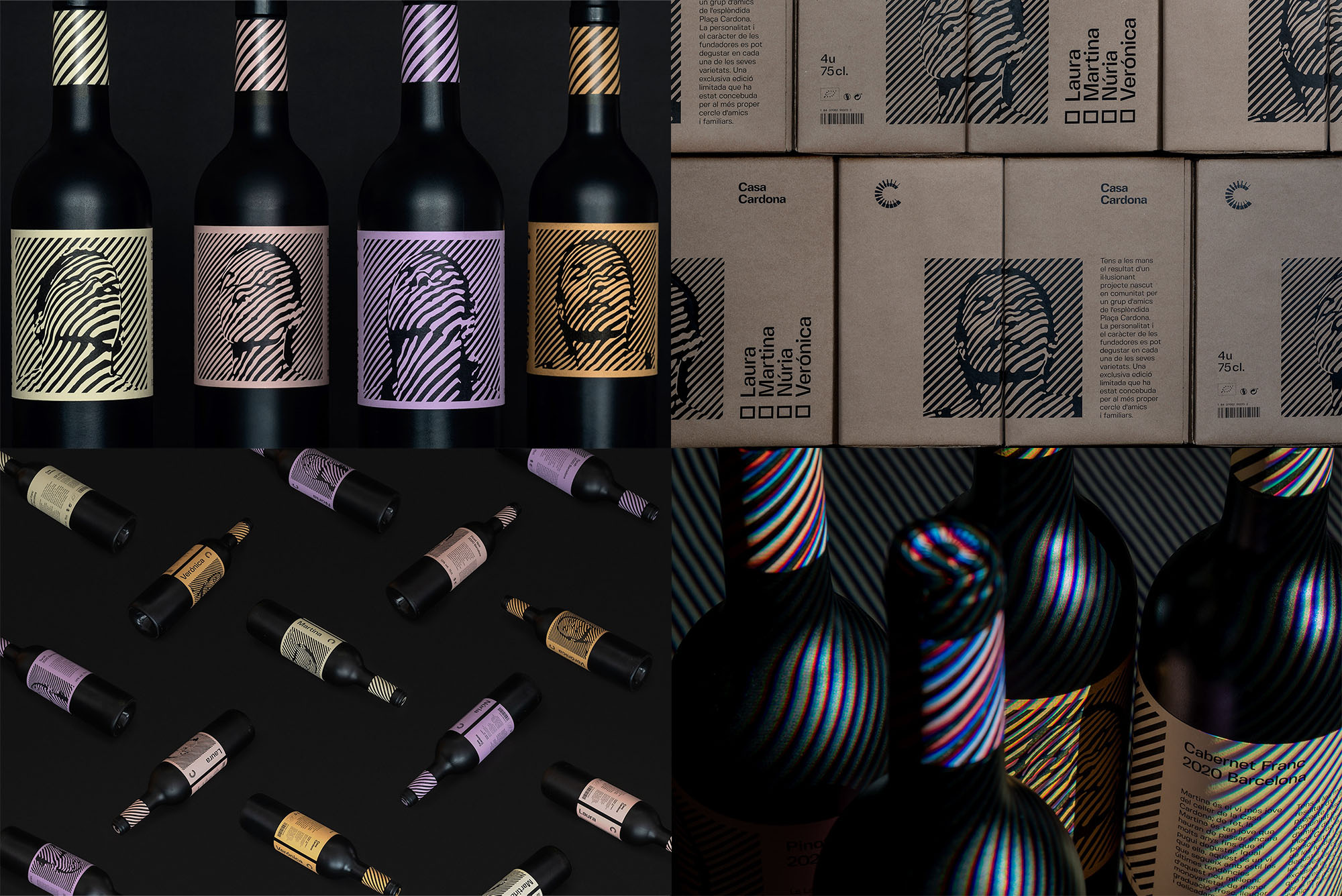
Casa Cardona is a very limited edition of wines that were purchased by a group of friends in Barcelona and intended for personal (re)distribution only, under the new moniker, taken from Cardona Square, Barcelona. The packaging, by London, UK-based Marçal Prats, takes inspiration from 1960s Op-art and renders portraits of the friends in a cool, trippy style that would probably be fairly un-marketable if this were a widely distributed commercial product but as a kind of artistic expression on a bottle, it’s quite fun. Like 8950 above, I’m also swayed by the extra trippy presentation of the bottles with additional color stripes illuminated unto the bottles for an additional hit of Op-art. See full project
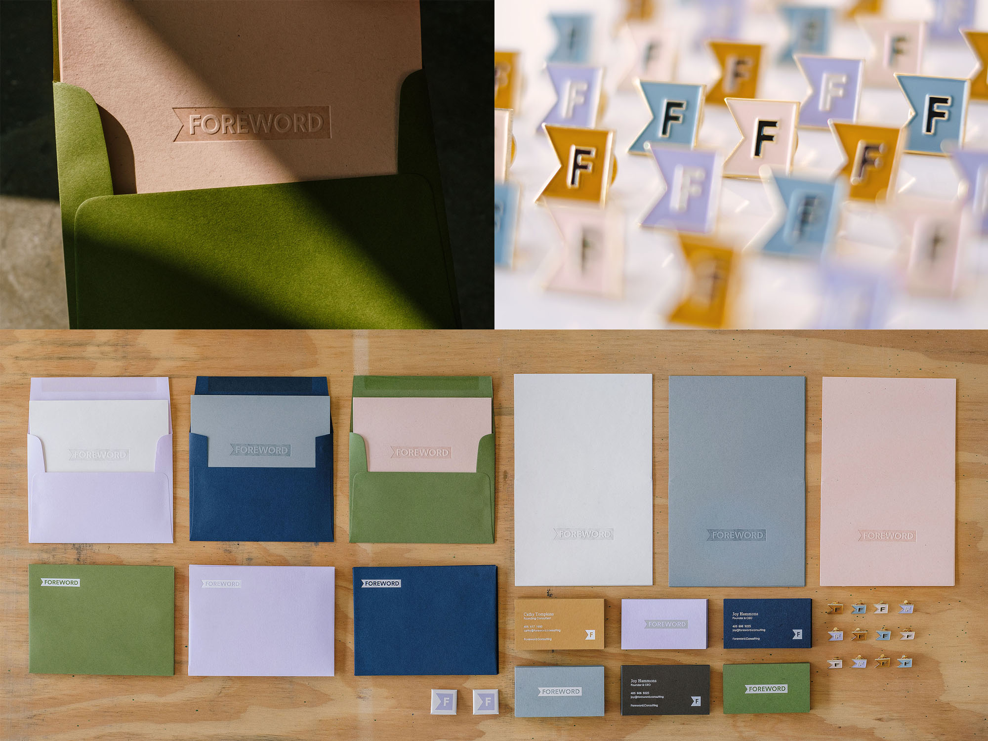
Foreword provides leadership consulting for executives to help them become better leaders or help them establish strong cultures in their workplace. Designed by Oklahoma City, OK-based Ghost, the identity is quite straightforward with a nice sans serif wrapped inside a bookmark holding shape that, as a bonus, has a neat arrow in the negative space at the beginning. It’s nothing groundbreaking but it’s very nicely deployed in print applications on a lovely range of colored stock and a slick use of clear foil stamping. Also, I would wear those pins for no reason whatsoever other than they are nice as F. See full project
 each year since publication began in 2006

 Новости Союза дизайнеров
Все о дизайне в Санкт-Петербурге.
Новости Союза дизайнеров
Все о дизайне в Санкт-Петербурге.